Timber construction
Hyne Group
Mention Hyne Timber to anyone in the construction game and they’ll know exactly what you’re talking about. Loved by builders and structural engineers everywhere, Hyne Timber has been Australia’s favourite structural timber for over a century. But over time, what started with a single brand has grown into a broader network of wood product innovators—from mass timber manufacturing under XLAM to a series of Australasian pallet producers.
Recognising the need to give shape and structure to this expanding family, Hyne Group brought us on board to refine three key brands in its ecosystem—starting with the group brand itself. Working closely with Hyne’s internal team, we set out to highlight each brand’s distinct character while maintaining the family resemblance.
Read more 
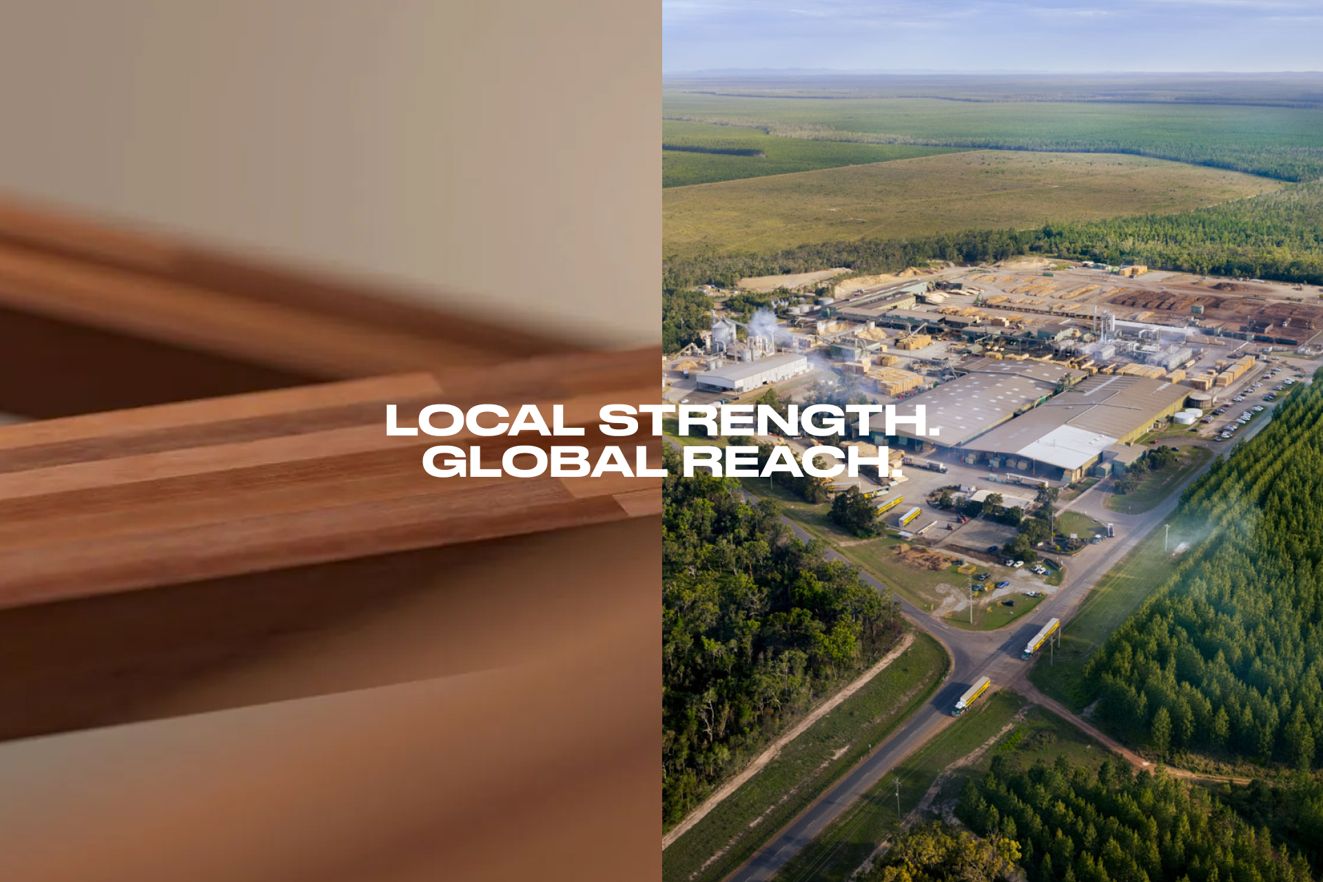
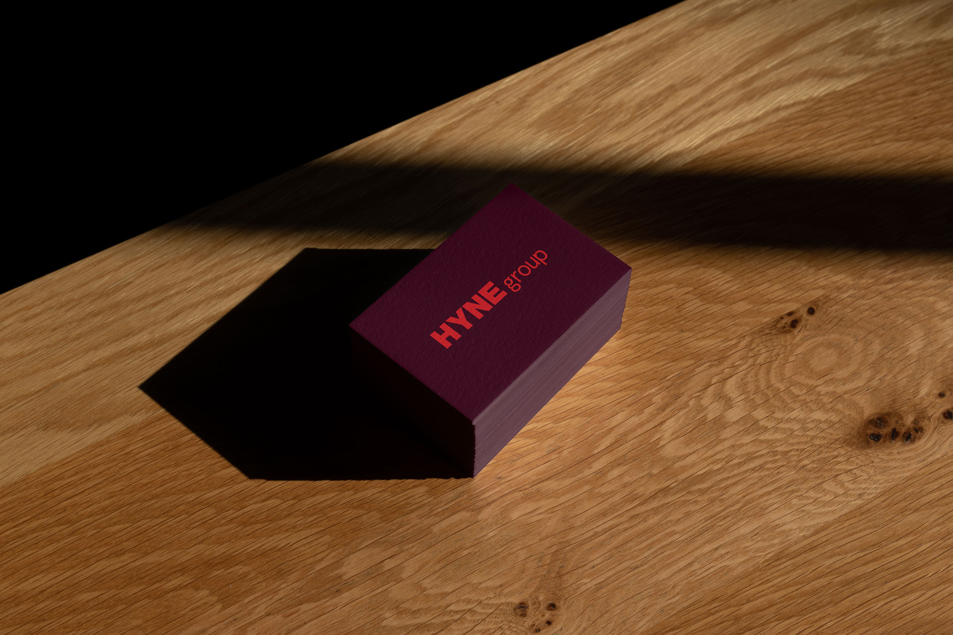
Hyne Group
While ‘Hyne Group’ had been an unofficial banner for some time, creating a dedicated brand identity made it official. Standing on the shoulders of Hyne Timber, the group identity brings forward the same typefaces, core colours, and ‘Hyne’ wordmark. However, just like all parents, the group brand carries itself with a little more maturity—a little more structure—than its first-born. With deep maroon and colour block graphic elements, the identity calls out as the solid centre of a growing family.
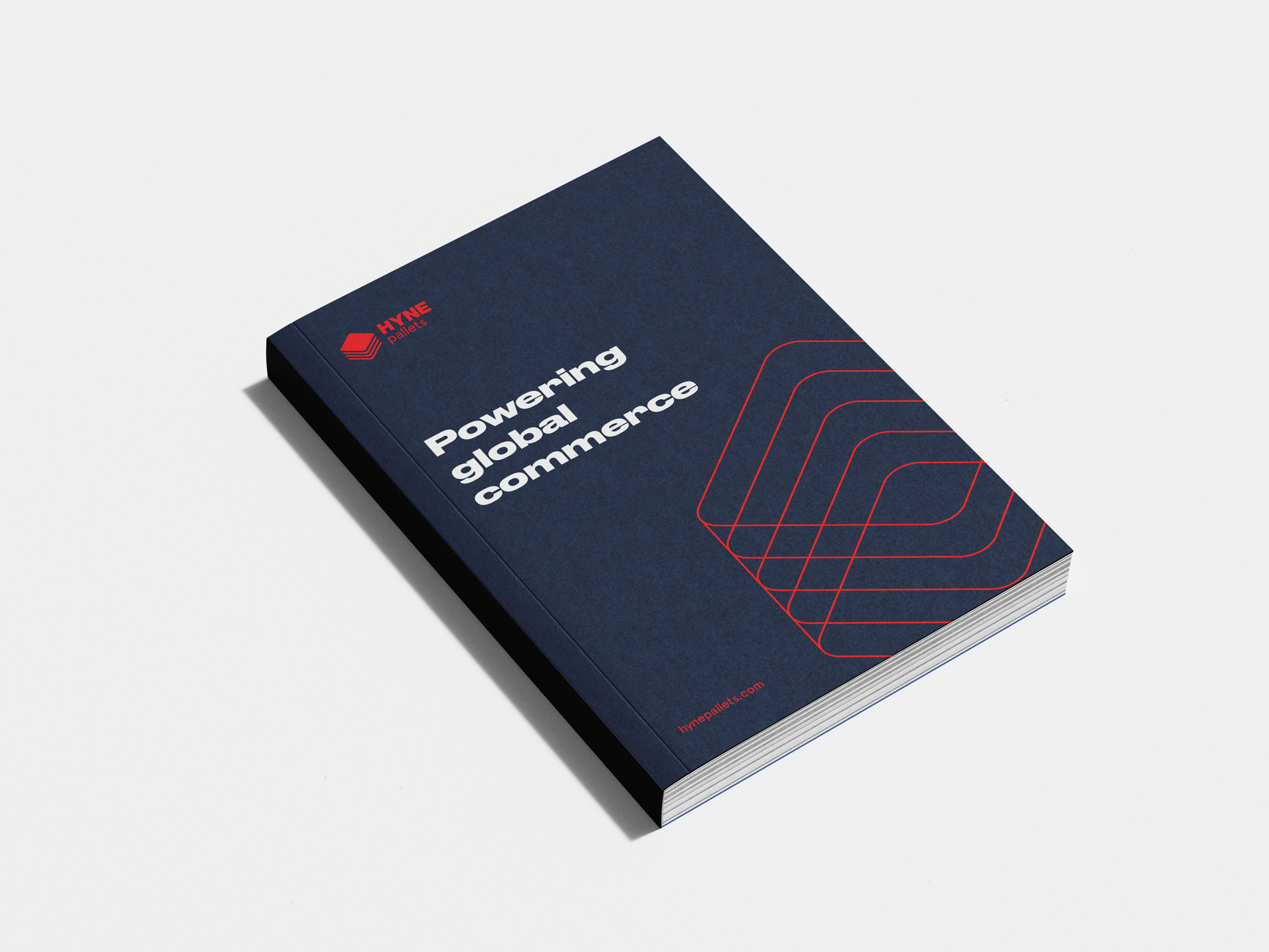
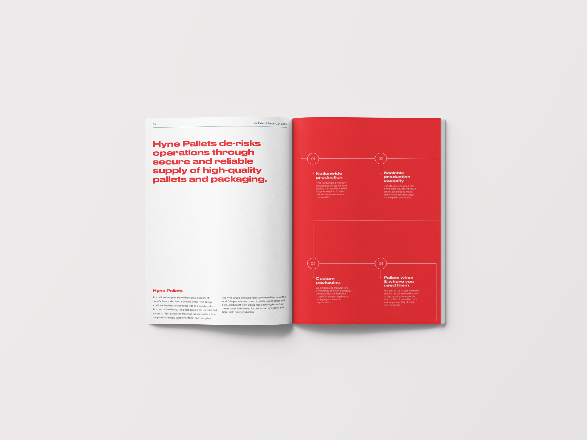
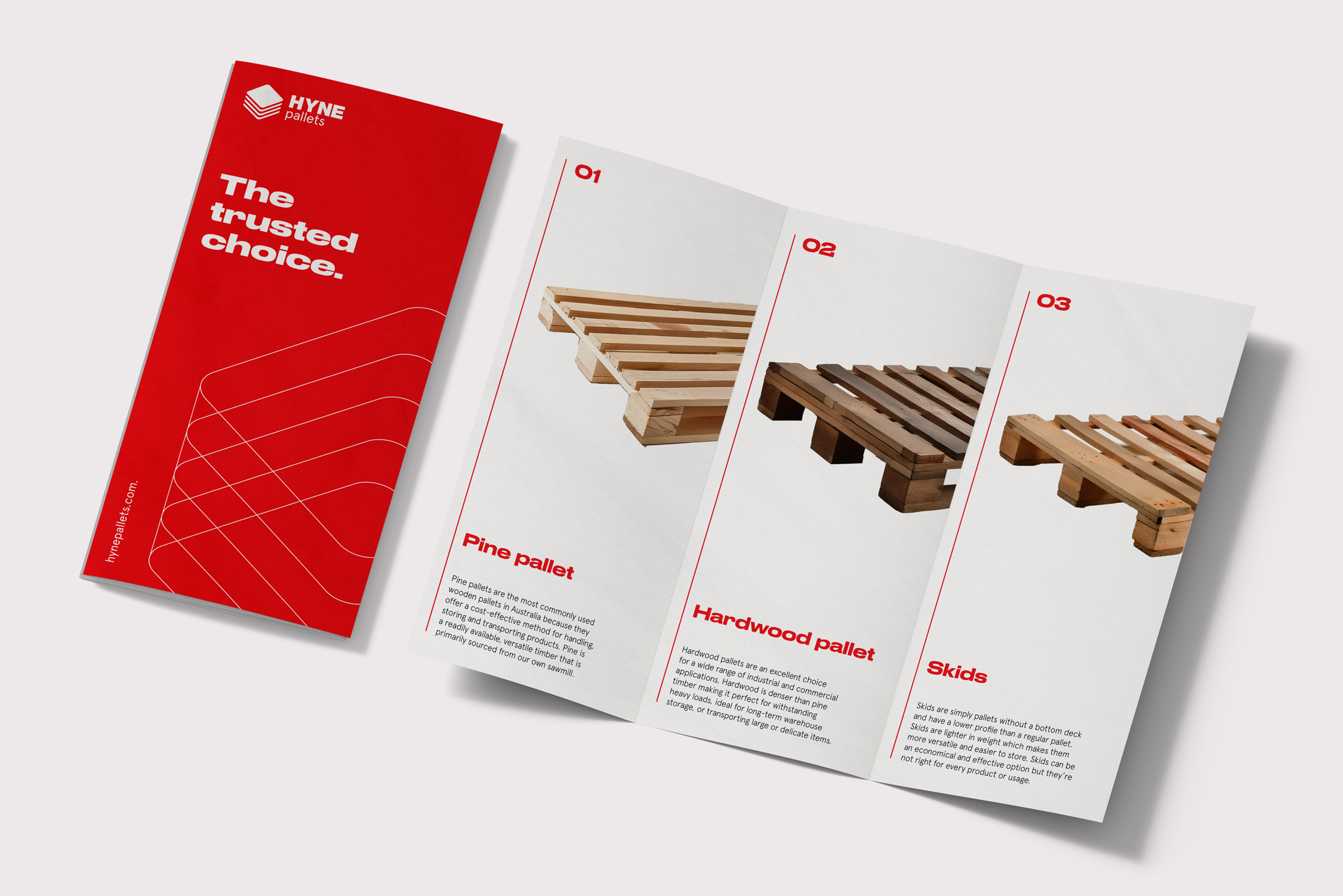
Hyne Pallets
At first glance, pallets can seem purely functional. But under the Hyne Pallets umbrella—a collective of manufacturers within the Hyne Group—there’s more to the story. In collaboration with the Hyne team, we created a visual identity that balances everyday practicality with a little polish. We brought over the core Hyne colours and added a bold accent of blue, signalling that Hyne Pallets is both part of the bigger family and distinct in its own right.
Rather than relying on the usual product photography, we recommended a clean, rendered approach to showcase Hyne Pallets’ offerings—making them look sharp and consistent without overcomplicating the visuals. And to tie the brand together, we introduced a keyline graphic style: thin, precise lines that reflect the journey pallets take, from manufacture to delivery—a nod to how these unsung heroes keep the supply chain rolling.
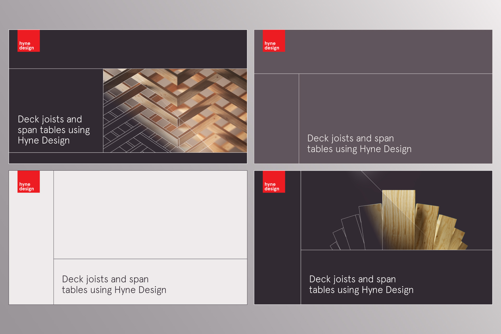
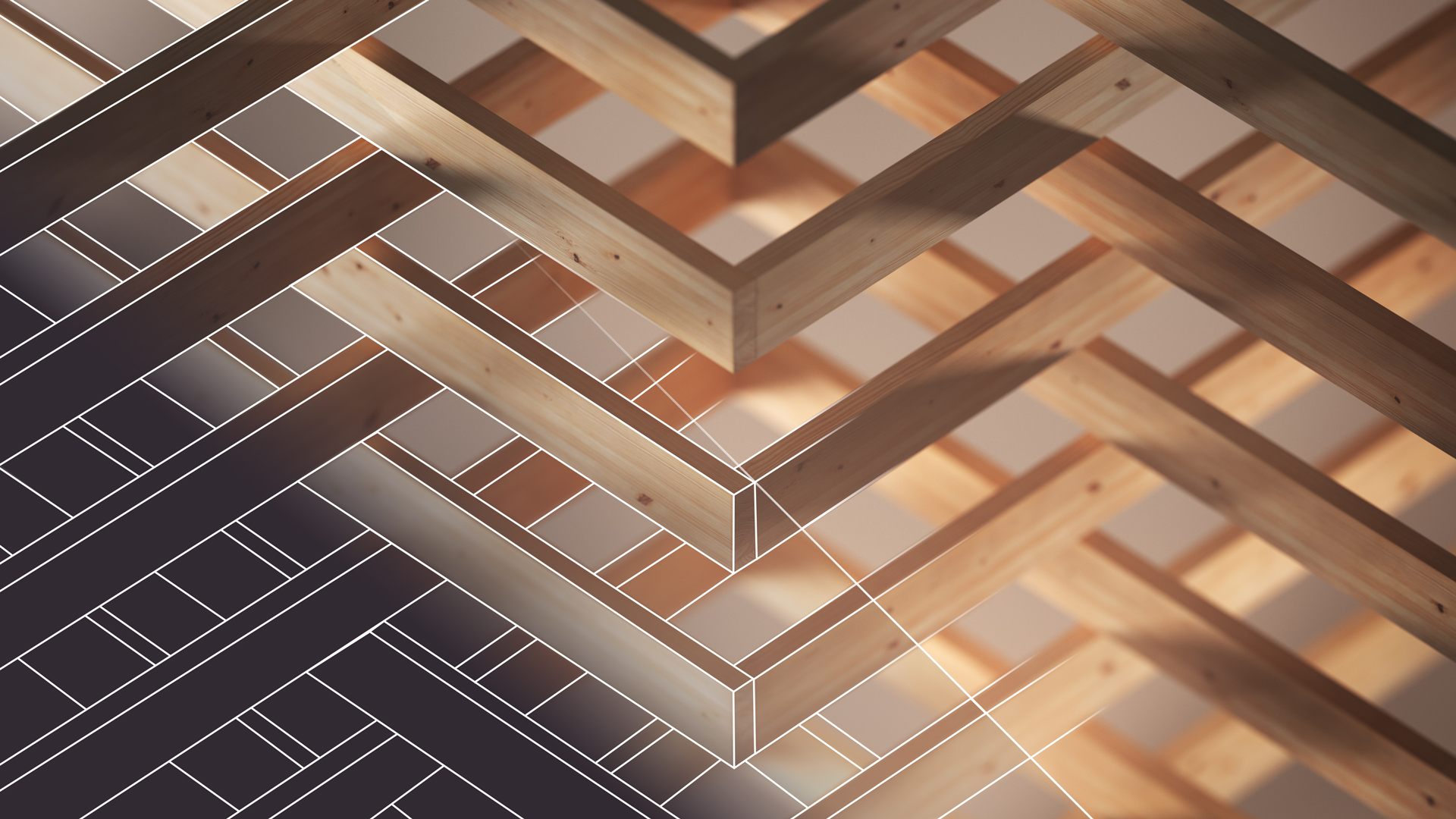
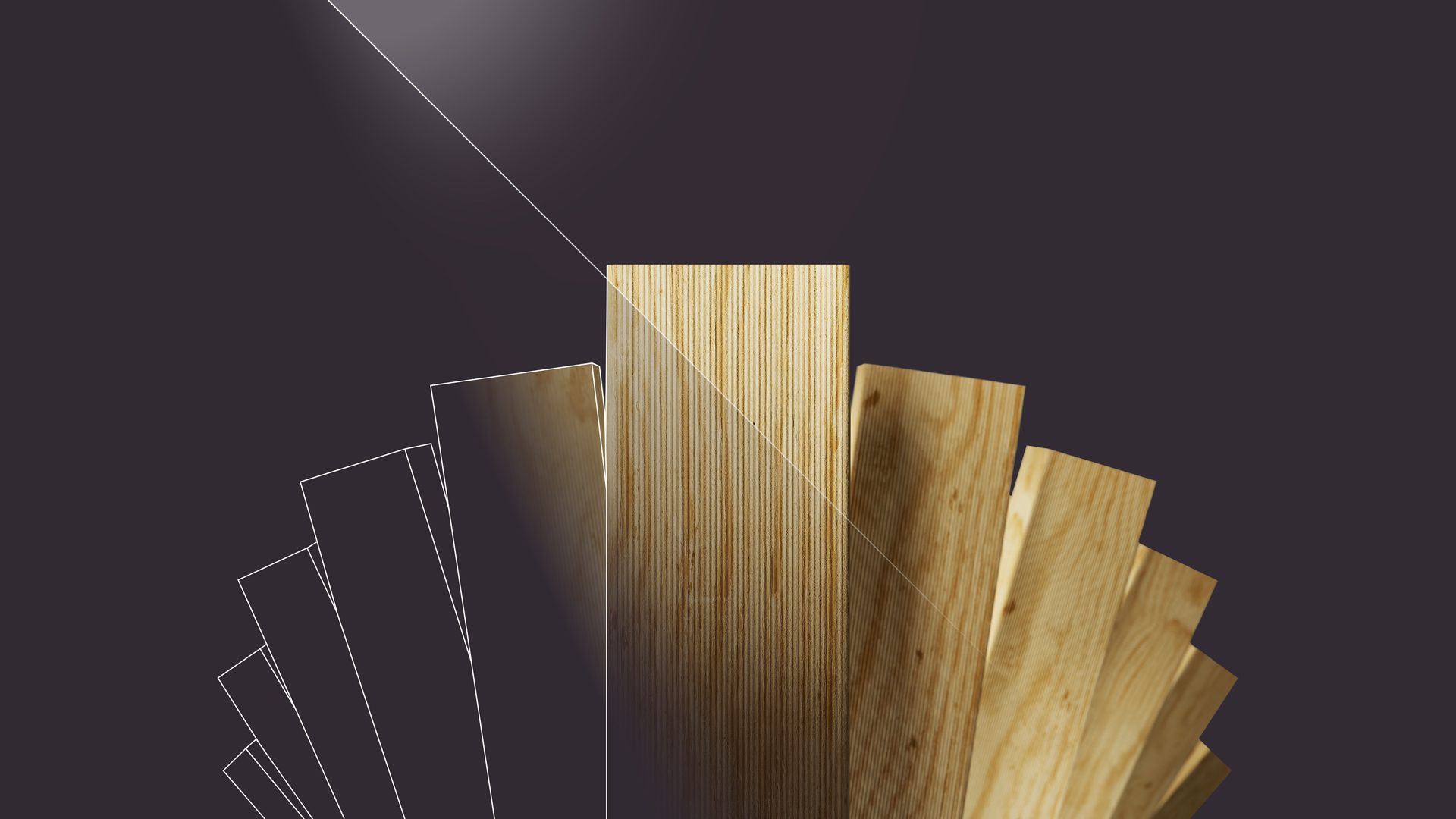
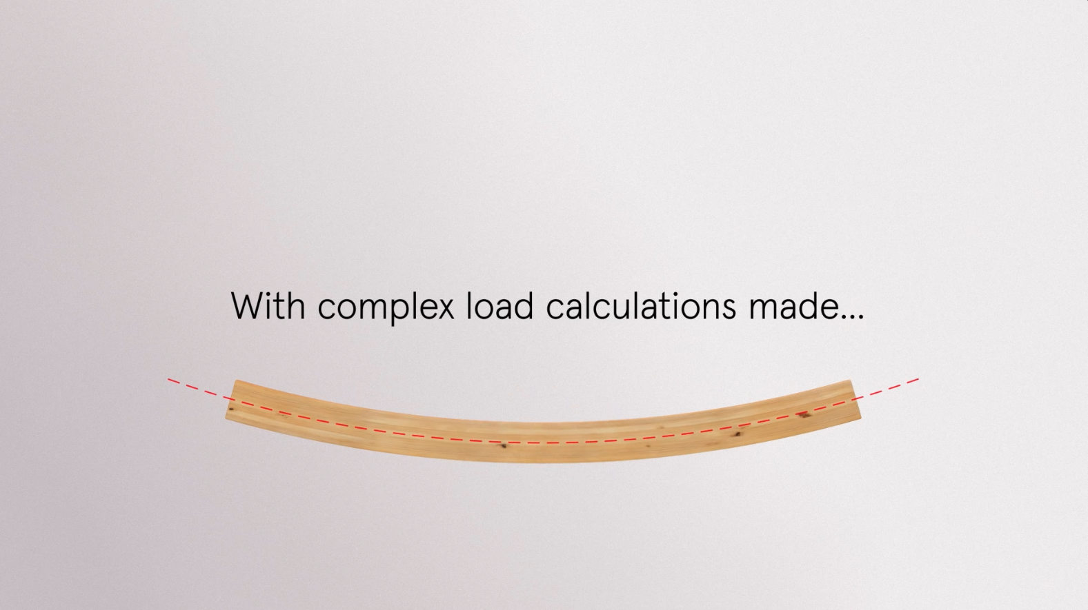
Hyne Design
For builders and engineers, Hyne Design has long been the trusted sidekick for structural calculations—quickly specifying the right products and comparing major manufacturers so you don’t have to. When the software moved from an offline program to an app, the brand identity needed an update that spoke to both its technical precision and its real-world impact.
Working hand in hand with the Hyne crew, we found inspiration in the building process itself. Crisp lines and blueprint geometry meet the warm textures of actual timber—capturing that journey from digital plan to physical construction. The result is a visual language that’s part blueprint, part finished build, communicating Hyne Design’s role of bridging the gap between concept and construction. To launch the app, we teamed up with our friends at Ruckus Studio on a short launch video—bringing the new look and feel to life for the first time.
- Industry
- Partners
Ruckus Studio
- Services
Brand identity
Creative direction


Created in collaboration with Ruckus Studio.
Ruckus: Art Direction and Animation.
Driven: Copywriting.