Internet service
Skymesh
In 2005, a small internet provider set out to connect the corners of Australia that the city often overlooked. Today, Skymesh has become a lifeline for people living beyond the reach of fibre broadband—delivering internet access where others don’t. But with a growing business and bigger ambitions, it was time to give Skymesh’s brand the same level of care they extend to their customers.
Looking to refresh their identity, website, and customer portal app, they turned to us to help them make it happen.
Read more 
Beyond brass tacks
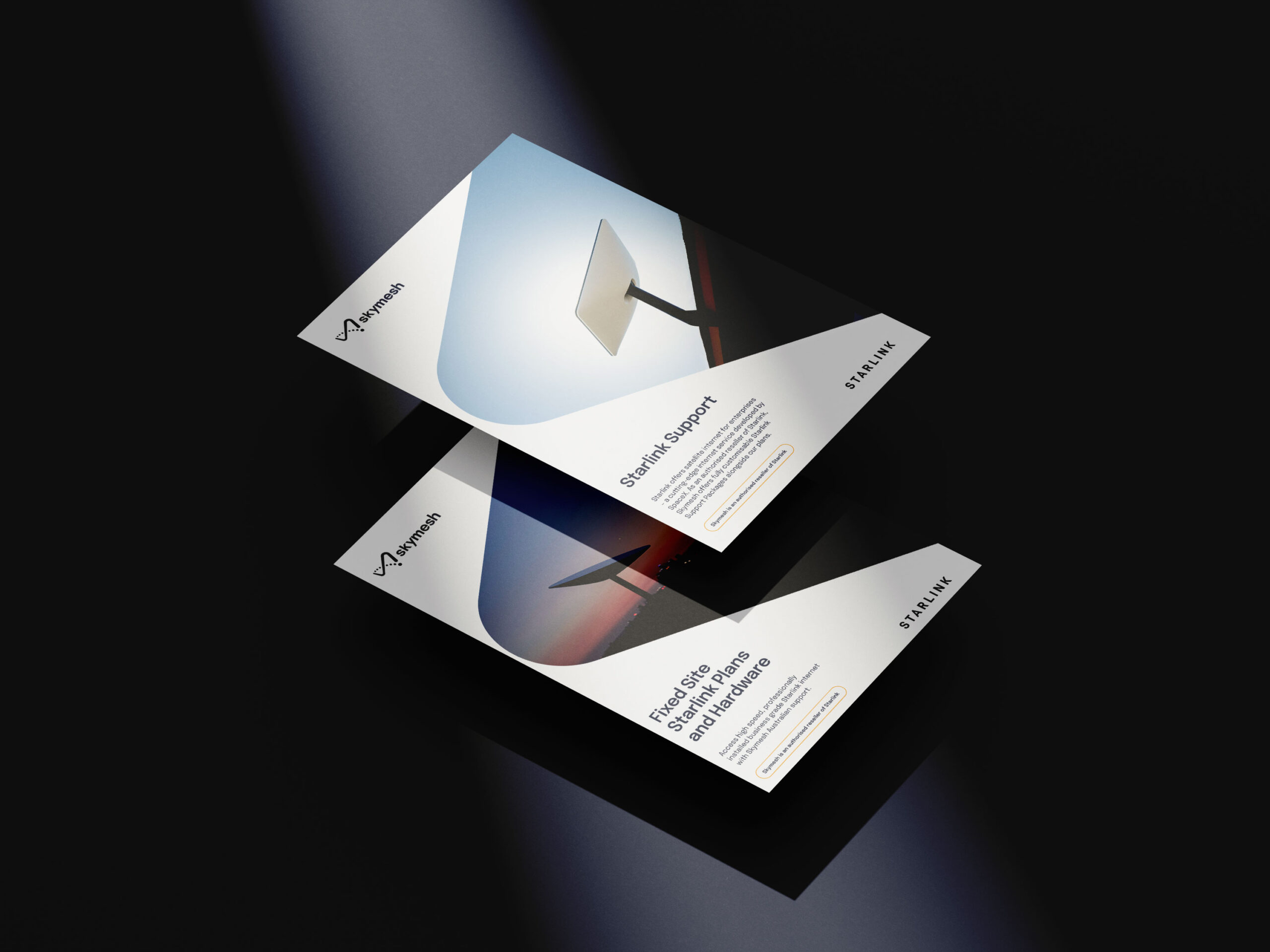
Like so many others in their industry, Skymesh had fallen into the trap of leading with its technology. This came through loudly in their identity system, where all visual communication took its cues from conventional internet symbolism. The logo incorporated a WiFi icon; the primary graphic device—a gridded ‘network’ overlay; imagery exclusively focused on subjects tapping away on ipads and computers. By leaning on generic symbolism throughout their brand, from the outside, Skymesh presented itself as ‘just another ISP’. And after getting under the hood of the brand, we knew that wasn’t the case.
In a market where everyone taps into the same network infrastructure, what actually sets Skymesh apart isn’t speed or price (any ISP can play that game)—it’s how they show up for regional Australians. Whether troubleshooting a tricky connection issue or seeing to it that every customer is met with warmth at every interaction, Skymesh has earned its stripes by consistently taking care of the person on the other end of the line.
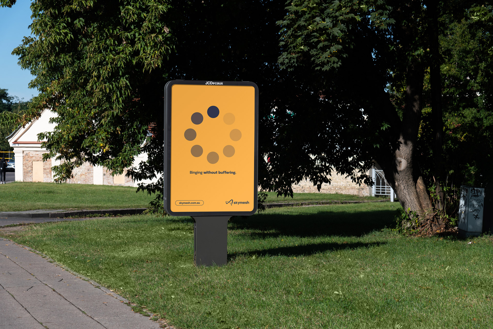
The sunshine spirit
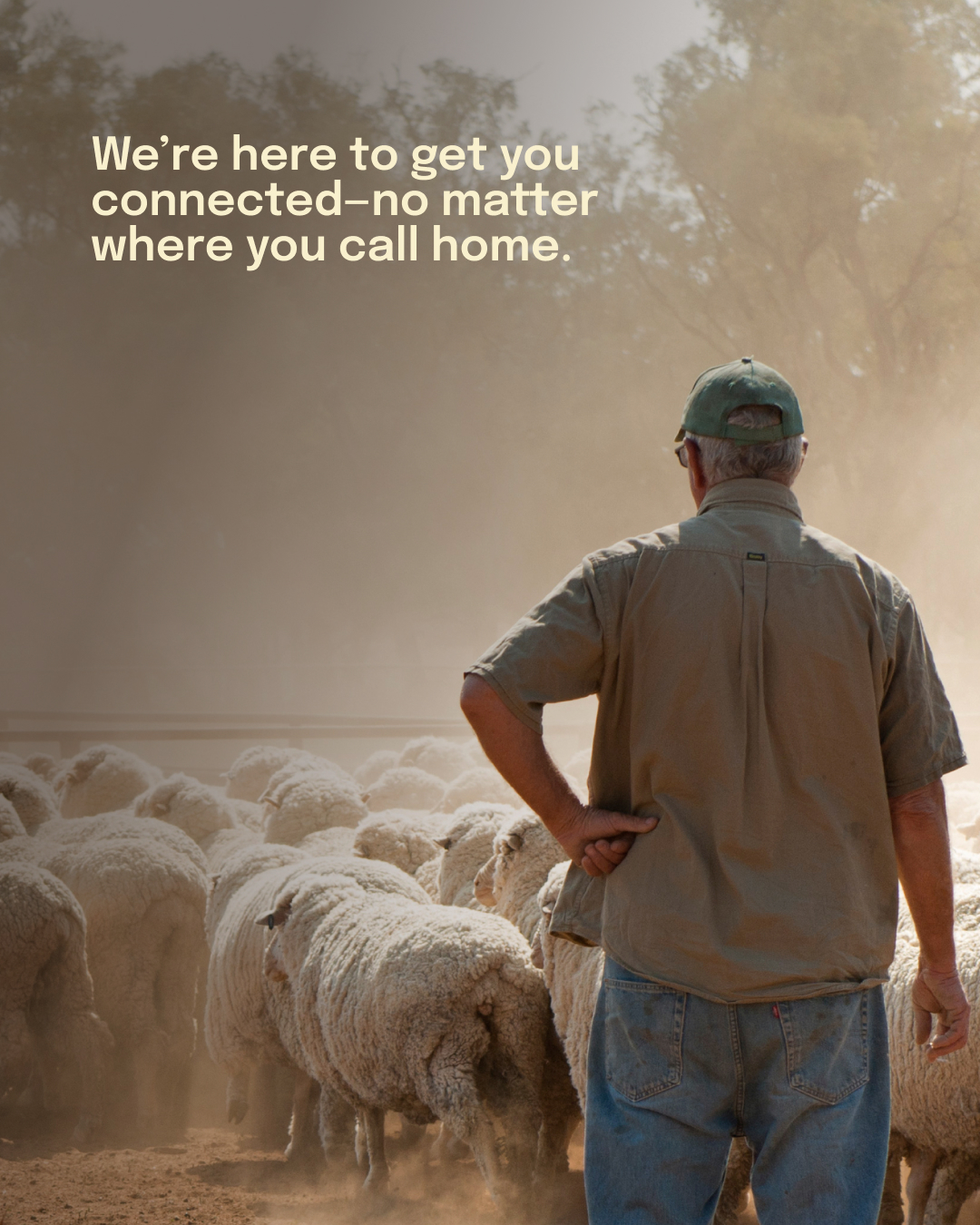
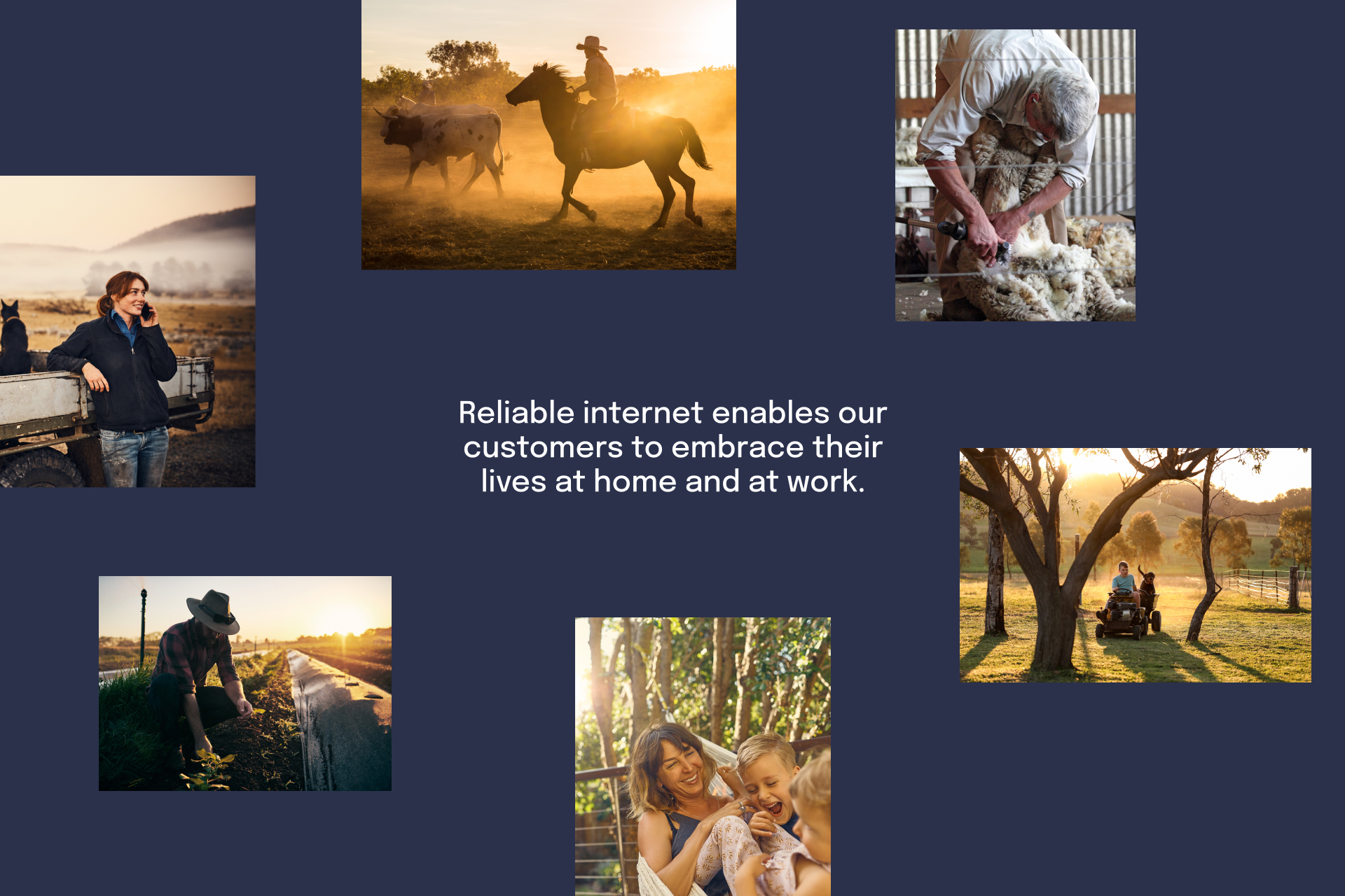
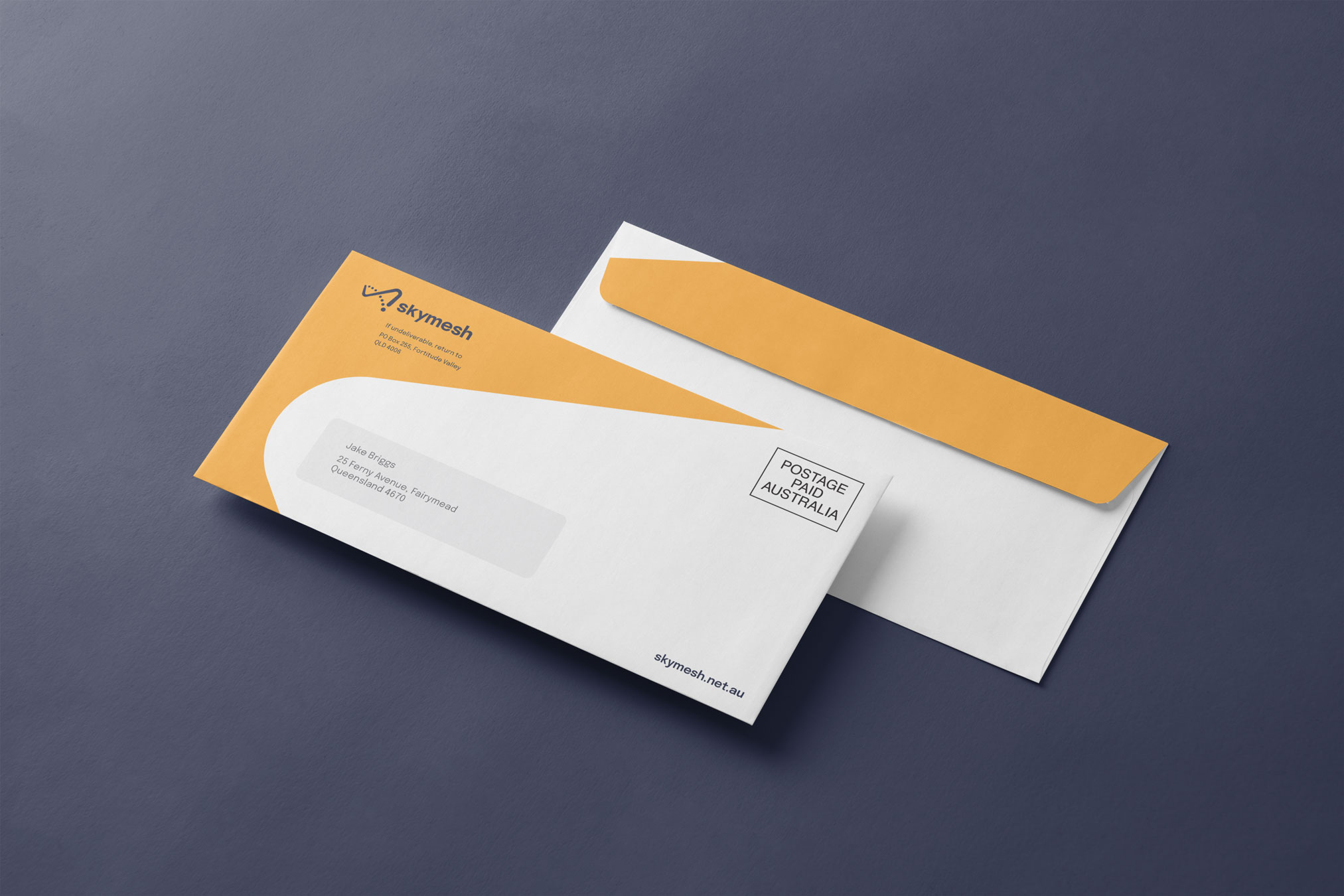
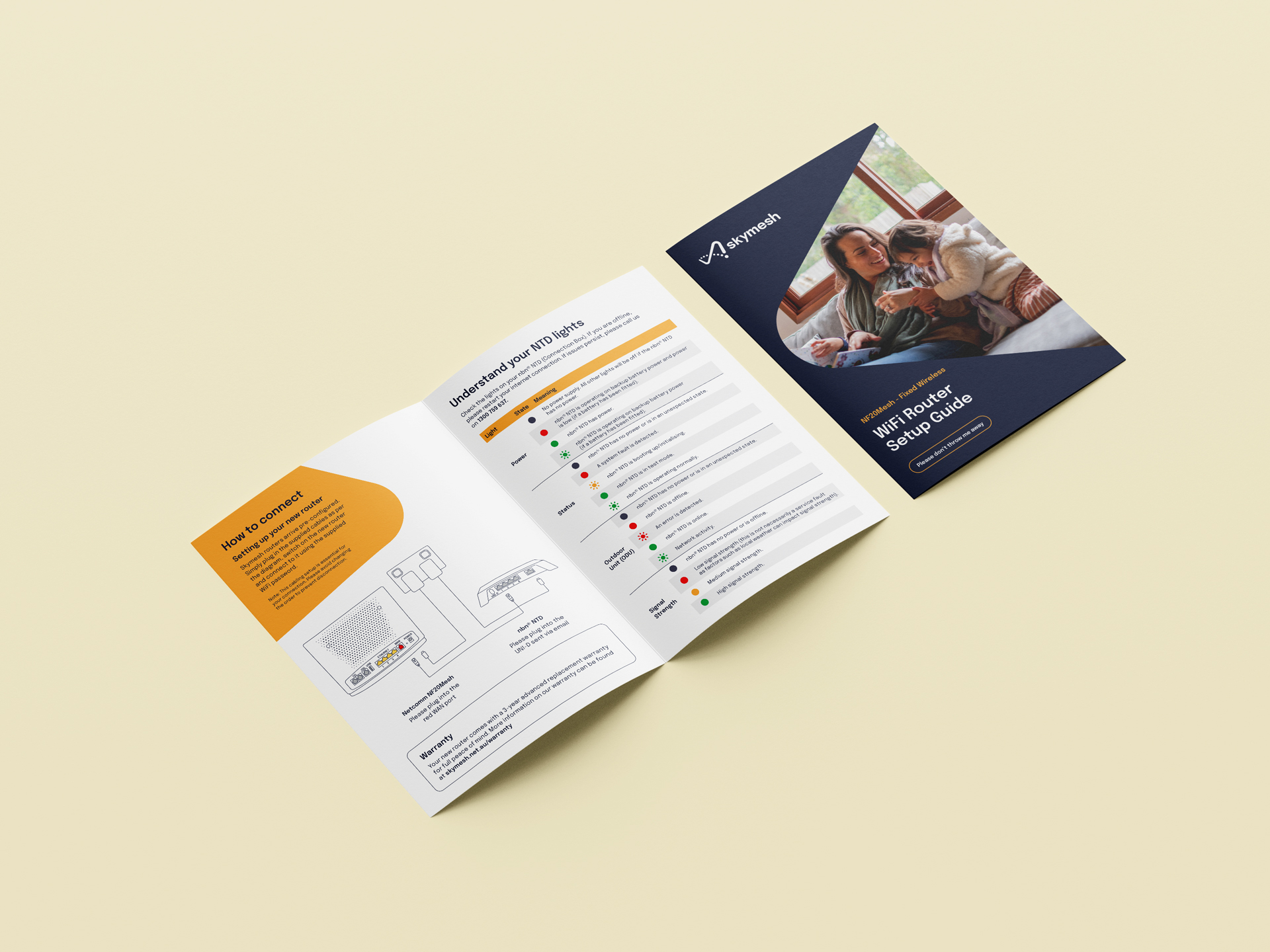
Quintessentially Australian, Skymesh’s can-do culture became the source inspiration for the identity. Shifting an infinity symbol into the shape of Australia, the logo communicates the endless possibility of a well-connected country; the palette simulates the colours of the land and sky; and the photography direction puts the tech on the backseat, giving the stage to the everyday lives of Skymesh customers. It’s an identity that says, “We’re here to get you connected—no matter where you call home.”
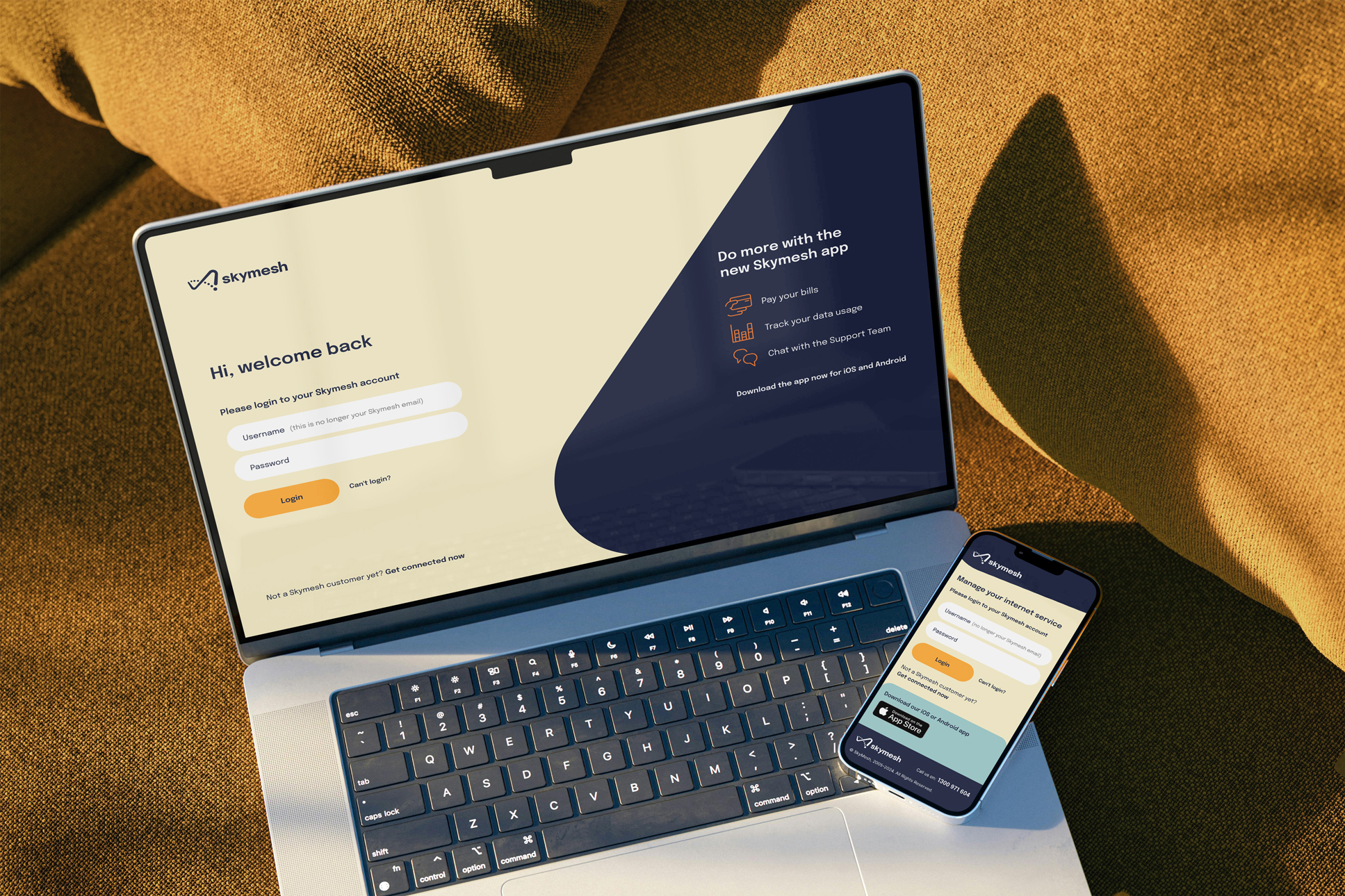
Designed for digital
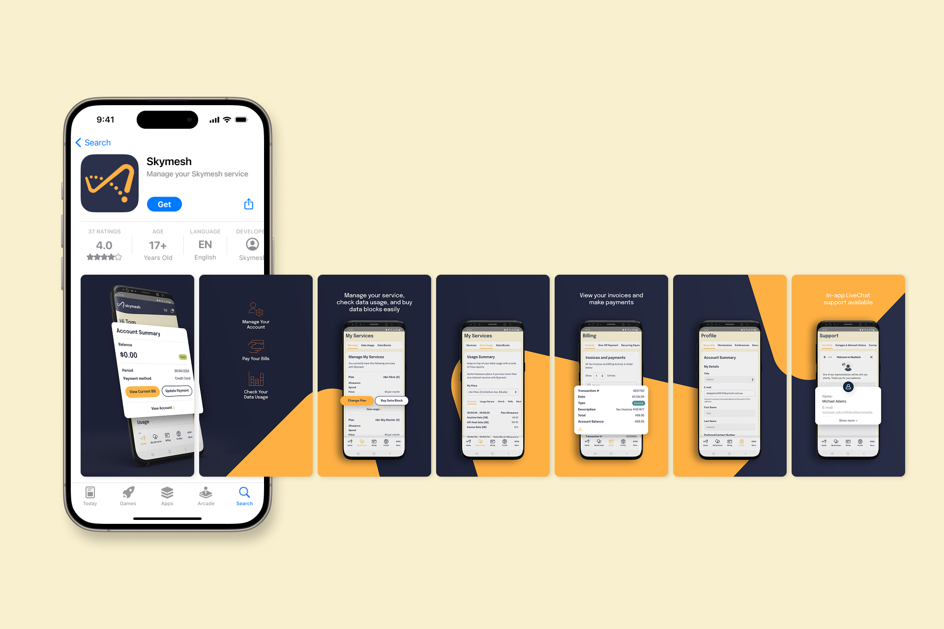
This refreshed spirit carries over into Skymesh’s new website and customer portal phone app, where straightforward navigation and friendly visuals make it easy for users to find the plan or service they need—without wading through tech jargon. Regional Australians can check coverage, compare options, and reach out for support in just a few clicks. We kept the brand’s warmth front and centre, leaning on down-to-earth language and crisp, consistent layouts to keep it unmistakably Skymesh.
By pulling the focus away from shiny bells and whistles, the site places real people and real needs at the heart of the experience—making sure every Aussie, from remote cattle stations to country towns, feels welcome and well looked after. It’s the same approach that Skymesh has championed since 2005—only now, the brand that shows it off is every bit as straight-talking, down-to-earth, and genuinely local as the team behind the scenes.
- Industry
- Partner
Flip (Web development)
- Services
Brand identity
Messaging
UX & UI
Rollout