Disaster relief
Disaster Relief Australia
Fires, floods, cyclones, drought—our communities have weathered them all. With more extreme events on the horizon than ever before, Disaster Relief Australia (DRA) is ready to step in, bringing hope in the wake of disaster. Led by veterans, powered by volunteers, DRA has become one of the nation’s most trusted forces in helping communities recover from disaster.
But as their reach grew, their brand didn’t keep pace. Their visual and verbal language felt narrowly military—excluding the everyday Aussies who were taking on a growing share of frontline volunteering work.
We were engaged to distill what makes DRA tick; gently refine their visual identity; and to show DRA for what it truly is: a veteran-led organisation with open arms for the wider community.
Read more 
A broader call to action
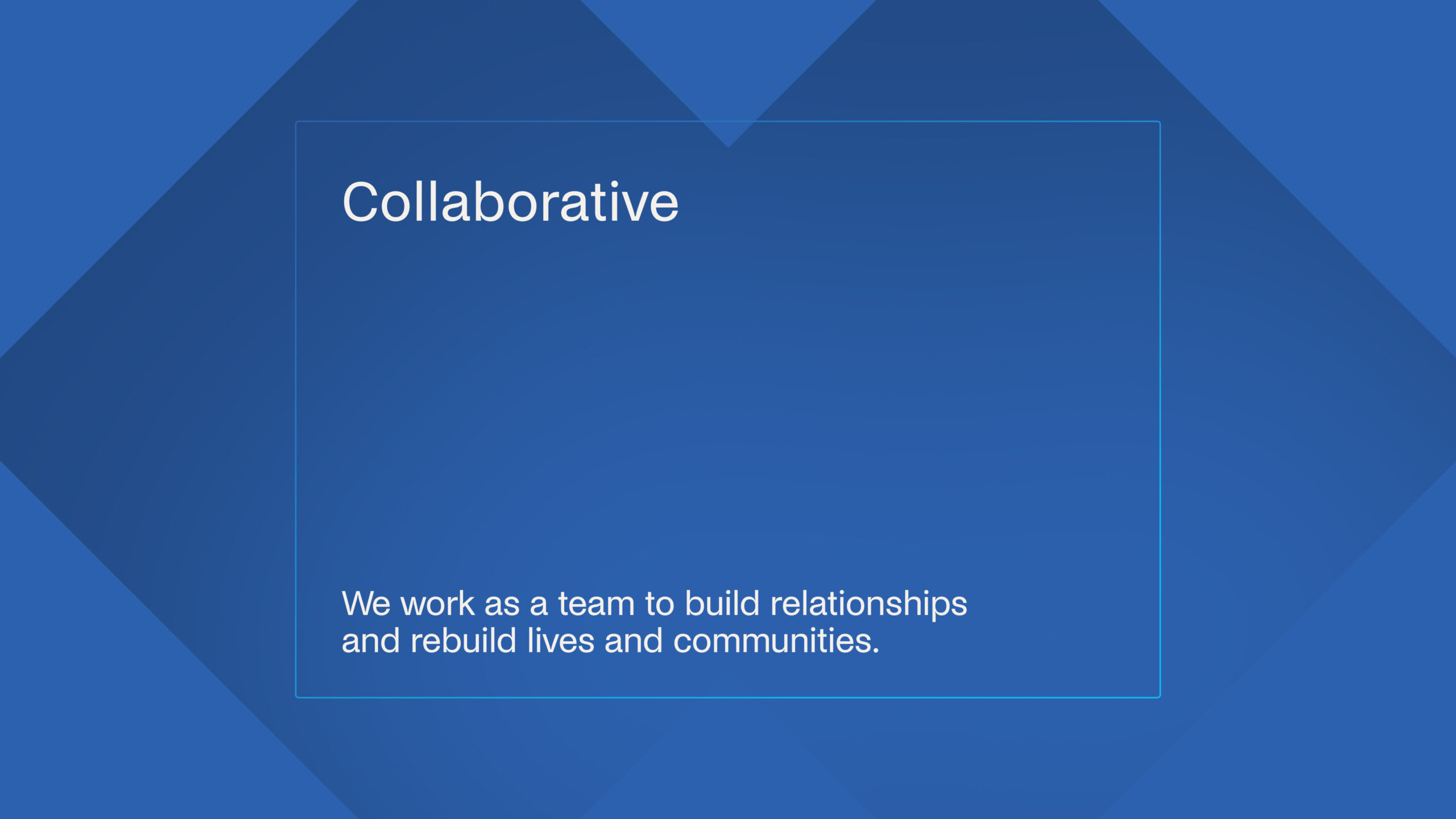
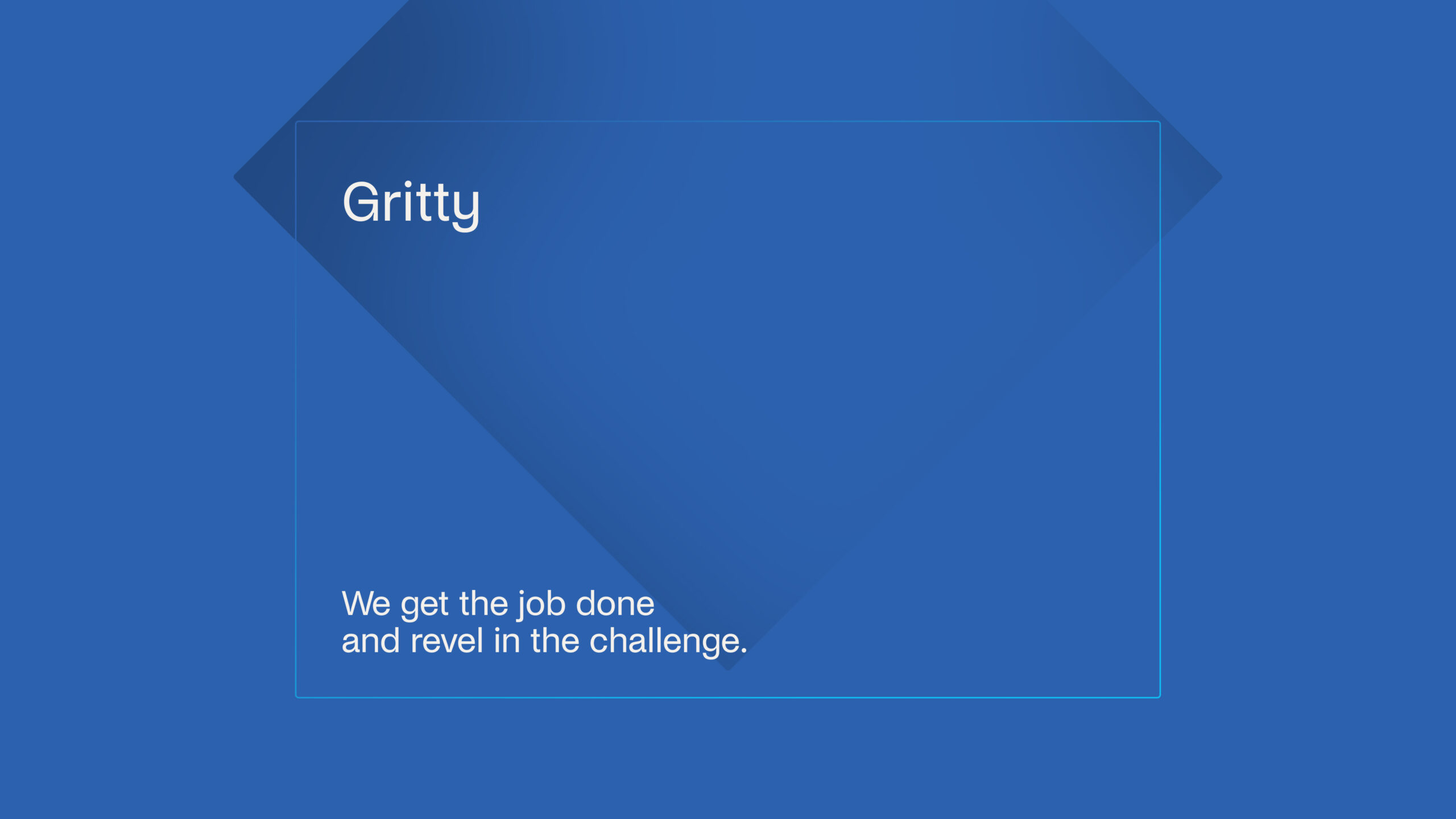
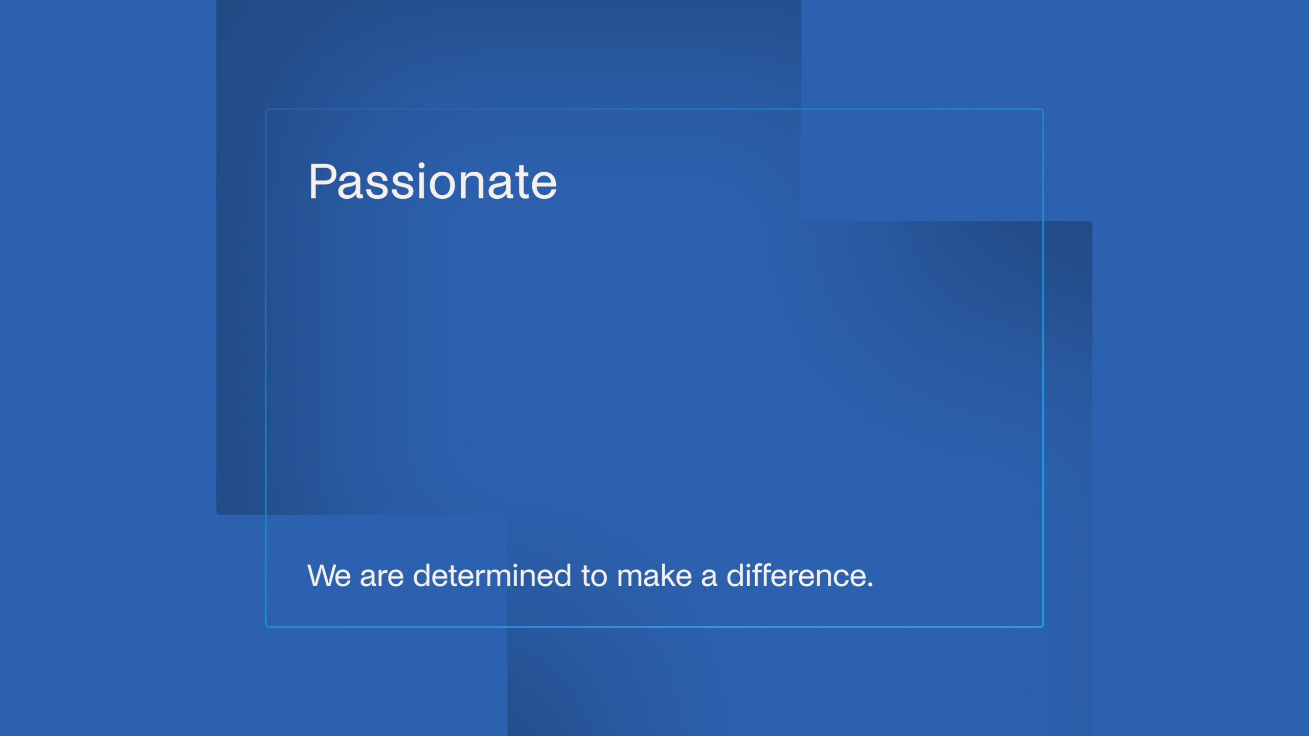
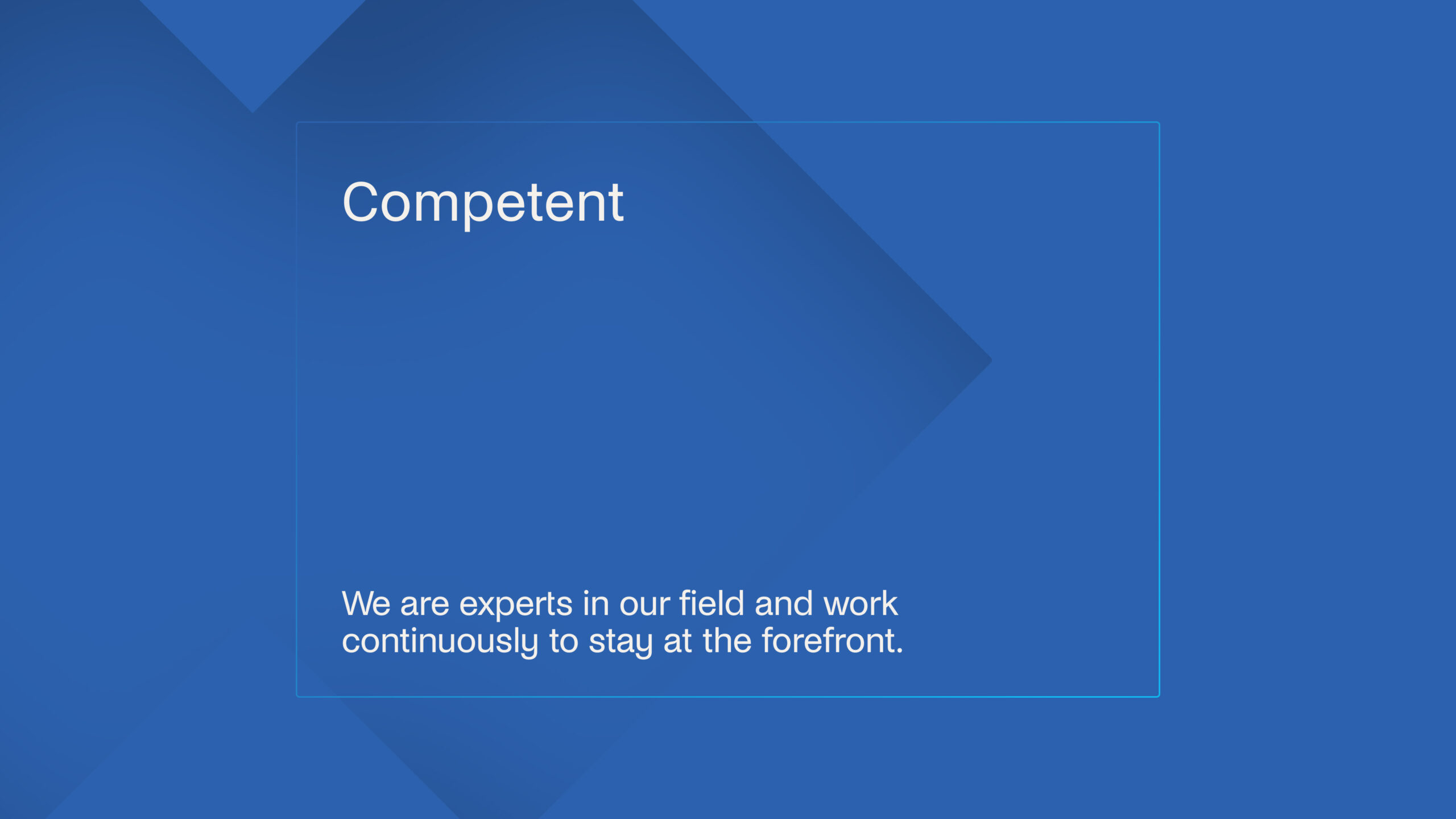
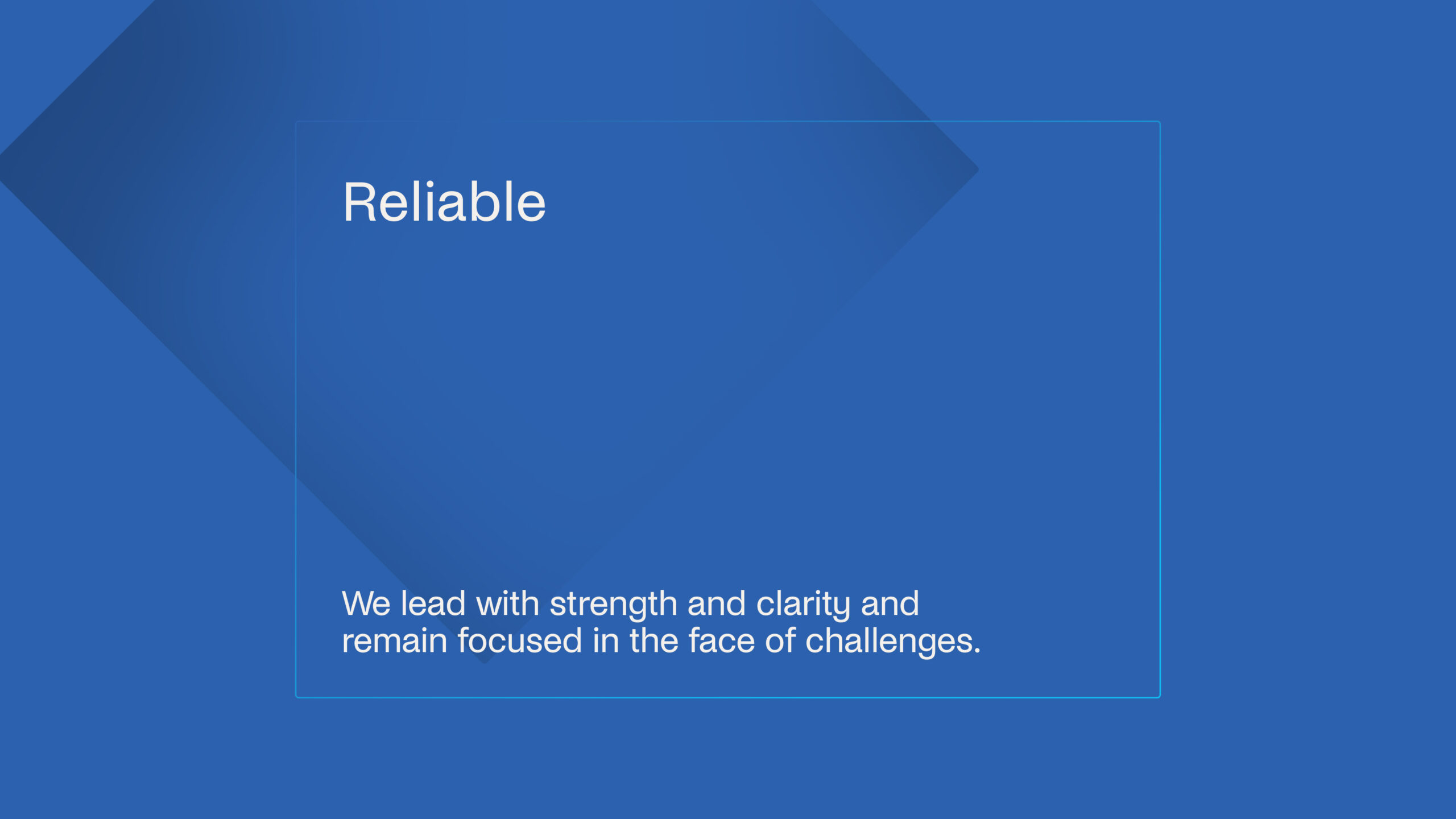
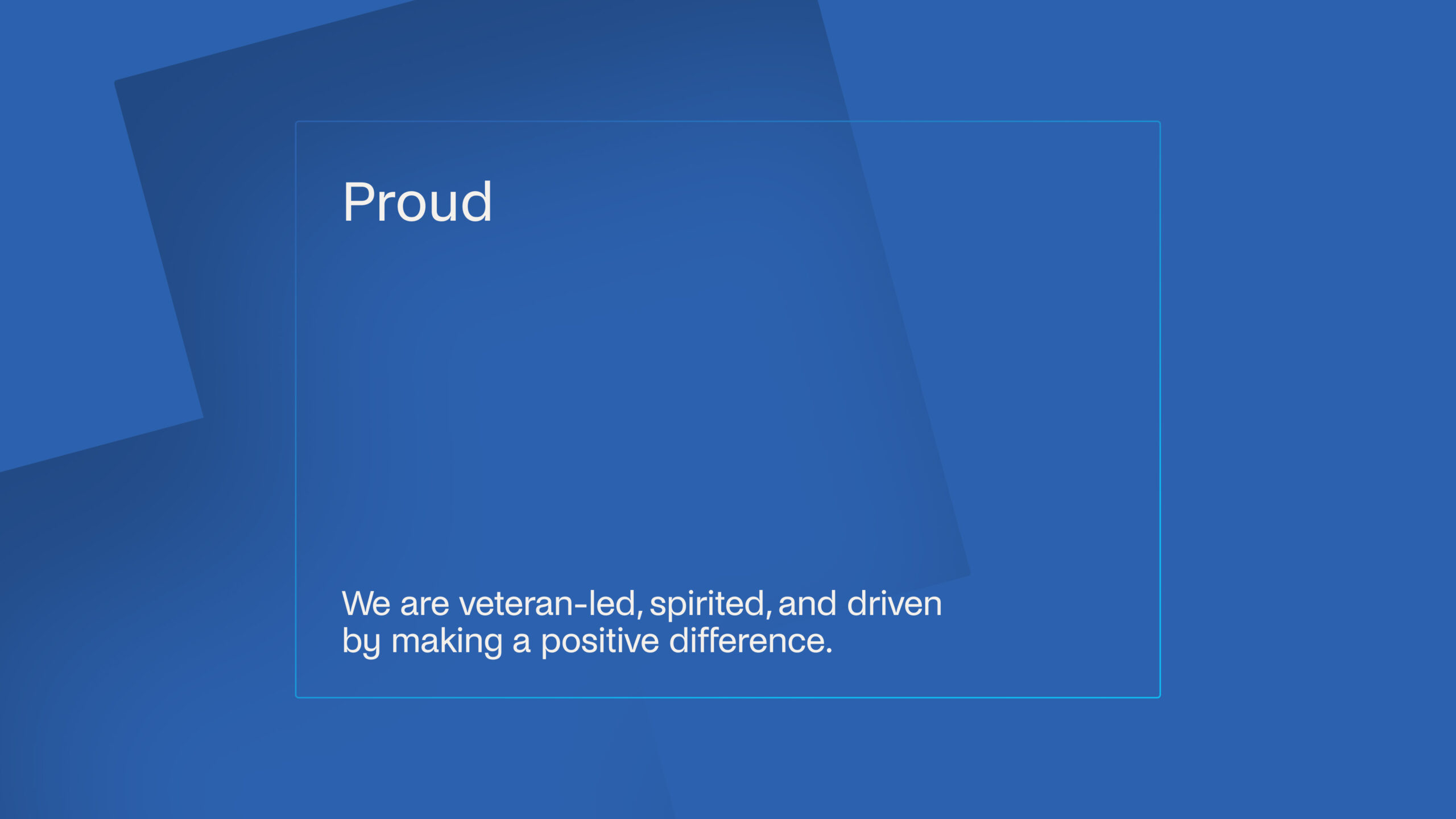
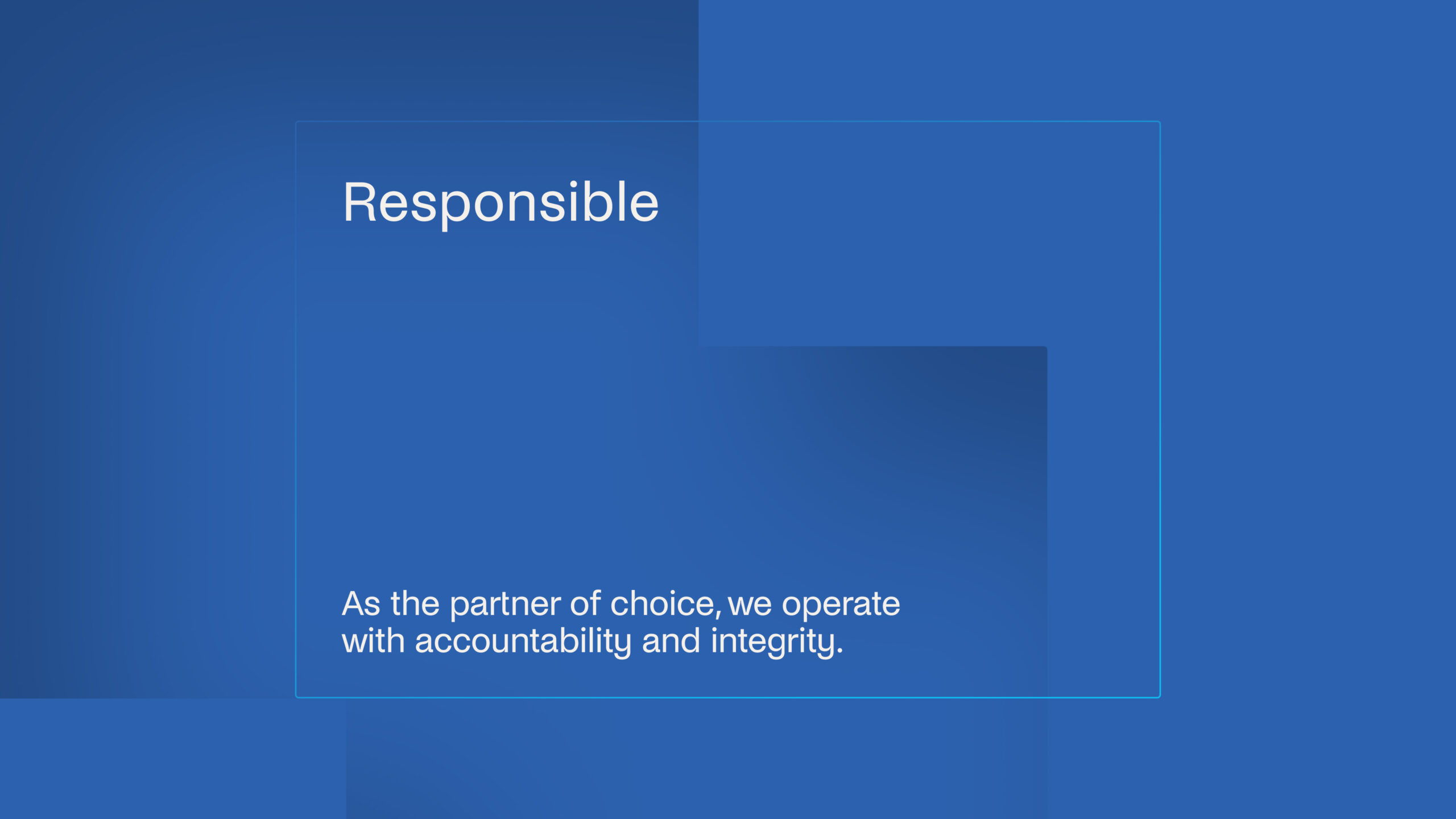
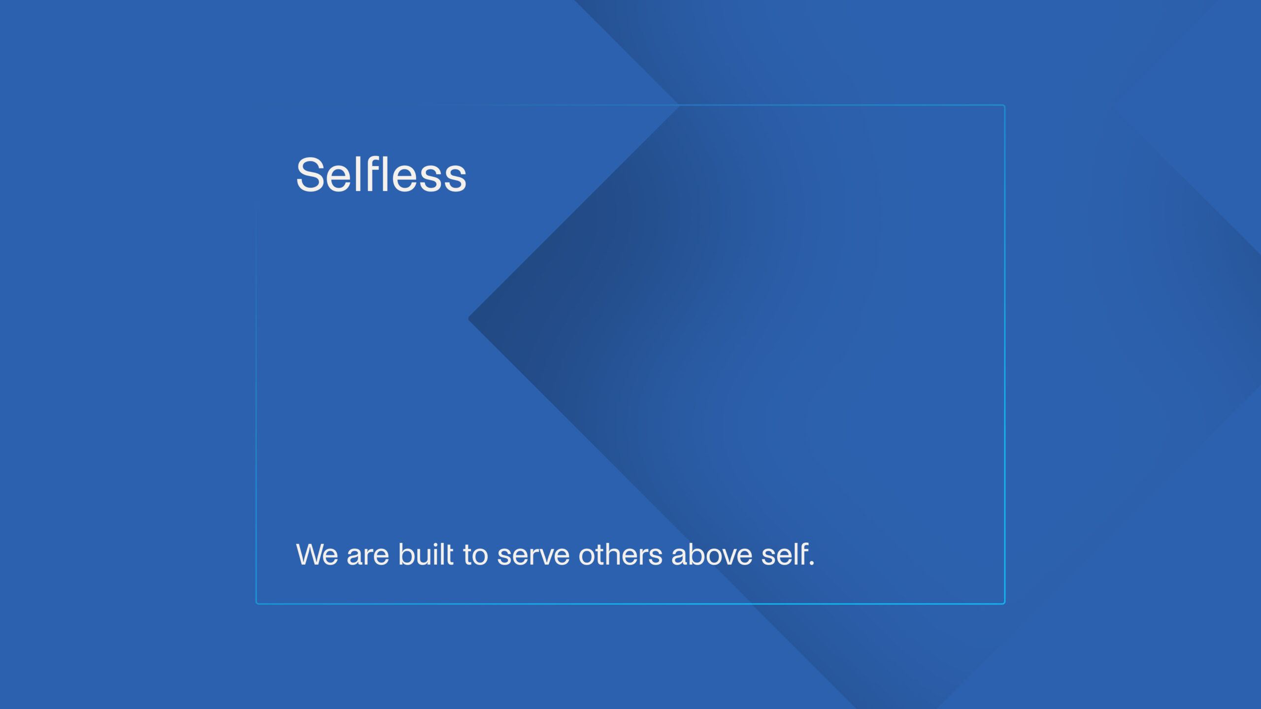
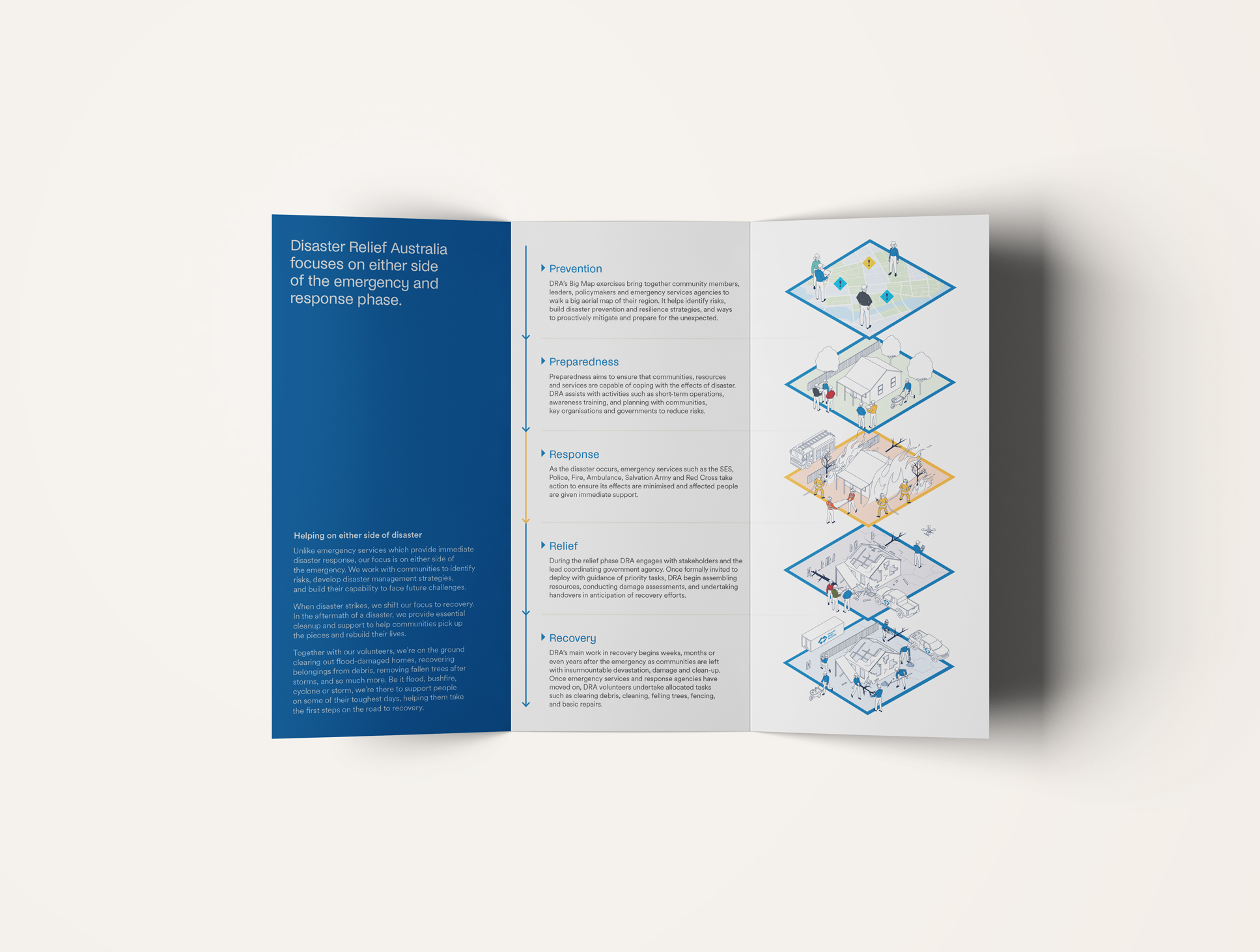
Veteran values of discipline, leadership, and camaraderie remain at DRA’s core, yet the volunteer base has expanded well beyond the forces. Teachers, tradies, nurses, and everyday Australians looking to lend a hand now made up around half of DRA’s boots on the ground. Through immersing ourselves in DRA’s world, we uncovered ‘Up For Impact’—the guiding idea that unites DRA’s motivations with those of its volunteers. It’s a rallying call and a spirit that charges the air whenever the iconic blue shirts assemble. If you’re willing to pitch in, you’re up for impact.
Change makers
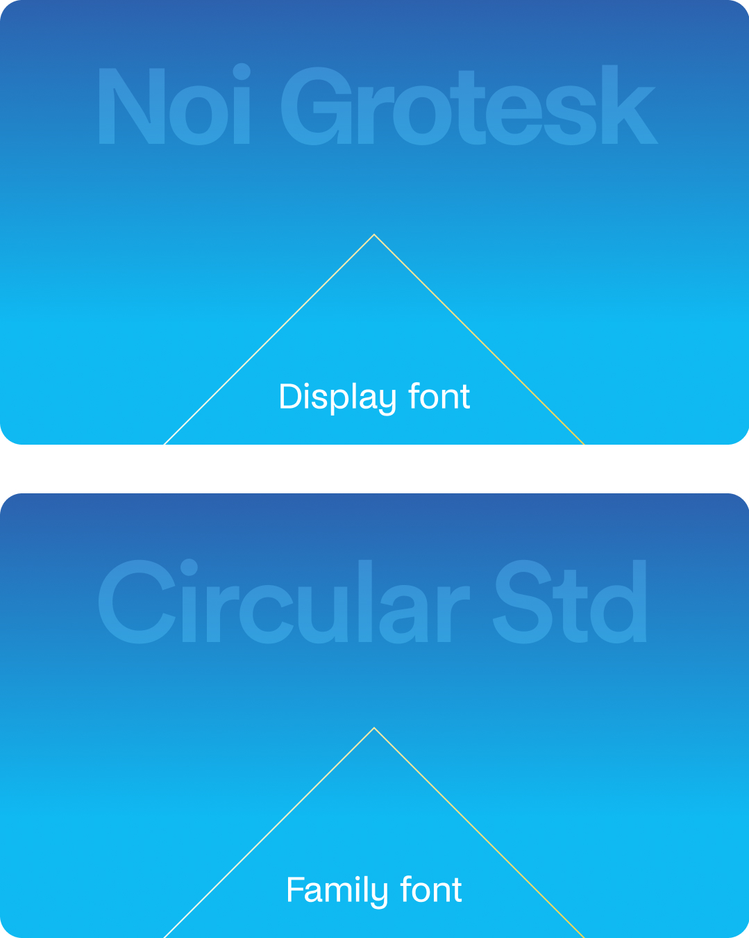
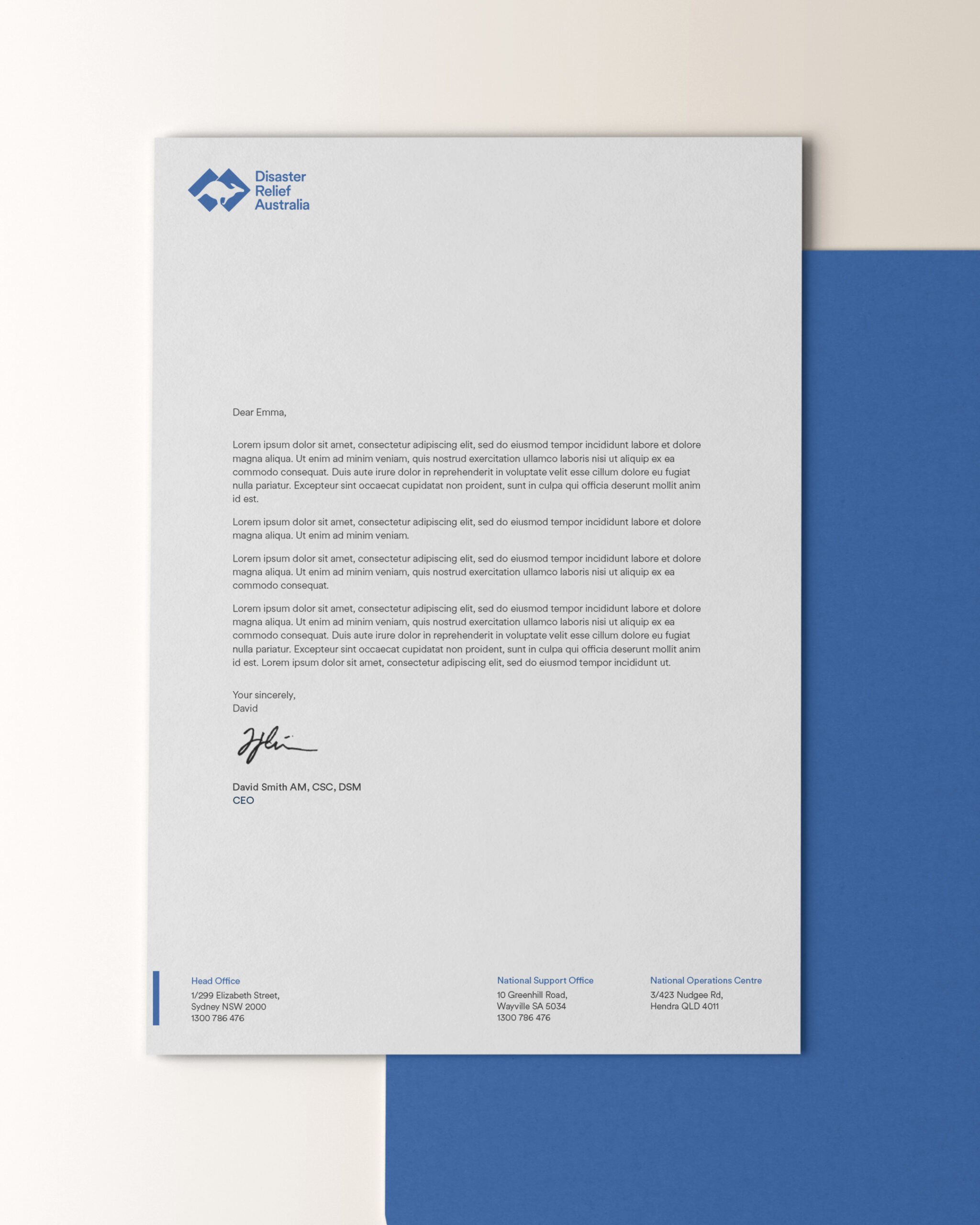
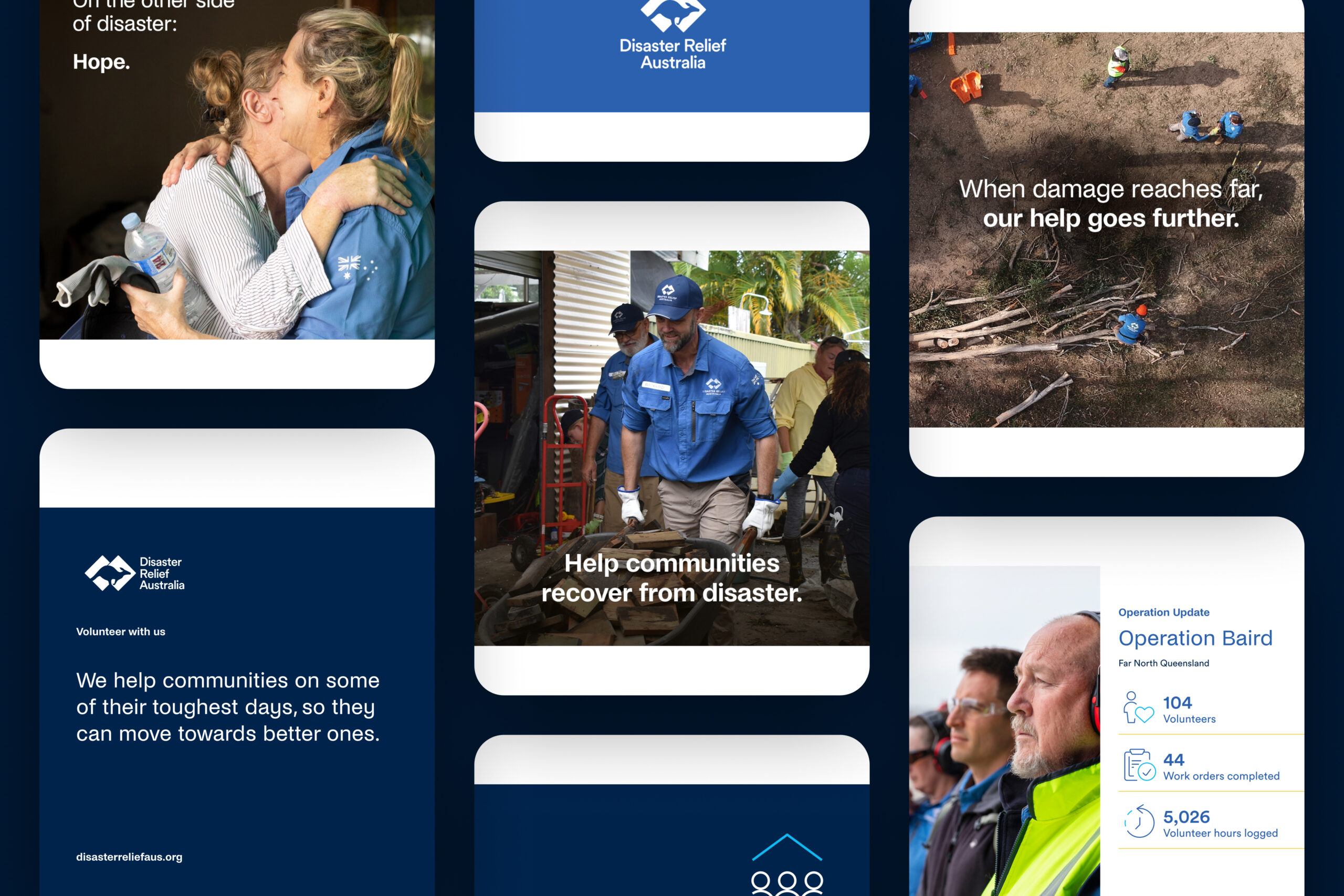
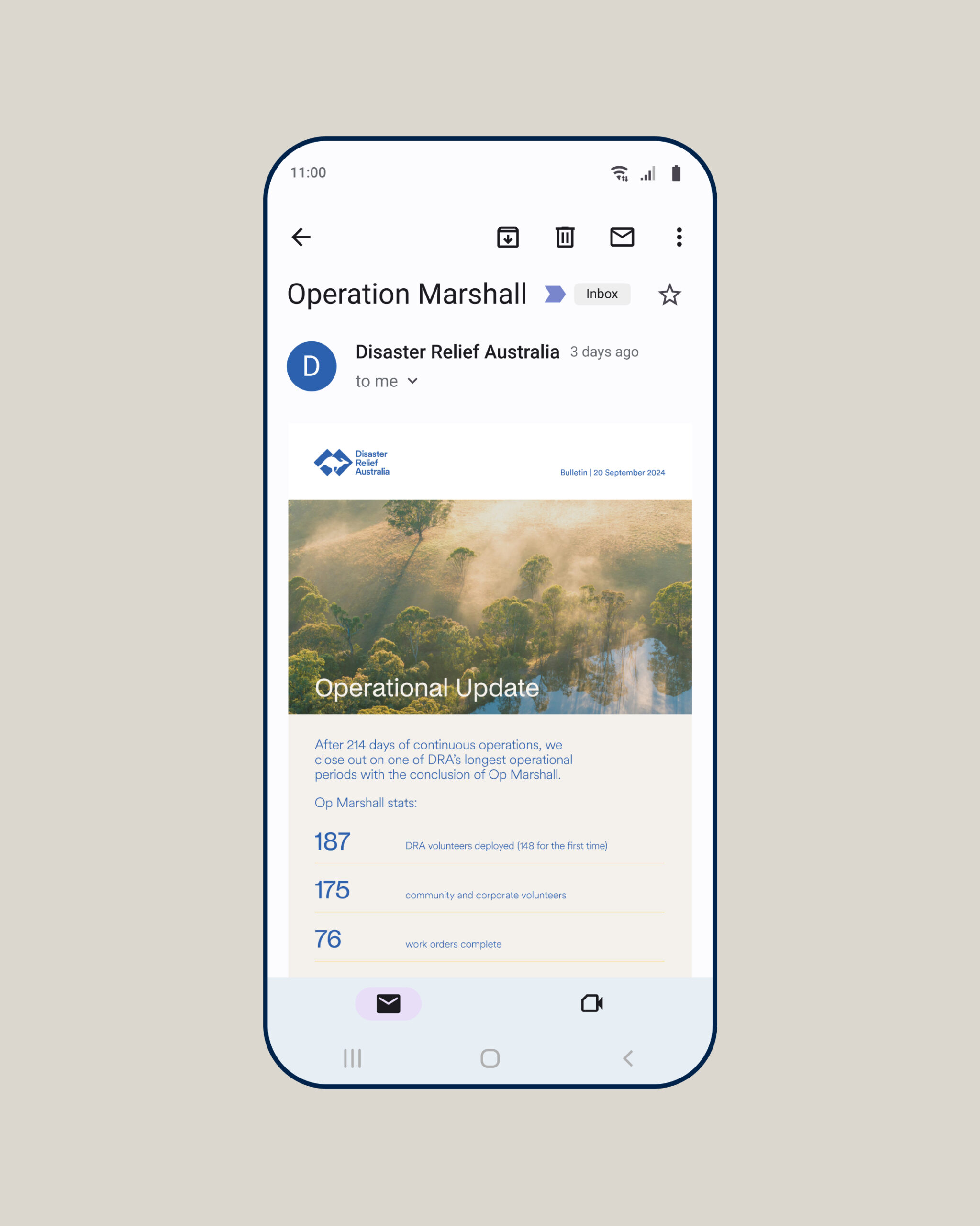
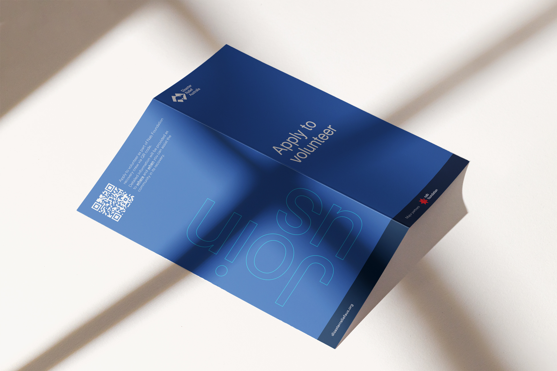
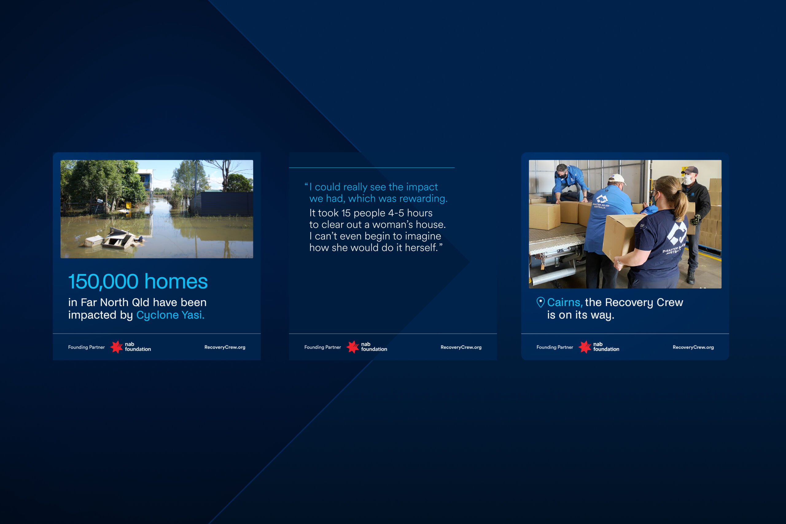
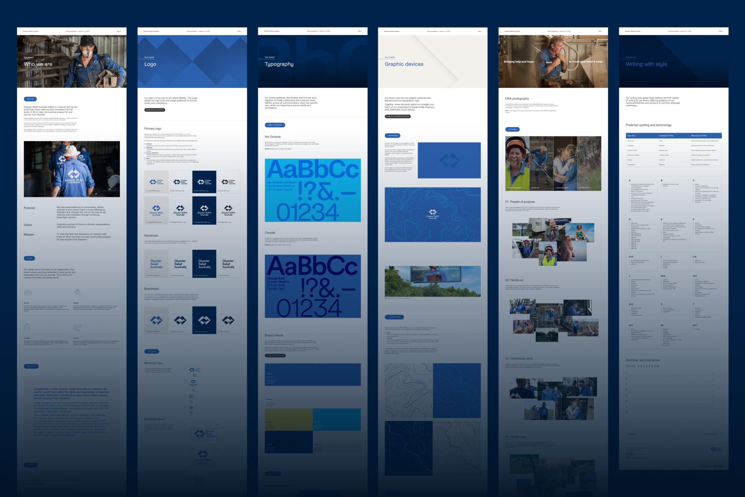
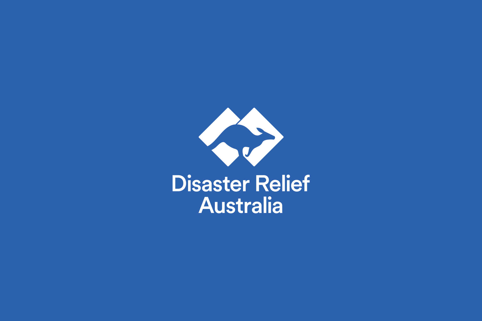
We evolved DRA’s visual presence to maintain the legacy of their visual identity—an identity heavily inspired by the military world—and bring forward the community spirit that fuels them. The refreshed logo keeps traces of the original aesthetic—bold lines and balanced forms—but sheds the hard corners and all-caps to make way for a lighter, more approachable emblem of identity. Moving to the palette, we swapped deep navy for a fresher, medium blue that matches the real shirts worn by volunteers in action—bridging the brand’s on-paper presence with its on-the-ground impact.
Charting a new course
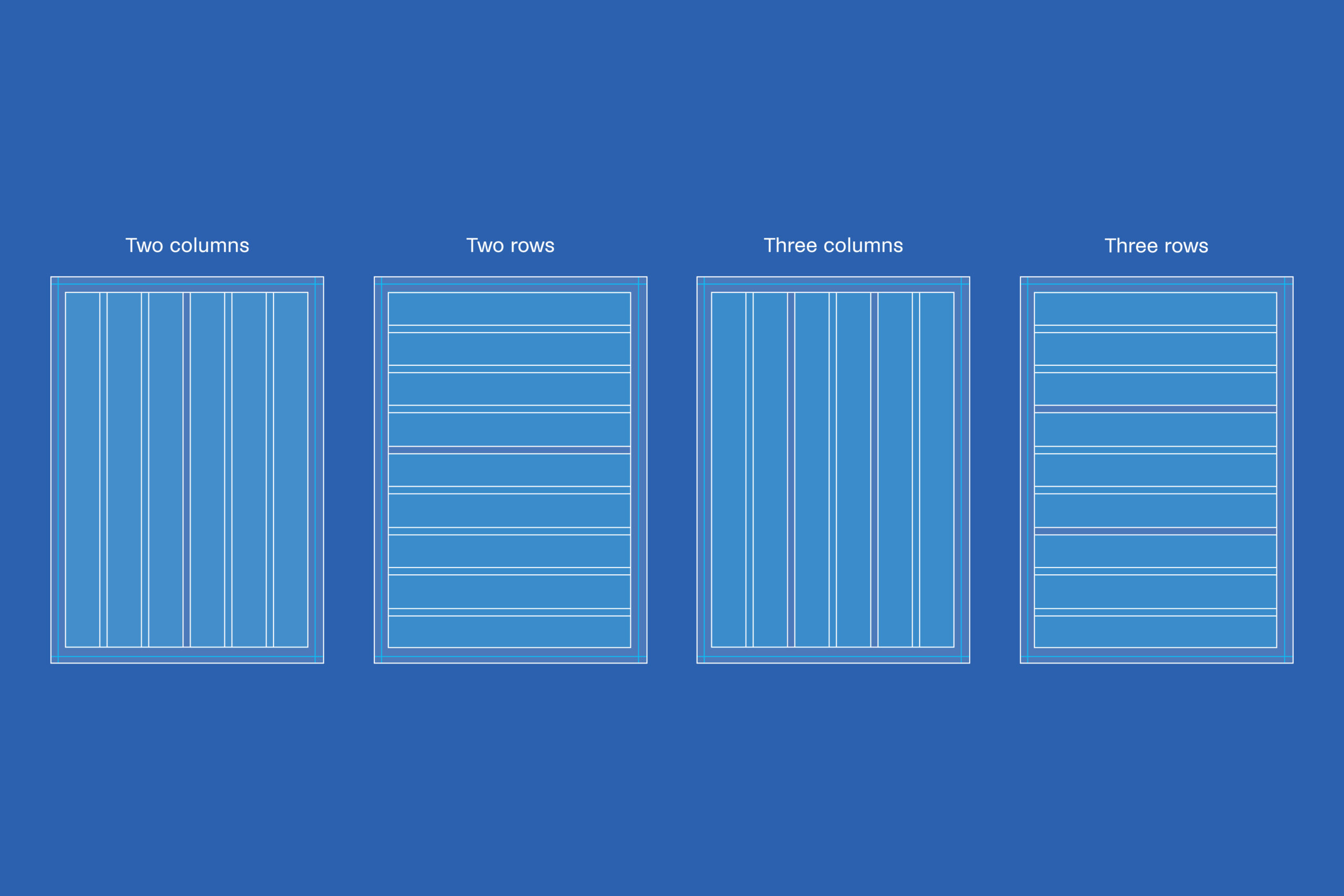
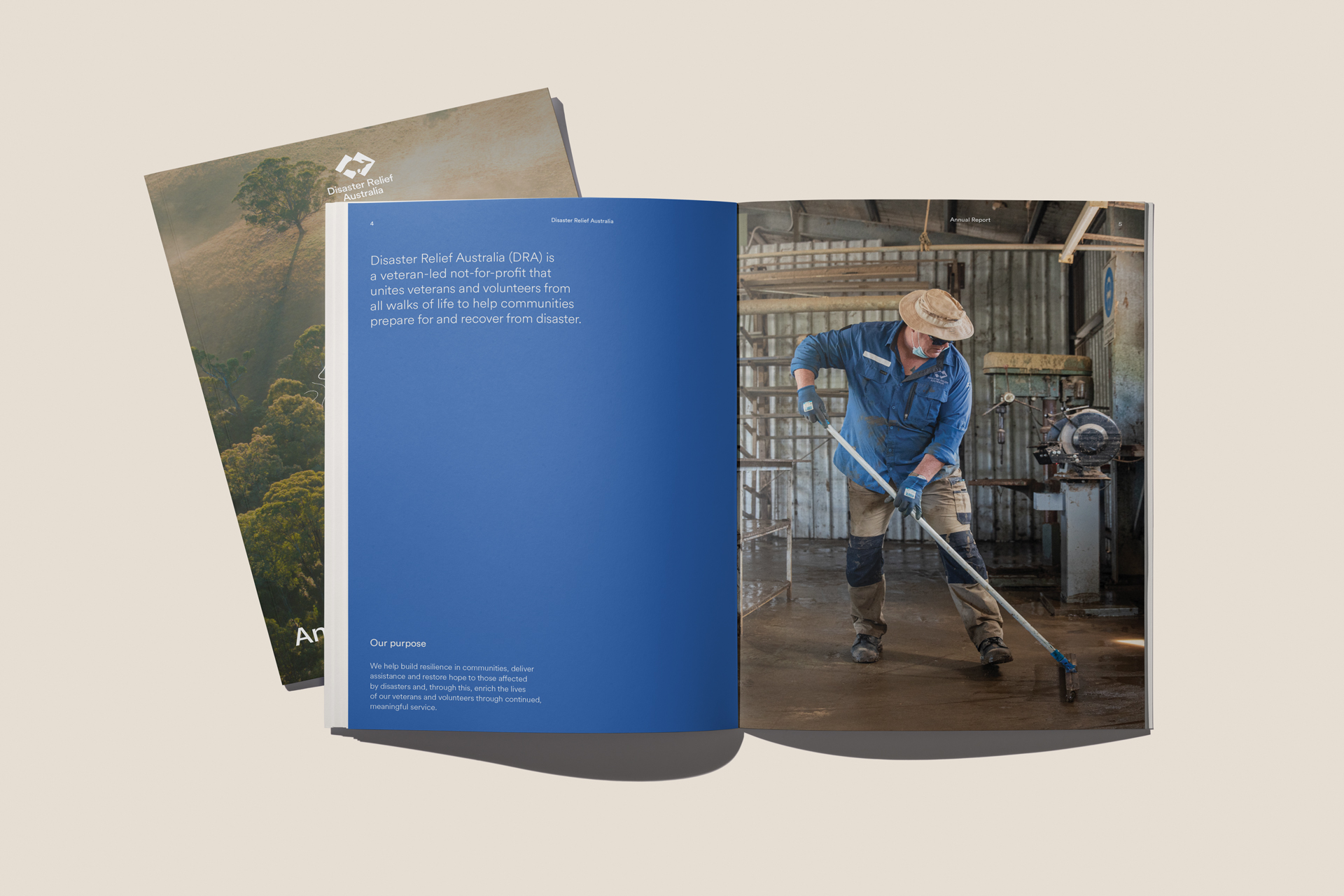
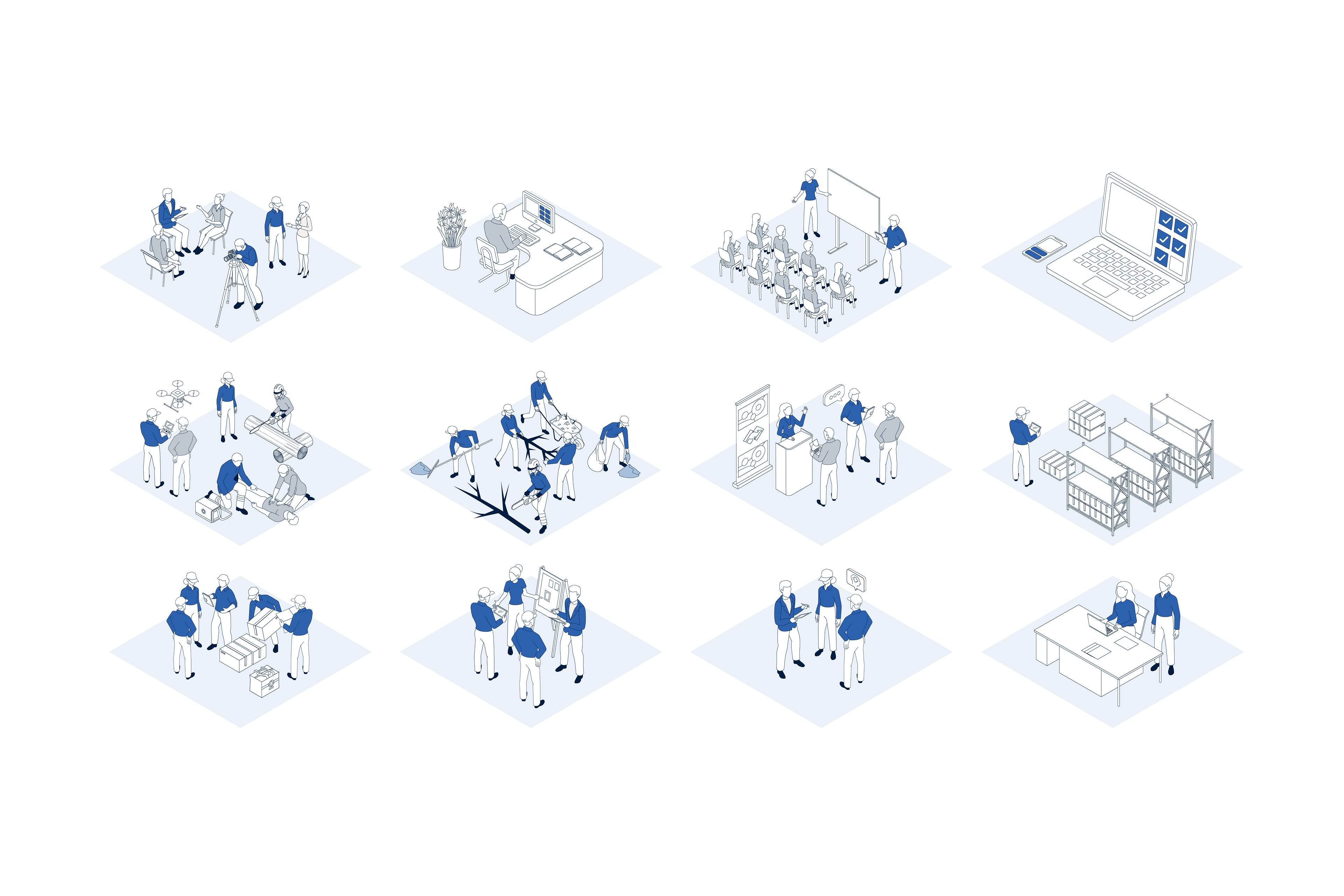
Central to the system is the diamond—a versatile container lifted from DRA’s brandmark. It’s where headlines and key text live, acting as a stage for the stories DRA tells. To anchor the identity in the real world, we introduced topographic map graphics—full backgrounds and diamond-shaped stamps alike—echoing the diverse landscapes DRA volunteers tackle, from flood-ravaged plains to fire-scorched bushland. Layer in a responsive grid system and a library of custom icons, and DRA’s visual system becomes as adaptable as the team that carries it.
The outcome is an identity that owns its military backbone while making room for everyday heroes. Bold yet welcoming. Structured yet human. Perfectly placed to rally communities whenever and wherever disaster strikes.
- Industry
- Services
Brand strategy
Visual identity