Mineral Processing
Engineering
Mipac
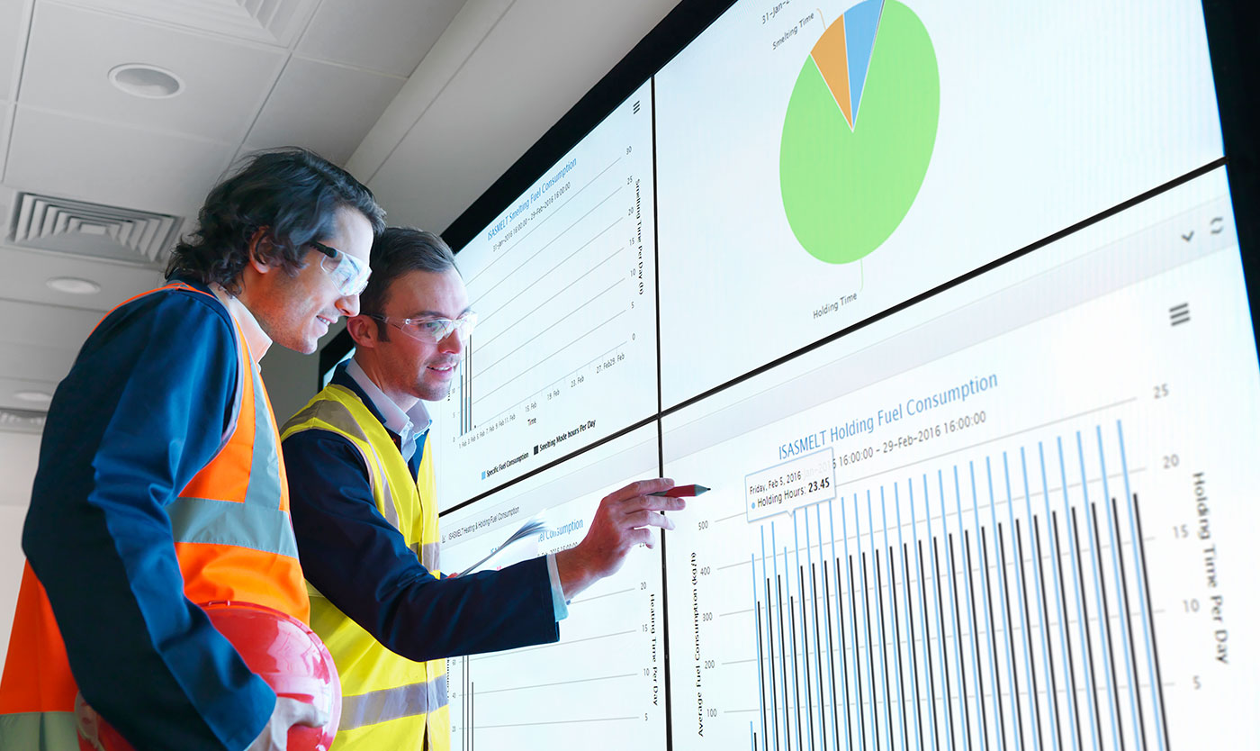
Mipac offers Australian and international clients engineering services for process control and optimisation. With over 30 years of experience, they have gained a solid reputation for their ability to solve complex problems. Mipac were looking to shift perceptions of being predominantly a ‘project only’ supplier to that of a more diverse ‘service and solutions’ offering. Keeping engineering the core focus, they were keen to gradually expand the tech and product side of the business.
Read more 
Evolution not revolution
With over 30 years of equity tied to their existing brand, it was decided that a subtle evolution would be the best course of action.
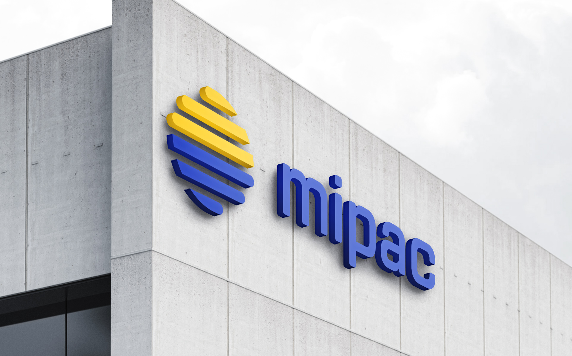
Having been used (in various iterations) since the company’s founding, the logo had become stale and had lost all original meaning. We viewed this as an opportunity to modernise the brand, creating a new rationale while helping step Mipac into a more technical, data-driven space.
Logo update
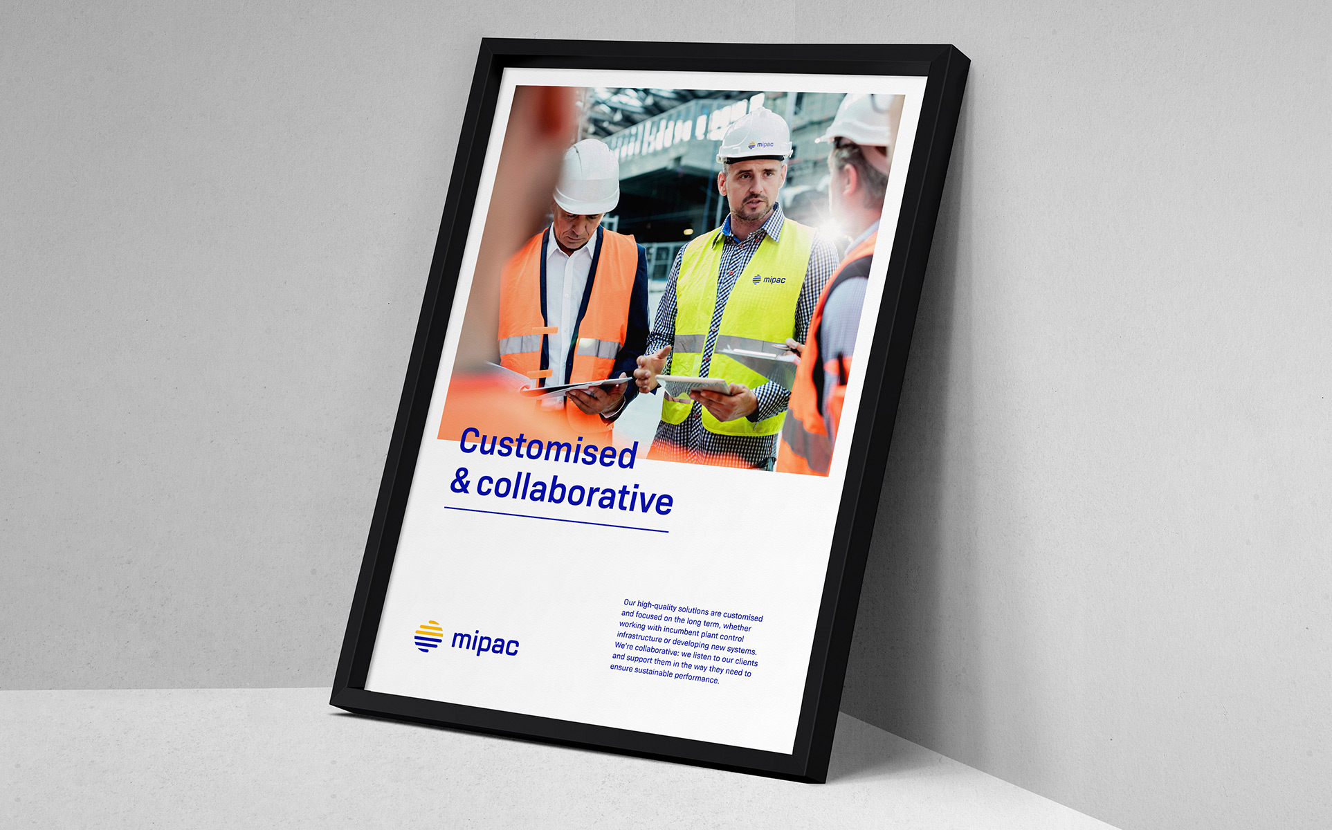
The updated brand appears modern and forward-thinking while also conveying a strong sense of quality, collaboration, and flexibility.
The refreshed marque was data-inspired in its design, showing Mipac as forward-thinking and dynamic. The existing Mipac blue and yellow colours were adjusted and updated to appear more contemporary and provide standout in an often predictable industry.
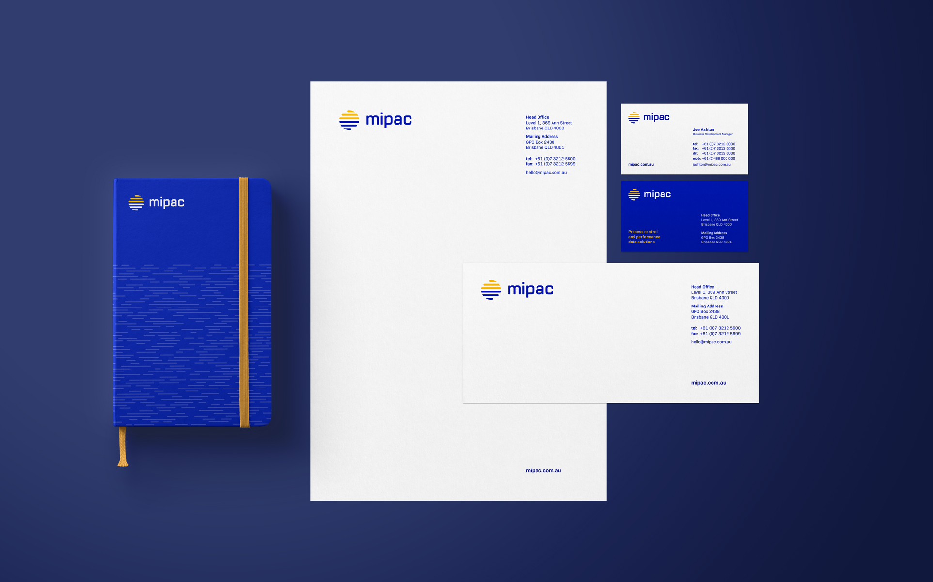
Data device
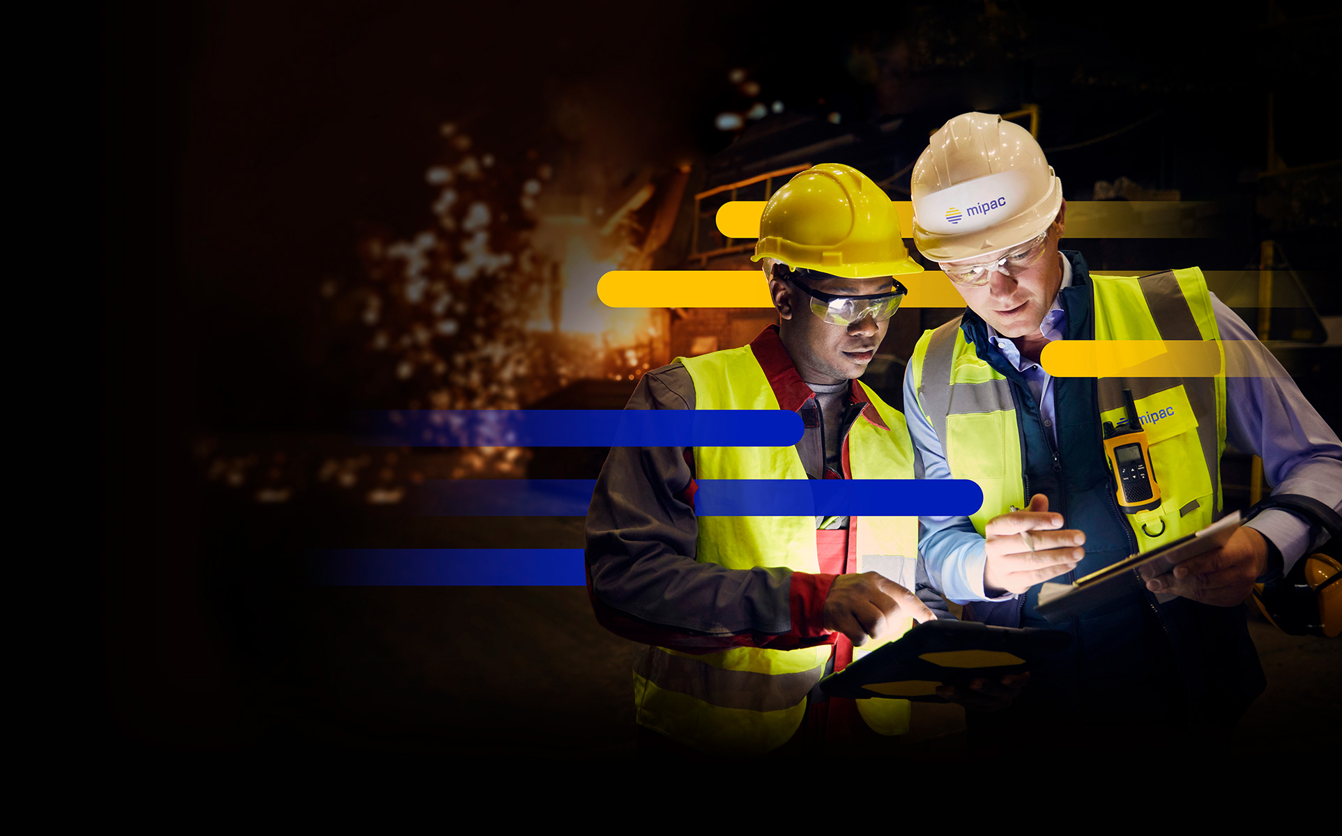
Using the new logo as a basis, we created a flexible ‘data device’ that can be applied across branded materials. This device reflects the technological, data-driven aspect of Mipac’s business and can also be used to highlight their commitment to partnership and collaboration.
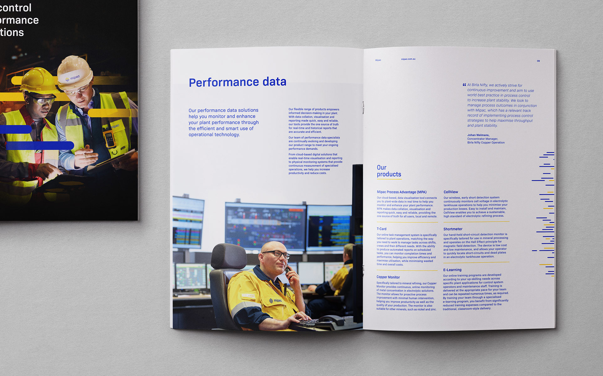
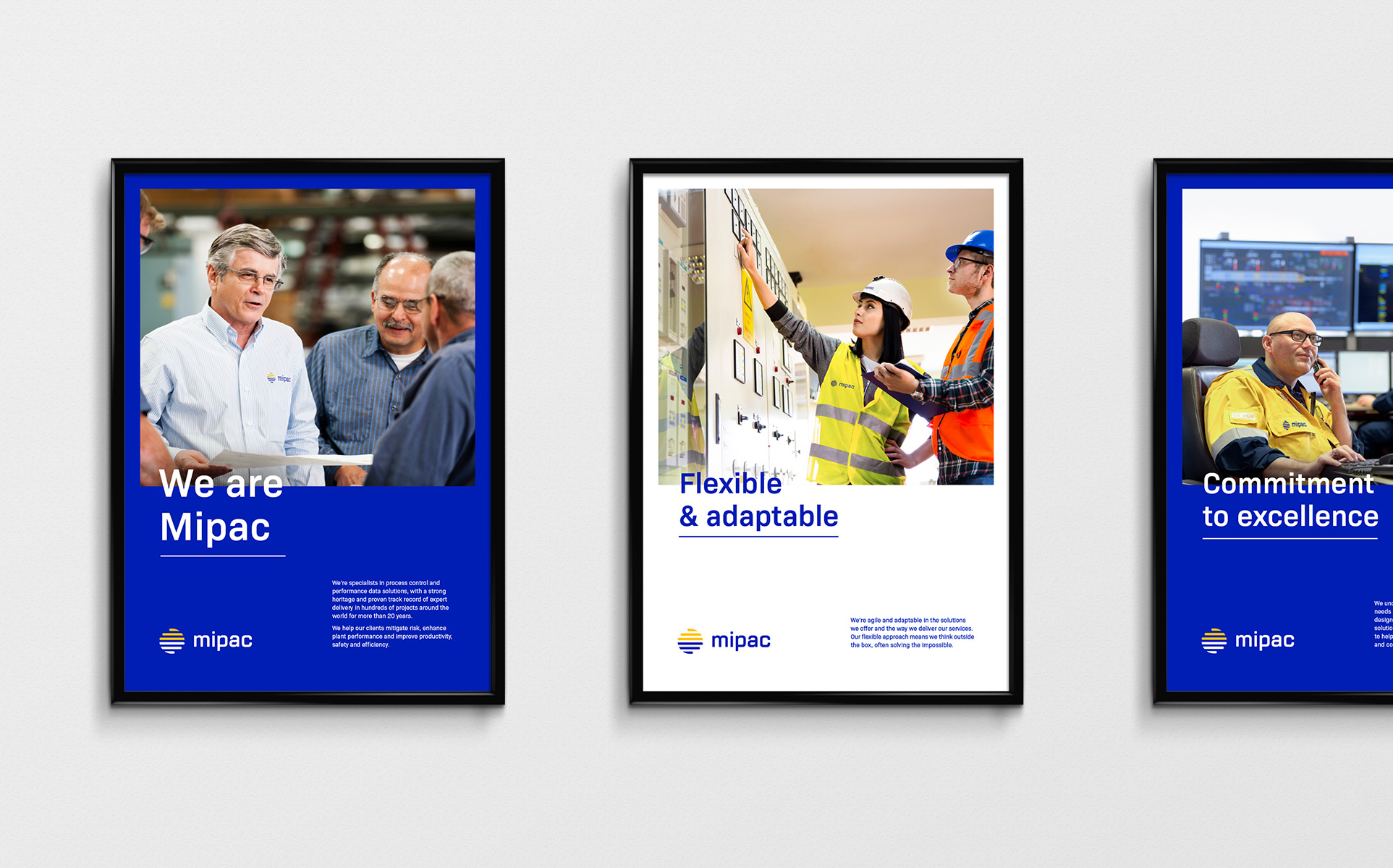
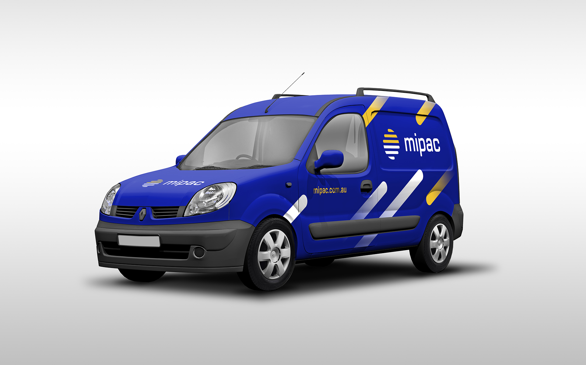
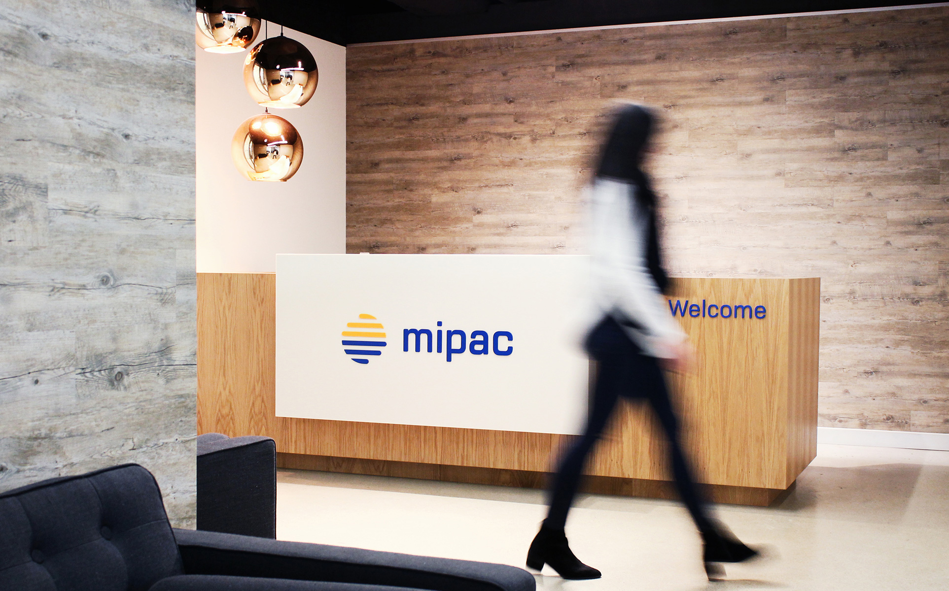
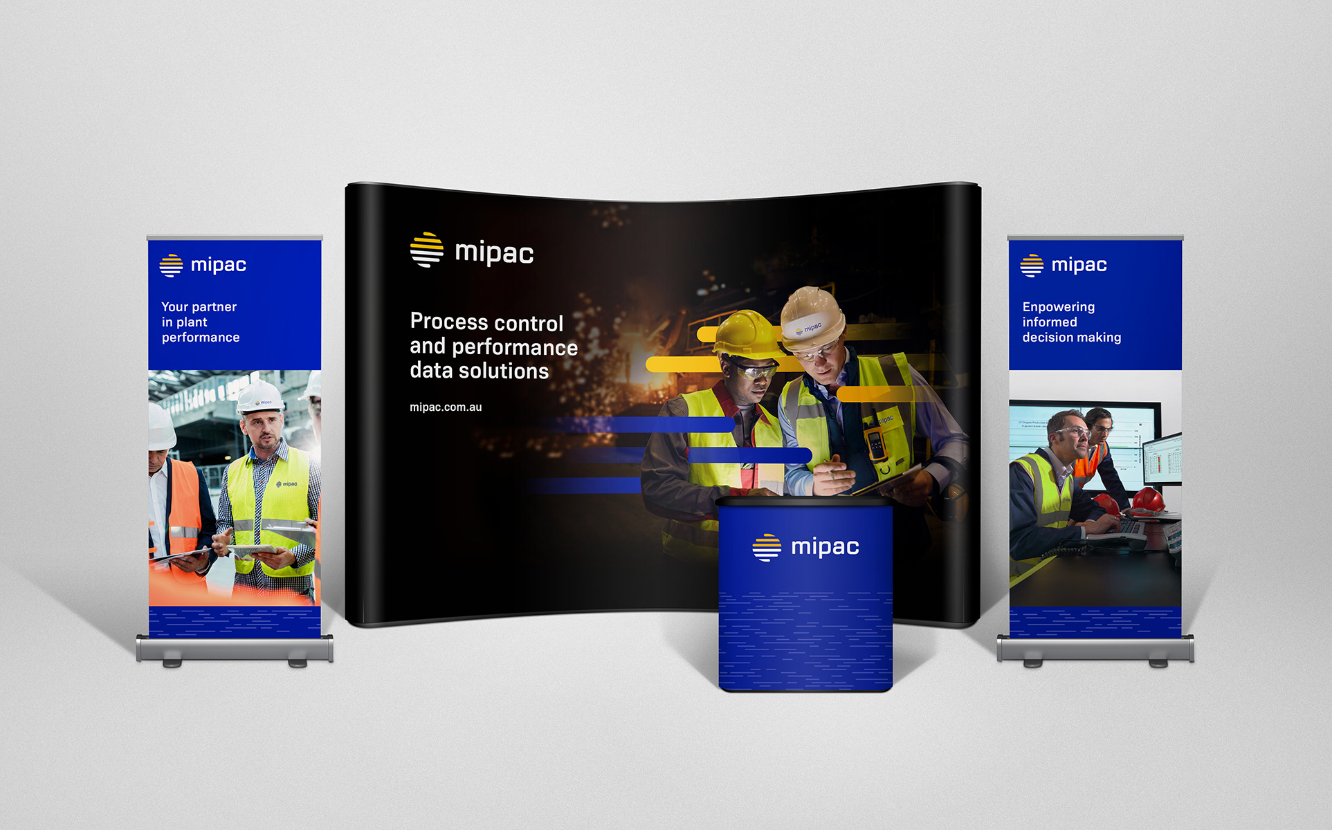
Brand application
Working in partnership with the client, we rolled out the new brand identity across office interiors, stationery, print marketing, and exhibition materials. We also created an in-depth brand guidelines document to ensure consistent usage across any future materials.
- Industry
- Partners
Darling Consulting
- Services
Logo refresh
Visual identity
Messaging
Office signage
Collateral
Digital creatives

Enquire with us
