Construction
Hymix
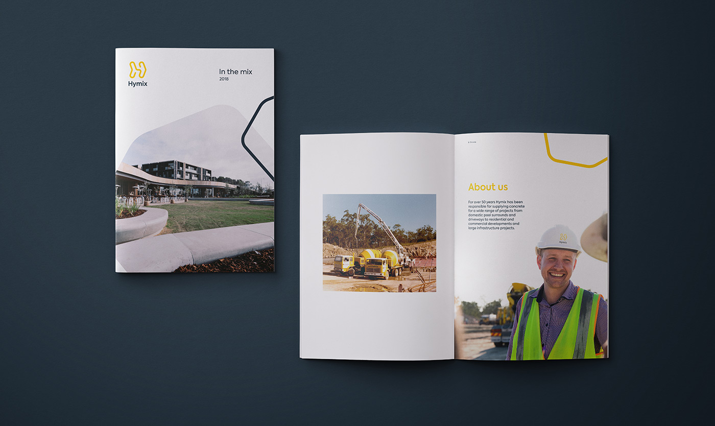
Hymix has been manufacturing and transporting concrete throughout Queensland, New South Wales, and Victoria for over 50 years. Historically the focus of the business has been broad, providing services for large commercial projects as well as smaller residential ones. However, in recent years the bigger commercial jobs have proven to be problematic, tying up the delivery fleet and other critical resources across the business.
Hymix needed a new brand strategy so they could narrow their focus — targeting the consumer market alongside the more traditional residential builders, pool builders, and small- to medium-sized commercial projects.
Read more 
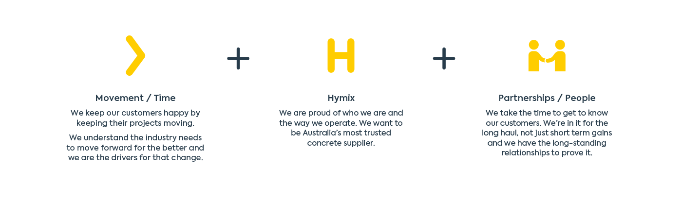
It’s about time
Demand for concrete continues to rise, but with this growth has come a decline in the way the industry does business. With confidence and trust at an all-time low, quality and reliable service has taken a backseat. Business relationships have become short-term and transactional with delayed or inaccurate delivery times, causing frustration and grinding construction sites to a halt.
We facilitated a number of strategy workshops, engaging everyone from high-level management through to truck drivers and sales representatives.
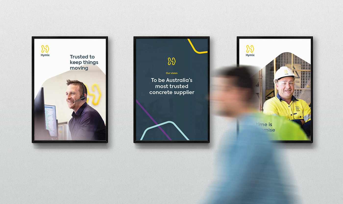
‘It’s about time’ demonstrates that time, not concrete, is Hymix’s most valued commodity. Separating them from their competitors, this idea celebrates their commitment to realistic delivery times and keeping projects moving. It also acts as a rallying call to shake up the industry and start treating customers with the respect and transparency they deserve.
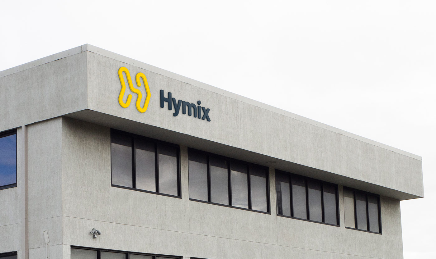
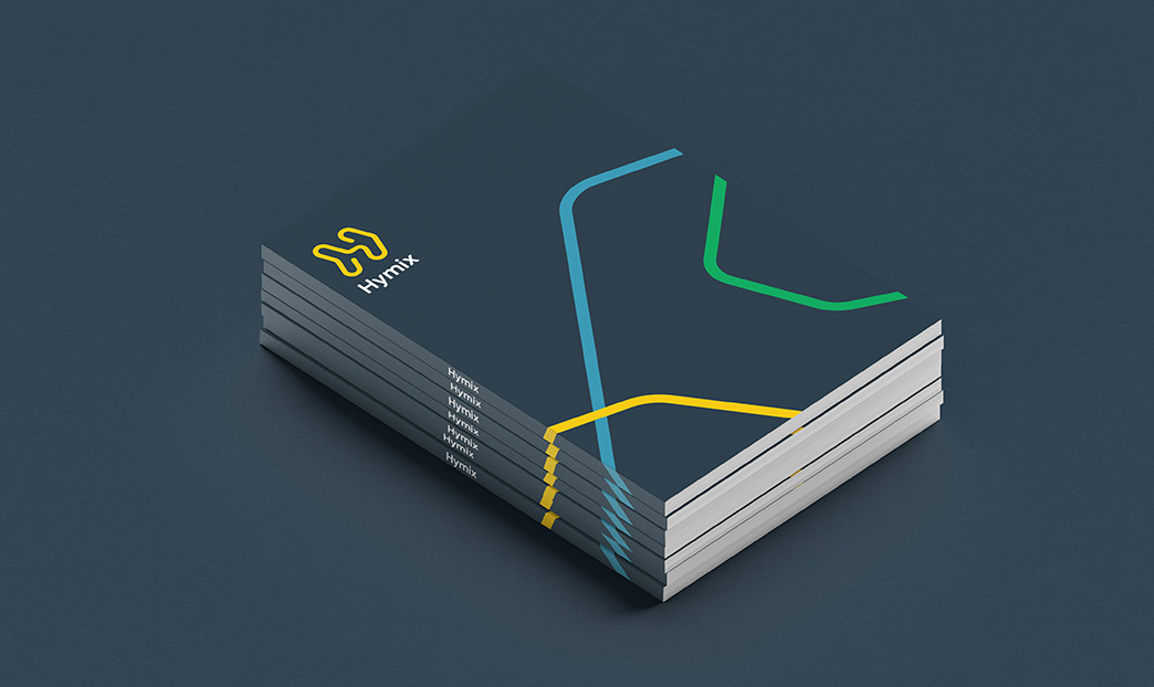
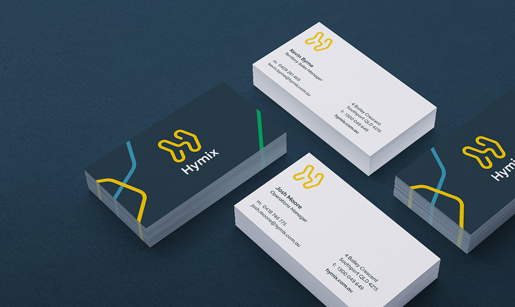
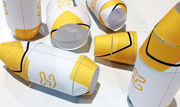
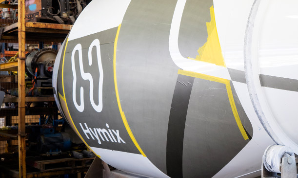
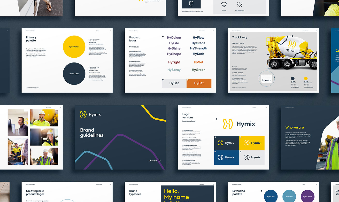
The H Arrow
Formed by a single flowing line, the H Arrow demonstrates Hymix’s promise to keep projects moving. The logo is bold and striking, with a strong sense of movement and forward momentum.
Designed to appeal to both the consumer and trade audience, the brandmark feels friendly and established.
Dynamic arrows
Referencing the angles in the logo we designed a flexible ‘dynamic arrow’ device that can be applied across materials.
Conveying a sense of movement, it gives the brand personality and creates a unique visual style that is instantly recognisable.
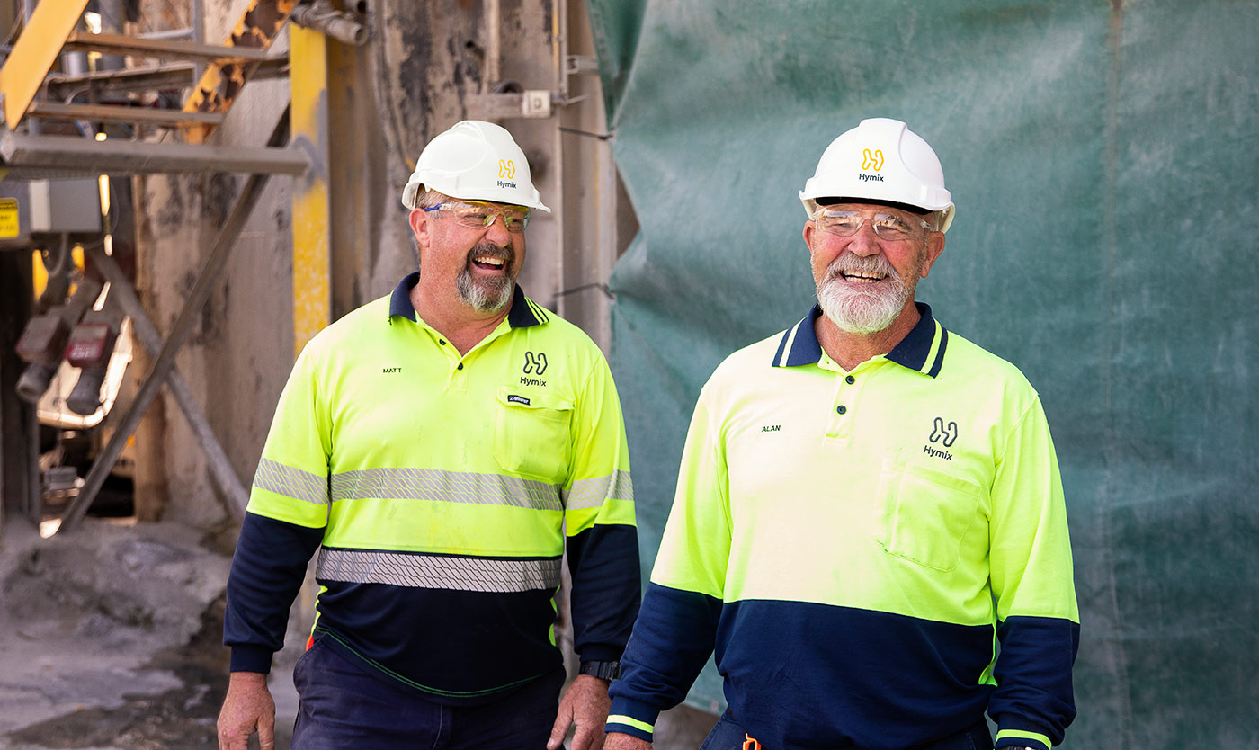
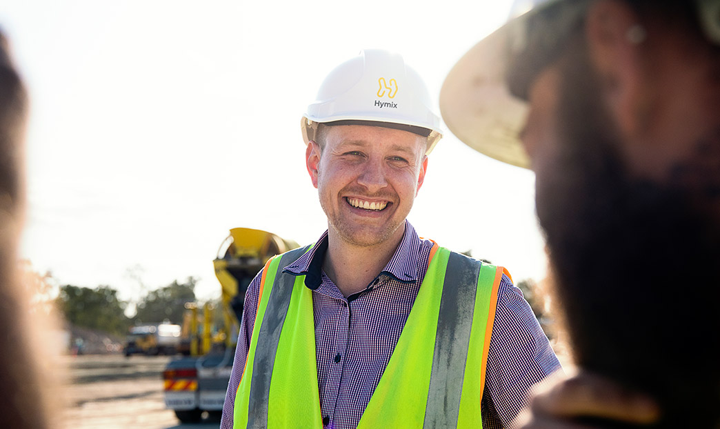
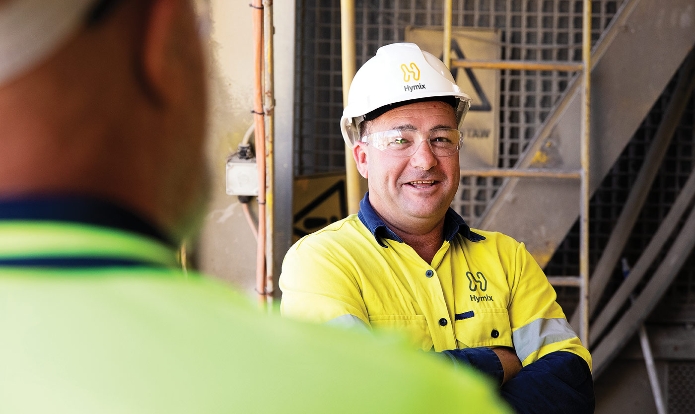
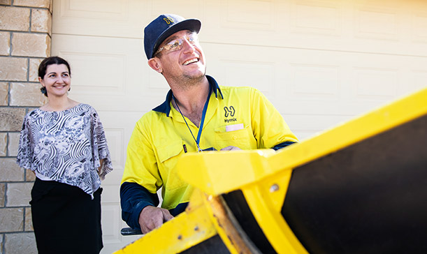
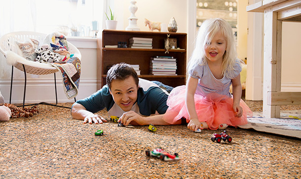
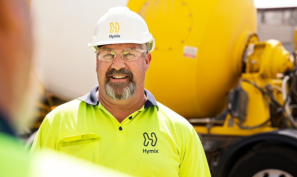
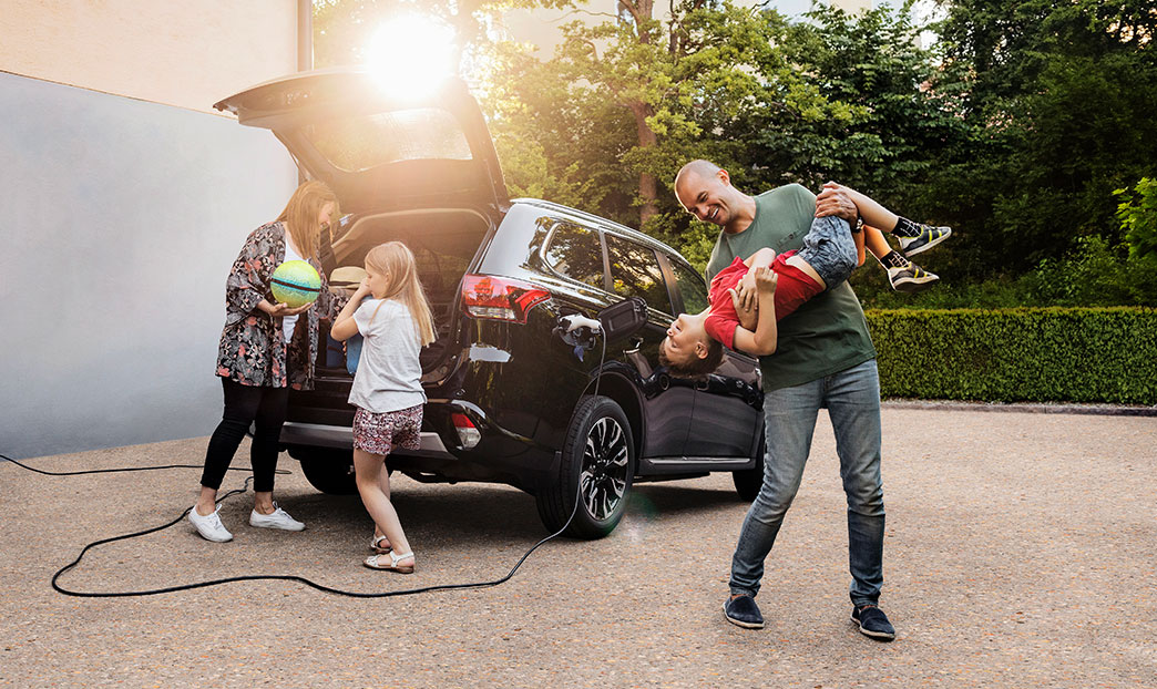
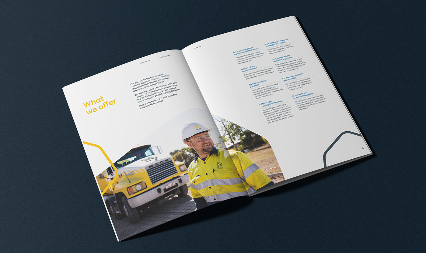
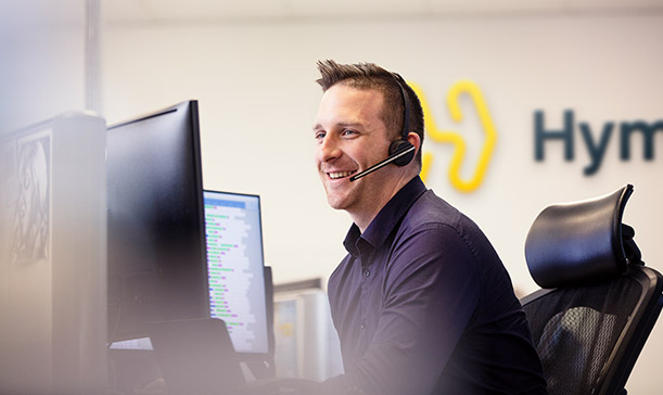
People first, concrete second
In line with the new strategy, photography looks beyond the product and focuses on the human aspect of the brand. Imagery is warm, personable, and contrasts against the industrial imagery synonymous with the industry.
Giving the client control
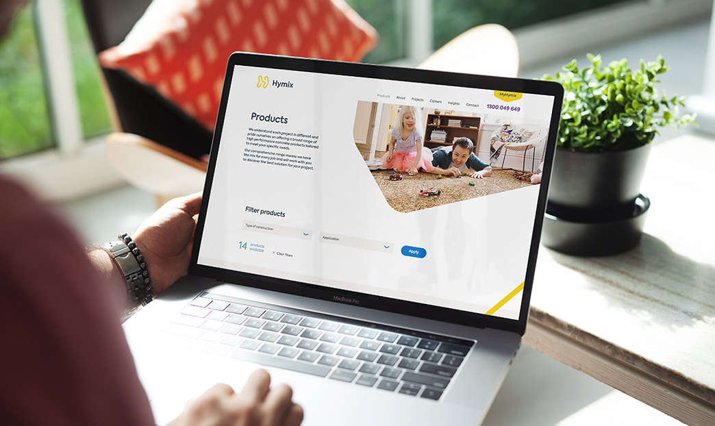
We built the new Hymix website from the ground up in WordPress, utilising our custom dynamic page builder which allows the client full control over future page layouts and content. The new website enhances the customer experience with handy features like the concrete calculator and product share tool.
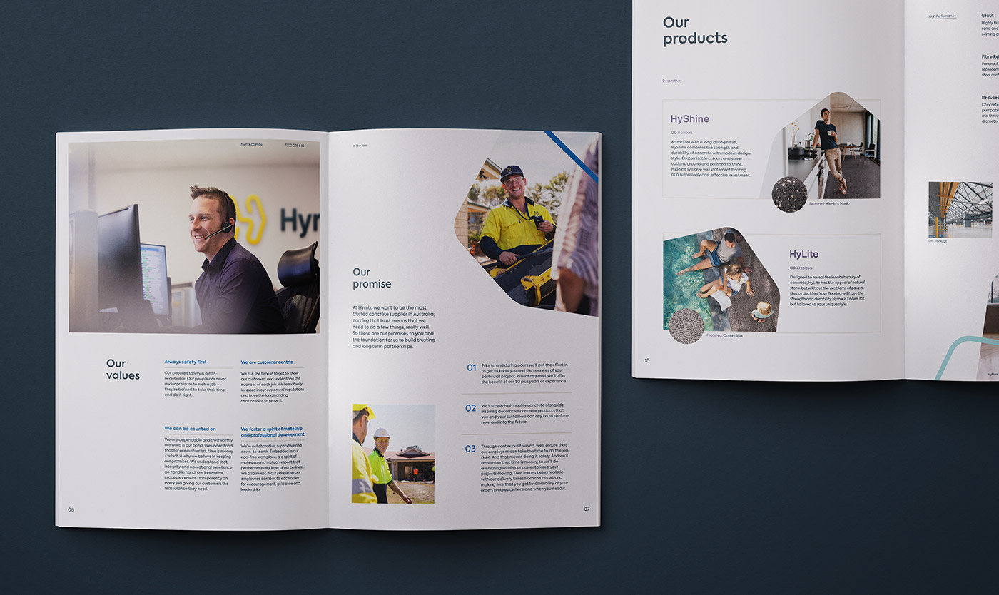
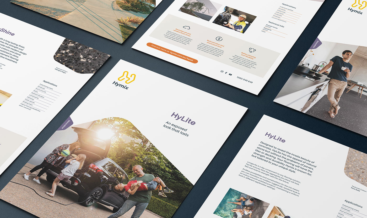
Rethinking every detail
We worked alongside Hymix on the architecture of their various sub-brands. Each product was given its own identity and clear value propositions within the brand family. To make things simple, we designed a suite of bespoke icons that highlight the key features of each product.
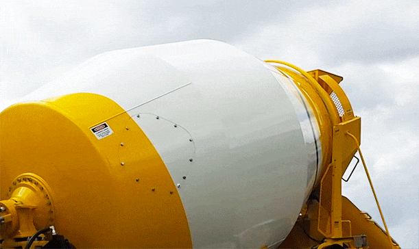
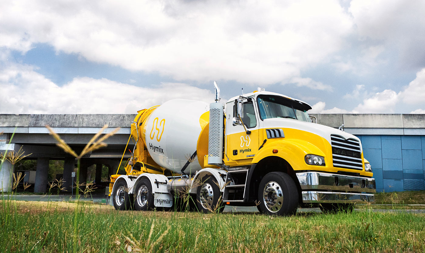
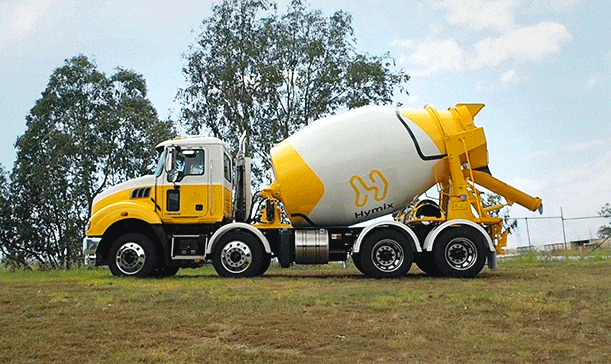
Constant priceless exposure
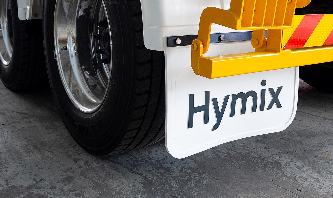
As one of the brands most visible assets, the agitator truck livery has an important role in building brand recall. Featuring the new Hymix brandmark and dynamic arrow device, the new barrel livery is unlike anything else in the industry.
With the truck body and barrel mechanisms produced and supplied by different manufacturers, we worked in conjunction with all parties to ensure a consistent and impactful end result.
Moving forward together
Following a successful brand launch, we continue to work together in close partnership.
As an extension of the Hymix team, we support them in a wide range of brand services; safeguarding the brand and ensuring consistent, effective communications.
- Industry
- Recognition
Silver – Brand Identity DrivenxDesign Awards 2019
Gold – Brand Identity BADC 2019
Silver – Logo BADC 2019
Finalist – Website BADC 2019
- Services
Brand strategy
Positioning
Logo
Visual identity
Messaging
Product naming
Photography
Print design
Signage
Vehicle livery
Uniforms


Together we achieved a full end-to-end rebrand that was insightful, creative and collaborative. We are thrilled with the end result. Through the whole process Driven were personable, easy going, and organised — which made the project even better.
Luke Pischedda | Queensland State Manager
