Superannuation

Media Super
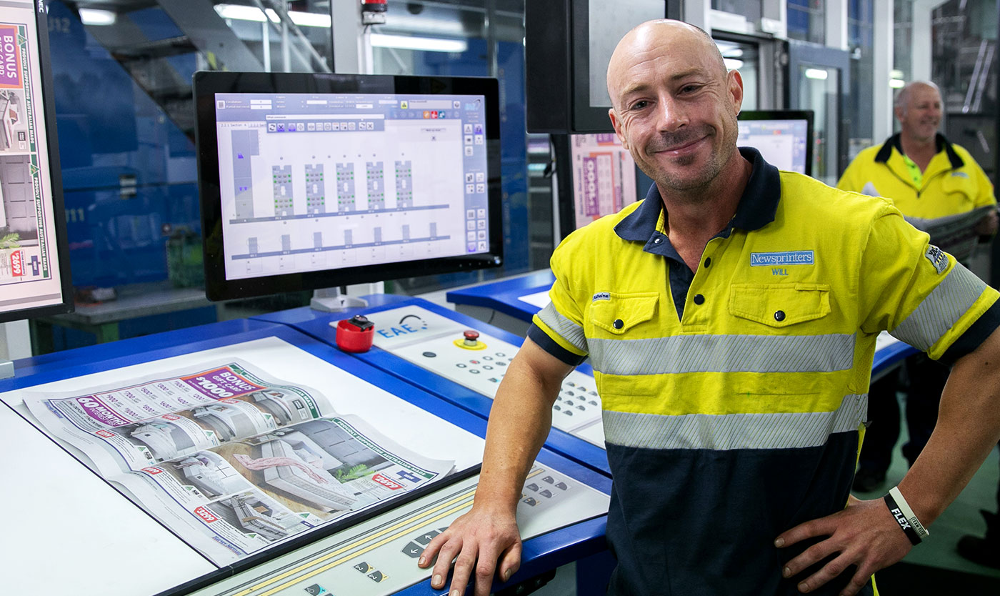
Formed by the merger of Print Super and JUST Super, Media Super are the specialist industry super fund for print, media, entertainment, and arts professionals. In addition to investing members’ super, the fund provides ‘life after work’ support, insurance products, and related advice.
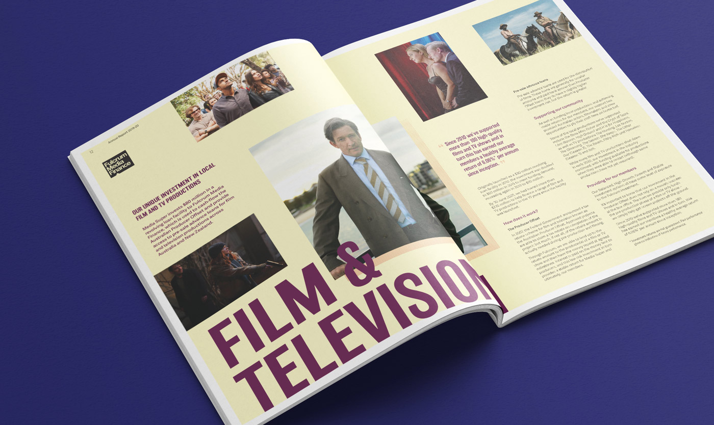
A niche player in the industry, Media Super actively assists, nurtures, and supports the creative industries. This is achieved through their investment portfolio (film, TV, classical instruments) and their funding of internships, educational programs, and industry awards.
Expressing the narrative
As the creative industry experienced unprecedented change, an opportunity emerged to position Media Super as an anchor in their arena — delivering stability to members through times of uncertainty. The fund engaged Driven to evolve the brand and visual identity to align with the new strategic narrative ‘Free to Create’, helping differentiate their offering, increase brand visibility, and refresh the brand to a more contemporary, creative-led aesthetic.
Media Super understands the unique nature of the creative industries and treats its members as individuals — not numbers on a spreadsheet. This places Media Super as the super fund for creative people and conveys a sense of passion, inspiration, and uniqueness.
Our strategic approach
Our approach was to explore the meaning of creativity and the idea that creative people see the world differently. This theme also celebrates the things that make Media Super different from their competitors.
Media Super were born from, and are invested in, the creative industries. They understand that it’s creative differences that make the community strong. They celebrate and take pride in the individual; walking with them through life’s challenges, empowering them to find their financial freedom, and sharing their passion for creativity.
A practical adjustment to the logo
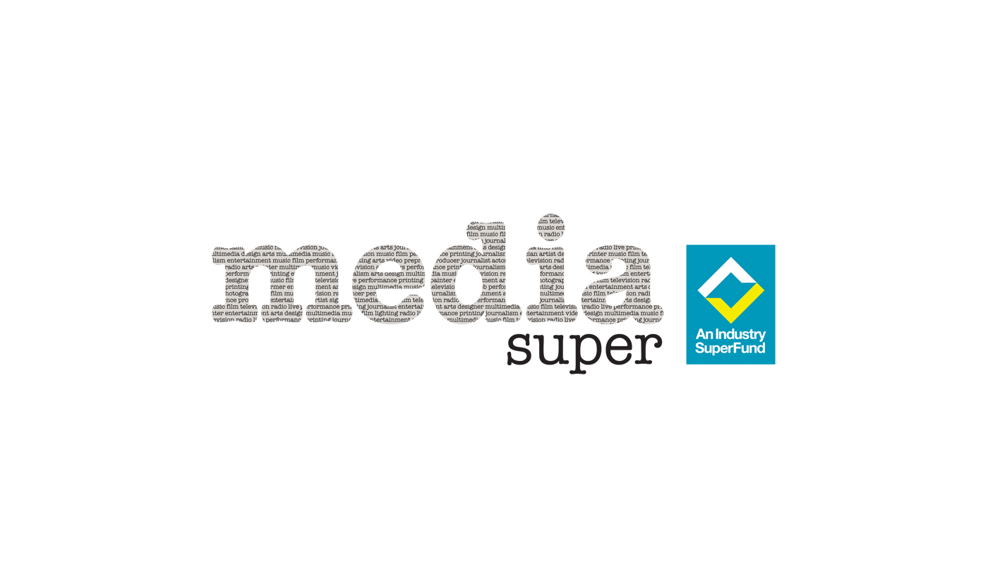
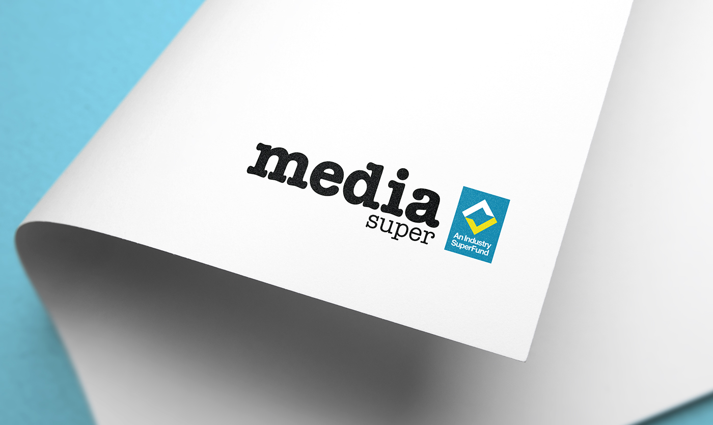
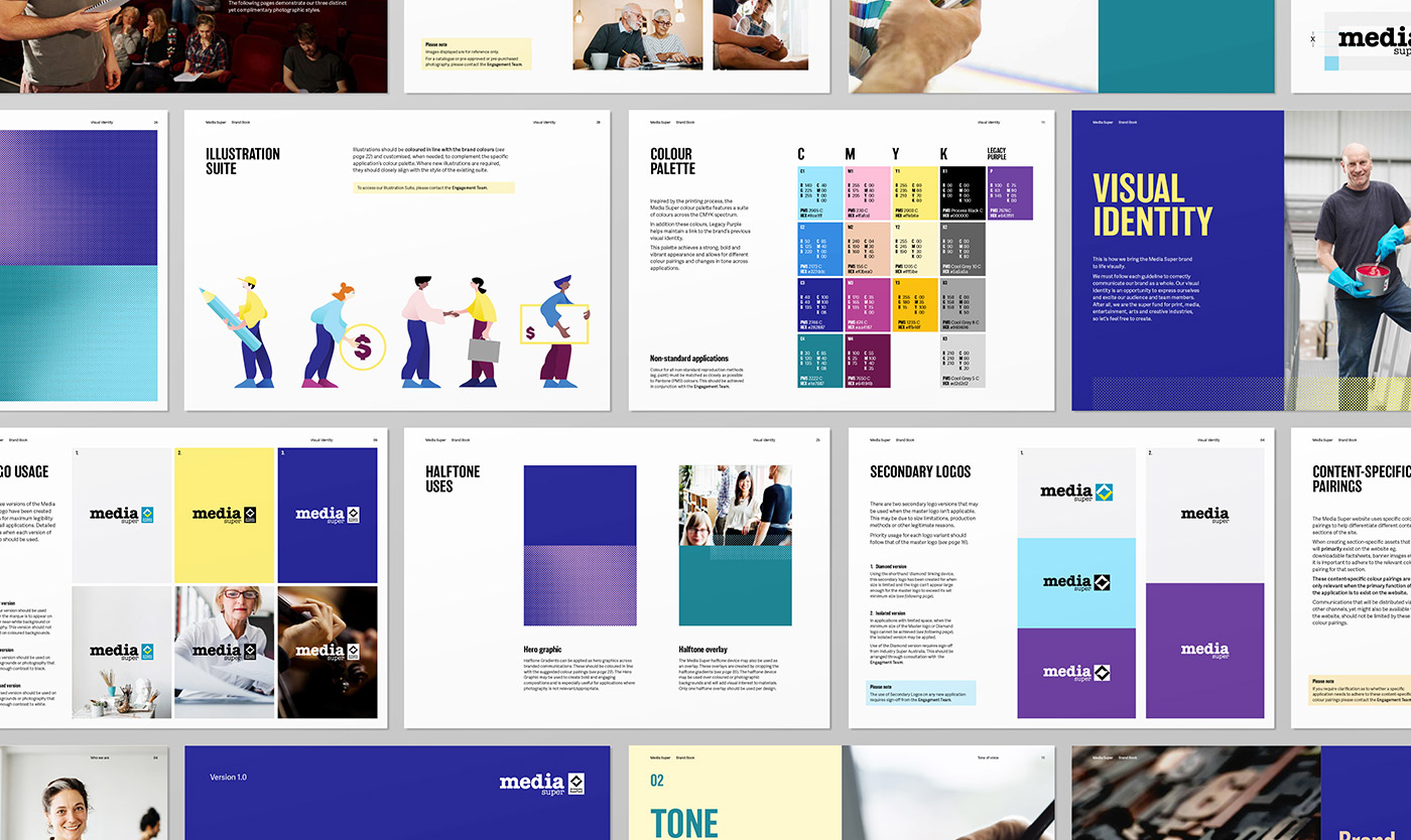
We updated the existing Media Super logo by replacing the small newspaper text within the letterforms with a rich black. This assisted with stand-out and legibility, while also allowing for better flexibility in its use. The logo has a strong history and legacy attached to it, so we set out to honour it — not redefine it.
A colour system for the creative community
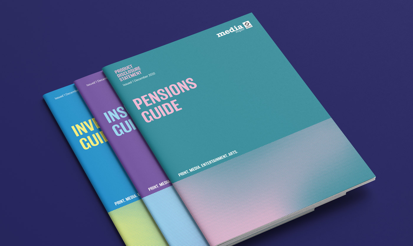
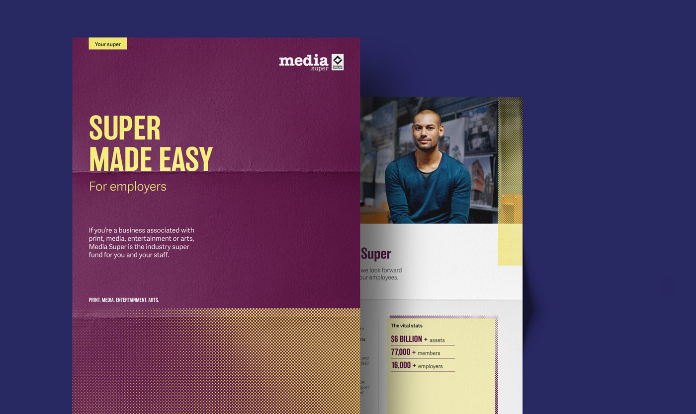
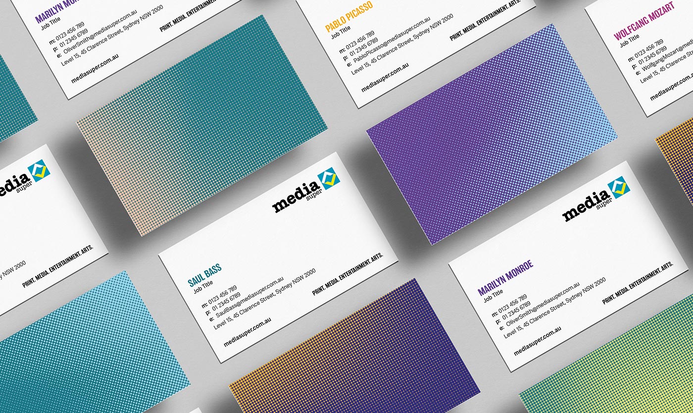
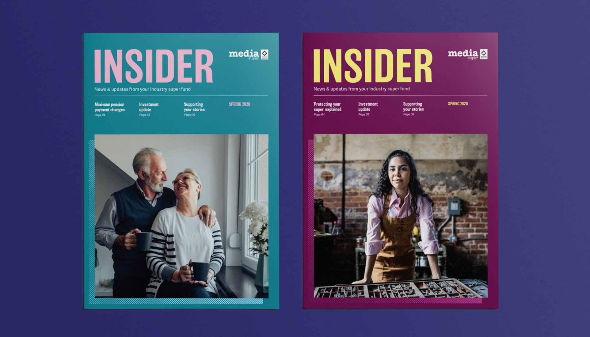
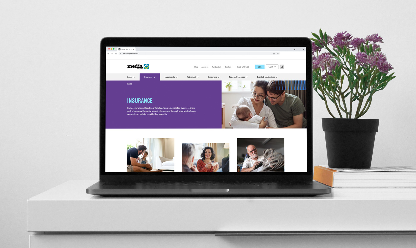
Inspired by the legacy CMYK colour palette, our design team developed an updated suite of colours to modernise the brand and allow for more flexible applications. The refreshed palette achieves a strong, bold, and vibrant appearance to allow for changes in tone across materials — ensuring the brand can effectively express itself across a range of materials.
The visual identity
Following the creative direction, we developed a ‘halftone’ device that references the texture found inside the existing logo. This style echoes the screening process used in print as well as the pixels in the digital environment. Paired with a vibrant, eclectic colour palette, the results are dynamic and striking. The device can be applied to photography or block colour and can be also used separately to add visual interest across designs.
In addition to the halftone device, we developed a suite of unique gradients based on the brand’s existing gradient style. These gradients act as an abstract representation of stage lighting and symbolise the brand’s connection to the arts. This style adds visual interest, injects a sense of movement, and conveys the value Media Super places on individuality.
- Industry
- Partners
Tundra Digital
Daryl Charles
- Services
Logo refresh
Visual identity
Tone of voice
Brand messaging
Digital creatives
Brand design
Long format design
Video production
Campaign development
Photography
