Health
Not-for-profit
Asthma Australia
For over 50 years, individual state-run Asthma Foundations were at the forefront of asthma healthcare, education, research and advocacy in Australia — helping improve the lives of those living with asthma. Following the merger of these organisations into one national group, Asthma Australia needed a refreshed visual identity that signalled a change in strategy and better represented their new bold, proactive, and empowering approach.
Read more 
The brand idea
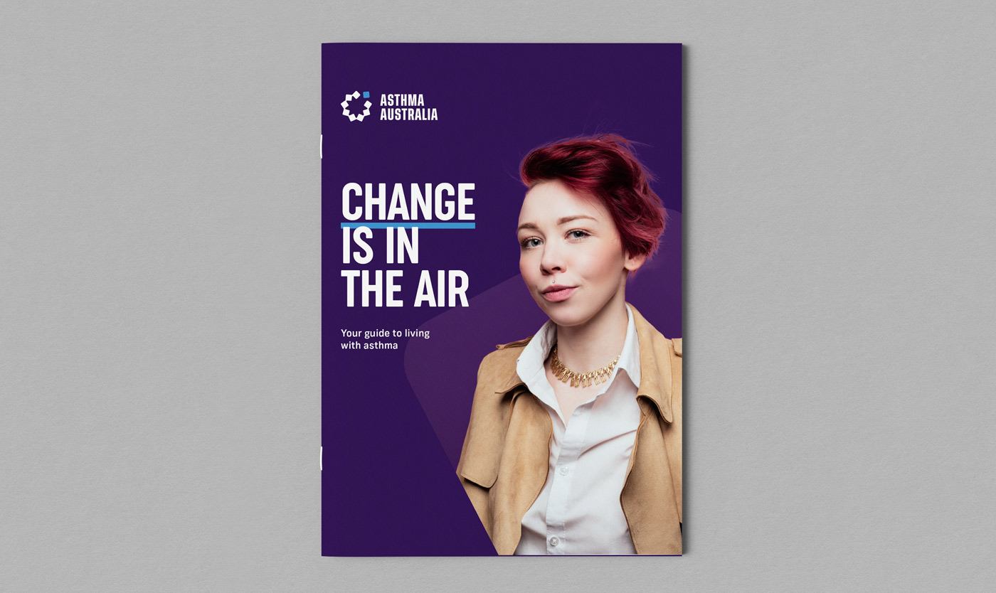
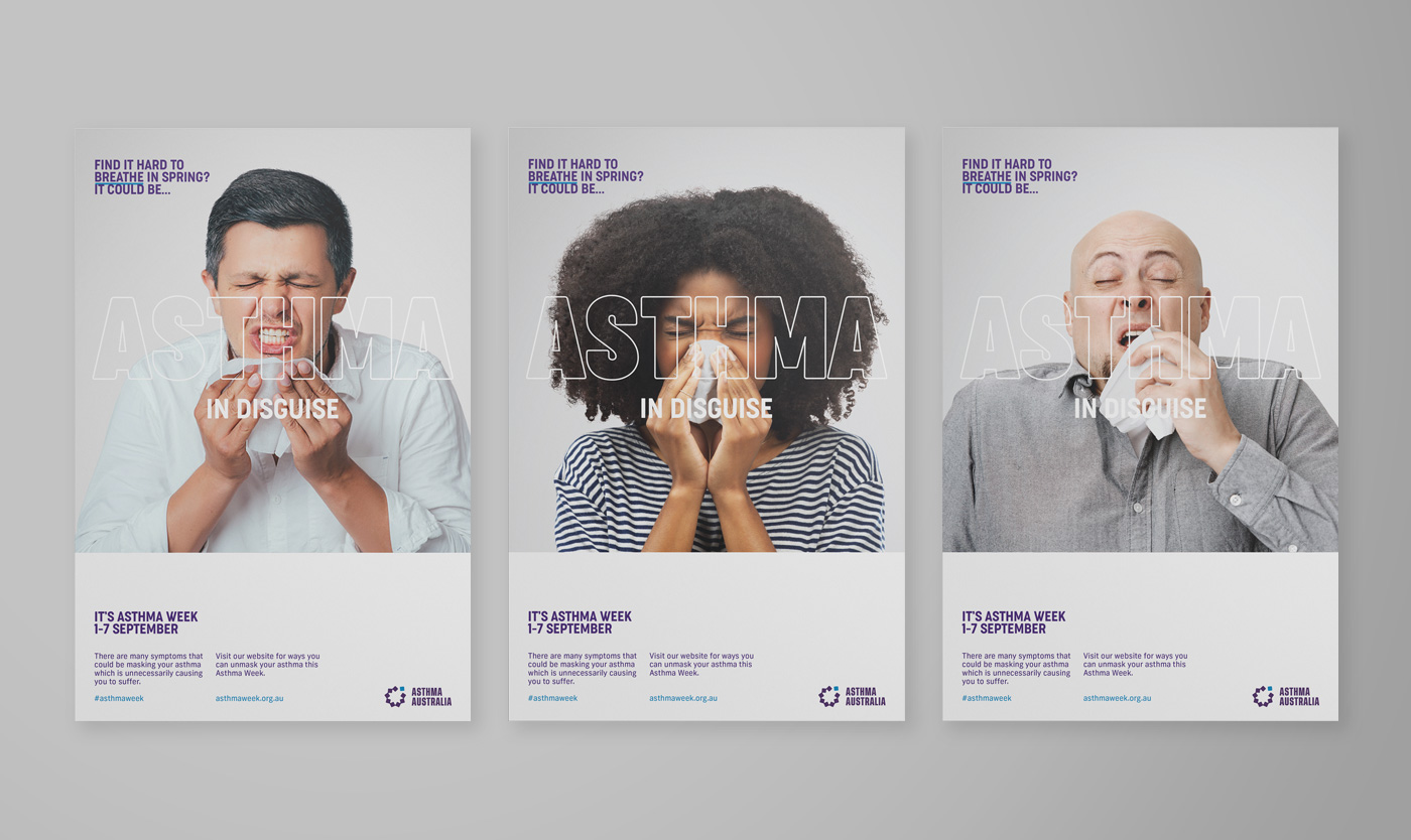
Bringing to life the brand idea of ‘Live Freely’, the new identity sets a bold, empowering tone for the brand — emphasising the seriousness of asthma and helping debunk the misconception that asthma is a childhood condition.
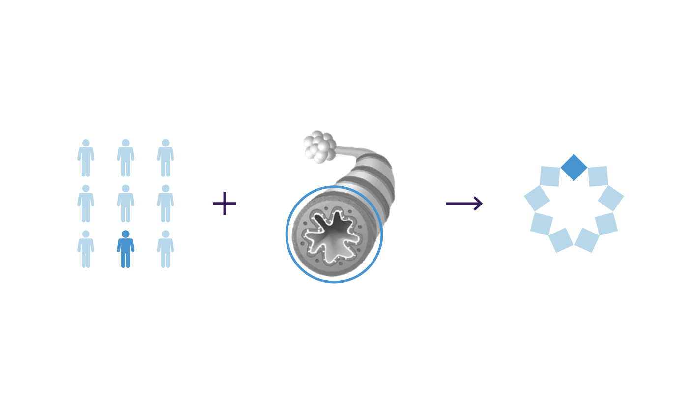
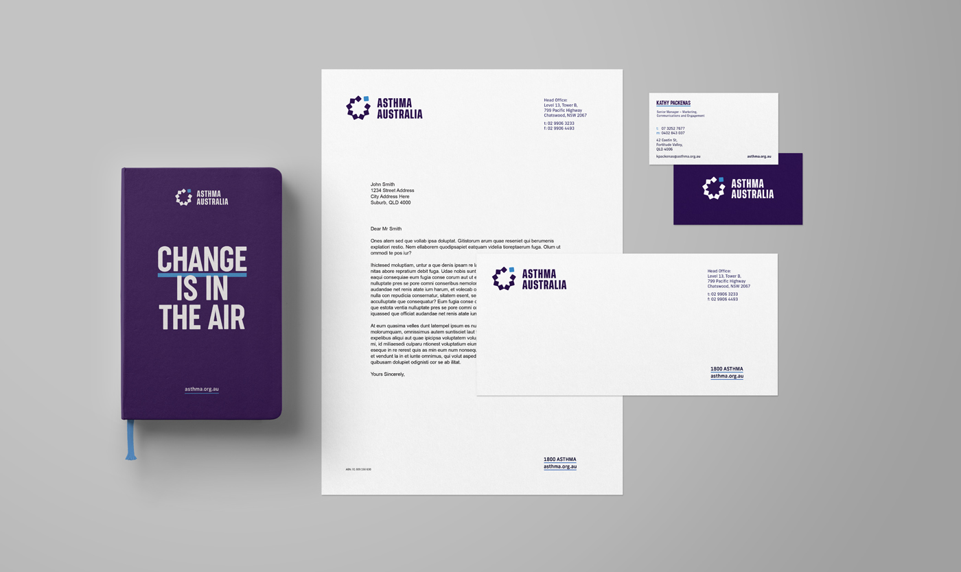
Logo
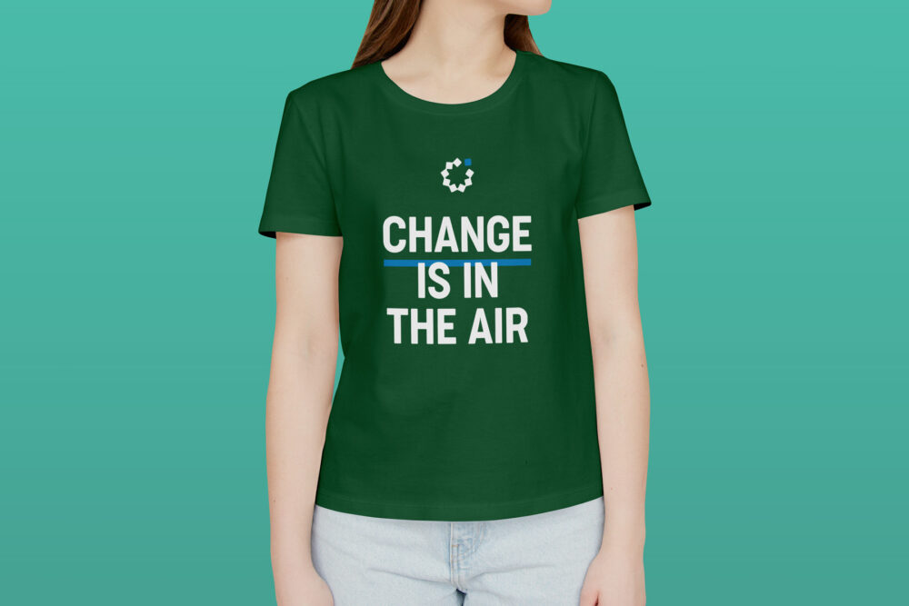
The designed logo represents the 1 in 9 Australians who currently live with asthma whilst the counter space references the shape formed by an airway during an attack. The ‘free square’ creates a sense of liberation to clearly reflect the ‘Live Freely’ brand idea.
The logo has a serious, mature aesthetic while remaining approachable, supportive, and community-focused.
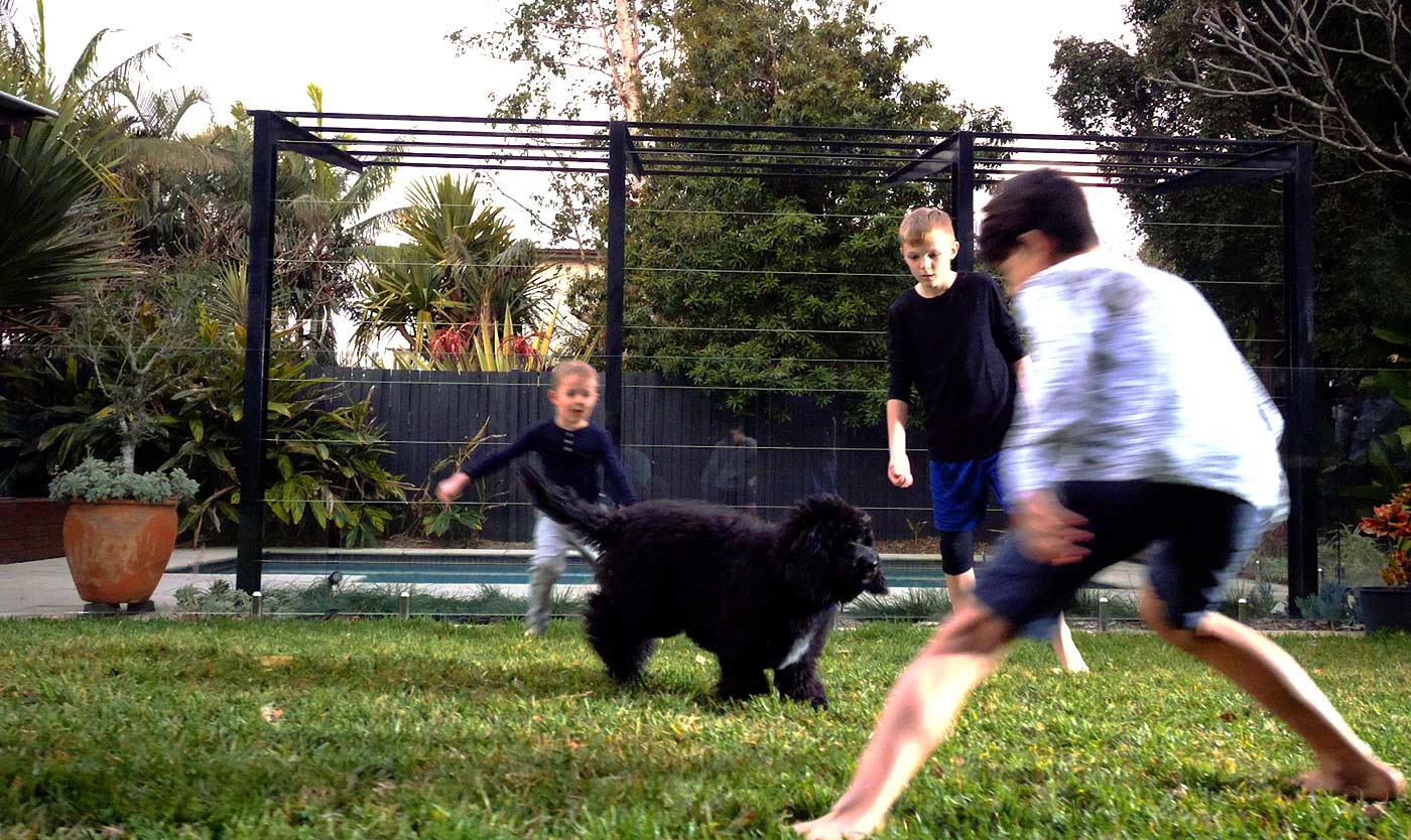
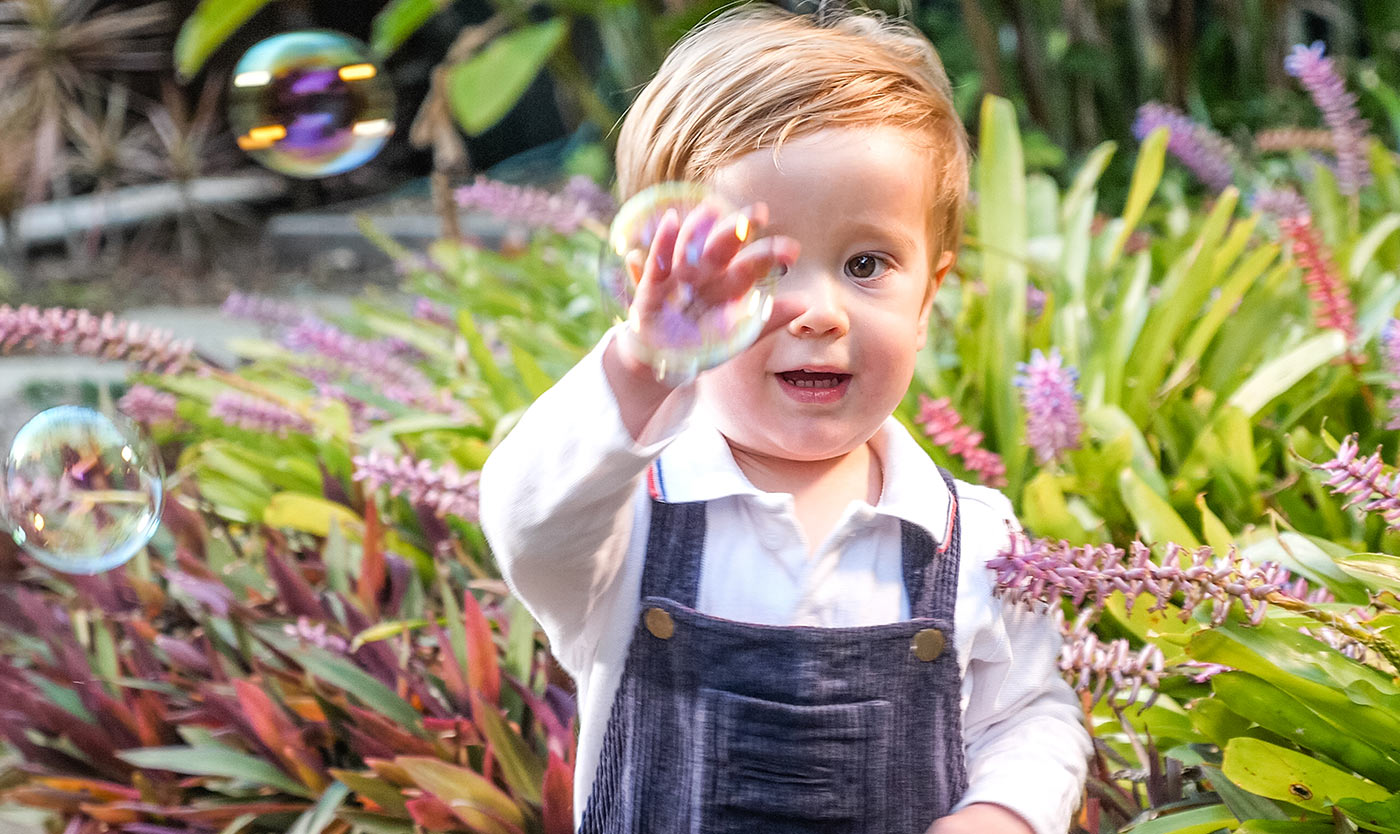
Photography
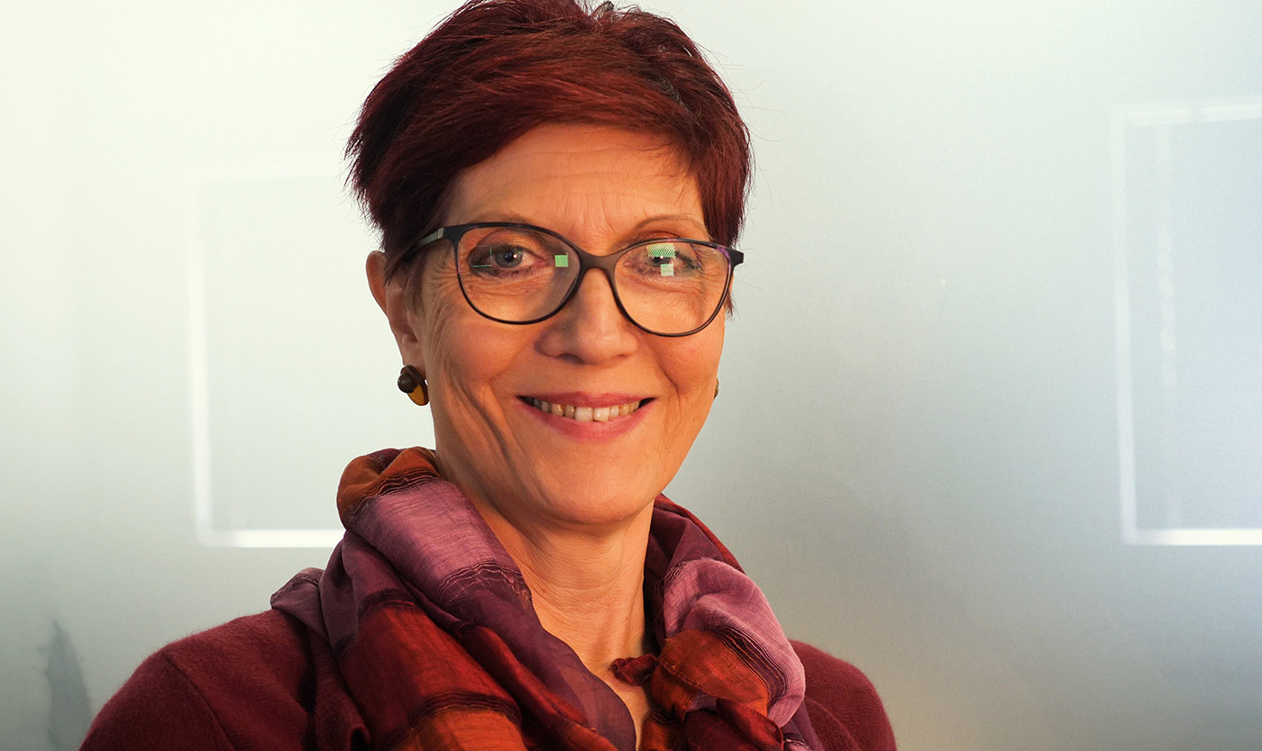
Flying in the face of the stereotypical frail asthma ‘victim’, we developed a bold and empowering photography style that demonstrates the sense of confidence and freedom that can be found through effective asthma management. Looking defiantly at the viewer, sufferers are seen confidently breaking free from the restraints of their condition. The complementary lifestyle library celebrates the everyday moments of joy that can be found when people are free to live life.
- Industry
- Partners
Two Thirds Sky
Dean Saffron
3P Studio
SST Workshop
- Services
Logo
Visual identity
Messaging
Collateral design
Signage and livery
Campaign strategy
Direct mail
Video production


Following an intensive journey to uncover the new strategic positioning for Asthma Australia, we engaged Driven to bring the brand to life with a new visual identity. Driven’s creative process worked perfectly for our team of stakeholders, by providing everyone an opportunity to contribute during this dramatic change for the organisation.
I found the Driven team incredibly professional, personable, willing to go the extra mile to explore a variety of design solutions in order to find the right one. We absolutely love the finished product and look forward to continuing our relationship with them and further delivering the Asthma Australia message to help people with asthma ‘live freely’. The team at Driven are absolute champions.
Kathy Packenas | General Manager Marketing, Communications and Engagement, Asthma Australia
