Disability Services
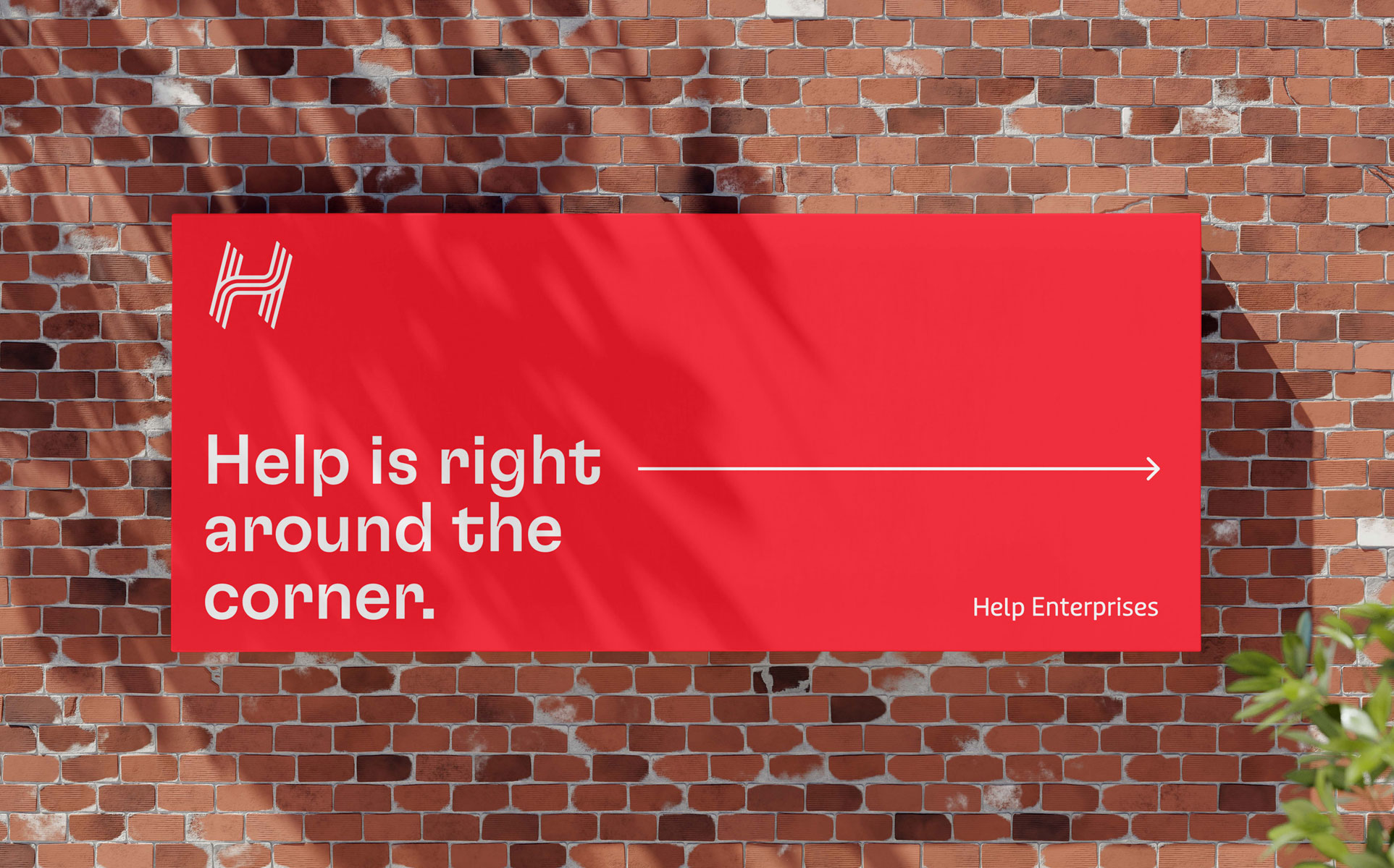
Help Enterprises
Help Enterprises has been changing the lives of people with disability since 1968. Over time, the evolution of the brand’s services and the acquisition of new businesses led to skewed growth, siloed audience experiences, and unclear brand positioning.
Help engaged us to create a new brand strategy and identity that would unite their vast ecosystem of services and set the tone for a next chapter brimming with possibilities.
Read more 
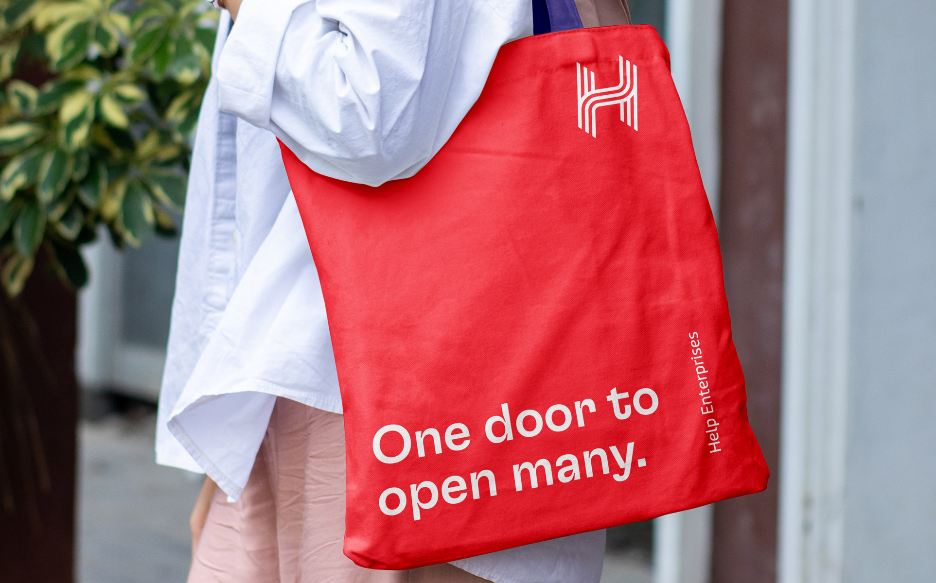
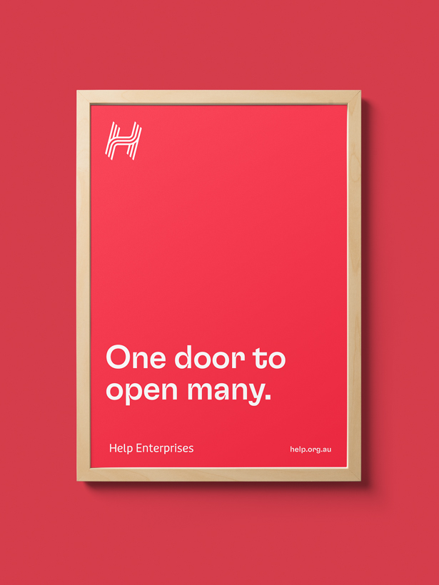
One door to open many
A national social enterprise leader, the scope and depth of Help’s capabilities is enormous. Providing a network of social enterprise businesses and services for home, work, and life—all of which are shaped around the individual’s goals—Help has truly created an ecosystem of opportunity for its customers and partners.
50+ years into their journey, Help found itself in a unique position. The organisation had experienced tremendous growth through evolving its service lines, acquiring new businesses, and serving new audiences. However, this growth had caused the brand to become fragmented. Both inside and outside the organisation, people recognised Help based only on their limited interaction, overlooking the full range and depth of Help’s services.
To reconnect the organisation, Help had realigned and streamlined its internal processes and architecture to serve the objective of ‘tell your story once’—a whole-of-life approach that enables customers to seamlessly tap into and out of services as they choose.
In reimagining Help’s brand, we embarked on a participatory design journey, consulting with Help’s diverse stakeholders to redefine and redesign the brand. Through this process, Help’s unifying brand idea and tagline, ‘One door to open many’ was born—a simple unifying proposition that captures the endless possibilities of Help’s network.
The neighbourhood hero
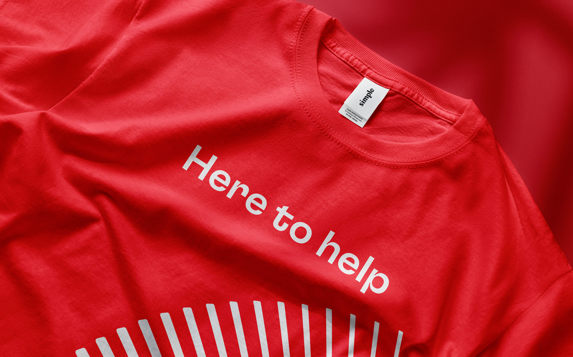
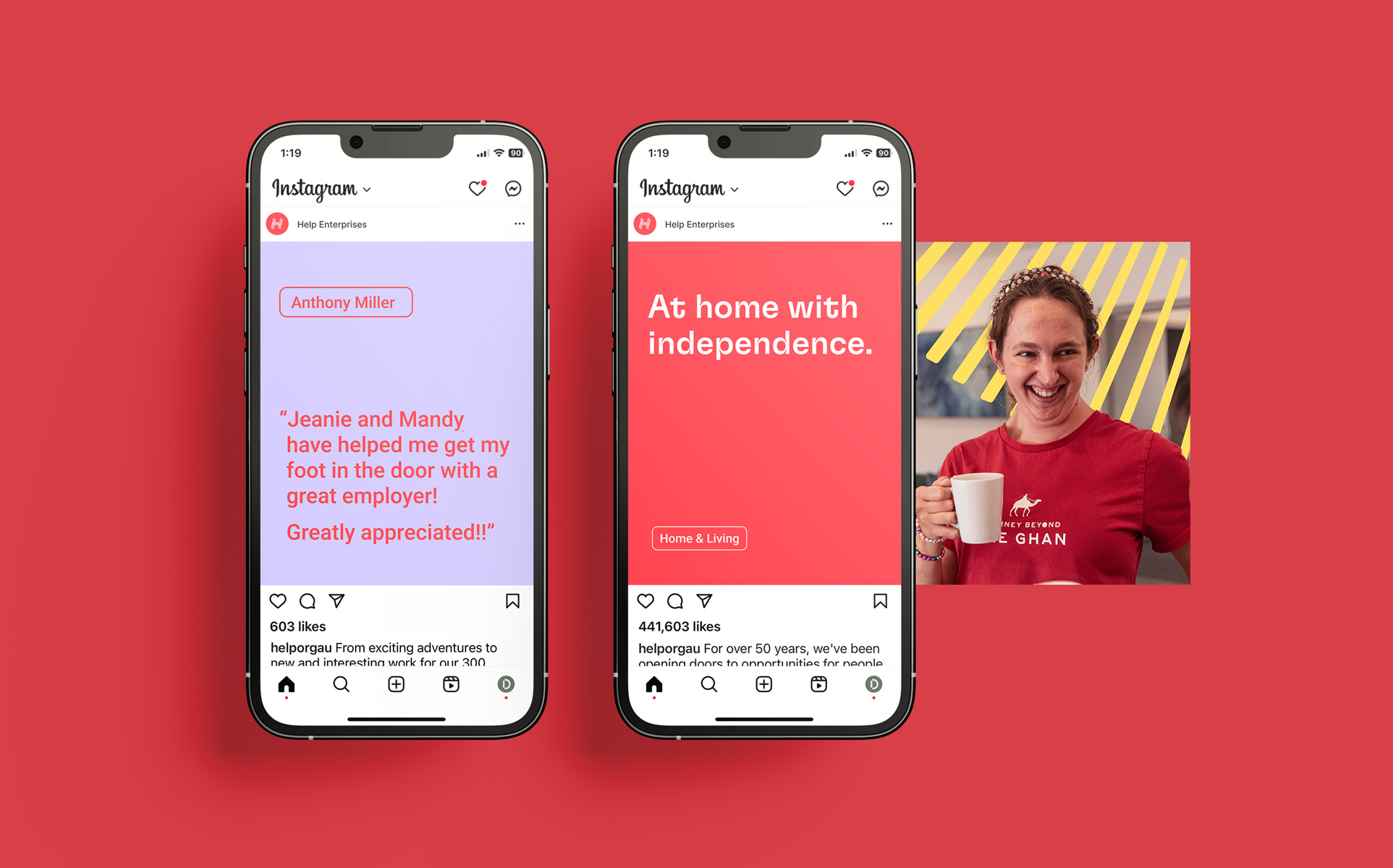
Shifting away from the hero or caregiver archetypes often seen in the social enterprise space, the new brand champions a more inclusive and empowering narrative, positioning the customer as the leader. Embodying the personality of ‘the neighbourhood hero’, Help’s visual and verbal language is friendly and down-to-earth; enthusiastic and unconventional.
A new direction
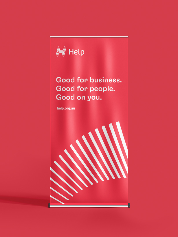
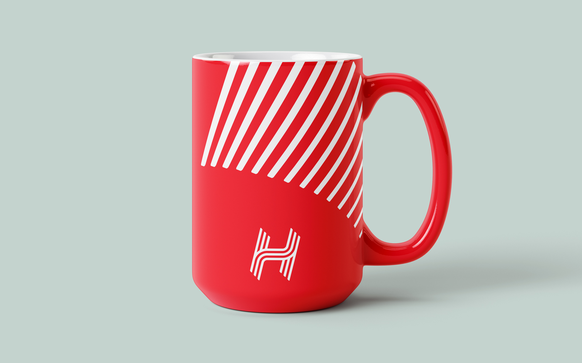
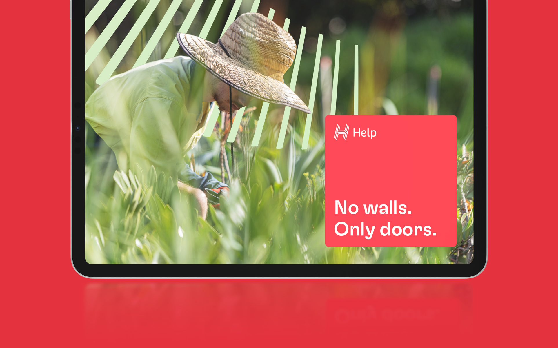
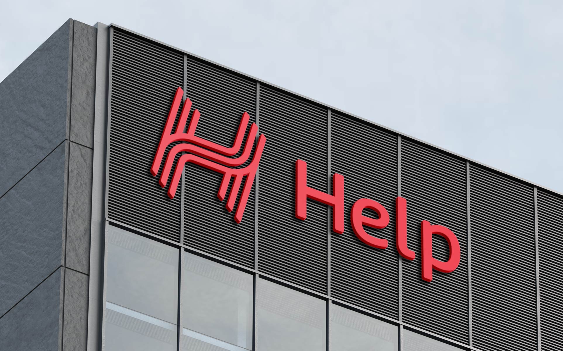
The new logo, designed with three-stroke pillars, symbolises Help’s layered support system—essentials, routine, and stretch—and reflects the dynamic, non-linear paths of individuals’ journeys through life. This symbolism is extended through our graphic language, which introduces a playful and flexible ‘doorburst’ motif which was inspired by the joyful promise of new opportunities.
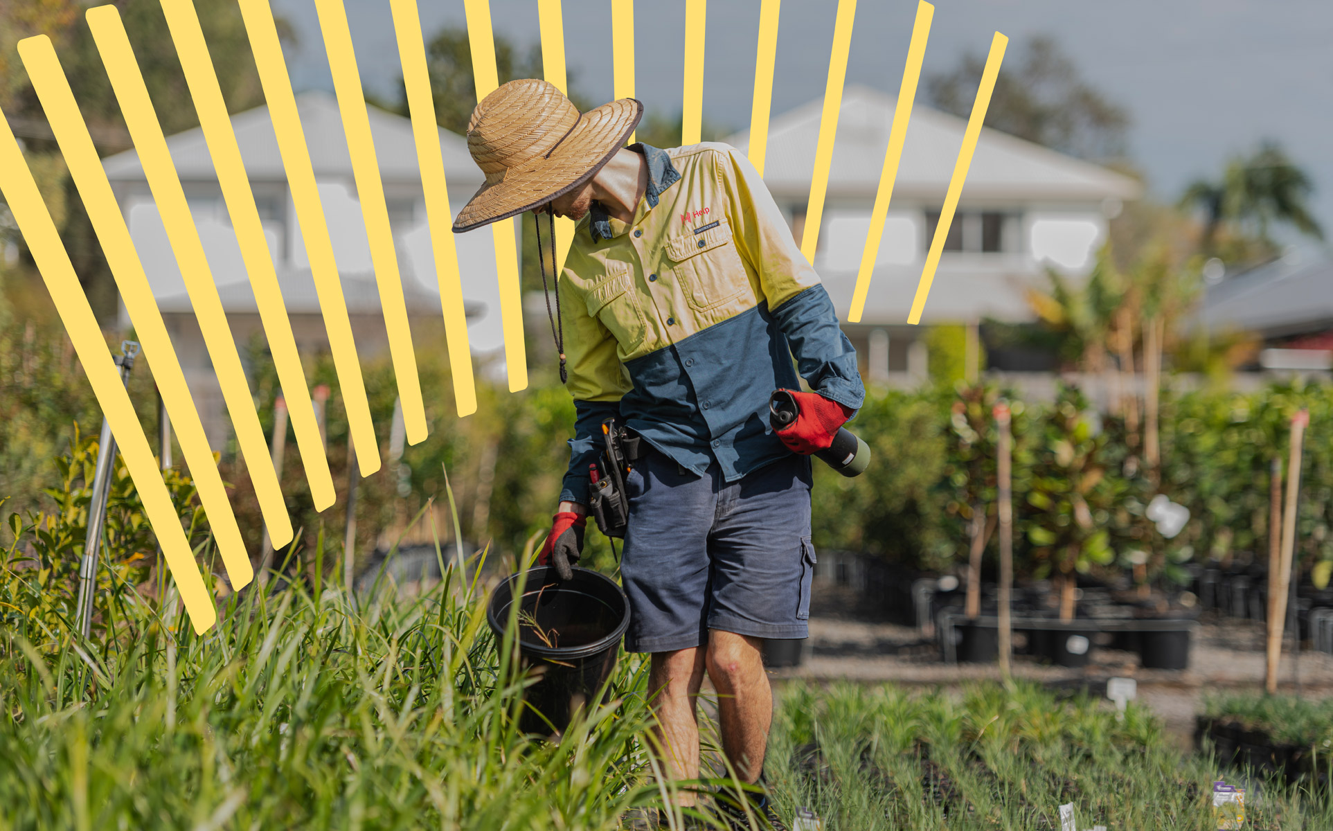
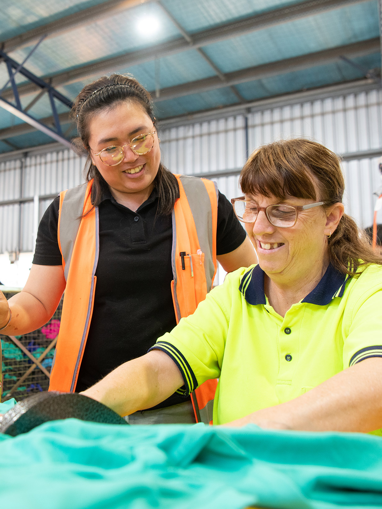
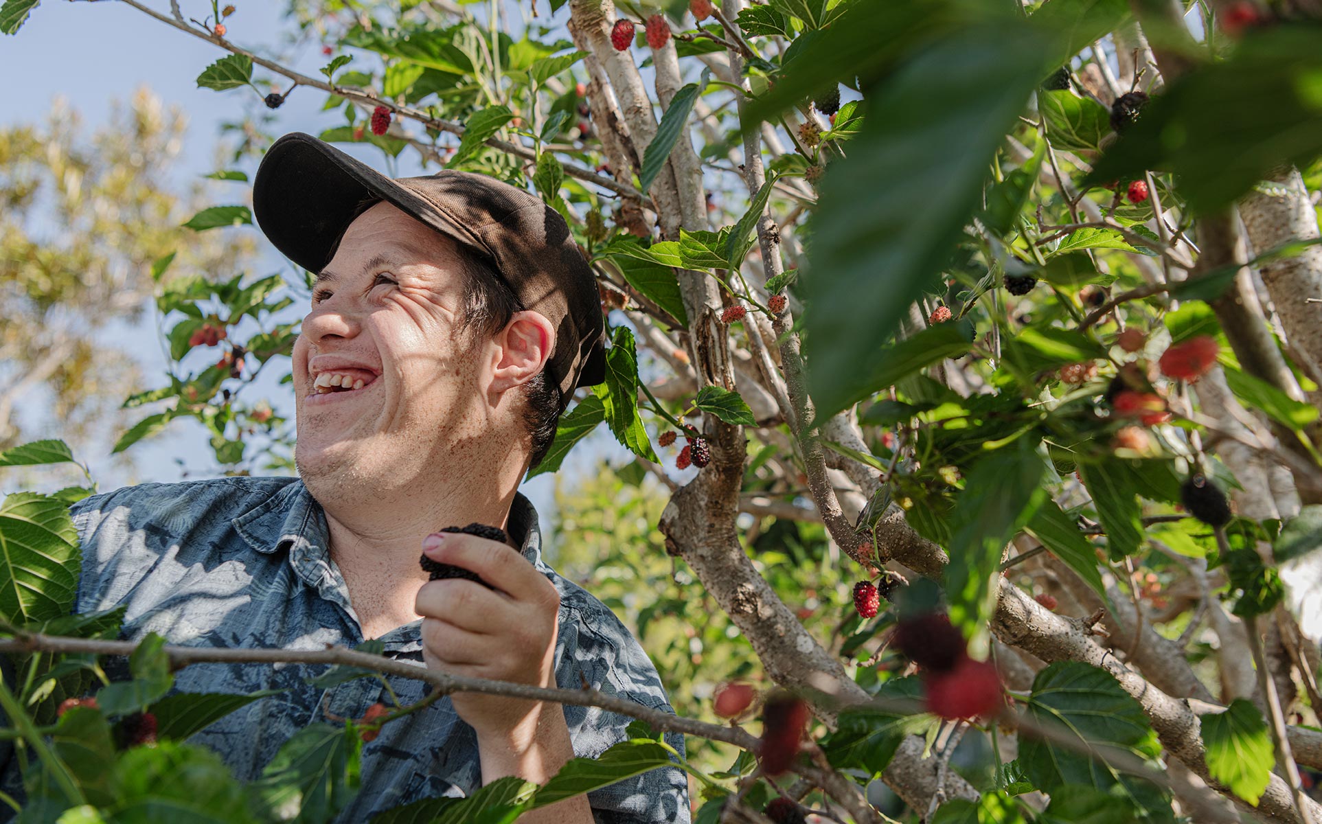
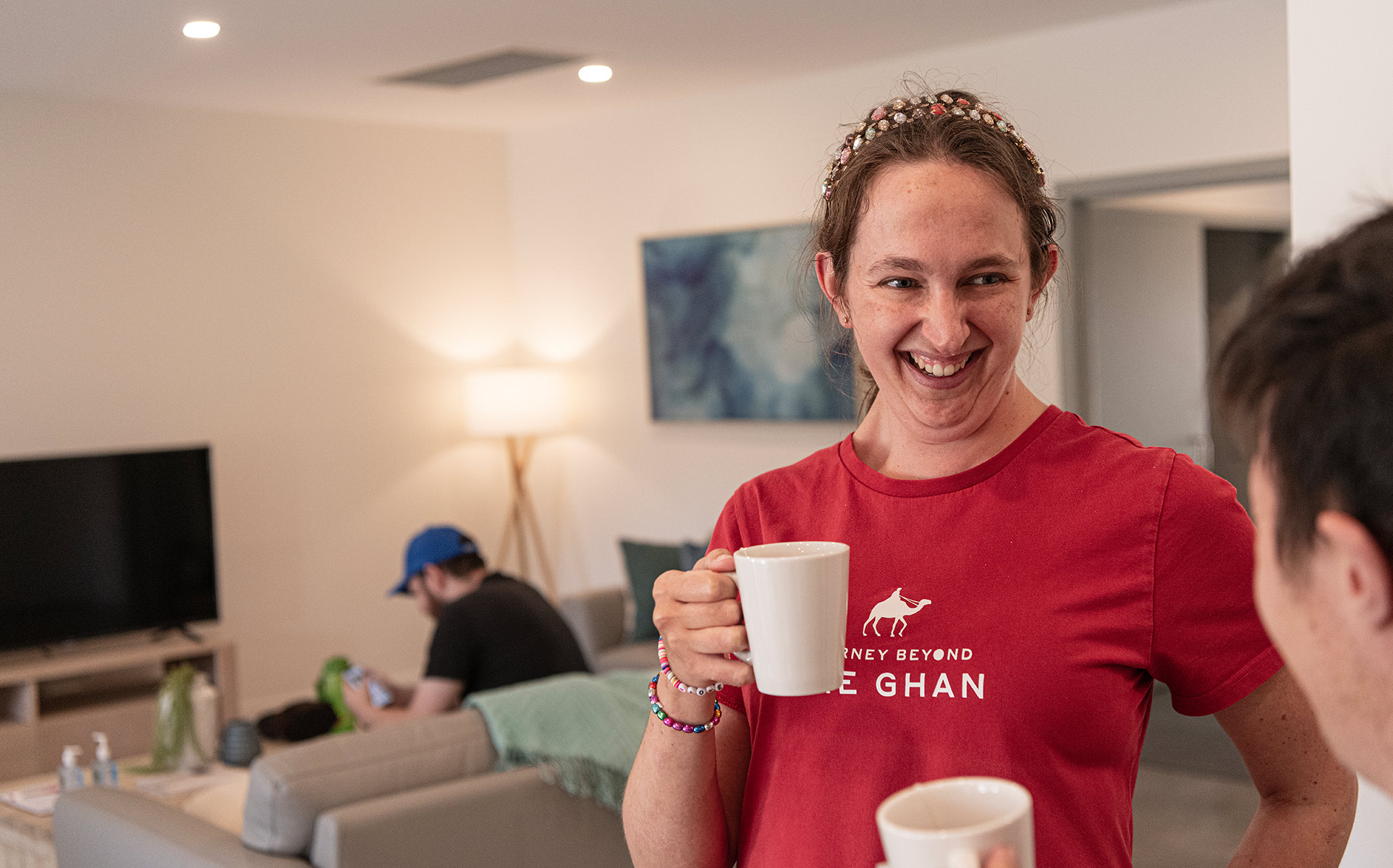
Far from still life
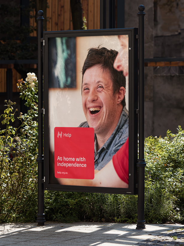
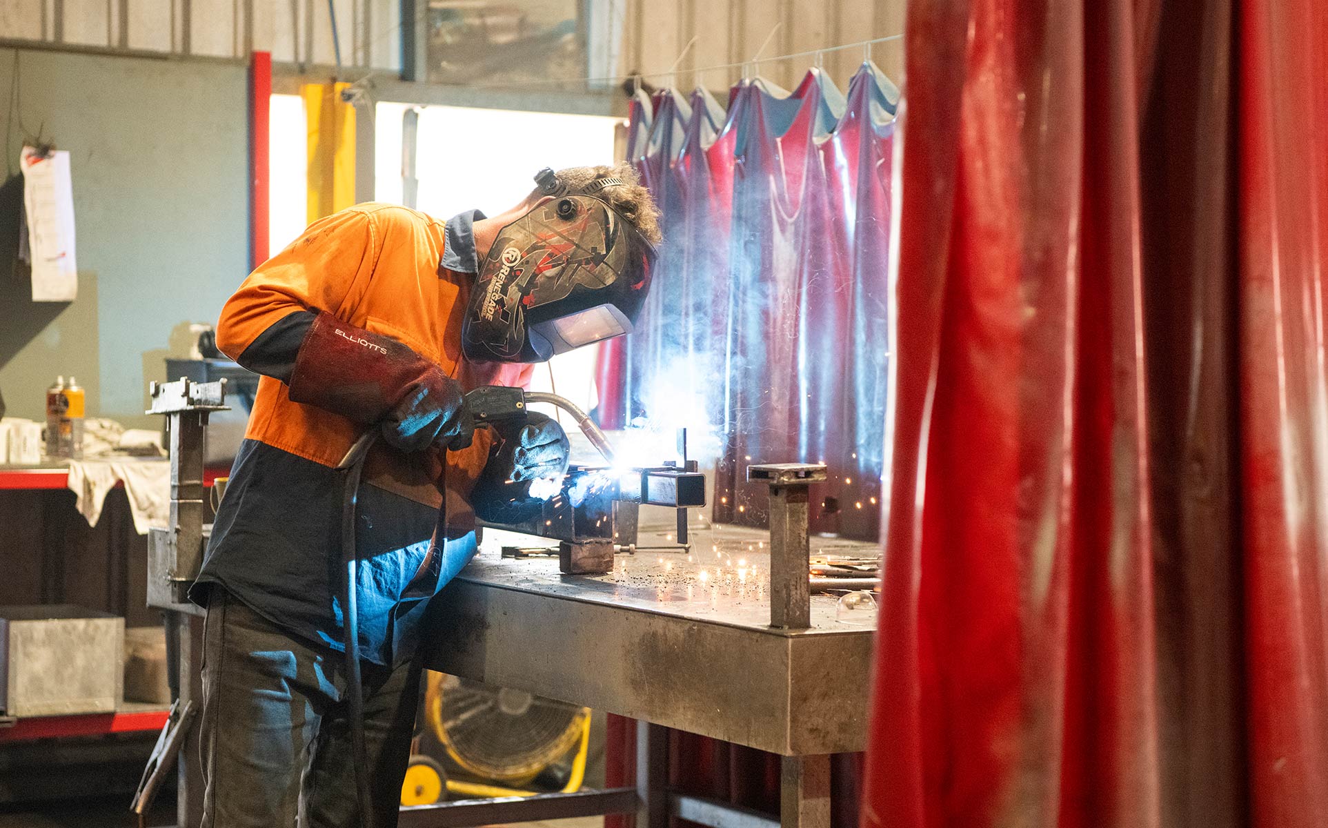
By focusing on real-life achievements and everyday moments of people with disability, our design counters the limited portrayal typically seen in the category. The photography style moves away from traditional posed images to more dynamic, interaction-focused visuals, highlighting genuine human connections and experiences.
Elevating accessibility
Honouring the Help’s brand legacy, we updated the primary shade of red from pillar-box to a contemporary ruby. Accessibility was a big consideration in this project—every colour in the secondary palette meets WCAG 2.0 AAA standards, with a WCAG 2.0 AA compliant crimson in the primary palette to further assist with accessibility.
To enhance content clarity and readability, we introduced the ’tile’ graphic device. This tool is specifically designed to enhance the legibility of key information within complex layouts, making it easier for everyone, including those with visual differences, to navigate and understand Help’s communications.
- Industry
- Partners
OMNI.X Studio
Aaron Tait Photography
- Services
Brand strategy
Logo
Visual identity
Design system
Tone of voice
Messaging
Photography
Film production
Video post production

Our brand refresh unites all Help services, stakeholders and sub-brands behind one simple and memorable brand idea—‘one door to open many’. It unlocks the story of how Help opens up possibilities for people with disability. Driven guided us through a process that made our complex story accessible to all—including our own team who can more confidently share our story.
Lara Thompson | Chief Experience Officer, Help Enterprises