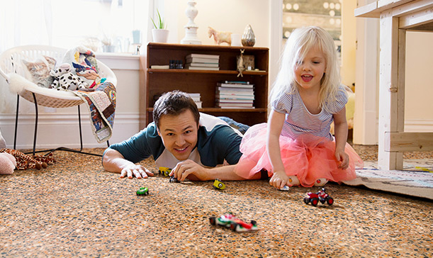
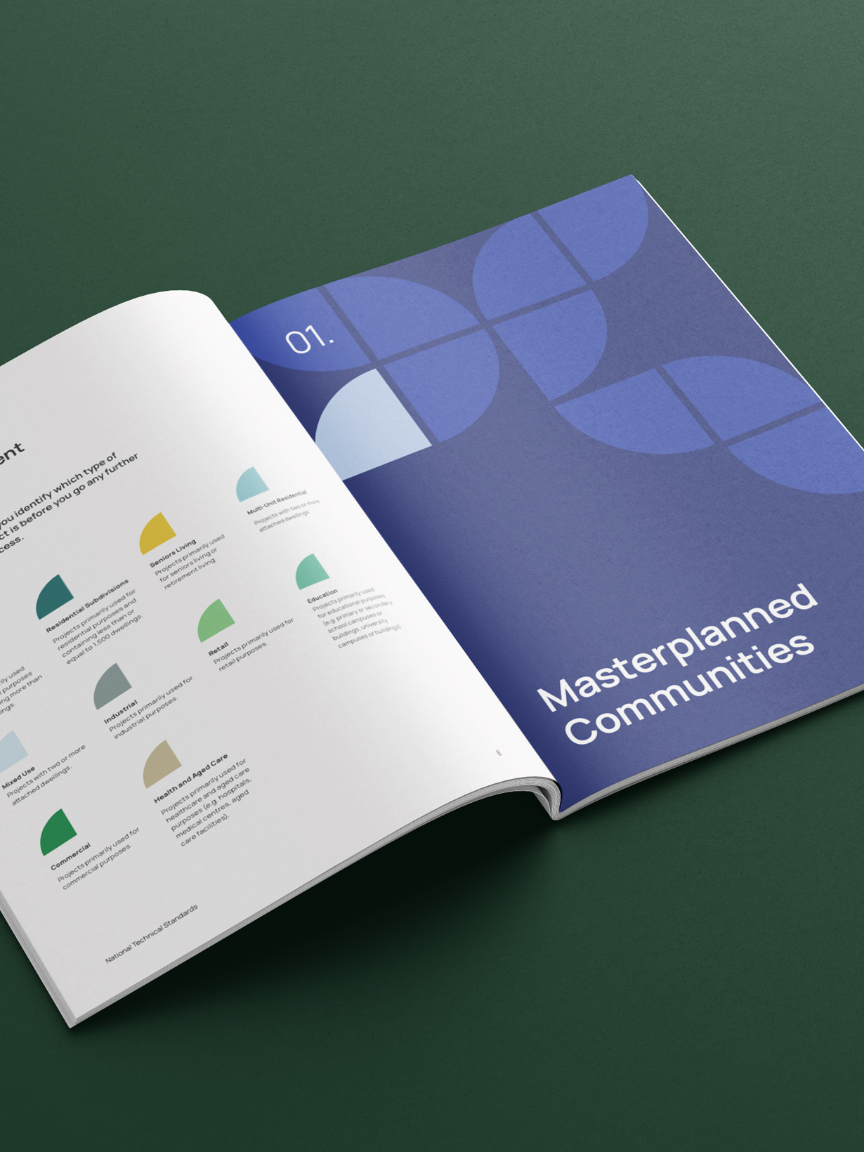
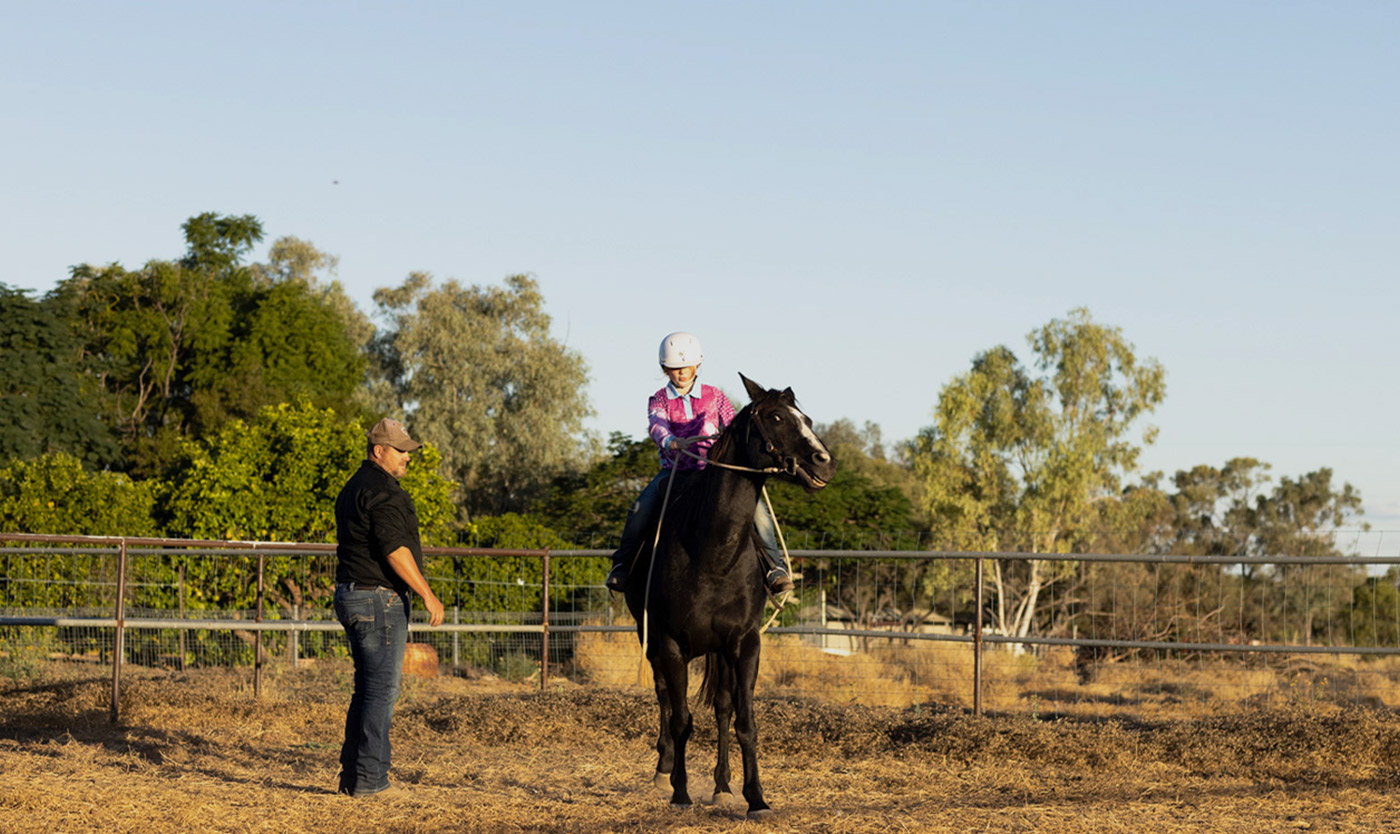
Internet service
Skymesh
In 2005, a small internet provider set out to connect the corners of Australia that the city often overlooked. Today, Skymesh has become a lifeline for people living beyond the reach of fibre broadband—delivering internet access where others don’t. But with a growing business and bigger ambitions, it was time to give Skymesh’s brand the same level of care they extend to their customers.
Looking to refresh their identity, website, and customer portal app, they turned to us to help them make it happen.
Read more 
Beyond brass tacks
Like so many others in their industry, Skymesh had fallen into the trap of leading with its technology. This came through loudly in their identity system, where all visual communication took its cues from conventional internet symbolism. The logo incorporated a WiFi icon; the primary graphic device—a gridded ‘network’ overlay; imagery exclusively focused on subjects tapping away on ipads and computers. By leaning on generic symbolism throughout their brand, from the outside, Skymesh presented itself as ‘just another ISP’. And after getting under the hood of the brand, we knew that wasn’t the case.
In a market where everyone taps into the same network infrastructure, what actually sets Skymesh apart isn’t speed or price (any ISP can play that game)—it’s how they show up for regional Australians. Whether troubleshooting a tricky connection issue or seeing to it that every customer is met with warmth at every interaction, Skymesh has earned its stripes by consistently taking care of the person on the other end of the line.
The sunshine spirit
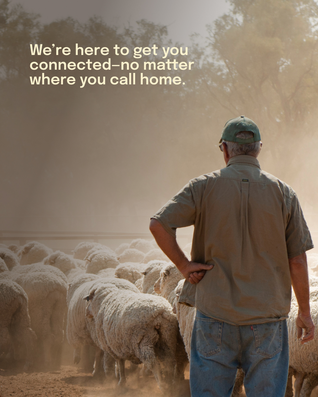
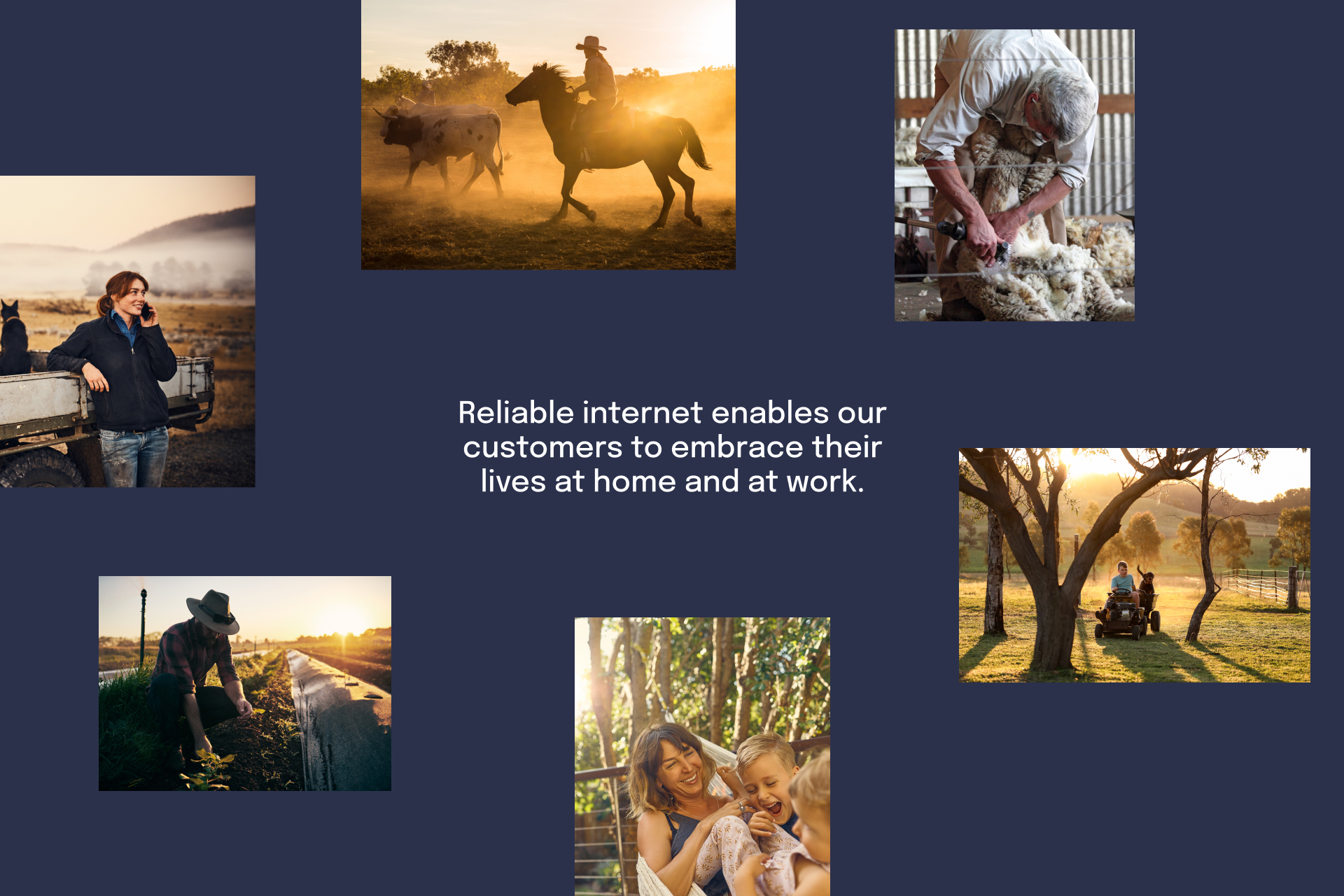
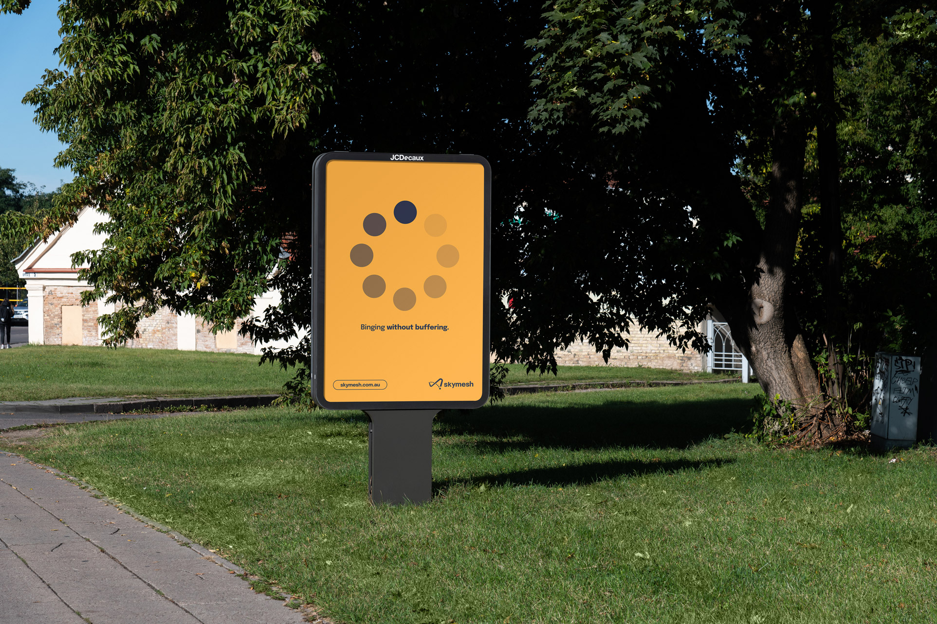
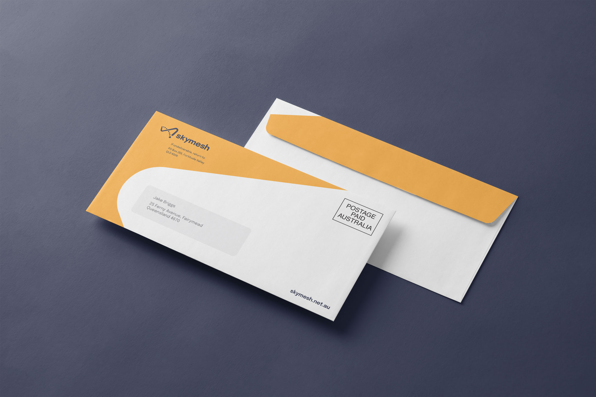
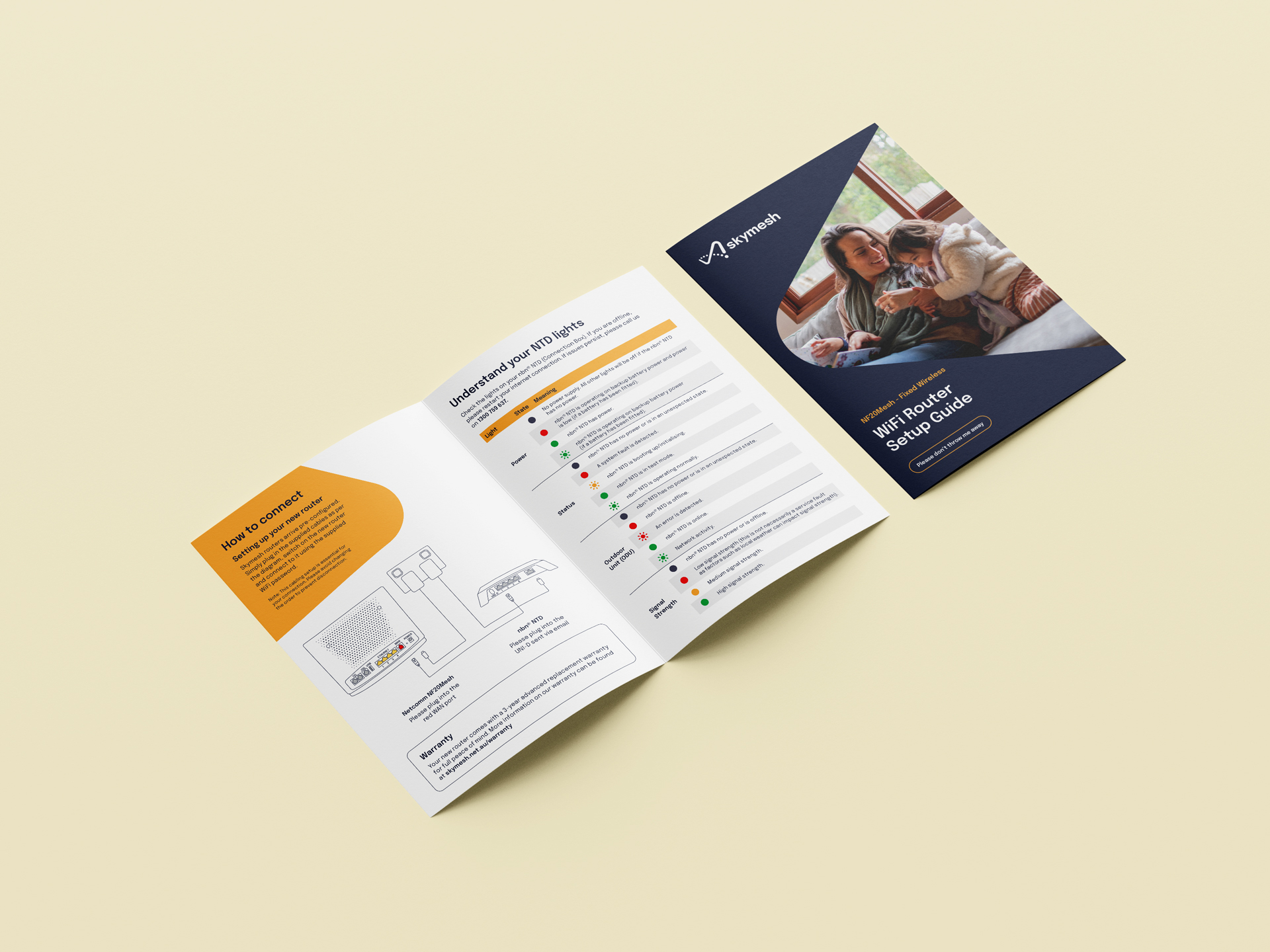
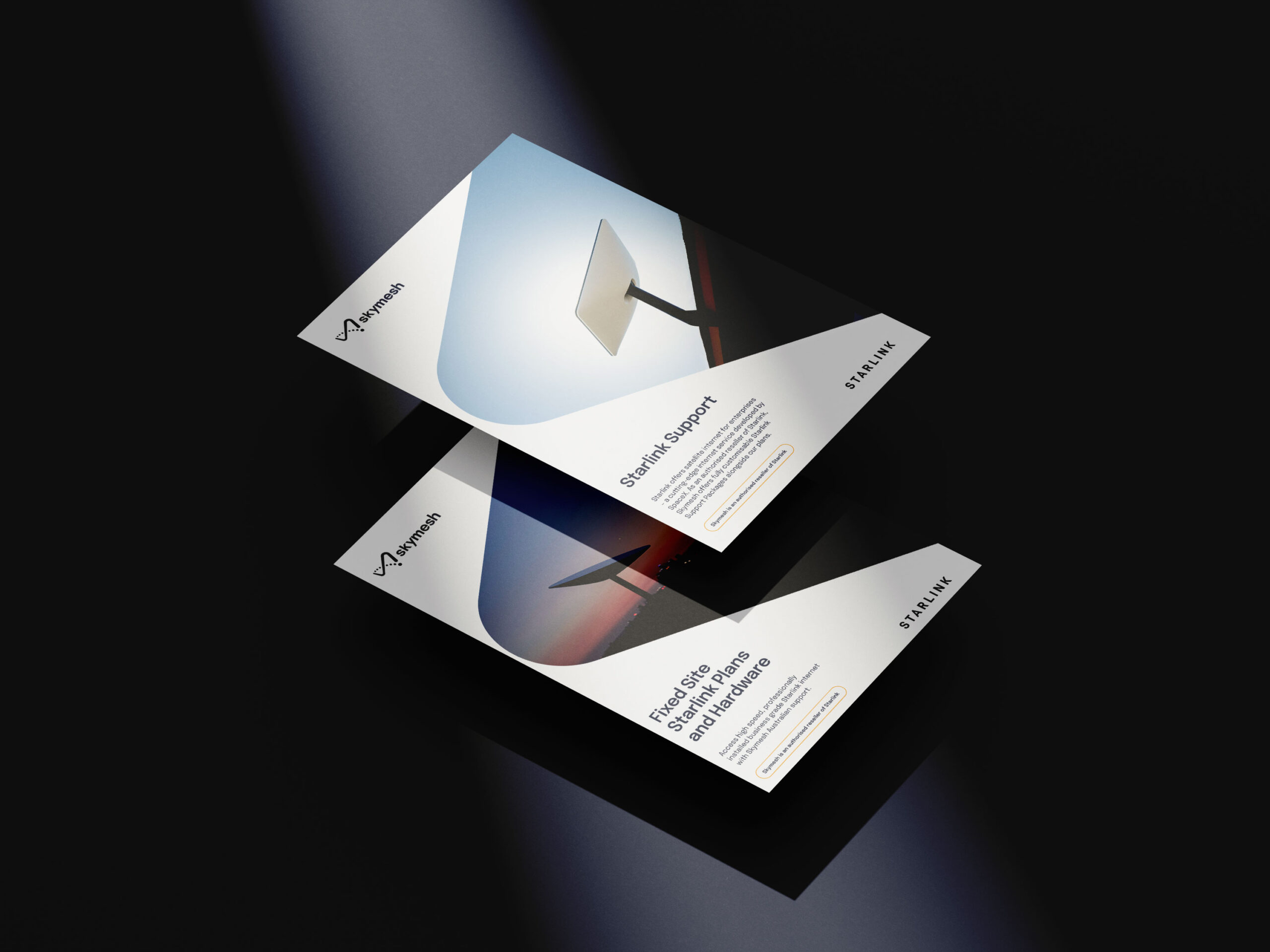
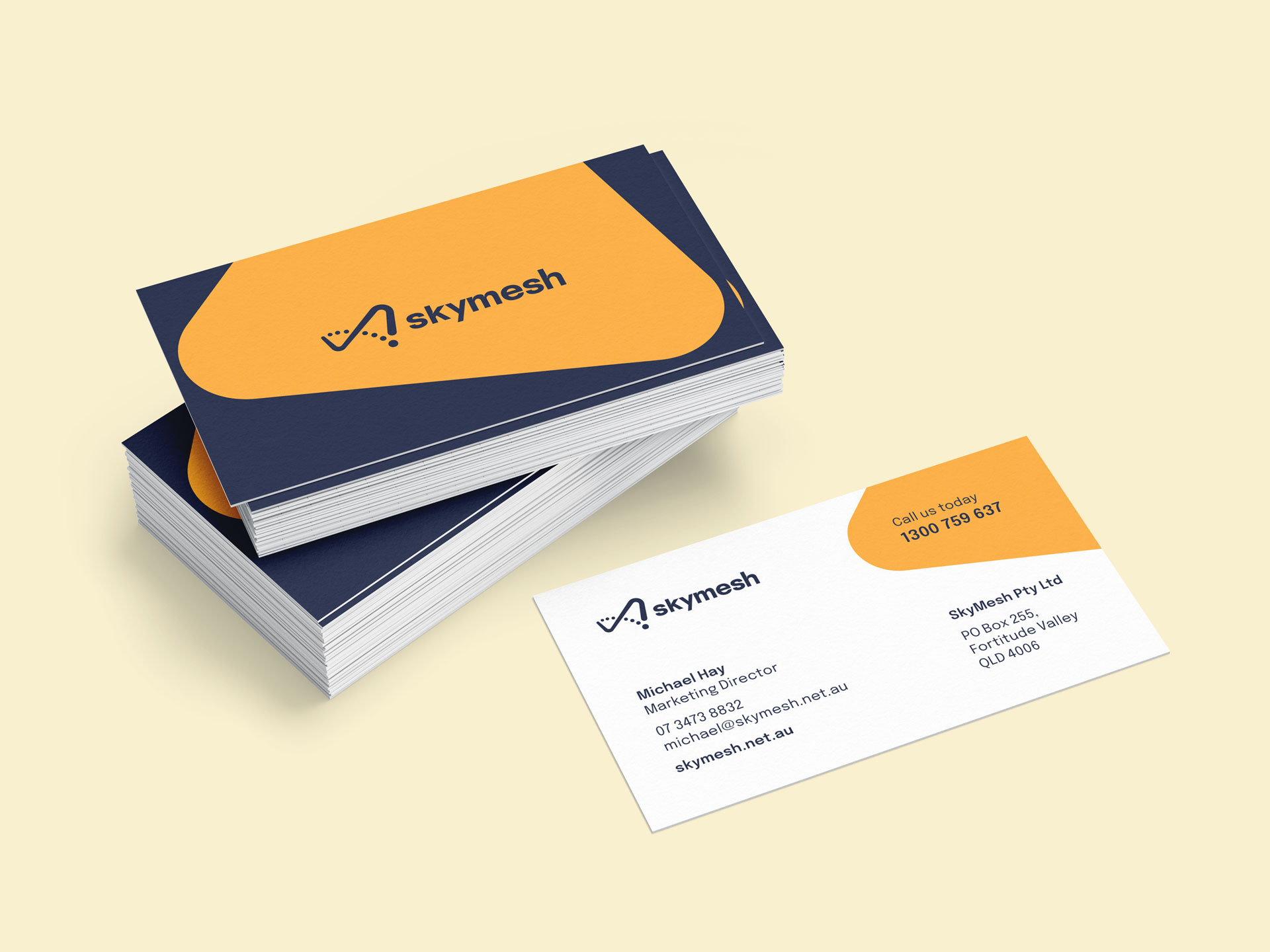
Quintessentially Australian, Skymesh’s can-do culture became the source inspiration for the identity. Shifting an infinity symbol into the shape of Australia, the logo communicates the endless possibility of a well-connected country; the palette simulates the colours of the land and sky; and the photography direction puts the tech on the backseat, giving the stage to the everyday lives of Skymesh customers. It’s an identity that says, “We’re here to get you connected—no matter where you call home.”
Designed for digital
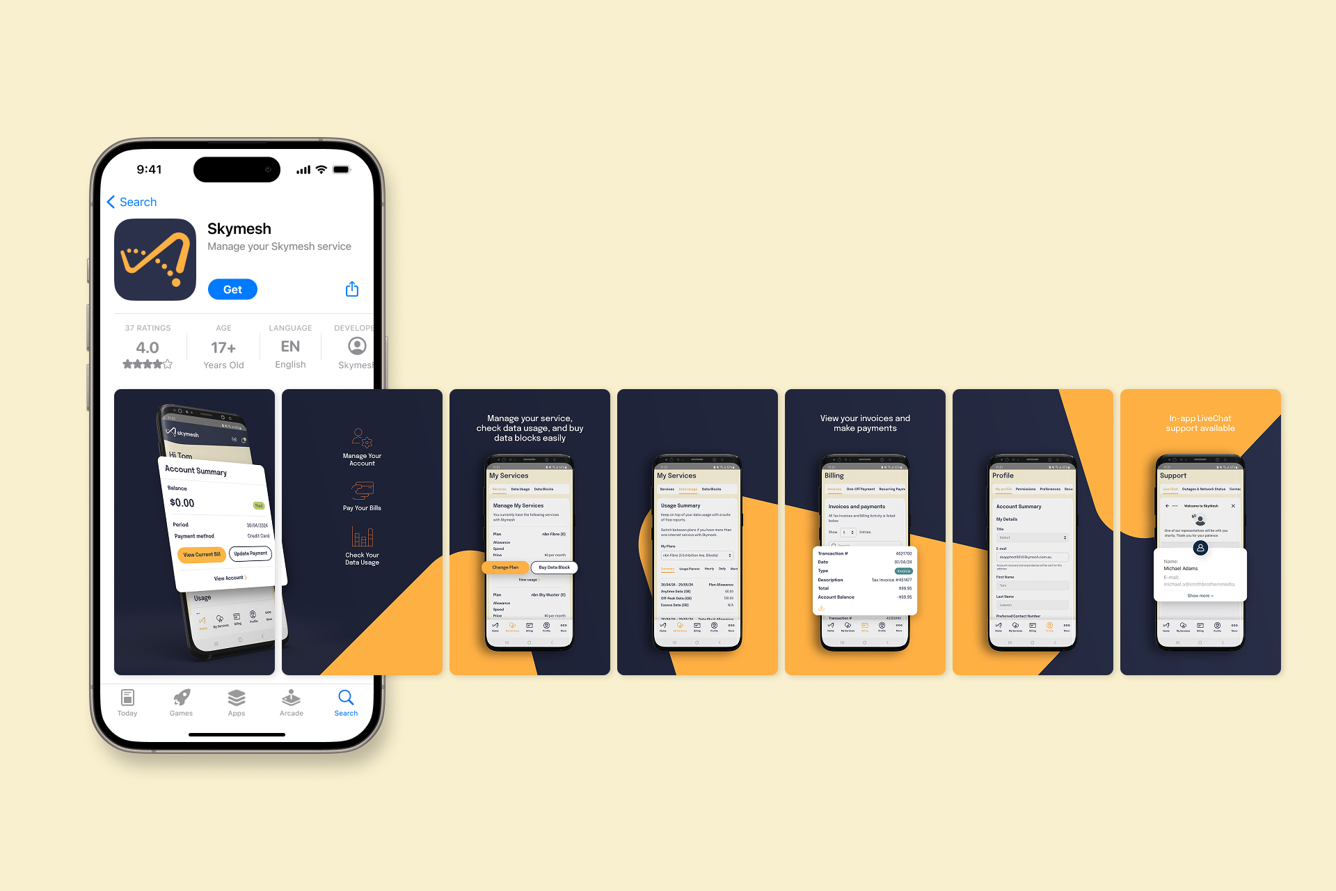
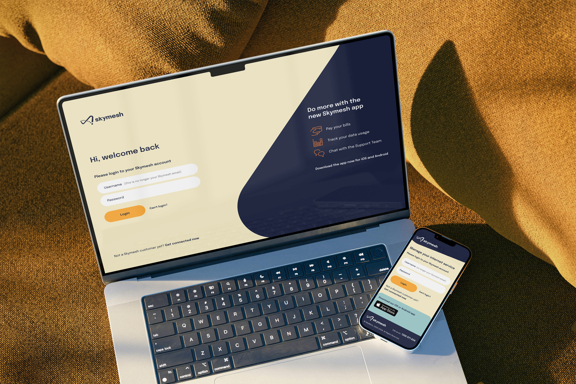
This refreshed spirit carries over into Skymesh’s new website and customer portal phone app, where straightforward navigation and friendly visuals make it easy for users to find the plan or service they need—without wading through tech jargon. Regional Australians can check coverage, compare options, and reach out for support in just a few clicks. We kept the brand’s warmth front and centre, leaning on down-to-earth language and crisp, consistent layouts to keep it unmistakably Skymesh.
By pulling the focus away from shiny bells and whistles, the site places real people and real needs at the heart of the experience—making sure every Aussie, from remote cattle stations to country towns, feels welcome and well looked after. It’s the same approach that Skymesh has championed since 2005—only now, the brand that shows it off is every bit as straight-talking, down-to-earth, and genuinely local as the team behind the scenes.
- Industry
- Partner
Flip (Web development)
- Services
Brand identity
Messaging
UX & UI
Rollout
Building the future
XLAM
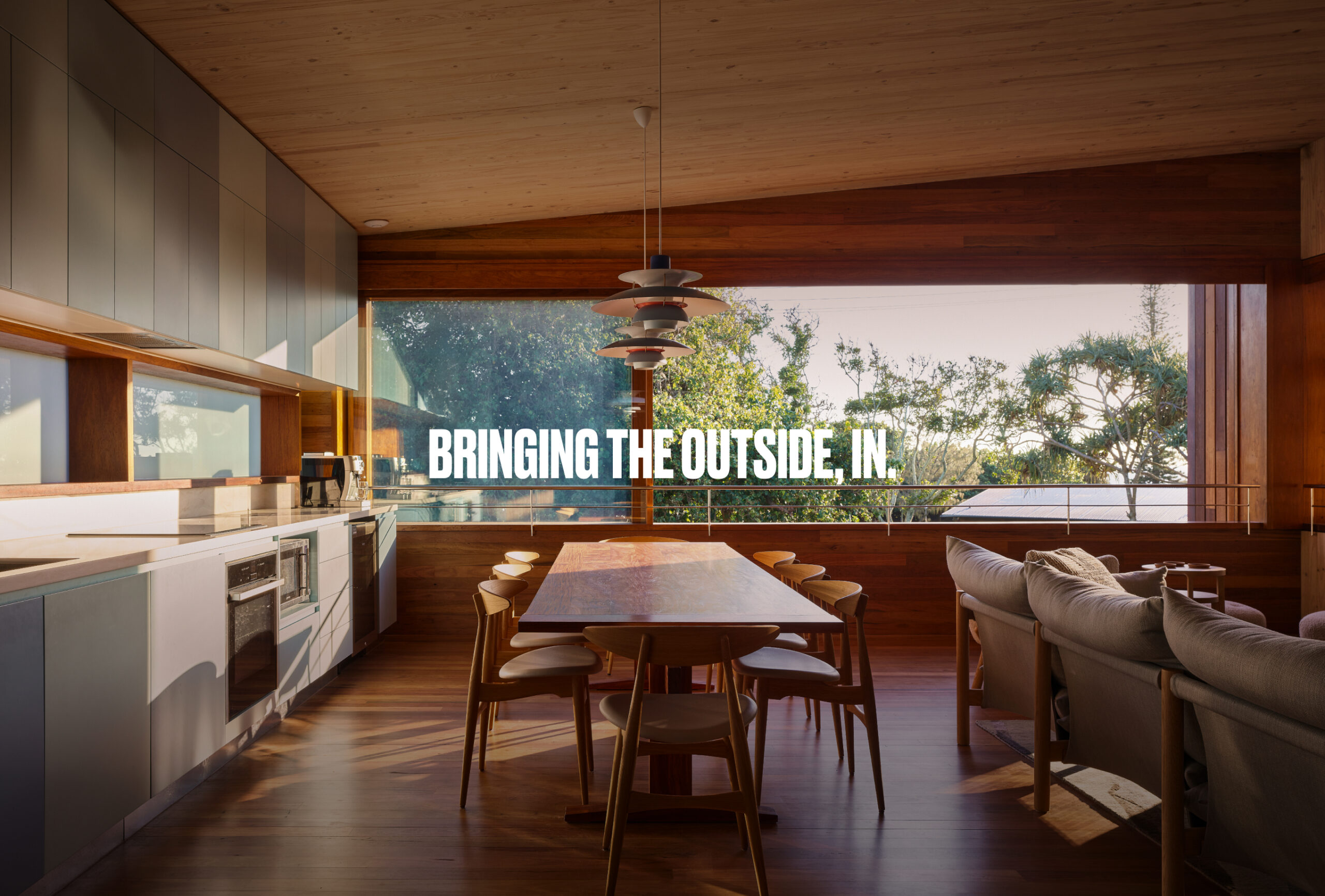
With construction touching nearly 40% of all global carbon emissions, the industry is ready for a new way of thinking.
Enter mass timber: a material that not only replaces steel and concrete but does so with a net-negative embodied carbon footprint. Leading the charge in Australia and New Zealand is XLAM, the force behind some of the Asia Pacific’s most groundbreaking sustainable buildings.
Ready for the next step in their evolution, XLAM enlisted us to bring their online presence up to speed—showcasing the bold thinking that defines every build.
Read more
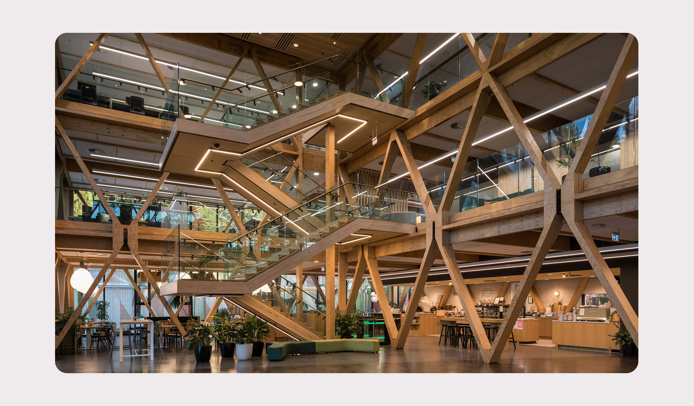
Build like the world depends on it
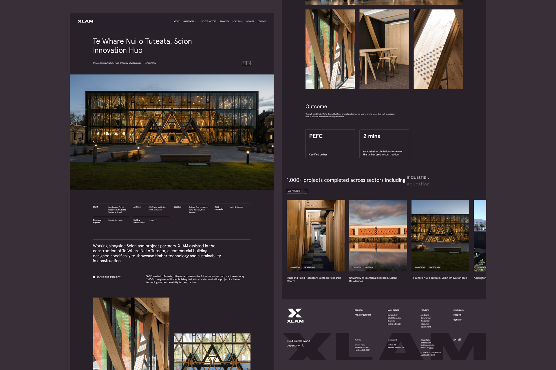
While XLAM had blazed the trail for mass timber in Australia and New Zealand, their website lagged behind. It was static, graphics were subdued, and the copy spoke with barely a whisper—hardly fitting for a brand pioneering net-negative building materials. Collaborating with the Hyne Group marketing team, which oversees XLAM, we redesigned and developed a new site that cranked up the XLAM brand, showing the world what true innovation in sustainable construction looks like.
Changing perceptions
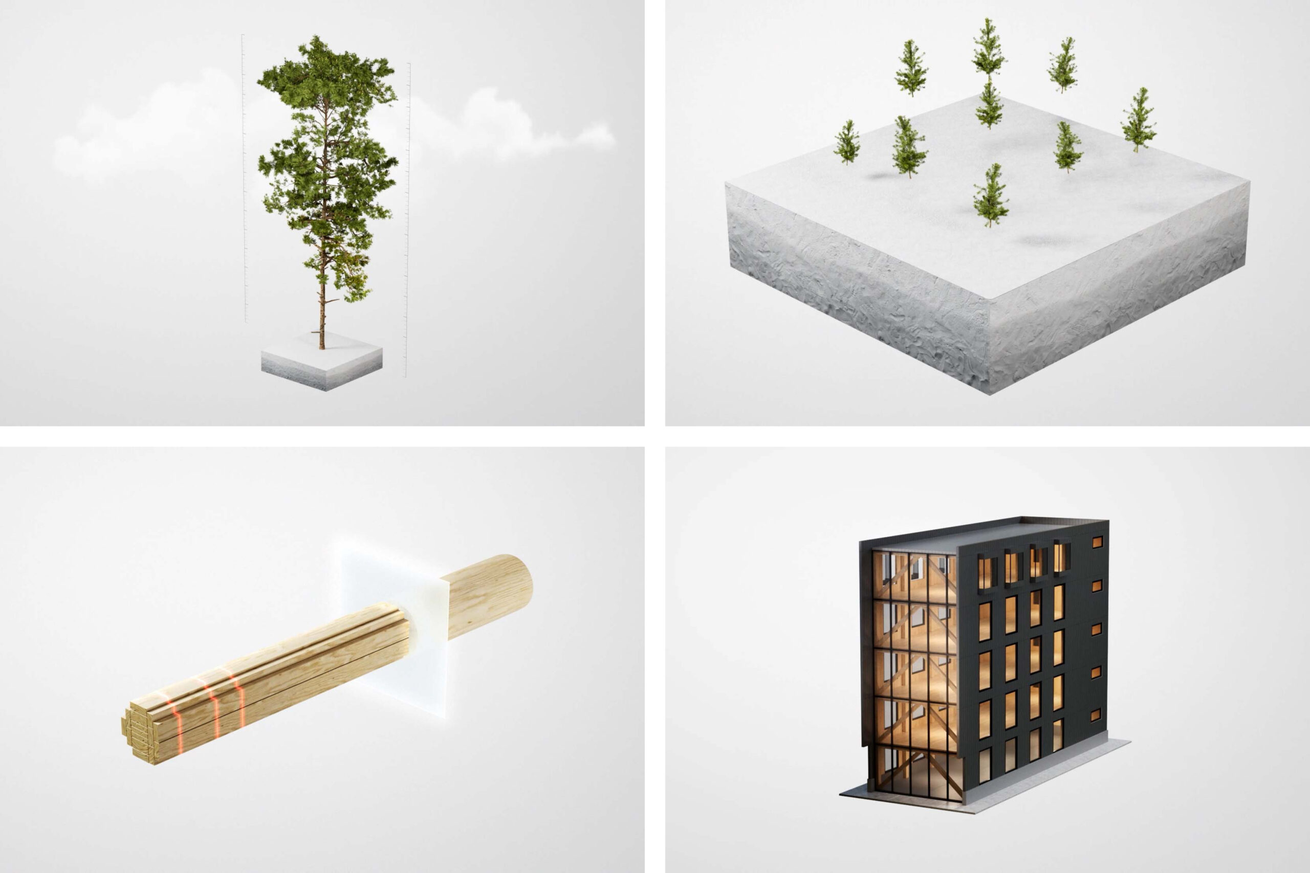
Despite XLAM’s leadership, one major hurdle remains: when people think of “timber” in construction, they picture framing, flooring, or small-scale builds. It’s hard to imagine multi-storey structures built entirely of mass timber—no concrete, no steel. To flip that mindset, we teamed up with RUCKUS to create a series of scroll-through animations that trace mass timber’s journey from seed to site, along with 3D renders that peel back the layers—revealing how XLAM’s products make these ambitious builds possible.
Welcoming interaction
Every corner of the new site invites exploration. From rollover details to interactive animations, each custom-developed feature pulls visitors deeper into the XLAM world. Big, full-width layouts and generous imagery give XLAM’s projects the spotlight—drawing attention to the awe-inspiring scale and ambition behind each structure. It’s a digital experience that captures XLAM’s commitment to redefining what’s achievable in sustainable construction—one step (and storey) at a time.
- Industry
Timber construction
- Partners
Ruckus Studio
- Services
Copywriting
UX & UI
Web development
Home to community creators
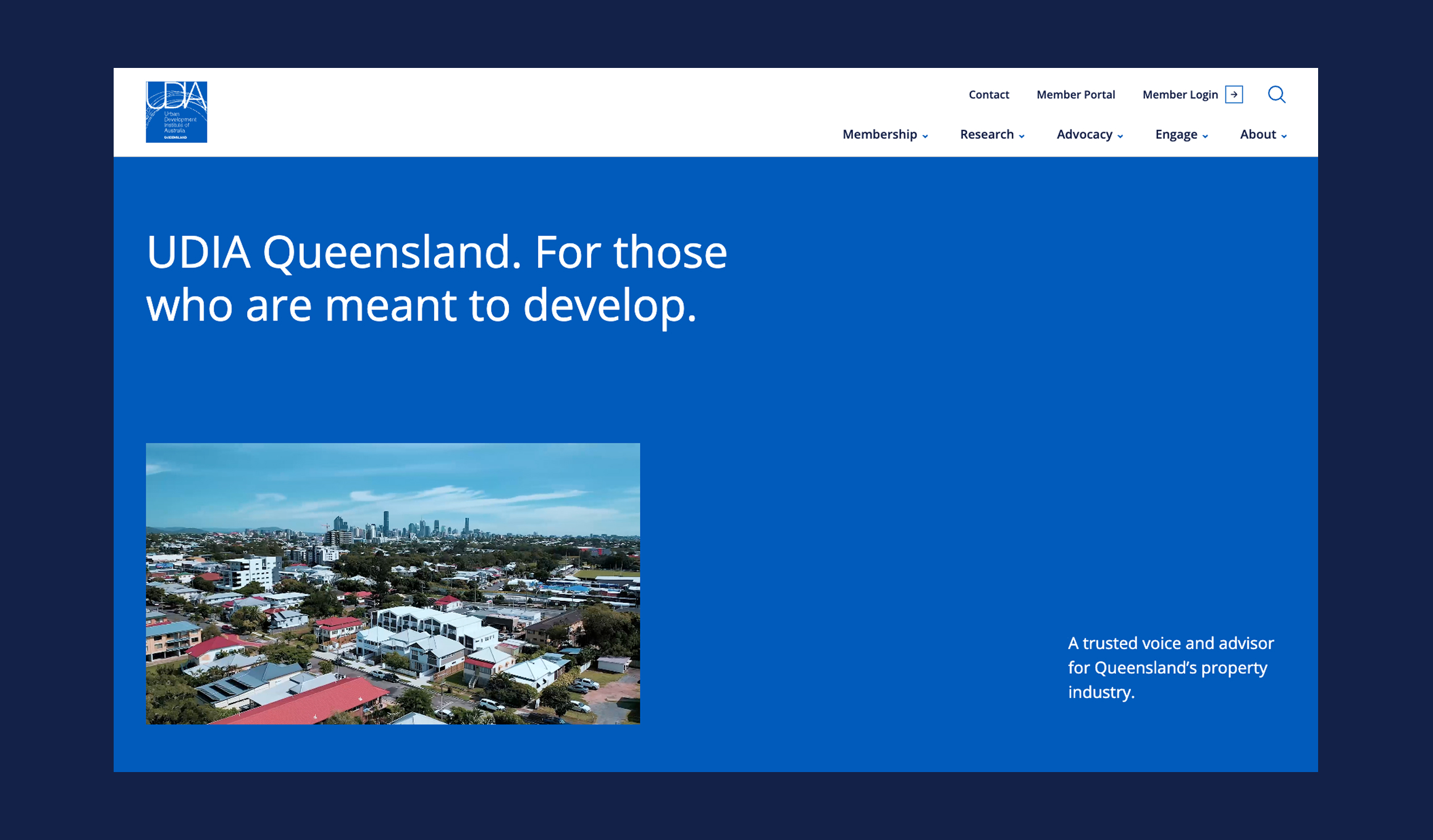
UDIA QLD
Queensland is on the move. In 2024, just over five and a half million people called the Sunshine State home—but by 2044, that figure’s expected to rocket past 8.6 million. More people means more homes, more roads, more everything. In short, Queensland needs developers—and developers need a strong, united voice.
And this is where the Urban Development Institute of Australia (UDIA) QLD comes in. As the peak body representing the property industry, they champion new thinking, shape policy, and bring together the minds creating Queensland’s communities. But as the state’s population soared, so did the demands on UDIA’s digital presence.
They turned to us for a website that reflects their mission-critical agenda and unites an industry holding Queensland’s future in its hands.
Read more
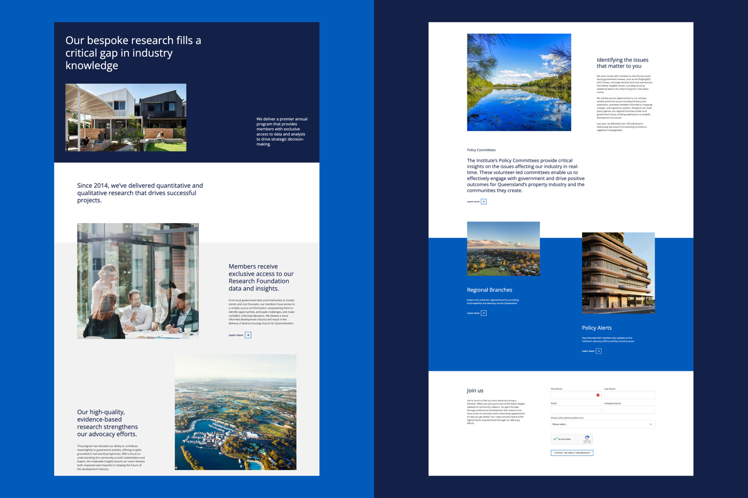
Inviting Queensland in
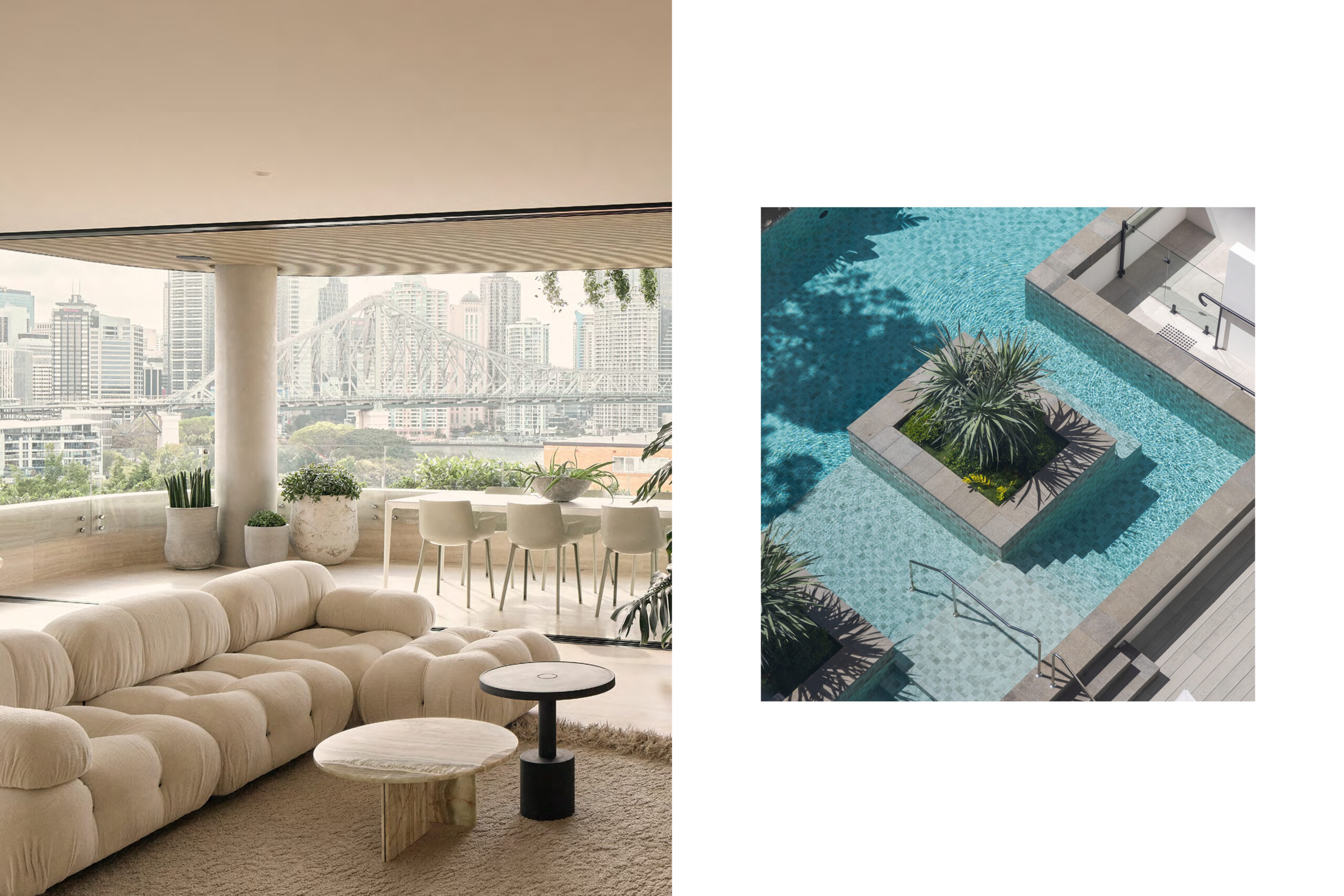
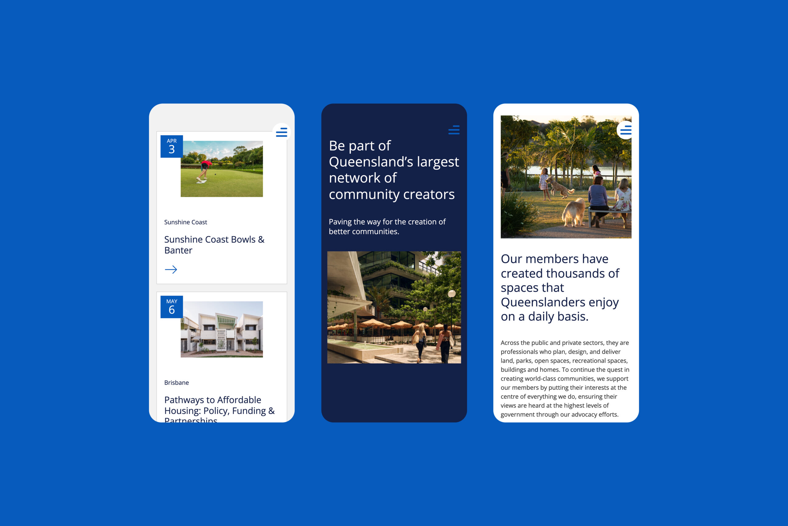
Built years ago, their website was static, hard to navigate, and didn’t live up to the organisation’s role as the driving force behind Queensland’s property industry. It delivered information but stopped short of drawing people in or showcasing the scale of UDIA QLD’s impact.
The new site flips the script. With bold visuals, interactive elements, and layouts that balance variety with clarity, it’s designed to pull visitors into the UDIA story. Every page invites exploration, unfolding the bigger picture of how the institute supports Queensland’s growth—and why that matters to everyone who lives here.
Closer connections
For an organisation that exists to be the voice for its members, UDIA QLD needed more than a fresh coat of paint on their public-facing site. They needed a way to deepen their connections within their network—a way to put industry insights, policy updates, and specialised resources in the hands of those shaping the Sunshine State’s bright future.
We built a members-only portal that does just that. A seamless, intuitive space where members can access exclusive content without friction. Now more than ever, members are dialled in—they are sharing knowledge, exchanging ideas, and more connected than ever to their industry’s biggest champion, UDIA QLD.
- Industry
Urban development
- Services
Digital strategy
UI design
User experience
Web development
Motion design
Messaging
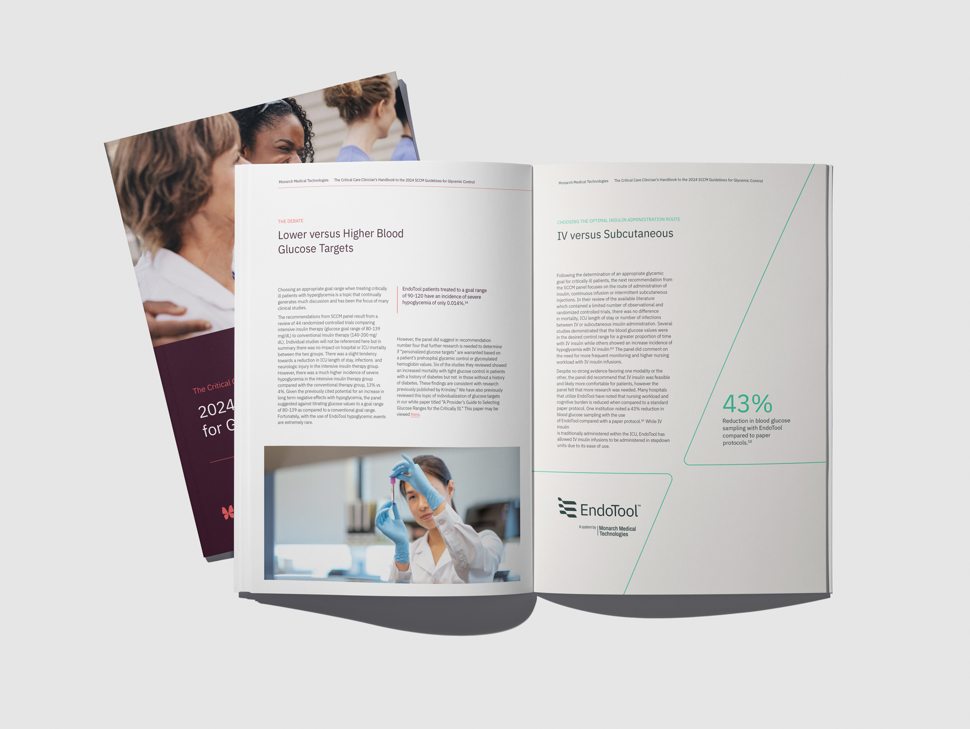
Bringing clarity to critical care units
Monarch Medical Technologies
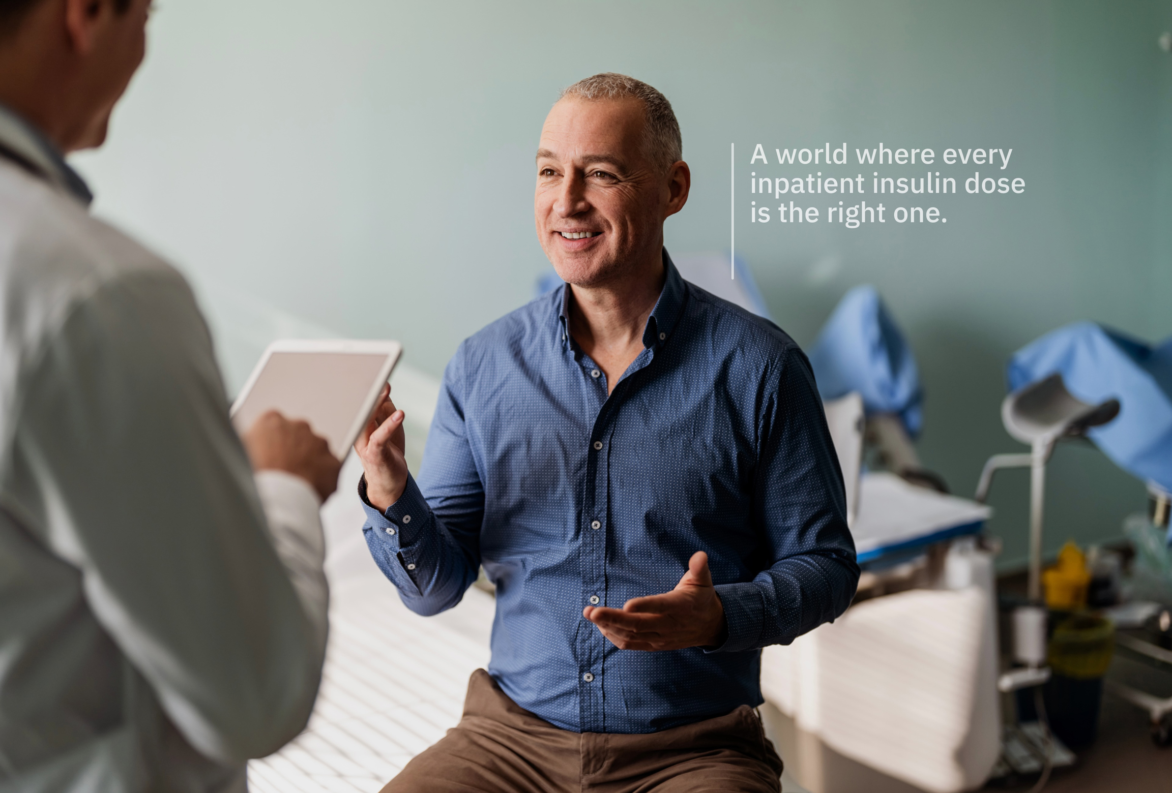
Monarch Medical Technologies is a medtech group specialising in precision insulin technology. Their flagship product is the EndoTool glucose management system—a software application providing hospitals with a streamlined, safer method for inpatient insulin management.
As the company and product have grown over the past 20+ years, they found themselves at a key juncture. Recognising the need to evolve their brand, they engaged us to clarify what makes them unique in the market, hone their message, and redefine their visual identity.
Read more
Cracking the code on insulin
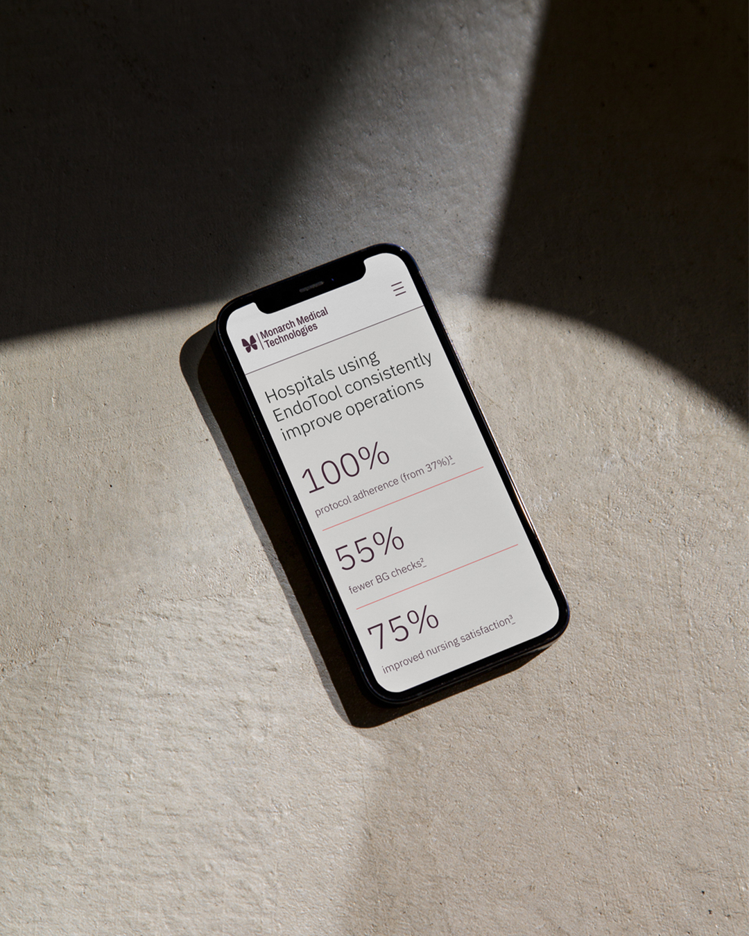
In intensive care, controlling patients’ glucose levels is crucial. Steady blood sugar helps prevent infection, delayed healing, and organ failure. It helps patients’ recovery in the immediate moment and in the long-term. The key to controlling glucose levels? Insulin—a drug hospitals know to be life-saving and rife with risk.
You see, hospitals have an insulin problem. More hospital drug errors are linked to insulin than any other medication. Getting the type, dose, and timing of insulin right requires a complex calculation—and the industry still relies on pen and paper to figure it out. Hell-bent on finding a way to improve insulin management in hospitals, Monarch Medical Technologies created EndoTool.
Clarity in care
Much more than a fast-tracked way of calculating insulin dosing, EndoTool’s algorithm uses the patient’s individual data points to generate a personalised glycemic management plan. However, to stand out from the market—a market that’s more comfortable discussing product features than human impact—we needed to dig deeper.
Our research led us to EndoTool’s end users—nurses. We quickly discovered that to nurses working in these demanding and often chaotic hospital environments, the act of shifting a complex task into something that is simpler and more manageable is not just helpful—it’s a powerful act of support.
In this way, the value of EndoTool doesn’t hinge on its advanced algorithm or slick product features. The value of EndoTool is its ability to empower nurses with a simple, streamlined way of providing the best care to their patients. With this vantage point, we shaped the strategy around the core idea ‘Clarity In Care’.
Clinical precision, human impact
The EndoTool identity finds its footing in the intersection of technology and human impact—lifted with a good dose of fresh air. These worlds are brought together in the wordmark, where clean and robust letterforms are punctuated with subtle hints of warmth—curved shoulders, softened corners, distinctive inner and outer boundaries; in the fluid ribbons of the logomark, which draws inspiration from a blood glucose graph and shows sugar levels trending down and remaining steady; and in a palette that complements a foundation of full-bodied greens and neutrals with bright accents. These elements, along with the ‘pointer’ graphic device, come together to speak the language of clarity—adding up to layouts that feel focused in their message but as clean as fresh air.
The butterfly emerges
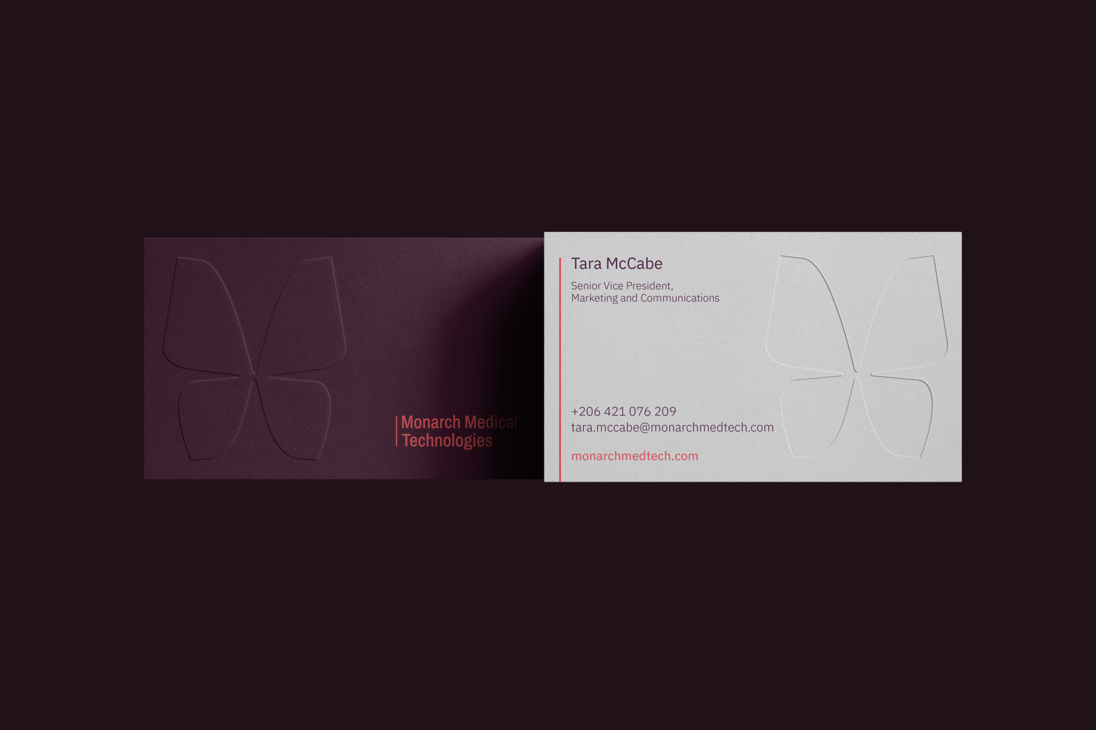
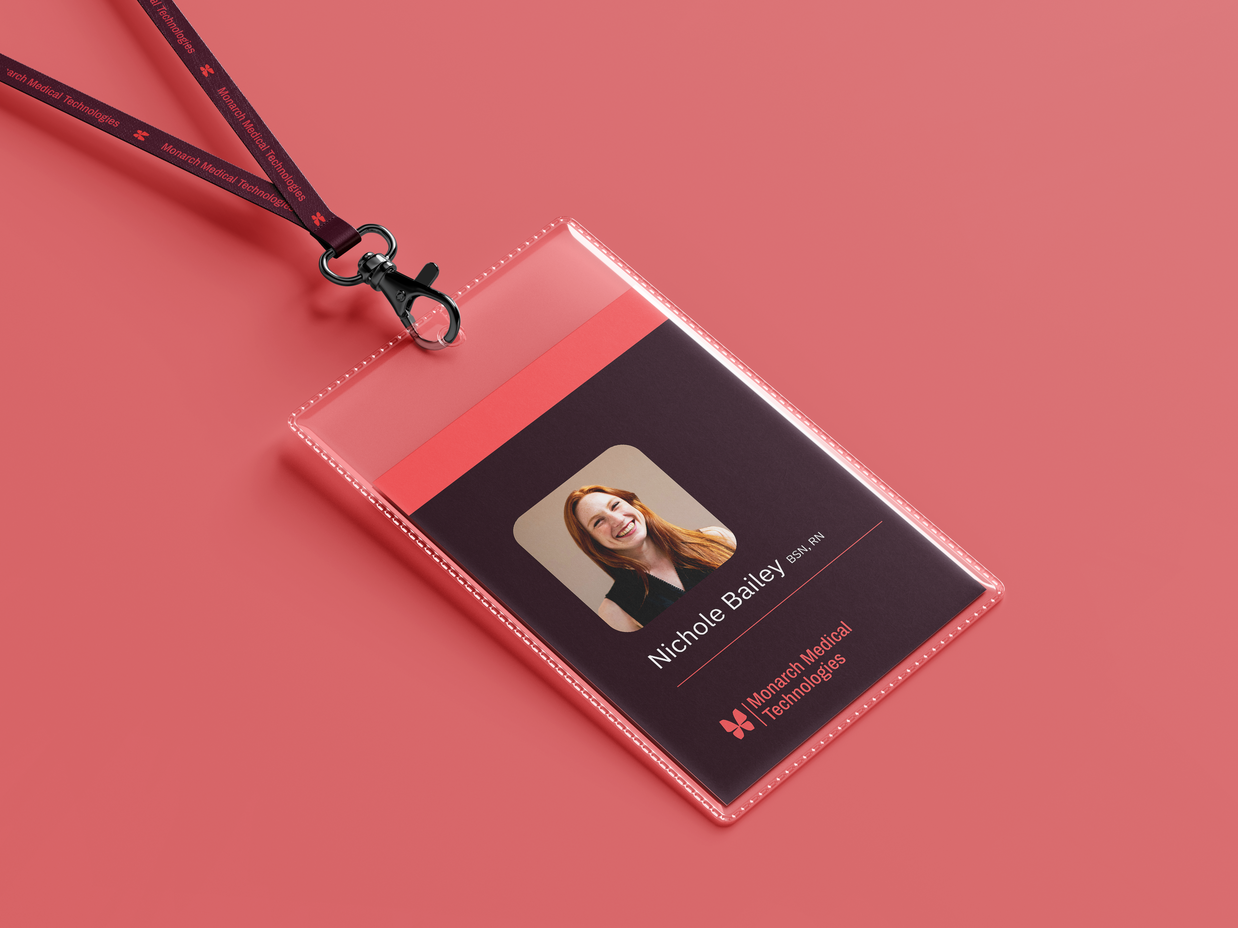
EndoTool is the platform, Monarch Medical Technologies is the creator. Keeping the door open to the possibility of future developments, the Monarch Medical Technologies identity is built with room to grow. A flexible 12-column grid and the ‘Stripe’ graphic device form a streamlined framework for everything from research papers to marketing collateral. Combined with deep colours and a geometric refresh of the butterfly brandmark, the identity upholds two decades of brand equity—and gives Monarch the space to stretch its wings.
A single vision
Bringing Monarch Medical Technologies and EndoTool together meant creating visual systems that feel distinct yet clearly interlinked—allowing each brand to stand on its own while lifting the other. This balance comes to life online, where a streamlined interface unites both brands (and their audiences) under a single promise of clarity in care.
- Industry
Medical technology
- Partners
Ruckus Studio
- Services
Brand strategy
Visual Identity
UI
Working with the Driven team on Monarch’s rebrand has been an amazing experience. They took the time to understand our vision, dug deep into the research, and delivered a fresh, strategic brand that exceeded our expectations.
Nicola Hunter, Senior Vice President, Marketing and Communications
A high quality agency that goes above and beyond to understand us and our markets. 2024 was a massive top line growth year for us, and our investment in Driven definitely help us get there, with an abundance of polish and professionalism along the way.
Charles Cornish, CEO
More projects
Enquire with us
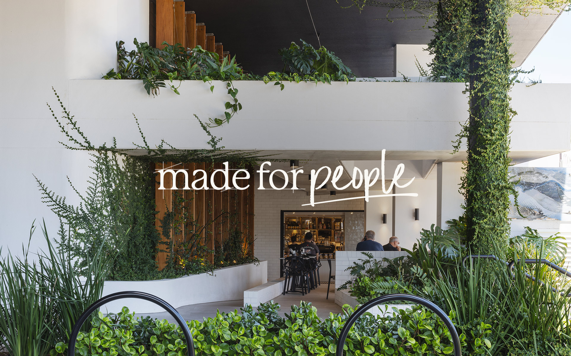
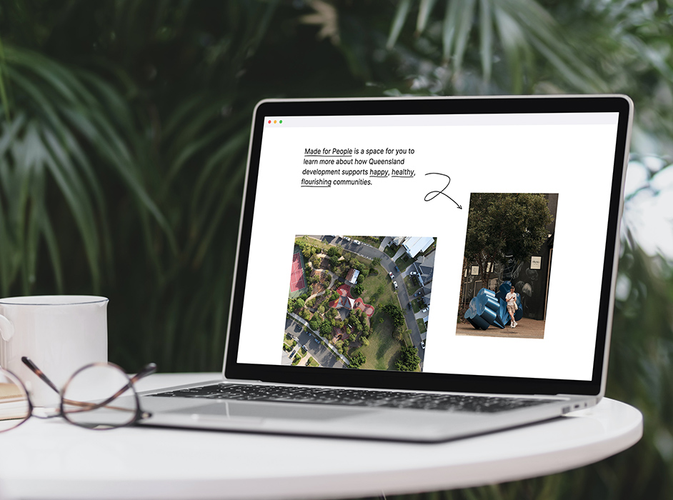
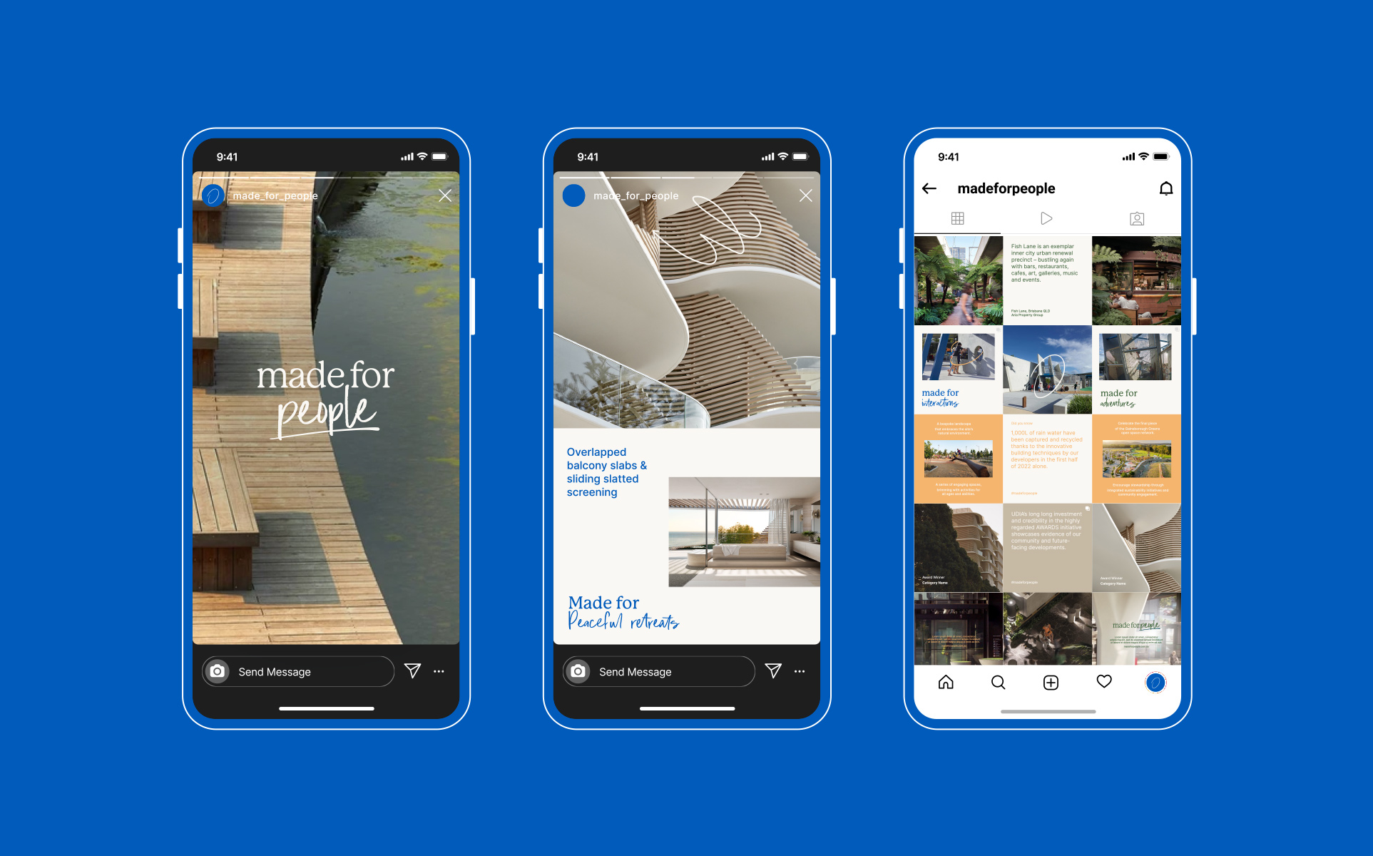
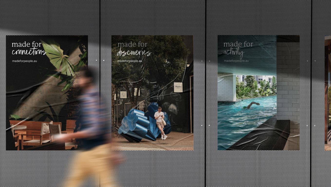
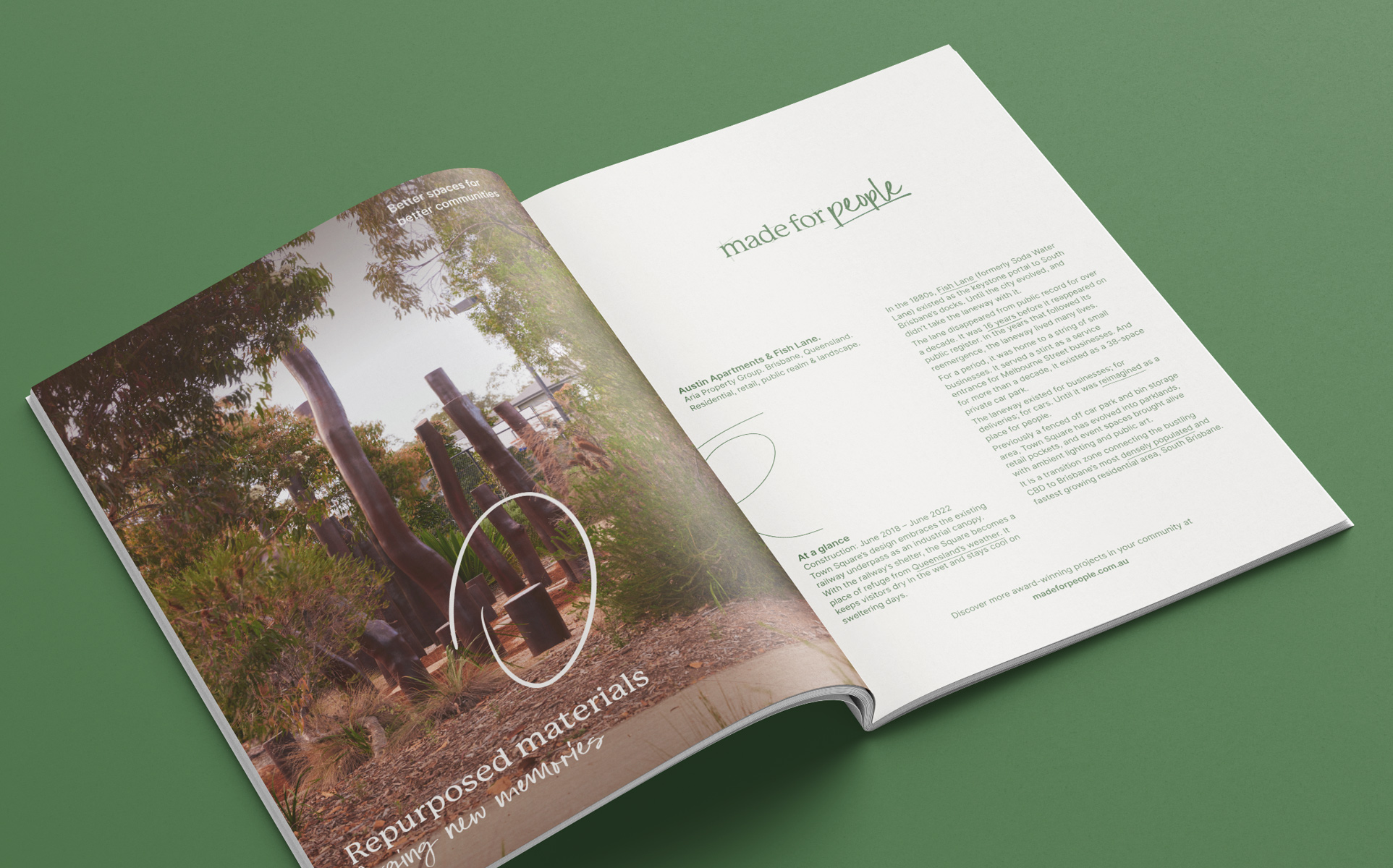
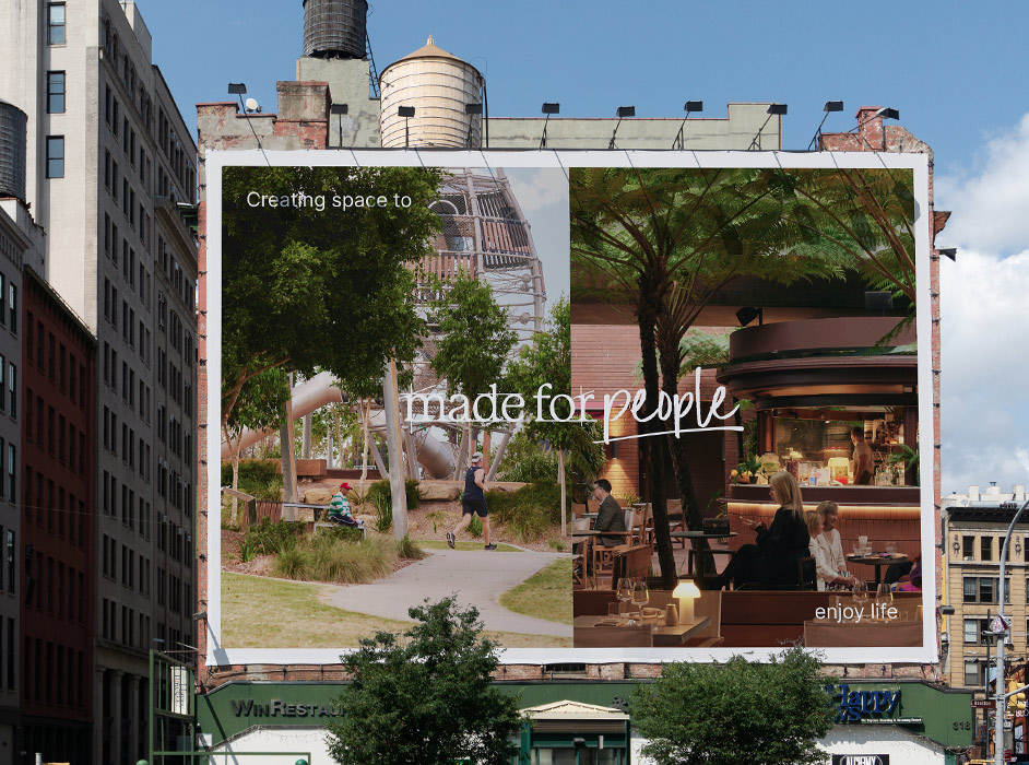
The campaign made for people
UDIA Queensland
As Queensland’s premier network of property developers, the Urban Development Institute of Australia (UDIA) is committed to shaping world-class spaces within our state. In recent years, misconceptions about the sector have come to shape public perception. To bring the real story of Queensland development into focus, we worked with UDIA to create Made for People — a campaign, brand, and platform.
Read more
Shifting the paradigm
In collaboration with market research firm Two Thirds Sky, UDIA explored public attitudes toward development and property developers in Queensland. This research unveiled a transformative insight: many people held the preconceived notion that property developers are responsible for population growth. Understanding that developers aren’t responsible for growth, but play a vital role in helping communities positively navigate it — was a powerful revelation.
Guided by this insight and the various audience truths unearthed through the research, we were challenged to engage state-wide residents in the real story of Queensland development and bring a voice to a group that has historically found it difficult to speak up.
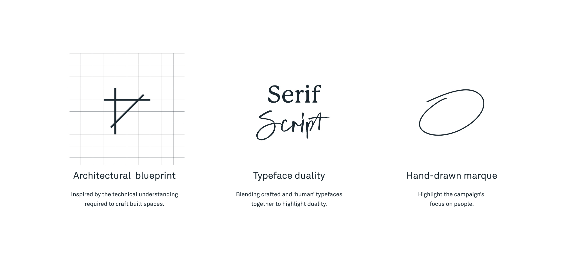
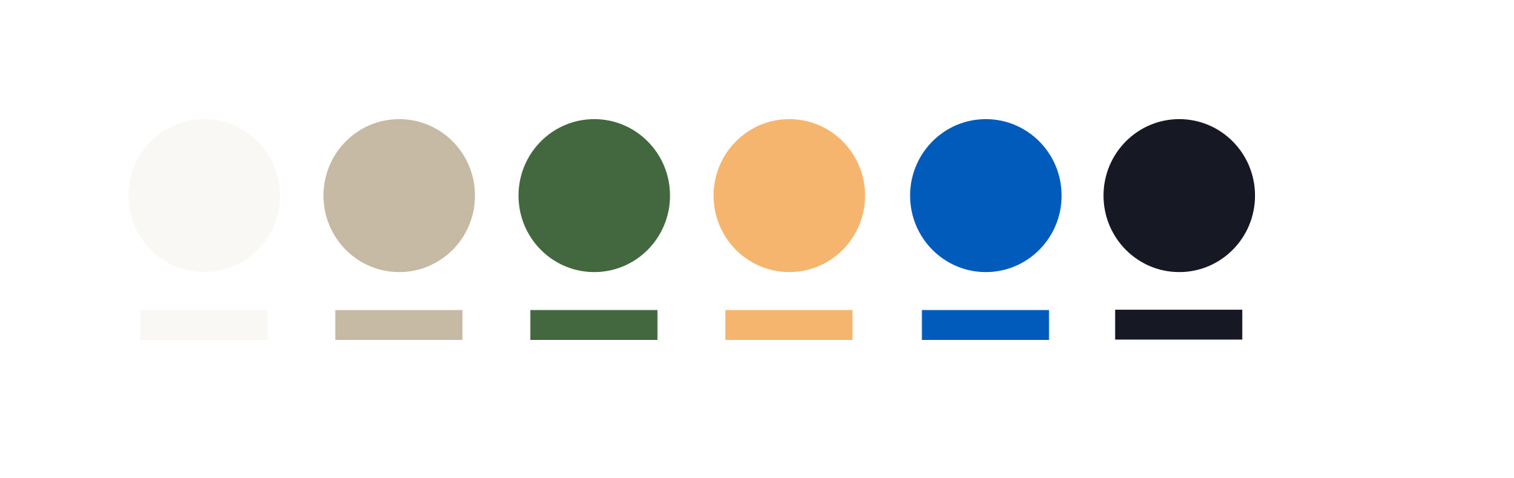
Built to endure
In the ongoing discussions about development, a key point is often overlooked: every project is built for people. Whether it’s a single building or an entire neighbourhood, its core reason for existence is to serve people. This idea comes alive in the Made for People brand identity. Our design language balances technical precision with human-centric elements; a mix of architectural accuracy and the real, everyday experiences; a bold blue colour palette offset by earthy tones.
Narrating reality
The brand video spotlights property development’s role in propelling progress, nurturing growth, and championing sustainability. Embracing the duality of humanity and craft, a captivating story emerges — the story of spaces and places that are made for people.
The bespoke website
In crafting the Made for People website, we aimed to transcend the conventional boundaries of government-led community initiatives and developer-centric campaigns. Merging architectural elegance with user-focused design, we created a bespoke platform that encourages exploration. The resulting website is a hub that educates and engages, amplifying the campaign’s mission to put people at the heart of Queensland’s development narrative.
- Industry
Urban development
- Partners
Two Thirds Sky
Cieran Murphy Photography
- Services
Visual identity
Brand messaging
Campaign development
Social media content
Photography
Digital strategy
User interface (UI)
User experience (UX)
Website development
Video production
Motion design
We’ve been overwhelmed by the response from our members and stakeholders and we’re really looking forward to continuing to share our members’ stories, which are ones of passion, innovation, and enduring endeavours to make people’s lives and communities better.
Kirsty Chessher-Brown | CEO, UDIA Queensland
More projects
Enquire with us
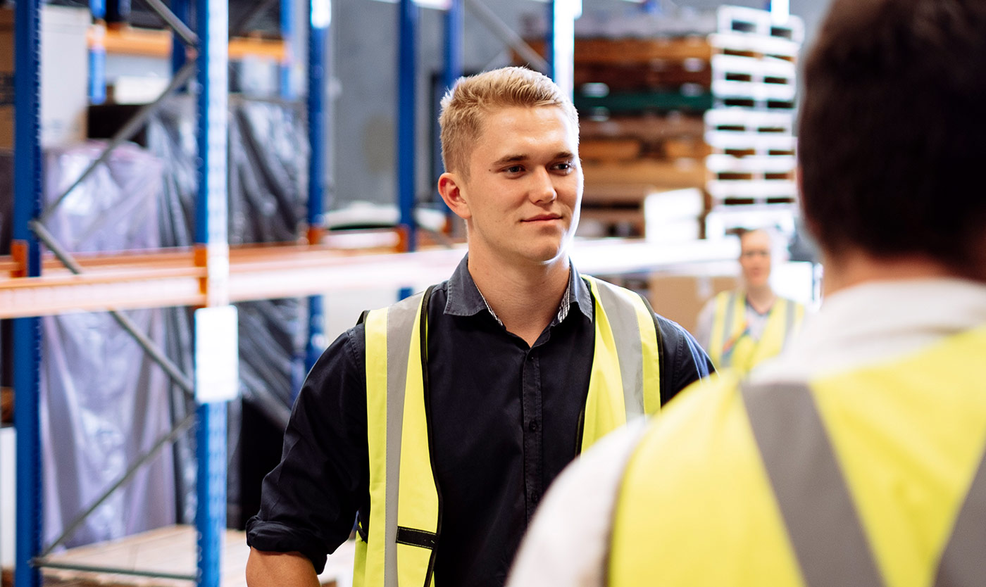
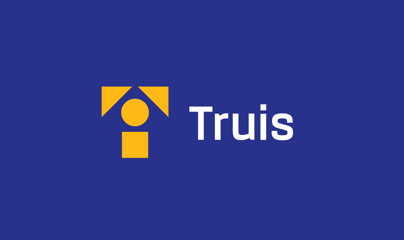
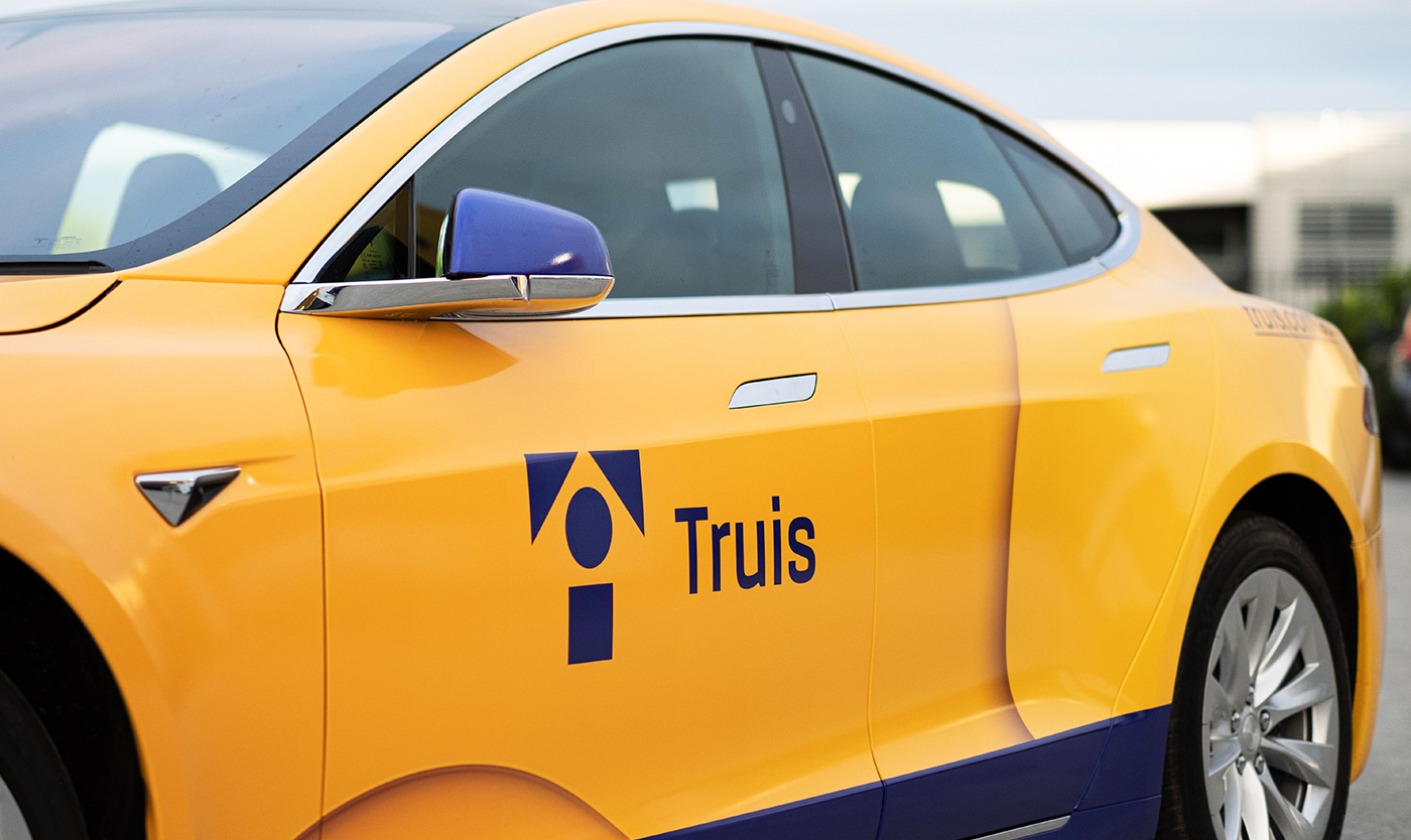
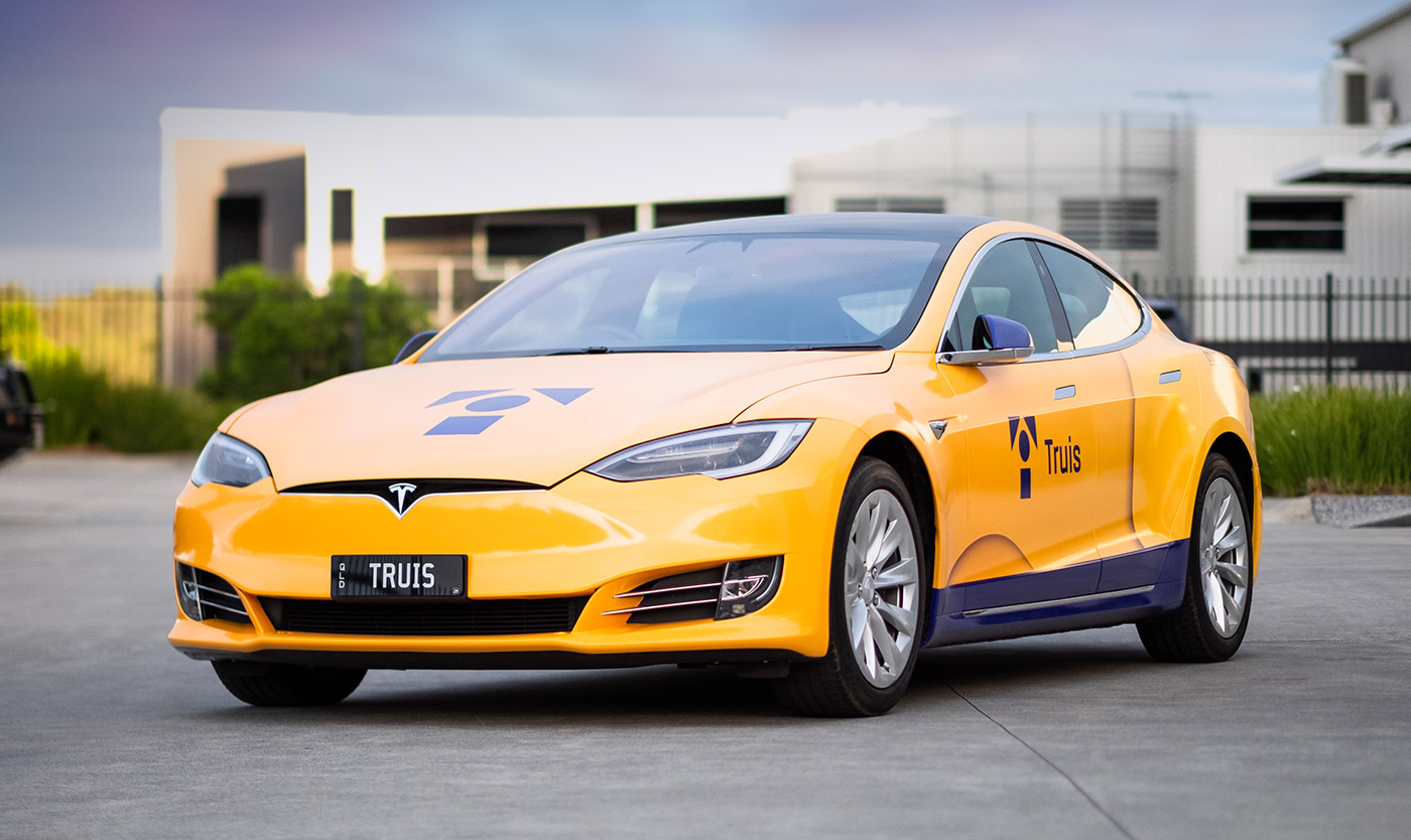
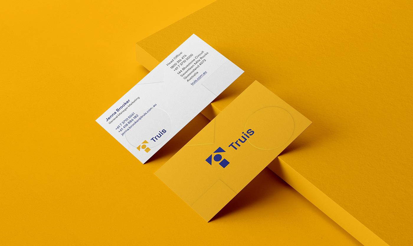
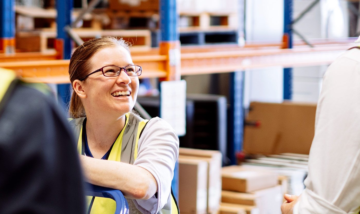
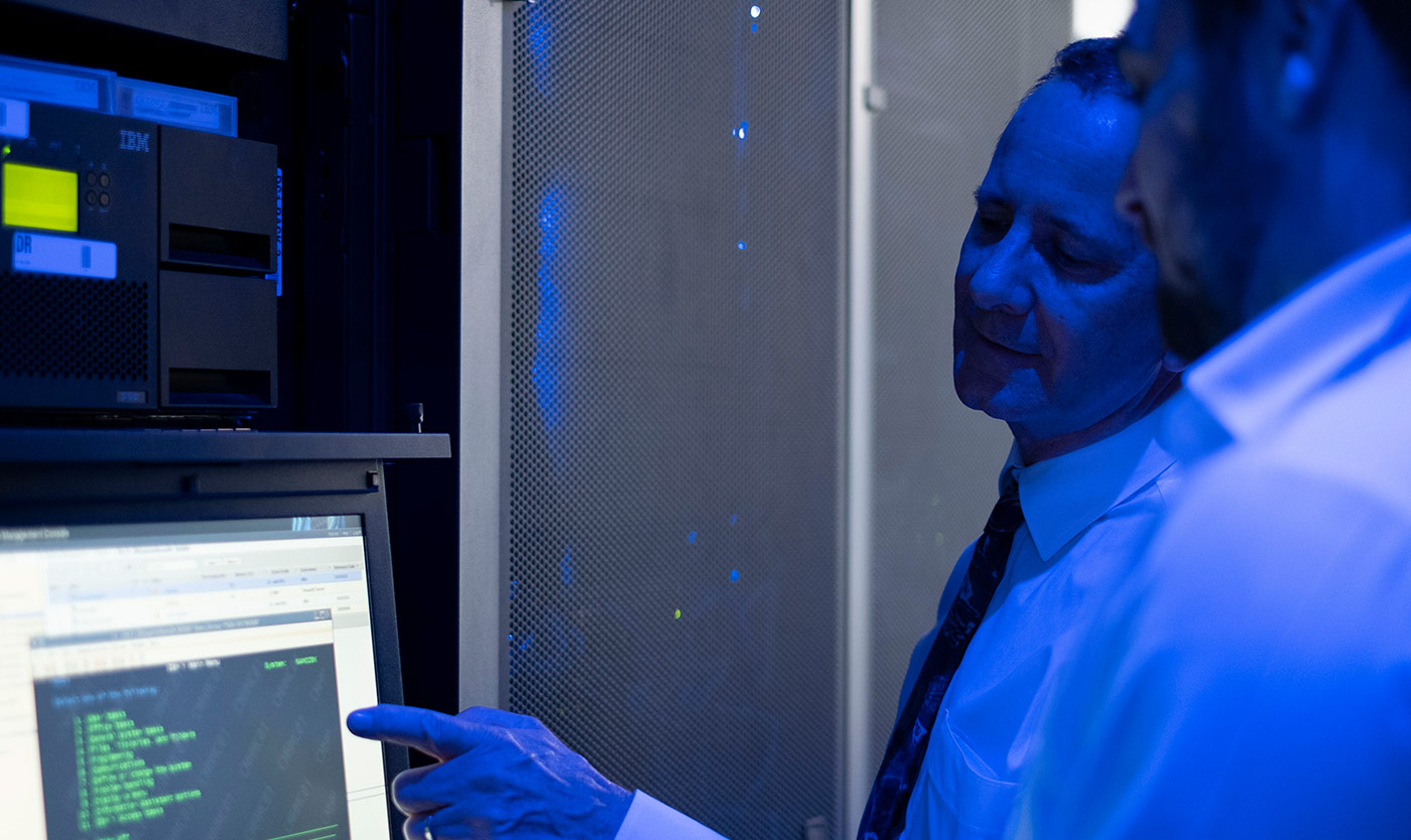
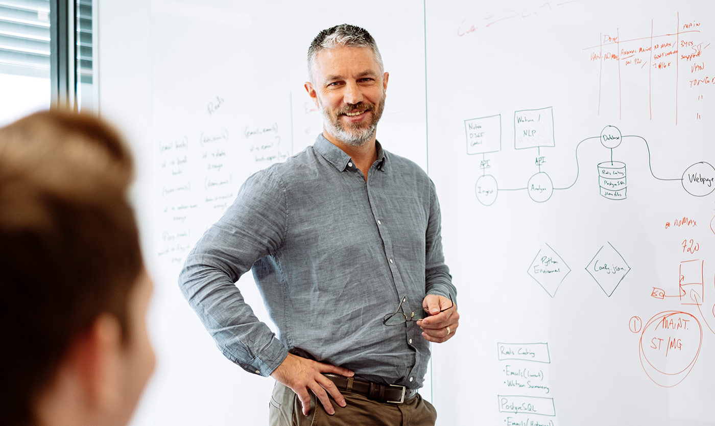
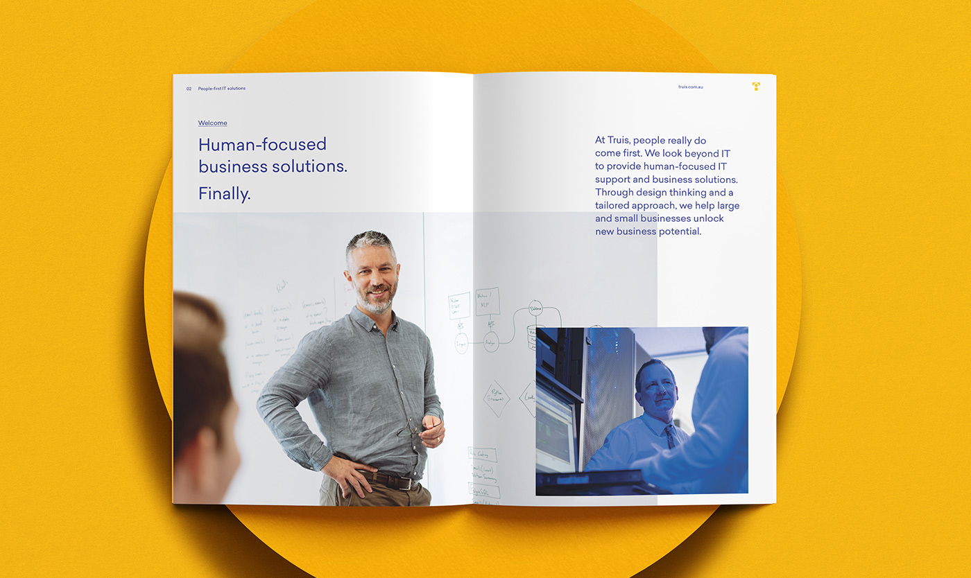
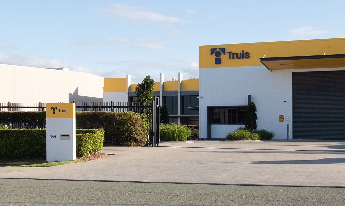
Humanising a technology brand
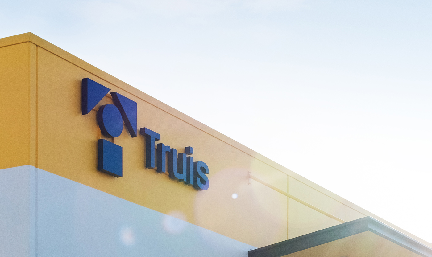
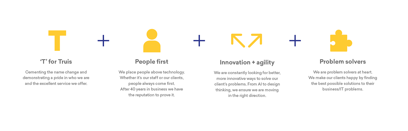
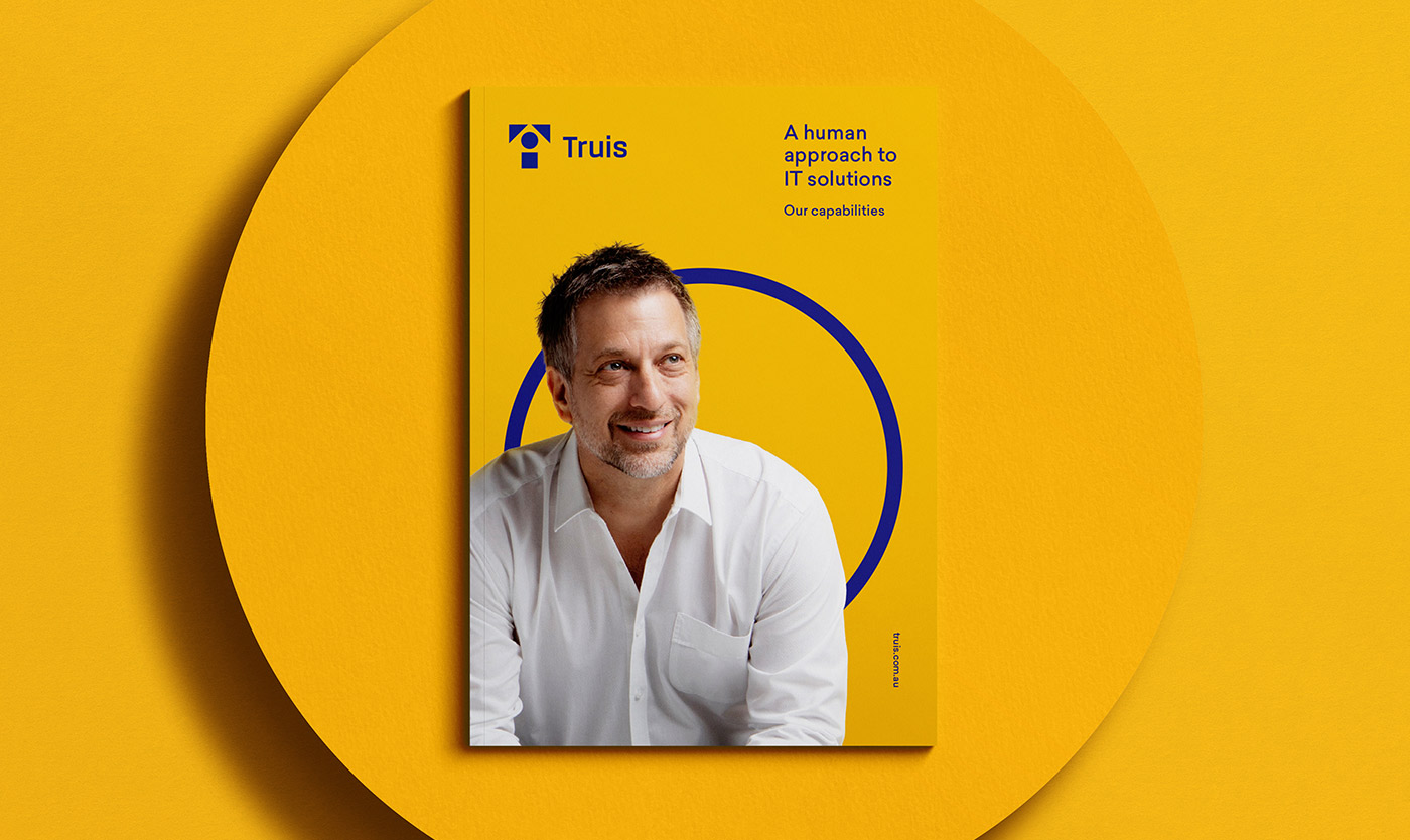
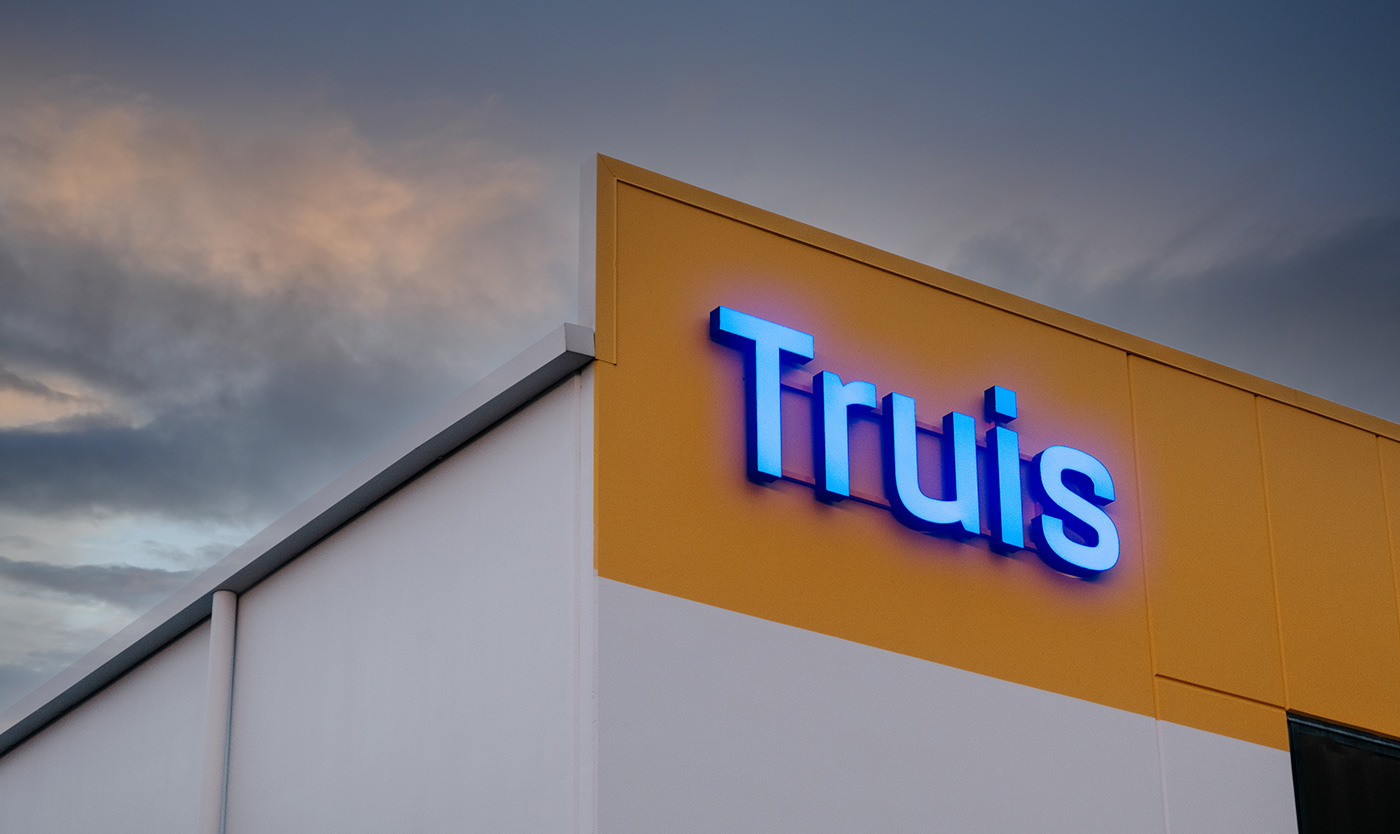
Truis
In 2020, we undertook the significant task of rebranding Computer Merchants, a seasoned player in the IT solutions arena with a four-decade legacy. The business found itself at a crucial juncture, needing to evolve to stay relevant in a rapidly changing technological landscape and shifting customer expectations.
We embarked on a transformative journey to redefine an IT brand that prioritises human interaction at every turn. Empowered by a new name, Truis, the rebrand has acted as a catalyst for sweeping positive change across the entire business — from increased levels of staff engagement, to bottom line business growth.
Read more
Bridging legacy and innovation
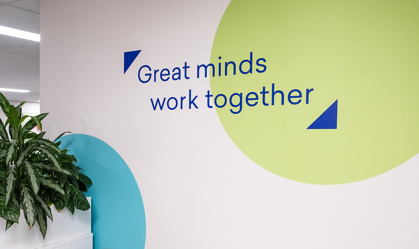
Computer Merchants needed a new name and a refreshed visual identity to align effectively with their refocused business goals. We saw a golden opportunity for Truis to set a new standard in the market by adopting a more human-centric approach. The essence of the new brand was inspired by the core value of ‘Togetherness,’ an ethos that places humans first and business second.
Introducing Truis
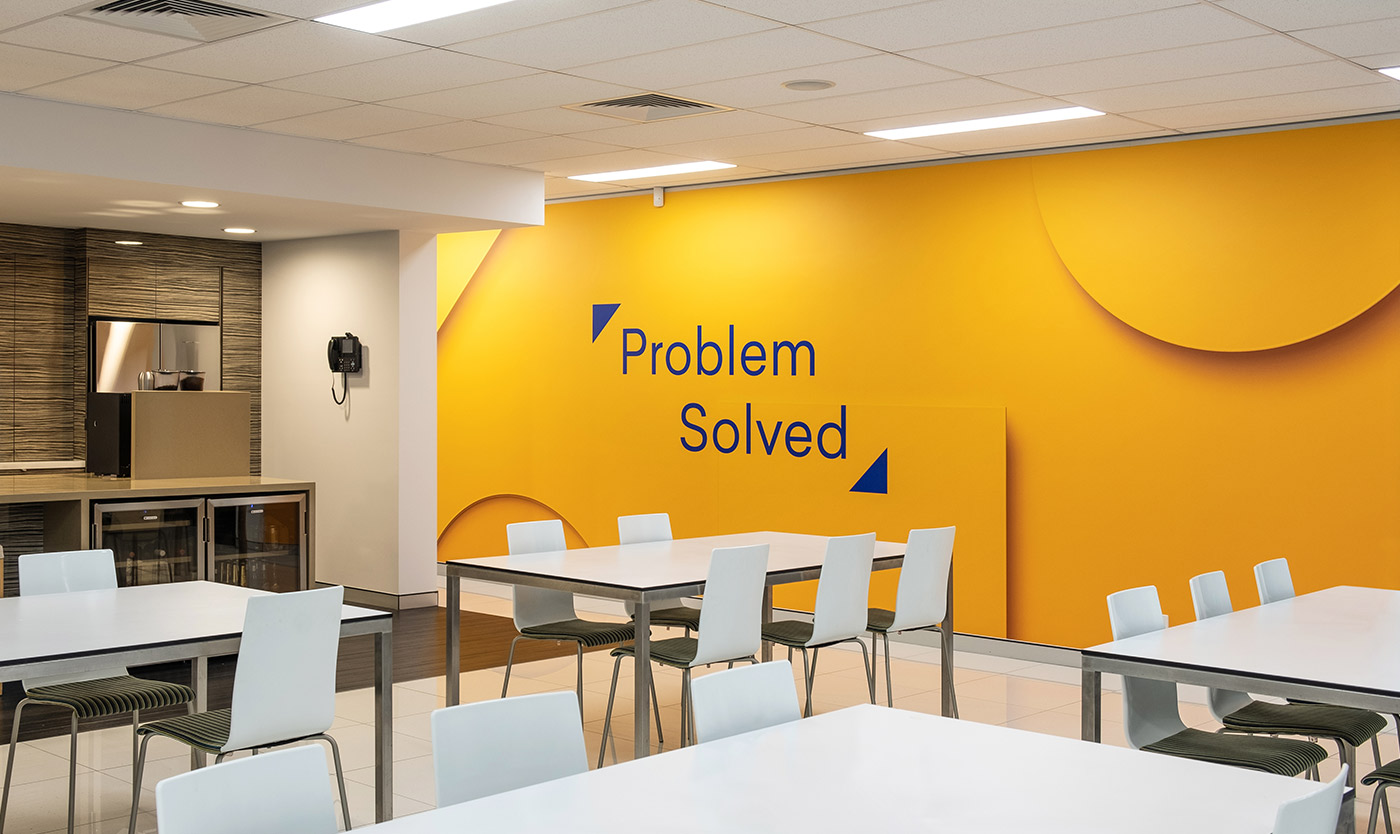
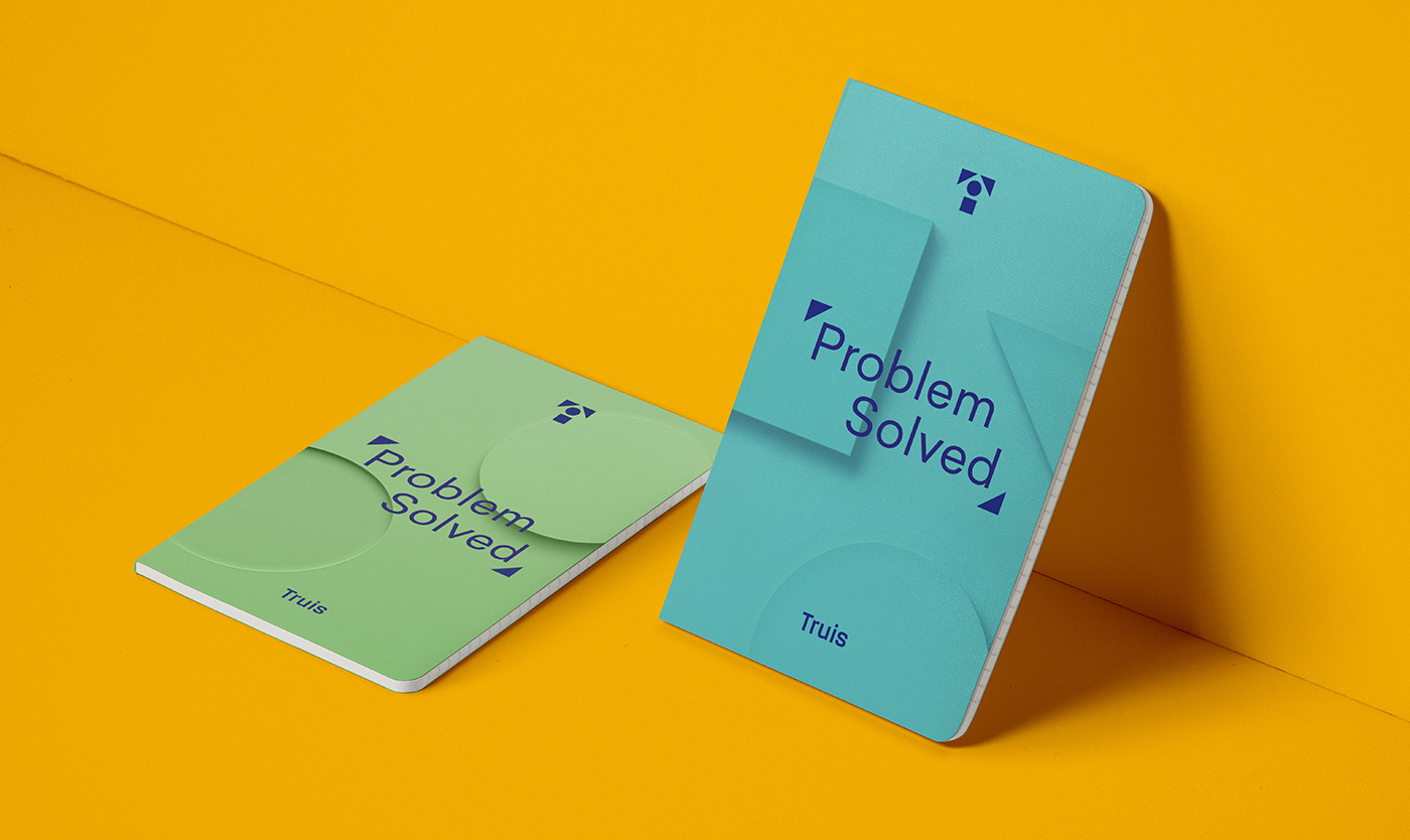
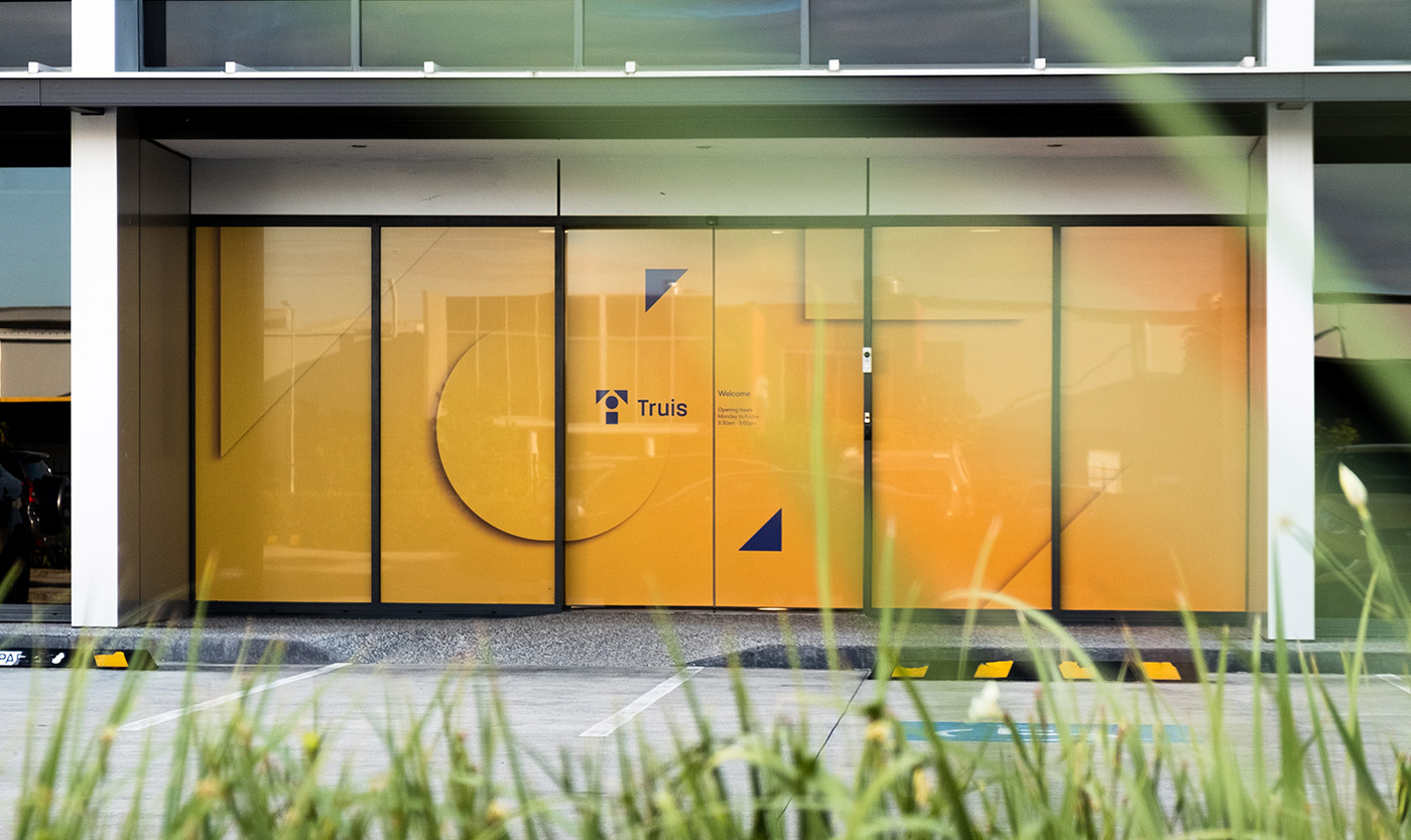
Inspired by the concept of ‘altruism,’ the name ‘Truis’ encapsulates their customer-centric philosophy. The logo, a series of interlocking puzzle pieces, serves as a visual metaphor for the brand’s problem-solving capabilities. With carefully curated typography, the identity achieves a balance of technological sophistication and approachability, exuding both confidence and care.
A system for engagement
Drawing from the puzzle elements in the logo, we devised a flexible framing device to spotlight key messages and human elements. This design feature amplifies the brand’s problem-solving commitment while keeping human interaction at its core. To enrich the brand’s visual language, we introduced a collection of 3D compositions, offering abstract takes on the puzzle motif.
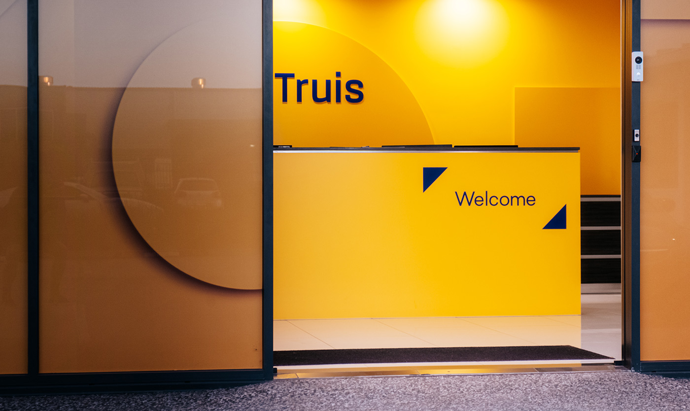
Digital presence to physical touchpoints
Our collaboration with Truis extended to various rollout initiatives, including creating a custom WordPress website and designing a custom wrap for the iconic Truis Tesla.
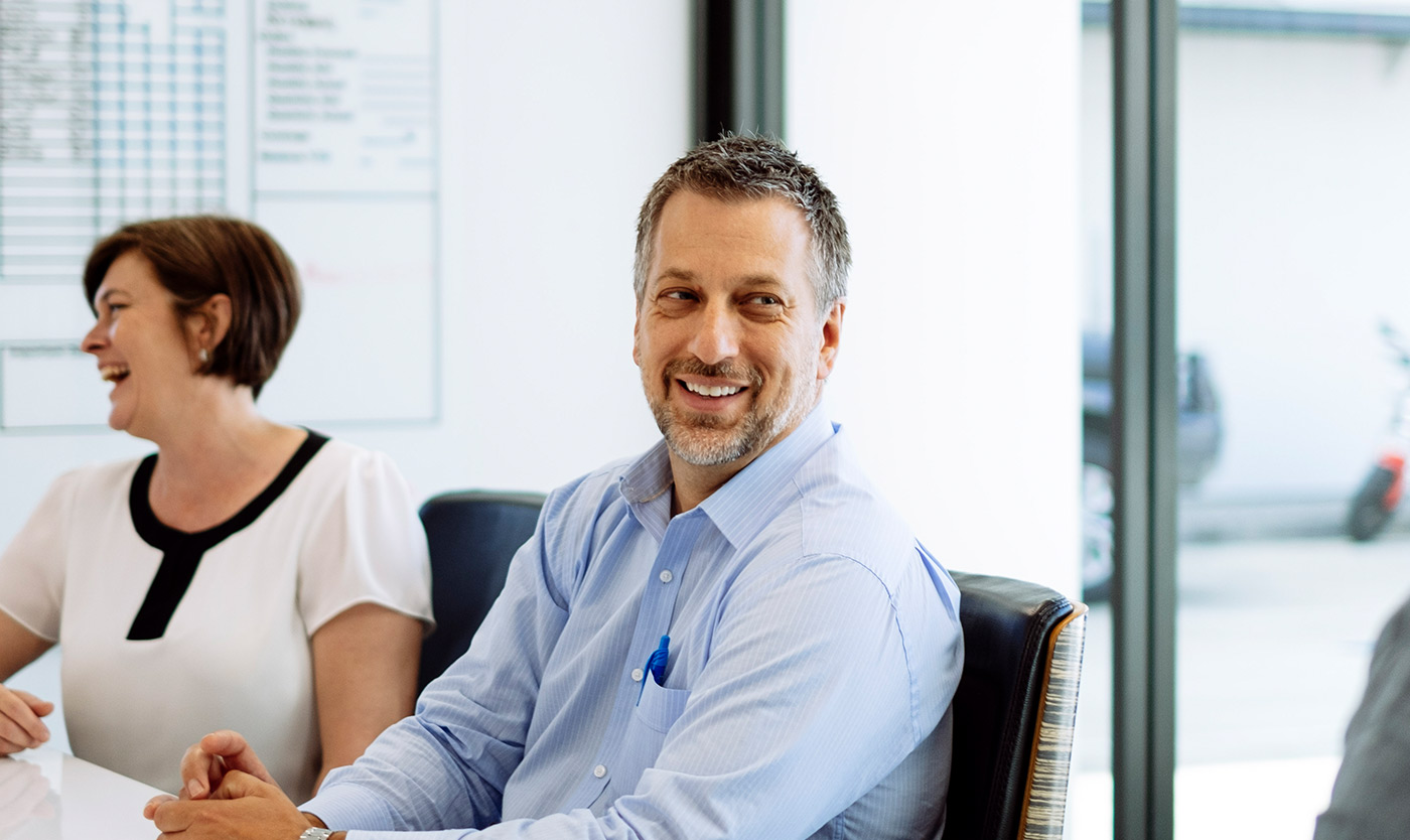
Success, together
Post-launch, our partnership with Truis has remained strong. We continue to serve as an extension of their in-house team, providing ongoing support with everything from marketing collateral to website content.
- Industry
Technology
- Partners
Darling Consulting
Ruckus Studio
Flash Photobition
Rochele Painting - Recognition
Shortlist, Wild Design Awards 2023
Shortlist, Australian Design Awards 2023
Gold, Brand Identity DrivenxDesign 2022
- Services
Naming
Logo
Visual identity
Digital strategy
Messaging
User interface (UI)
User experience (UX)
Website development
Photography
Video animation
Video production
Signage
Content creation
Vehicle livery
Print design
Stationery design
Environmental design
Our business is more than 40 years old, so changing our name was a decision we took very seriously. After receiving strong recommendations for Driven, we proceeded to engage them to help us establish our new name, visual identity and build a marketing strategy to launch it. This experience was exceptional. It was very consultative and Driven did all the heavy lifting. The results of changing our name and refreshing our brand with Driven have been outstanding.”
“The relationship has continued to develop, with the team at Driven doing much more for us. We rely on them to help us with our website, e-commerce platform, and branded content such as videos, EDMs, and case studies. They are wonderful to work with and the results always seem to exceed expectations.
Norm Jefferies | Managing Director, Truis
Enquire with us
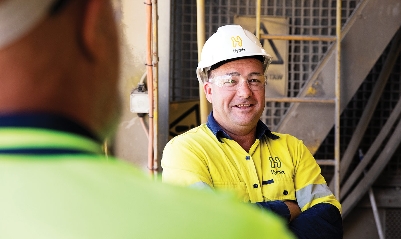
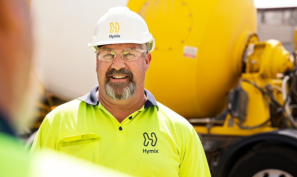
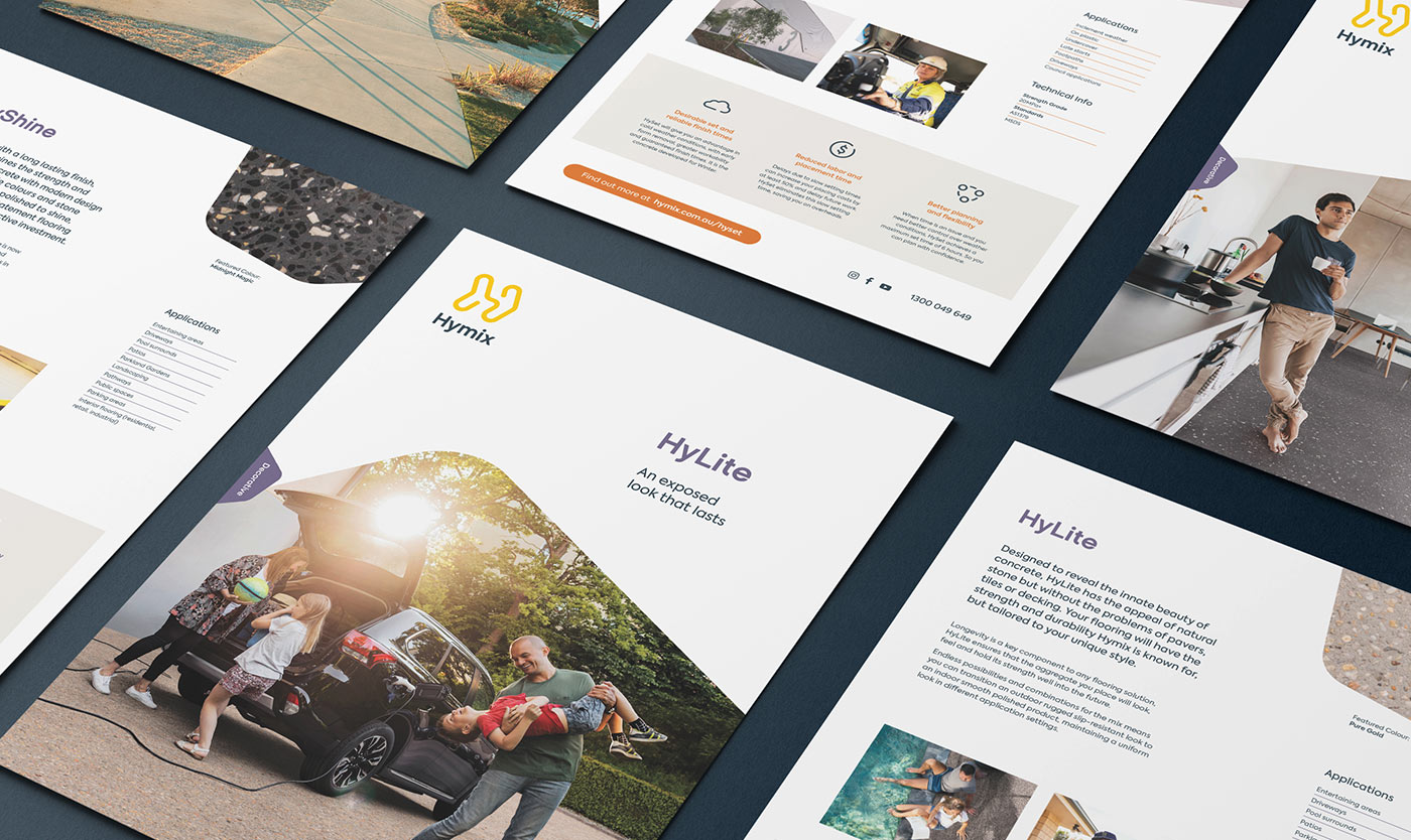
The concrete brand with a softer side
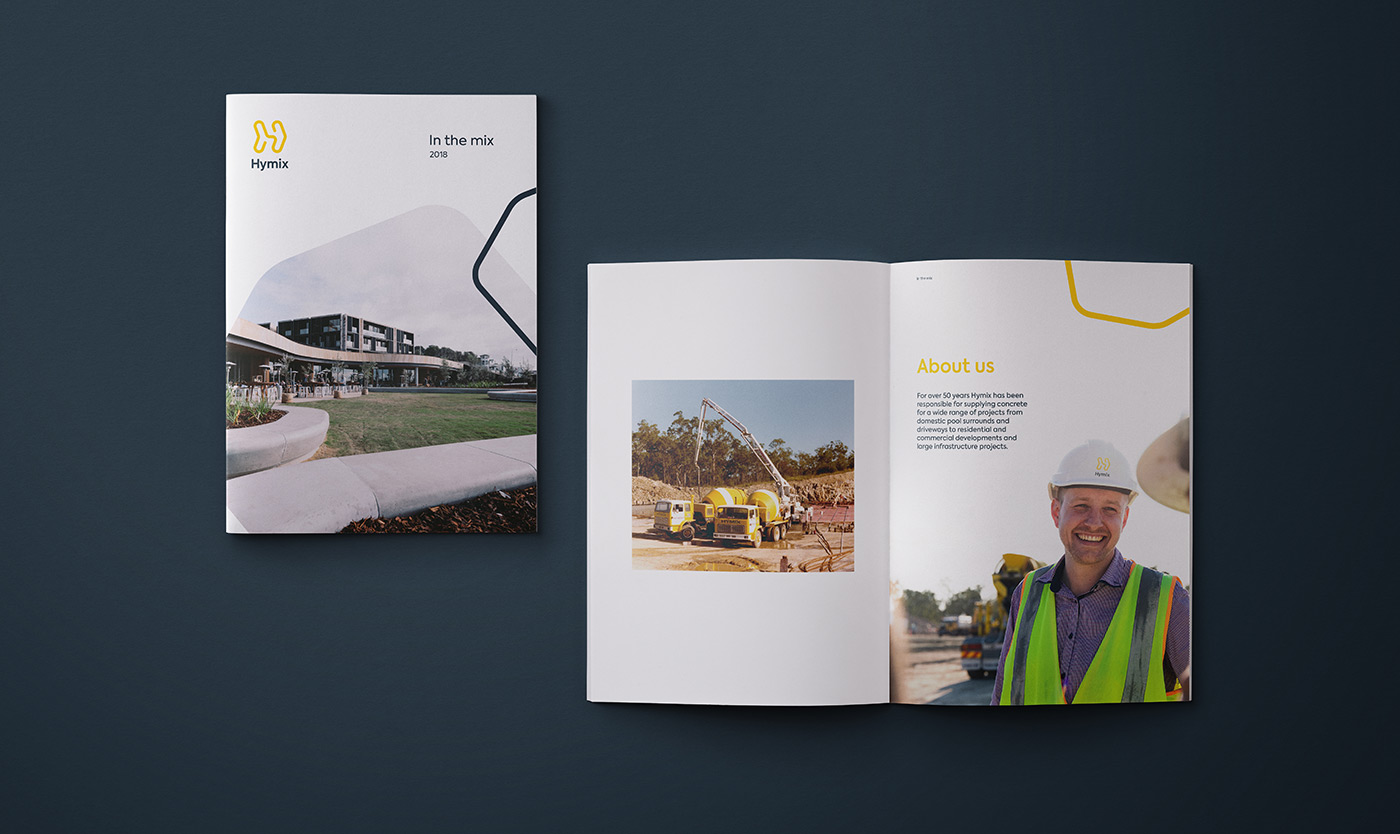
Hymix
Hymix has been manufacturing and transporting concrete throughout Queensland, New South Wales, and Victoria for over 50 years. Historically the focus of the business has been broad, providing services for large commercial projects as well as smaller residential ones. However, in recent years the bigger commercial jobs have proven to be problematic, tying up the delivery fleet and other critical resources across the business.
Hymix needed a new brand strategy so they could narrow their focus — targeting the consumer market alongside the more traditional residential builders, pool builders, and small- to medium-sized commercial projects.
Read more
It’s about time
Demand for concrete continues to rise, but with this growth has come a decline in the way the industry does business. With confidence and trust at an all-time low, quality and reliable service has taken a backseat. Business relationships have become short-term and transactional with delayed or inaccurate delivery times, causing frustration and grinding construction sites to a halt.
We facilitated a number of strategy workshops, engaging everyone from high-level management through to truck drivers and sales representatives.
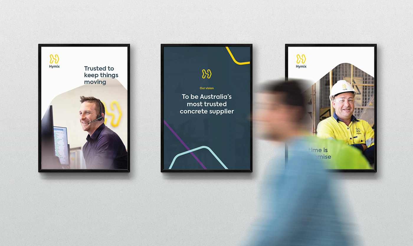
‘It’s about time’ demonstrates that time, not concrete, is Hymix’s most valued commodity. Separating them from their competitors, this idea celebrates their commitment to realistic delivery times and keeping projects moving. It also acts as a rallying call to shake up the industry and start treating customers with the respect and transparency they deserve.
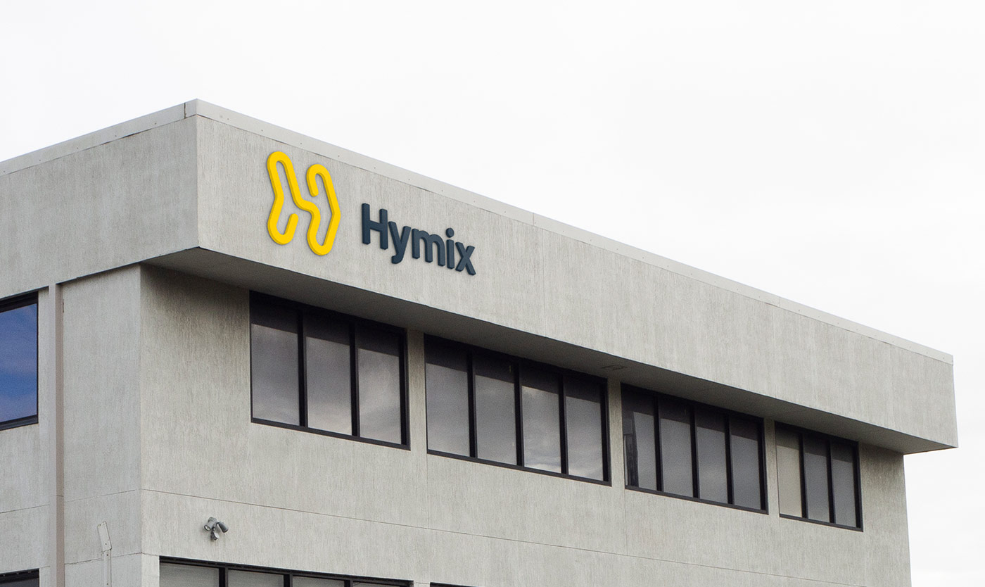
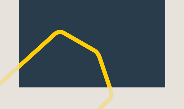
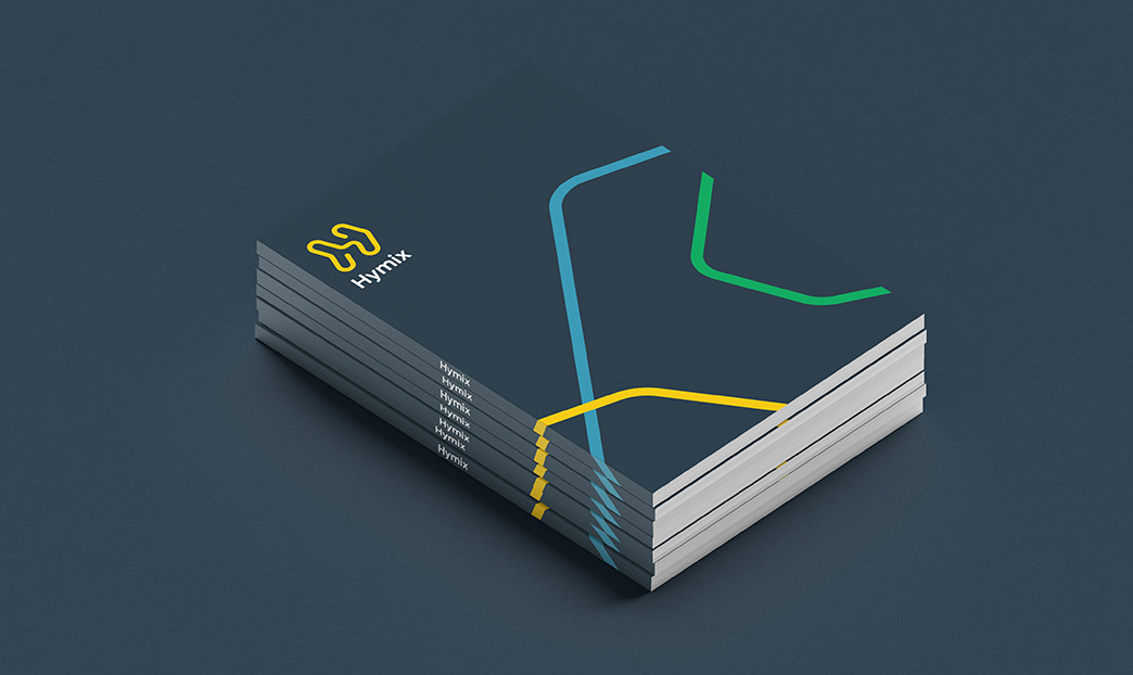
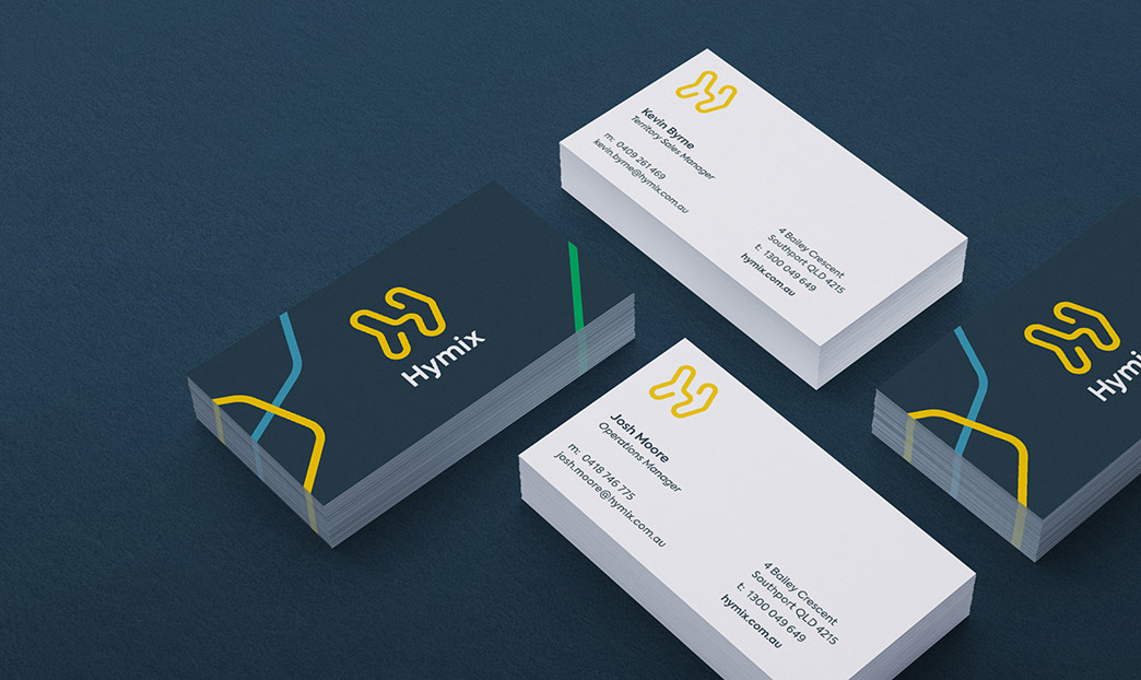
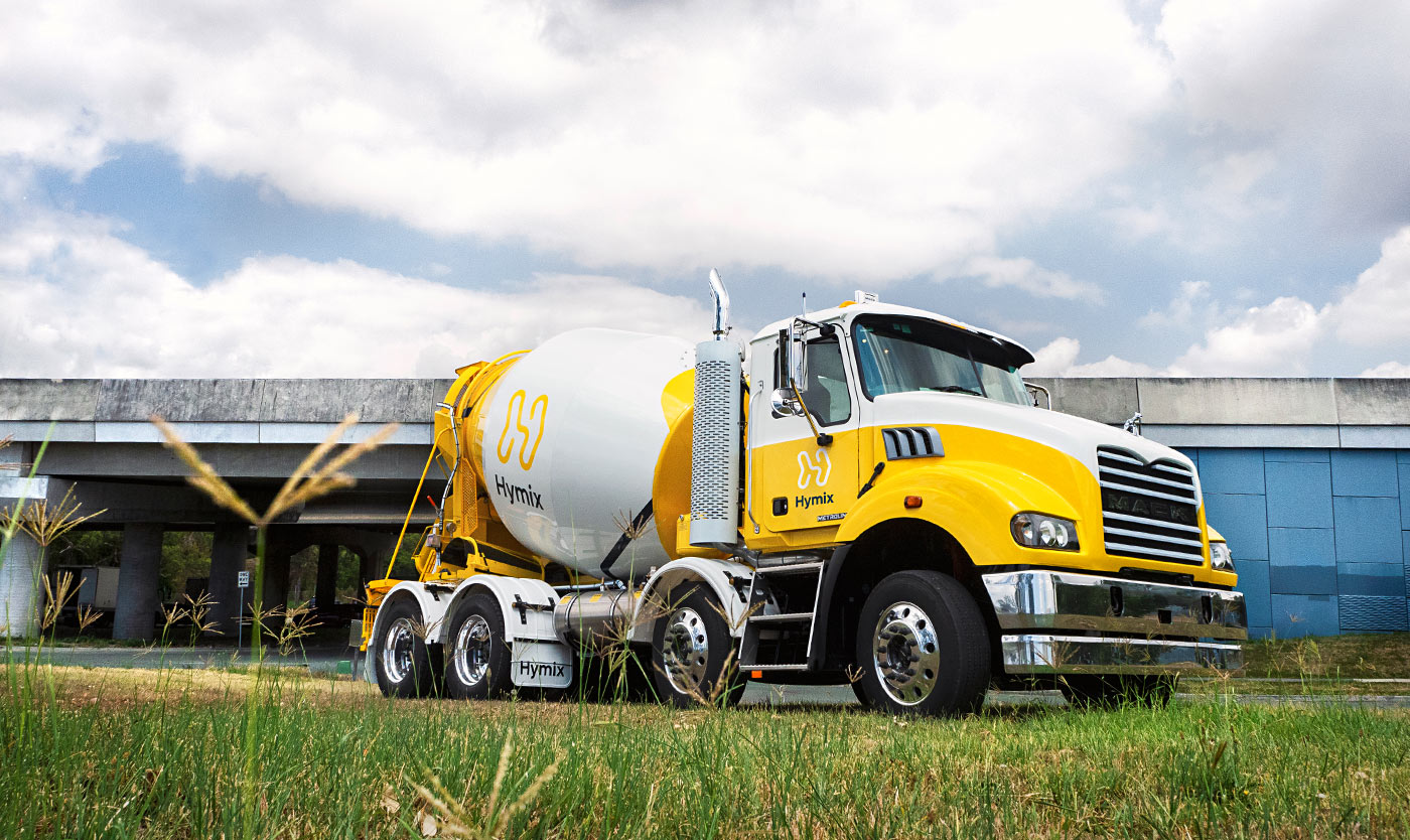
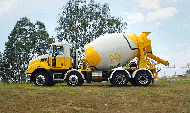
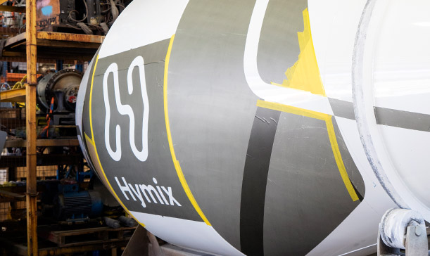
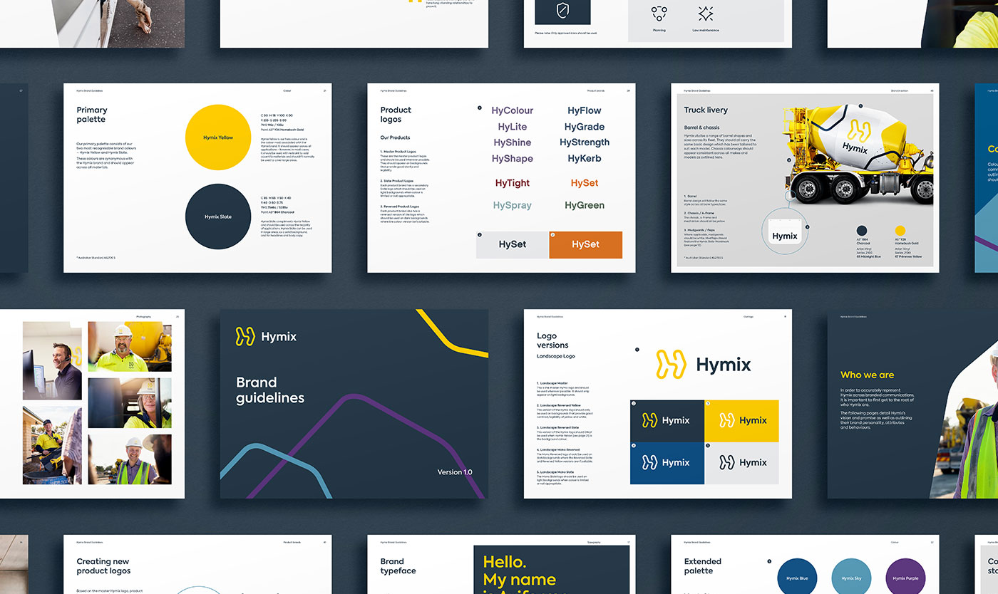
The H Arrow
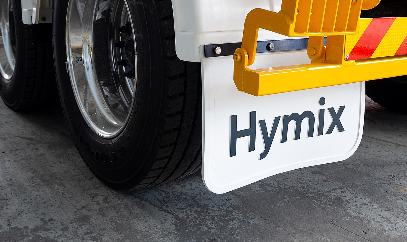
Formed by a single flowing line, the H Arrow demonstrates Hymix’s promise to keep projects moving. The logo is bold and striking, with a strong sense of movement and forward momentum.
Designed to appeal to both the consumer and trade audience, the brandmark feels friendly and established.
Dynamic arrows
Referencing the angles in the logo we designed a flexible ‘dynamic arrow’ device that can be applied across materials.
Conveying a sense of movement, it gives the brand personality and creates a unique visual style that is instantly recognisable.
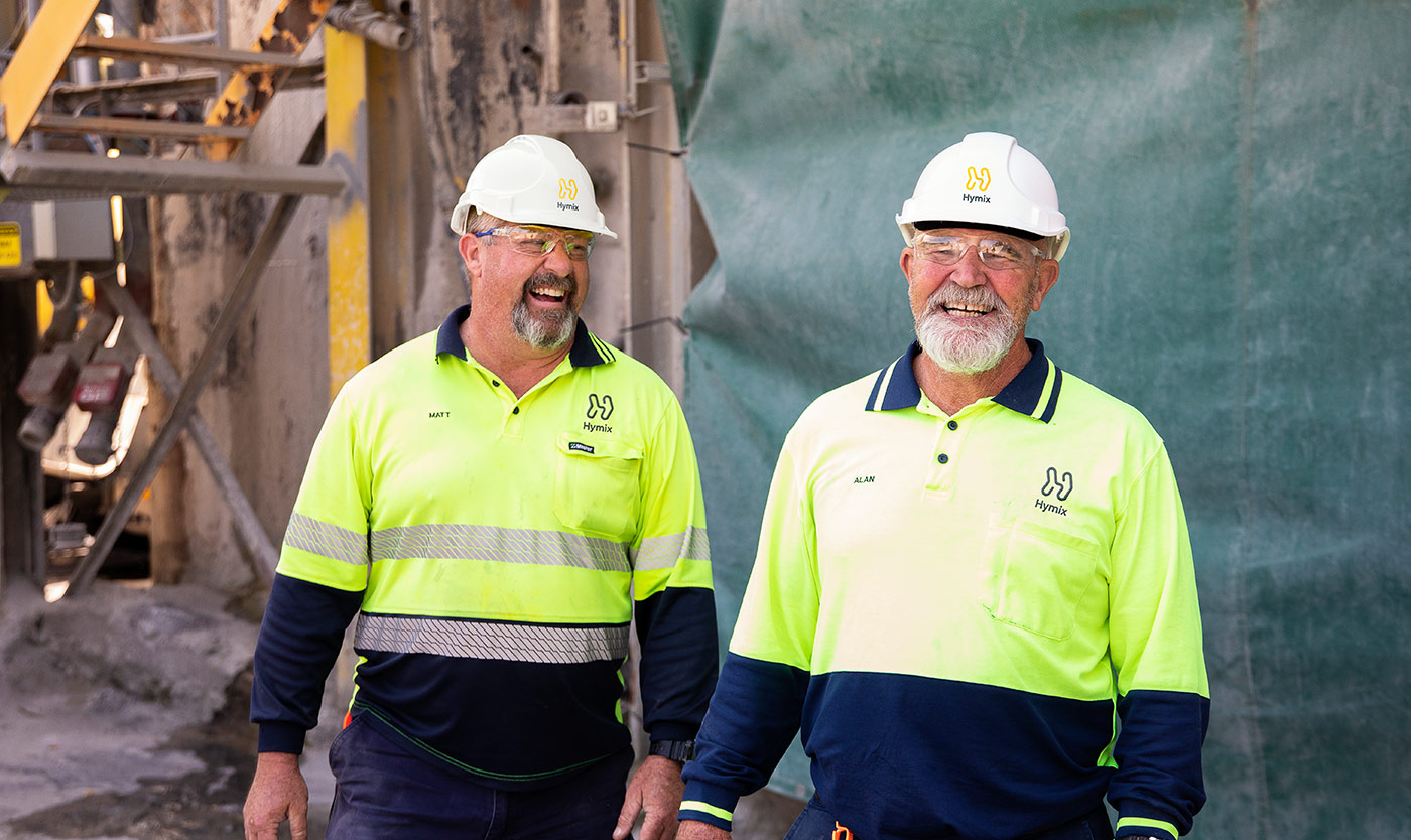
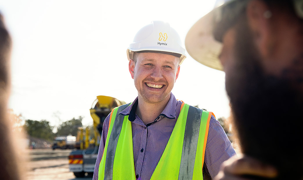
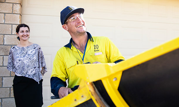
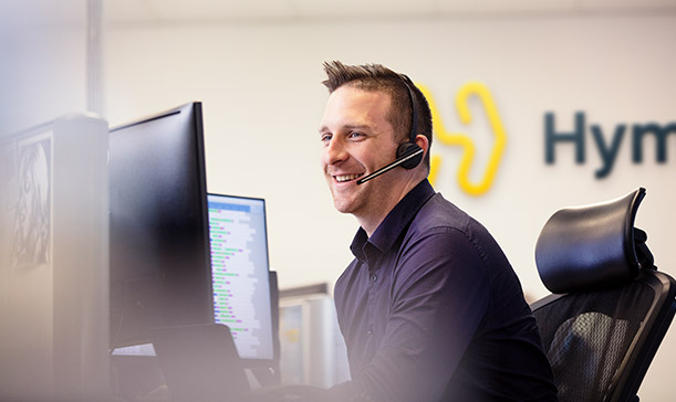
People first, concrete second
In line with the new strategy, photography looks beyond the product and focuses on the human aspect of the brand. Imagery is warm, personable, and contrasts against the industrial imagery synonymous with the industry.
Giving the client control
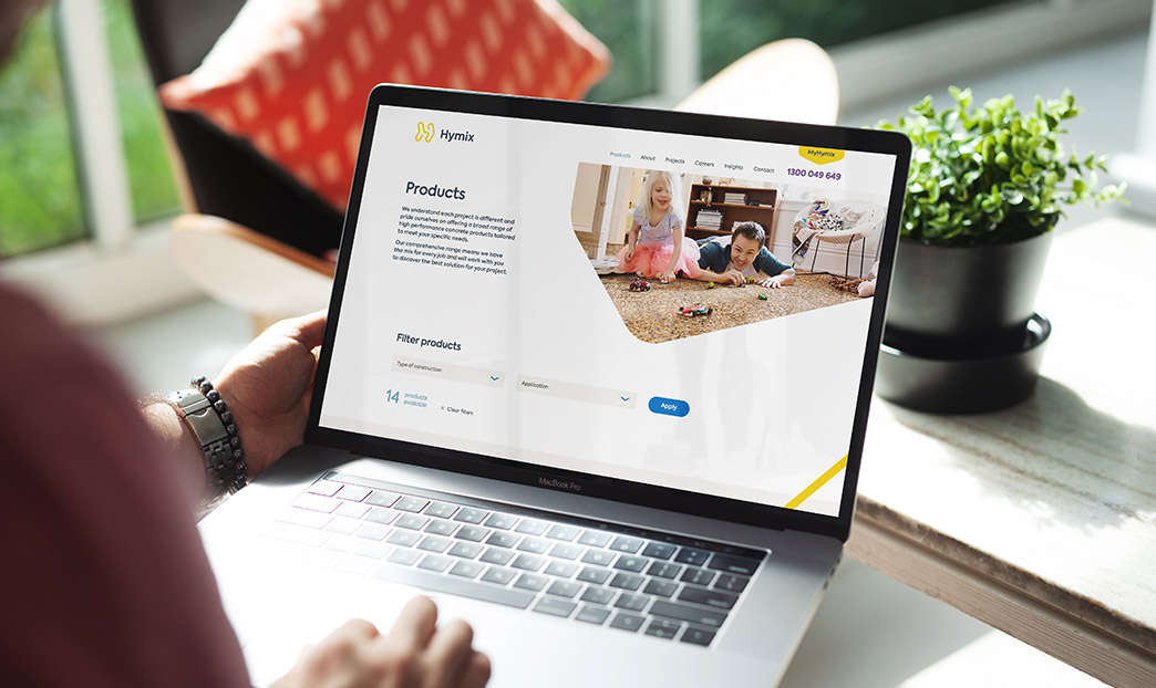
We built the new Hymix website from the ground up in WordPress, utilising our custom dynamic page builder which allows the client full control over future page layouts and content. The new website enhances the customer experience with handy features like the concrete calculator and product share tool.
Rethinking every detail
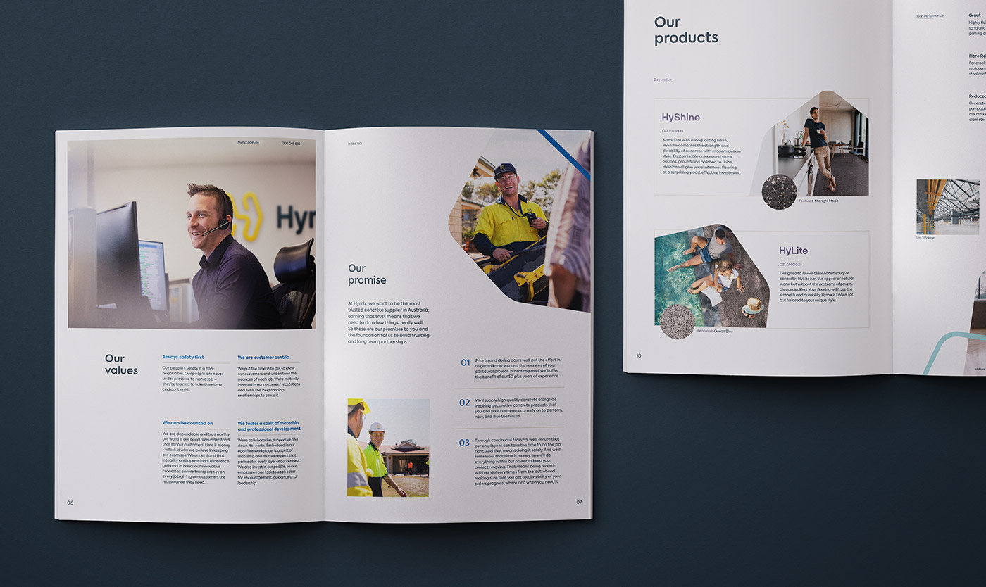
We worked alongside Hymix on the architecture of their various sub-brands. Each product was given its own identity and clear value propositions within the brand family. To make things simple, we designed a suite of bespoke icons that highlight the key features of each product.
Constant priceless exposure
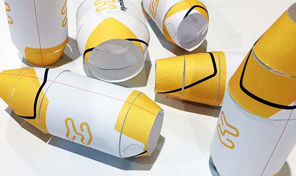
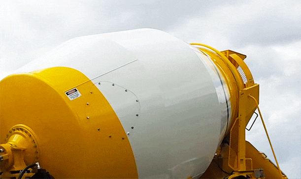
As one of the brands most visible assets, the agitator truck livery has an important role in building brand recall. Featuring the new Hymix brandmark and dynamic arrow device, the new barrel livery is unlike anything else in the industry.
With the truck body and barrel mechanisms produced and supplied by different manufacturers, we worked in conjunction with all parties to ensure a consistent and impactful end result.
Moving forward together
Following a successful brand launch, we continue to work together in close partnership.
As an extension of the Hymix team, we support them in a wide range of brand services; safeguarding the brand and ensuring consistent, effective communications.
- Industry
Construction
- Recognition
Silver – Brand Identity DrivenxDesign Awards 2019
Gold – Brand Identity BADC 2019
Silver – Logo BADC 2019
Finalist – Website BADC 2019
- Services
Brand strategy
Positioning
Logo
Visual identity
Messaging
Product naming
Photography
Print design
Signage
Vehicle livery
Uniforms
Together we achieved a full end-to-end rebrand that was insightful, creative and collaborative. We are thrilled with the end result. Through the whole process Driven were personable, easy going, and organised — which made the project even better.
Luke Pischedda | Queensland State Manager
More projects
Enquire with us
Developing a sustainable brand
EnviroDevelopment
Developed by the Urban Development Institute of Australia (UDIA), EnviroDevelopment is a certification program for sustainable development initiatives. Created to address the growing urgency for environmental responsibility, the program makes it easy for homebuyers to identify and choose eco-friendly developments.
Engaged to help elevate the brand as the nation’s leading sustainability accreditation for property development, we developed a fresh visual identity that speaks with confidence.
Read more
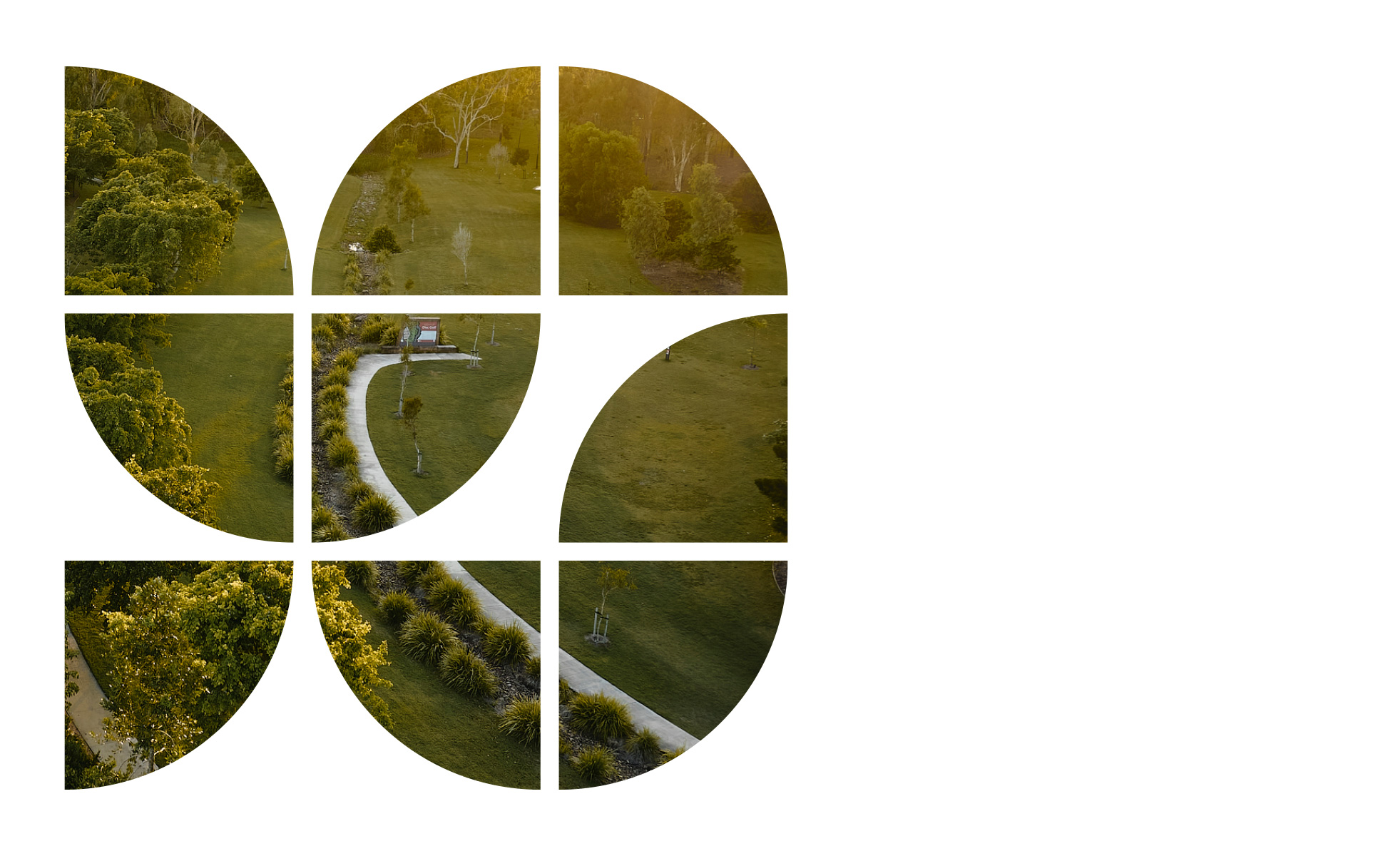
Making a mark on diverse audiences
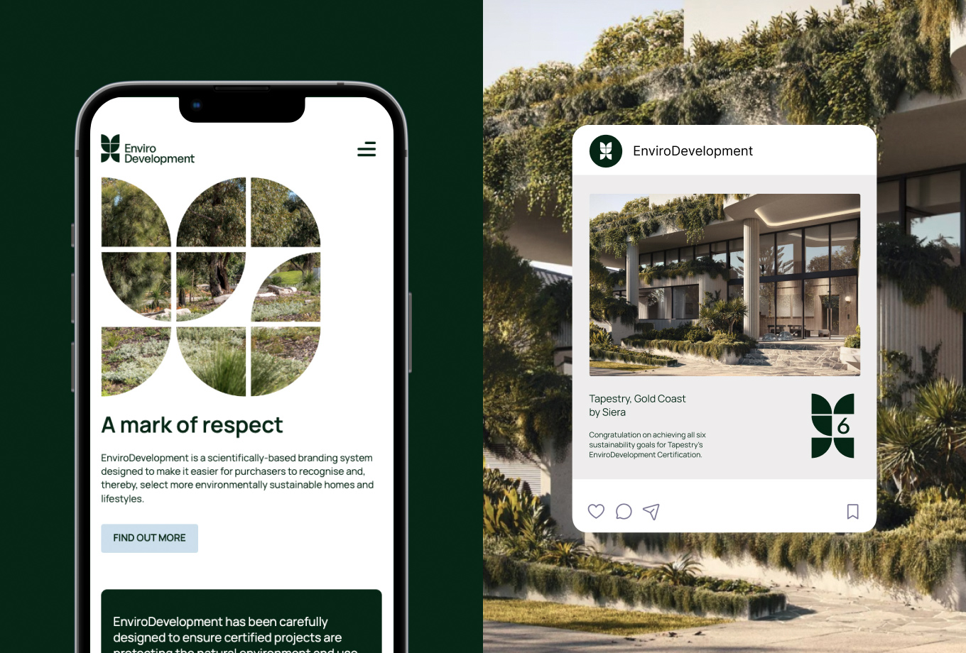
In our rebranding work with EnviroDevelopment, we aimed to capture the essence of their mission — making sustainable living accessible and recognisable. We refreshed their entire logo suite, including special marks for their EnviroDevelopment Professional membership and project certification tiers.
We aimed for a design language that resonates across audiences. For property developers, these marks are badges of pride in sustainability. For homebuyers, clarity is key; the marks had to be instantly decipherable, serving as guideposts in the journey to eco-conscious living. Beyond individual appeal, we created the marks to harmonise with other logos they’d share space with, be it a developer’s brand or a property’s specific identity.
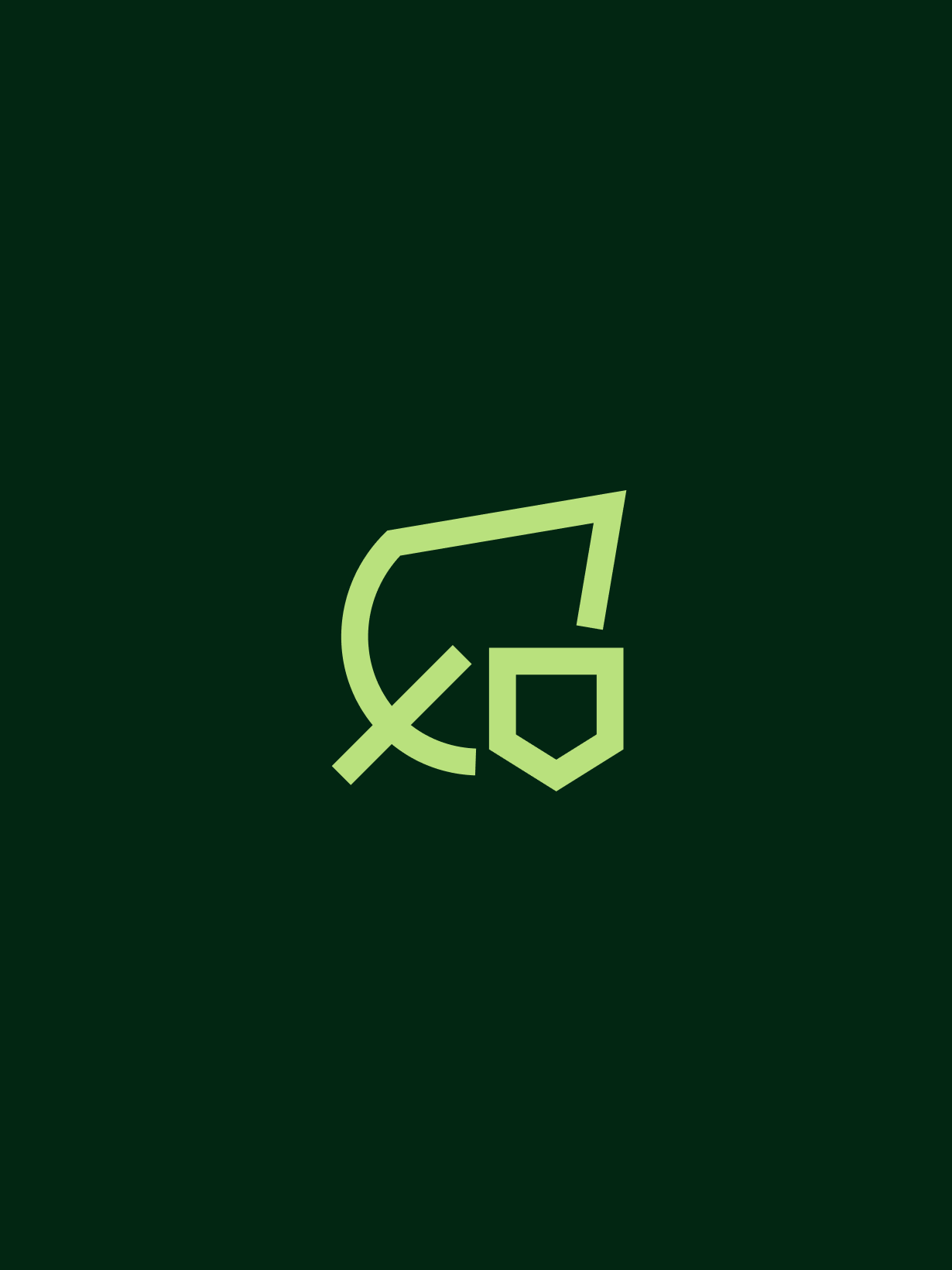
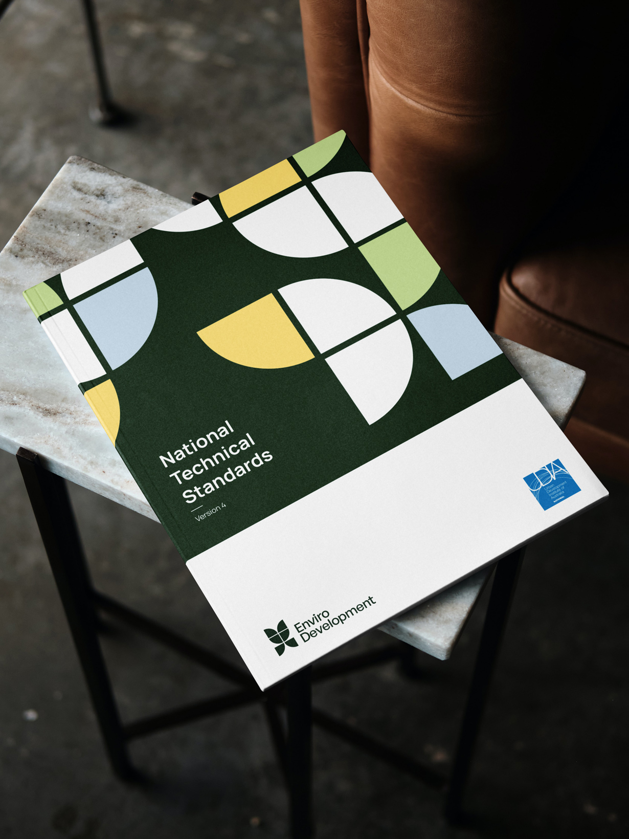
The geometric leaf
In the realm of sustainable development, the leaf is more than a symbol; it’s an emblem of life, growth, and ecological balance. We created the EnviroDevelopment masterbrand logo by taking this iconic imagery and giving it a geometric twist, encapsulating the brand’s blend of scientific rigour and environmental focus. The unique form and clean lines make the logo easily recognisable — a crucial factor when considering its application across various platforms and alongside other brand identities.
Contemporary by nature
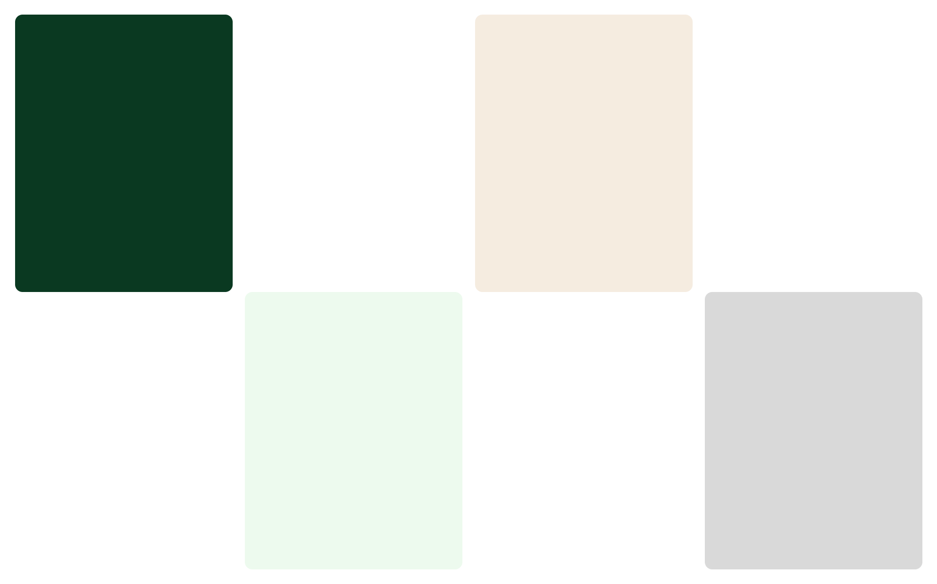
In line with our mission to reflect EnviroDevelopment’s commitment to sustainability, we curated a colour palette that both embraces the ‘green’ spirit of the sector and sets itself apart. Unlike the typical visual identities in this space, which often veer toward either a too-corporate or too-casual aesthetic, the palette offers a fresh, modern alternative.
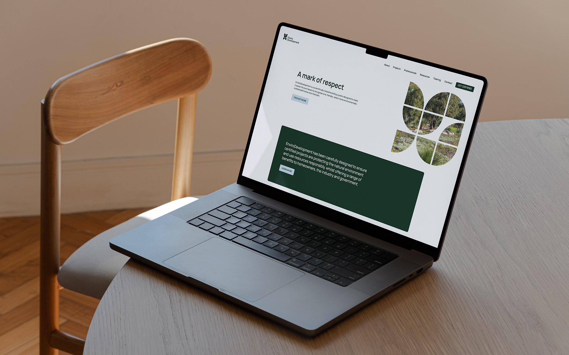
Streamlining the digital journey
To amplify EnviroDevelopment’s commitment to sustainability, we consolidated their distinct ‘certification’ and ‘living’ websites into a single, user-friendly hub. Designed to serve property developers, professional partners, and the community at large, the platform offers streamlined access to essential resources, including a professional member directory and a directory of certified projects.
Leveraging Driven’s custom website builder, Made, we integrated EnviroDevelopment’s visual elements throughout the site, creating a unified online identity. This rejuvenated website expertly accommodates the needs of diverse stakeholders, while reinforcing EnviroDevelopment’s core mission of sustainability.
- Client
Urban Development Institute of Australia (UDIA)
- Industry
Urban Development
- Services
Rating architecture
Design system
Visual identity
Logo
User interface (UI)
User experience (UX)
Website development
Copywriting
Long format design
Enquire with us
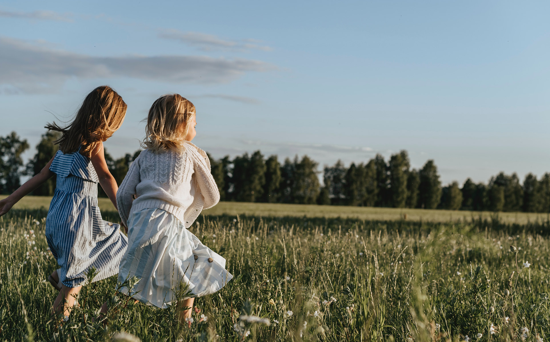
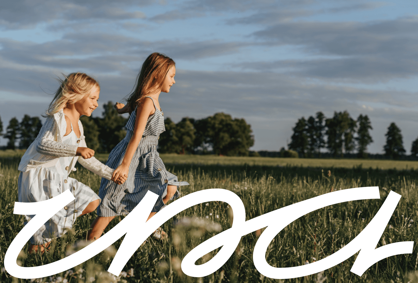
Capturing the wildhood of childhood
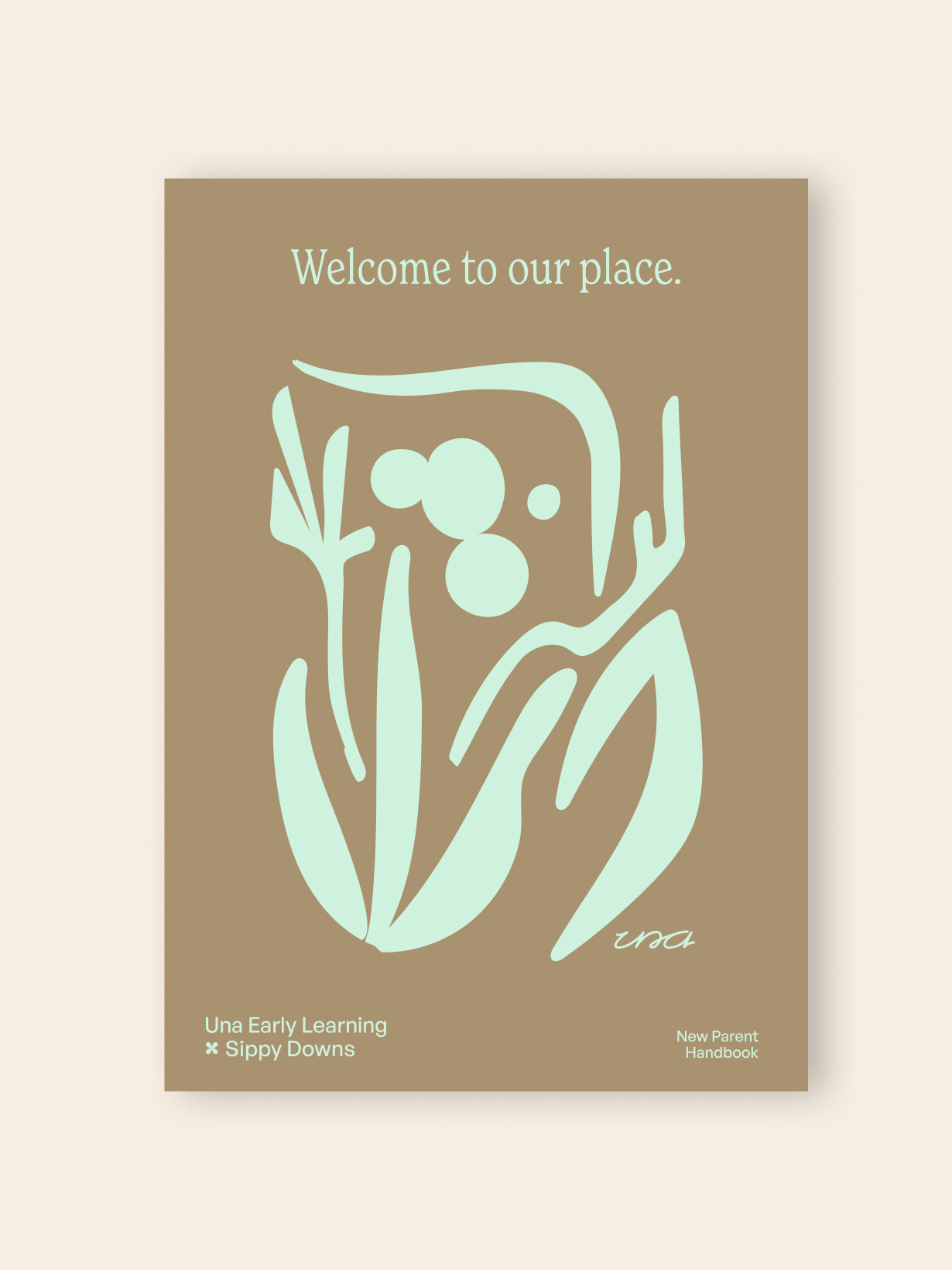
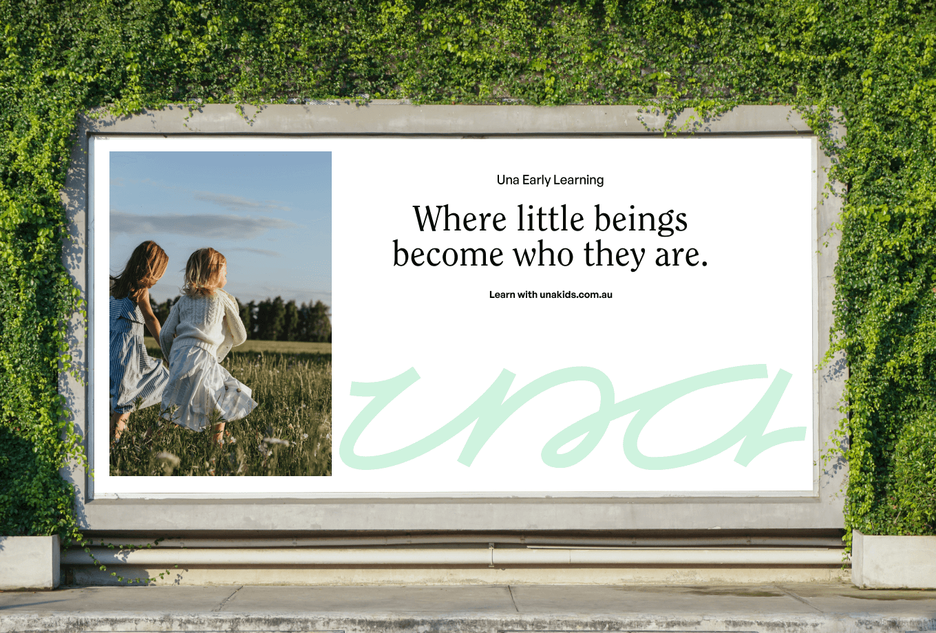
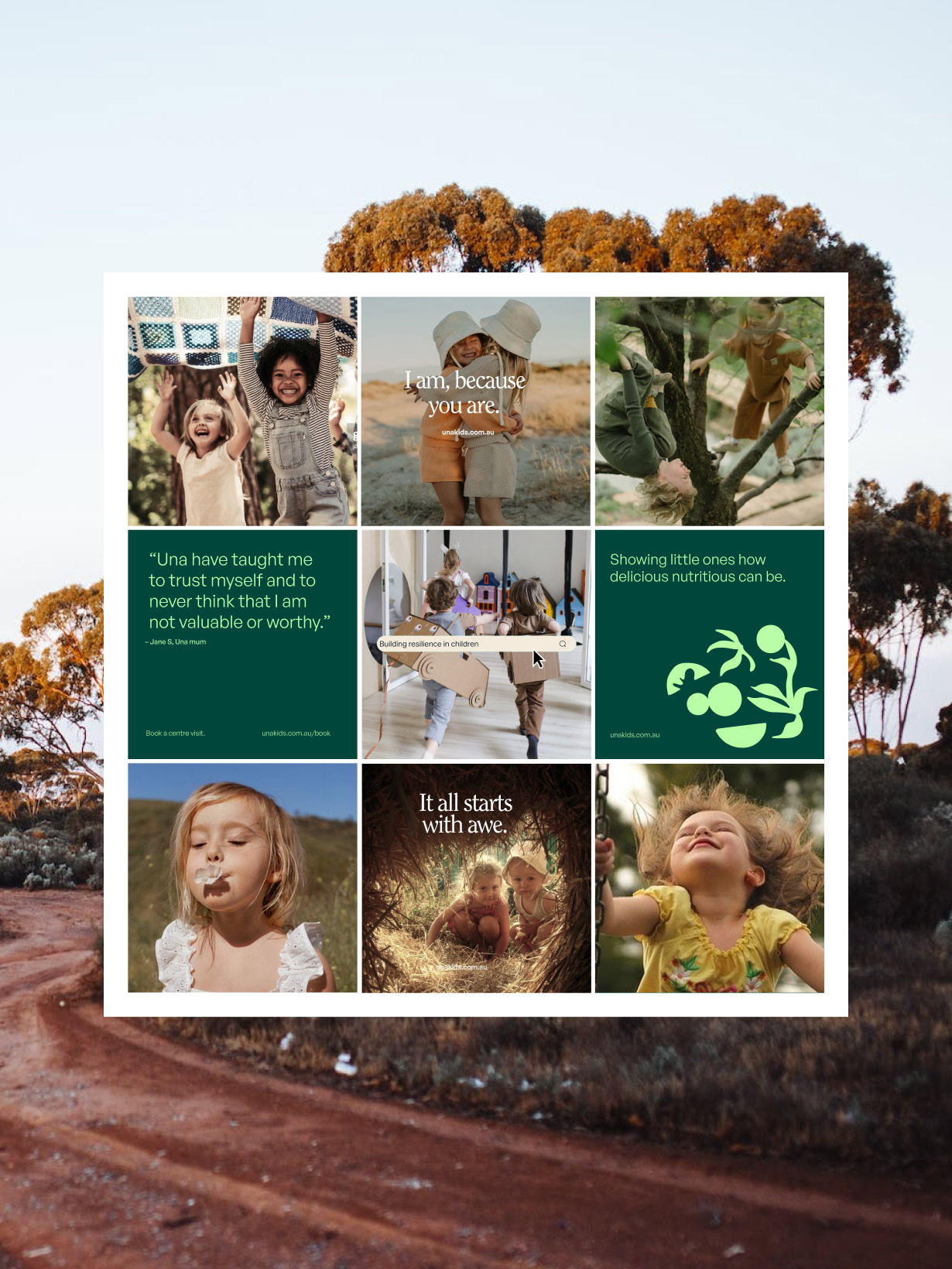
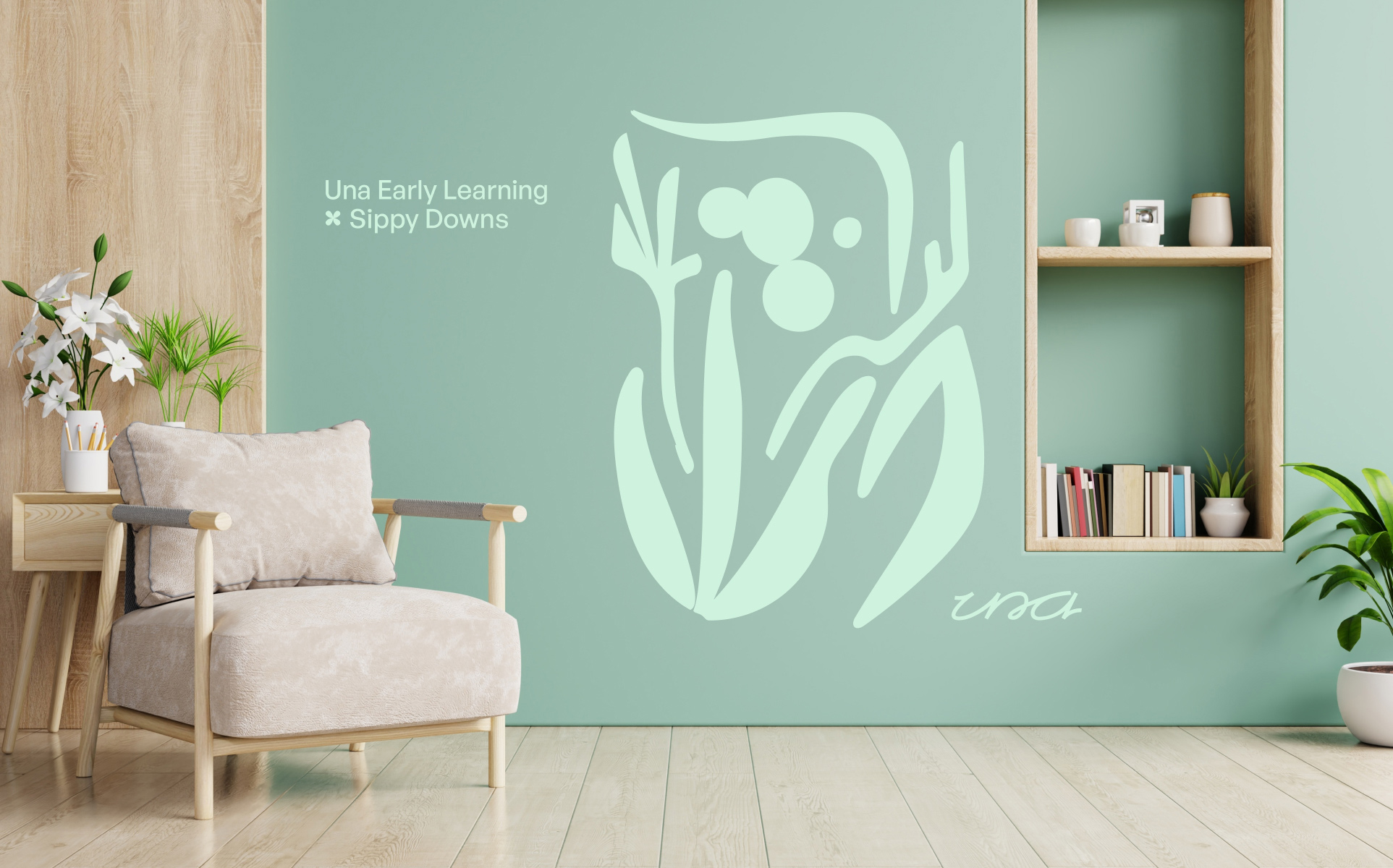
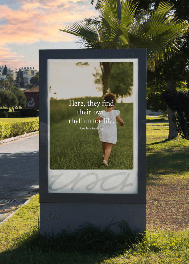
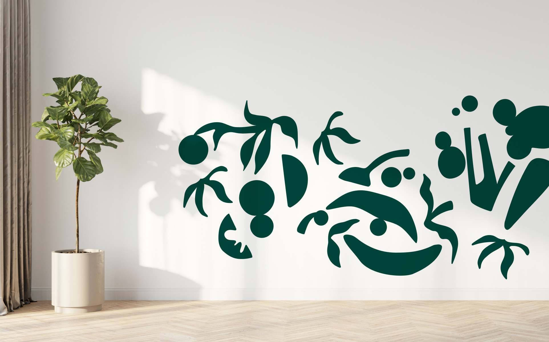
Una
Sippy Downs Early Learning Centre, a visionary up-and-comer in the childcare space, recognised the need for a brand shake up. With ambitions to expand their locations and offerings, they needed a fresh brand identity to better represent their evolved purpose and story. They also needed the freedom of a name that wouldn’t tether them to a specific location.
Through a comprehensive research phase, we unearthed the notion that fast became the brand’s beating heart: Rewild childhood. This idea captured the brand’s MO of approaching early education in a way that embraces nature, community, holistic wellbeing, and ‘wildhood, not childhood’.
Read more
Nurturing agency
A term used in environmental conservation, rewilding is intentional effort to return nature to its vibrant, natural state — ‘intentional’ being the key word. We realised this concept through a visual identity geared around bringing a curated edge to a wild heart.
Meet Una
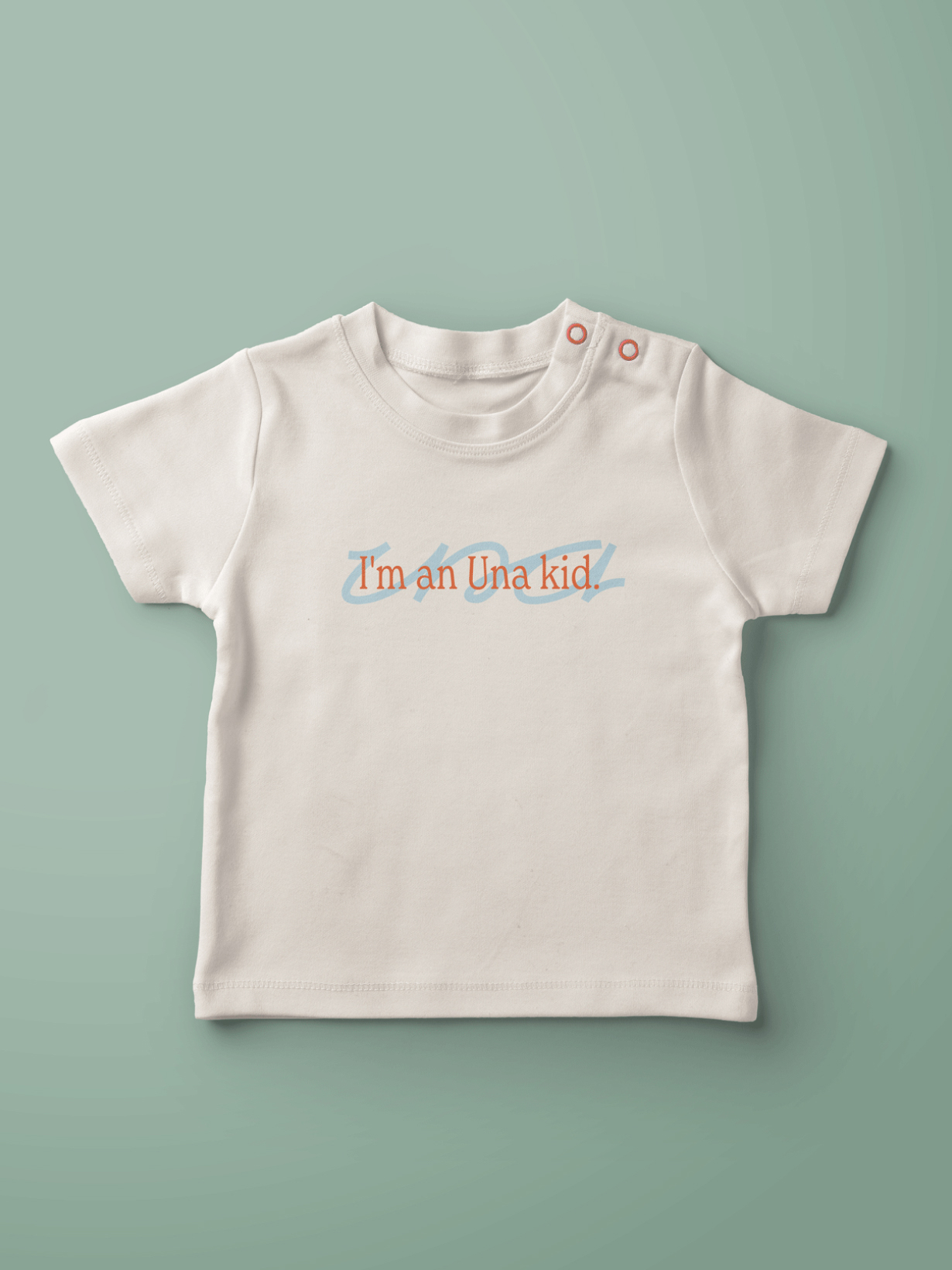
Meaning ‘in this place, together’, the new name breaks away from category norms, encouraging families to perceive Una not just as childcare but as a community, philosophy, and way of being that flows into their homes and lives. Channelling the brand’s focus on individuality, we developed a distinctive wordmark that shows an artful touch through its intentionally imperfect letterforms.
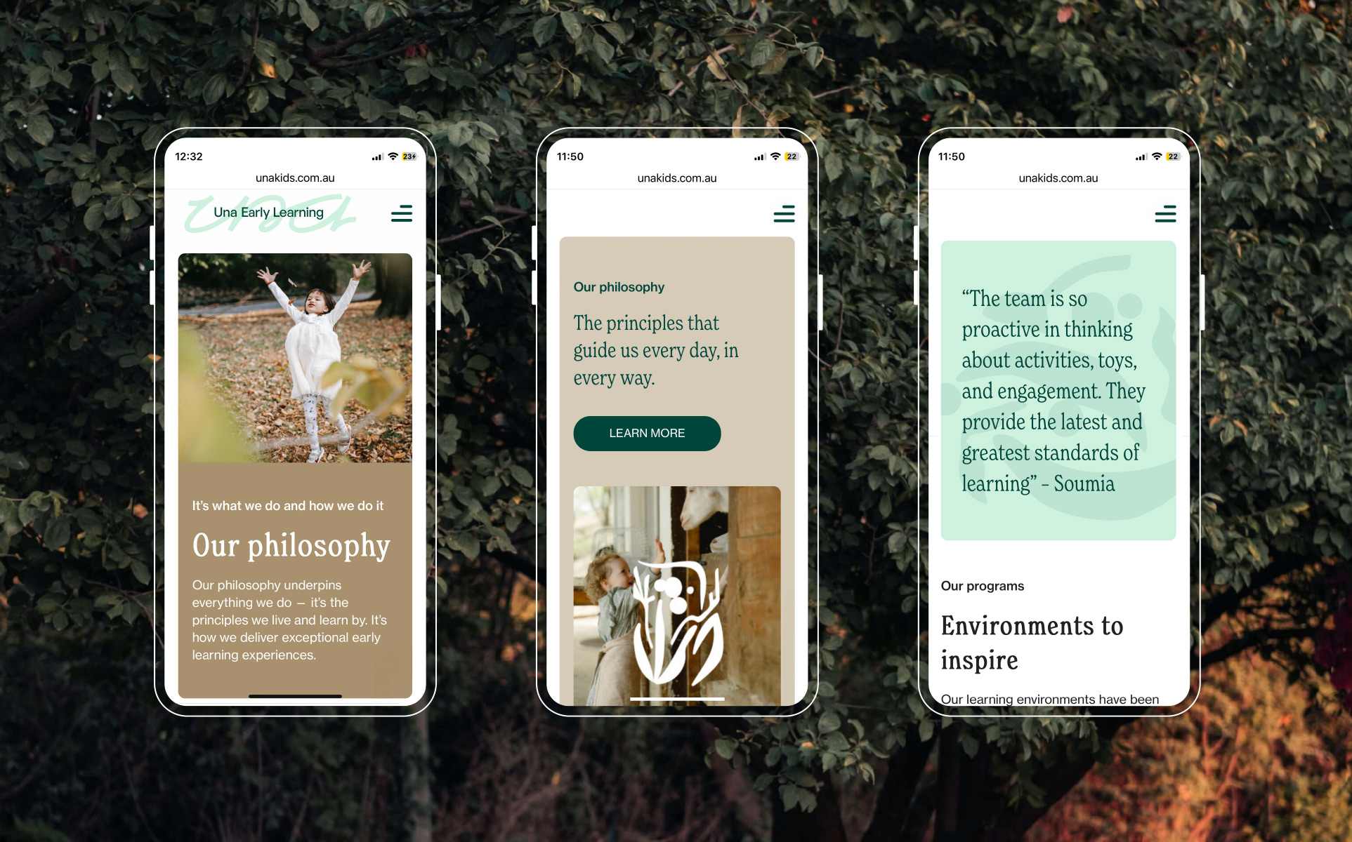
The digital experience
Understanding that exceptional word-of-mouth had already filled their waiting lists, Una sought a centralised online hub where families could easily register their interest. In response, we crafted a cost-effective website using our Made builder. The new website not only encapsulates the brand’s core philosophy but also offers the scalability to easily incorporate new locations as the business expands.
- Industry
Early childhood education and care
- Client
Evans Long
- Services
Brand positioning
Brand strategy
Naming
Messaging
Logo
Visual identity
User experience (UX)
User interface (UI)
Website development
The entire Driven brand team was involved in the project from the get go, and the benefits of this shows in the quality of the finished product. They immersed themselves in the Una way through site tours, meeting with our centre educators, team workshops, and seeing how all our staff interact with the families. They really understood our brief, and the ethos we were aiming for. The Driven team then went on to develop a brand and identity that absolutely embodies ‘Una’.
Matt Evans – Founding Partner, Evans Long

More projects
Enquire with us
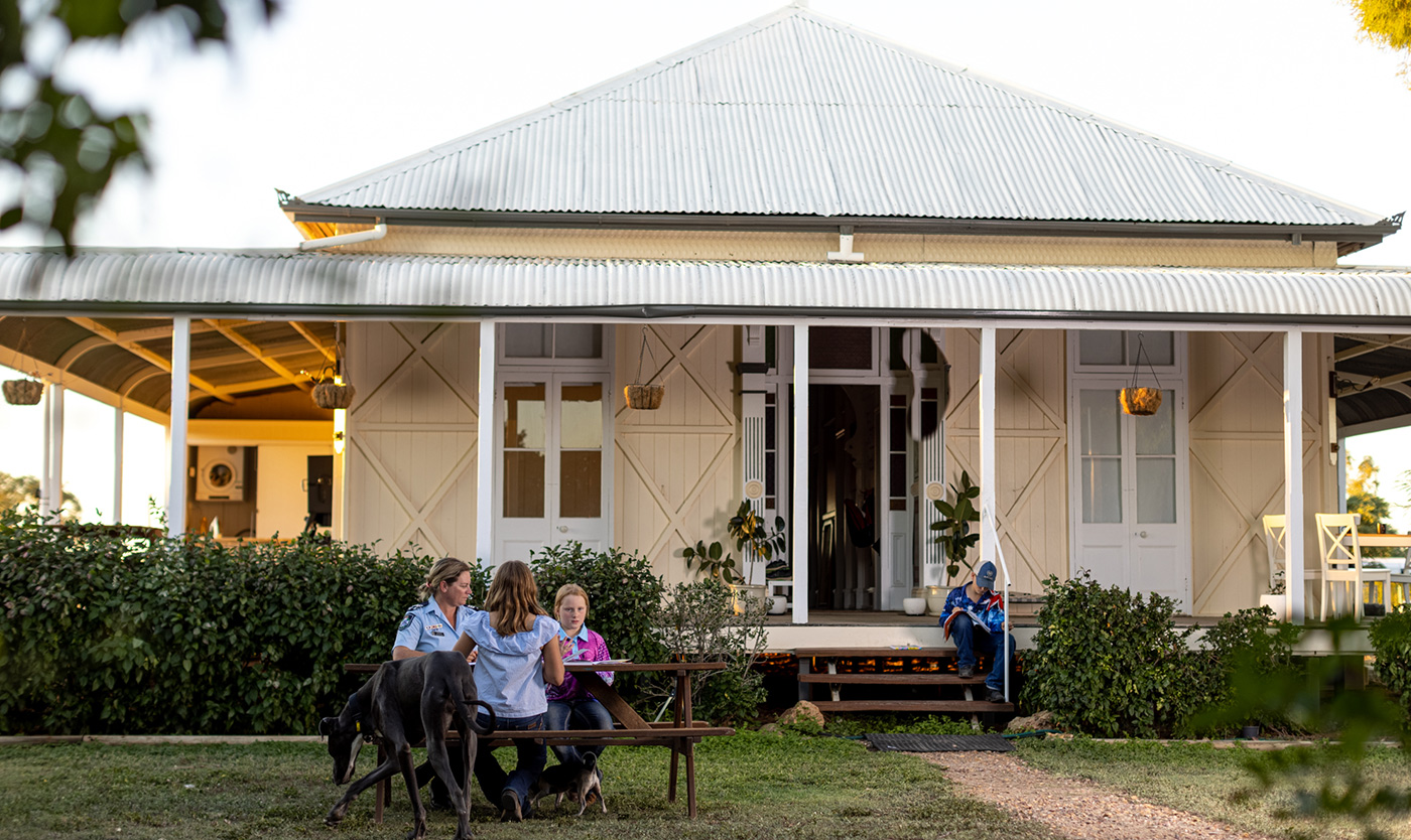
Giving bold direction to the Central West
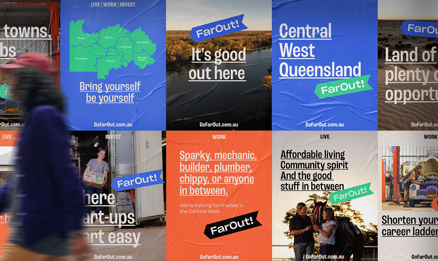
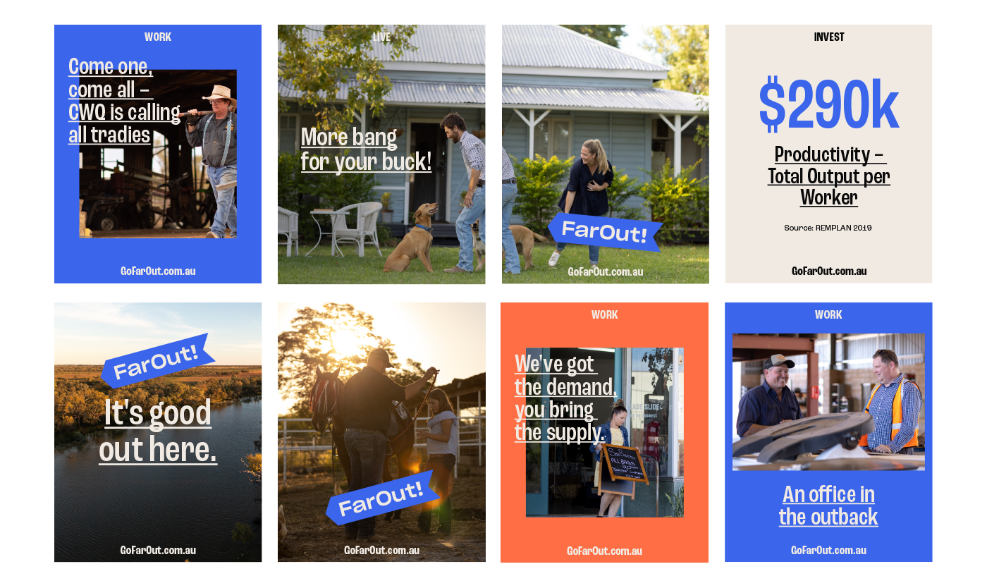
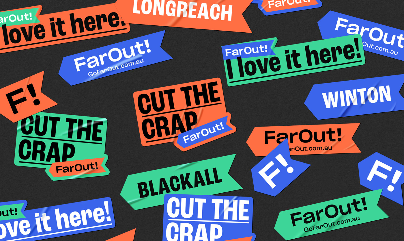
FarOut!
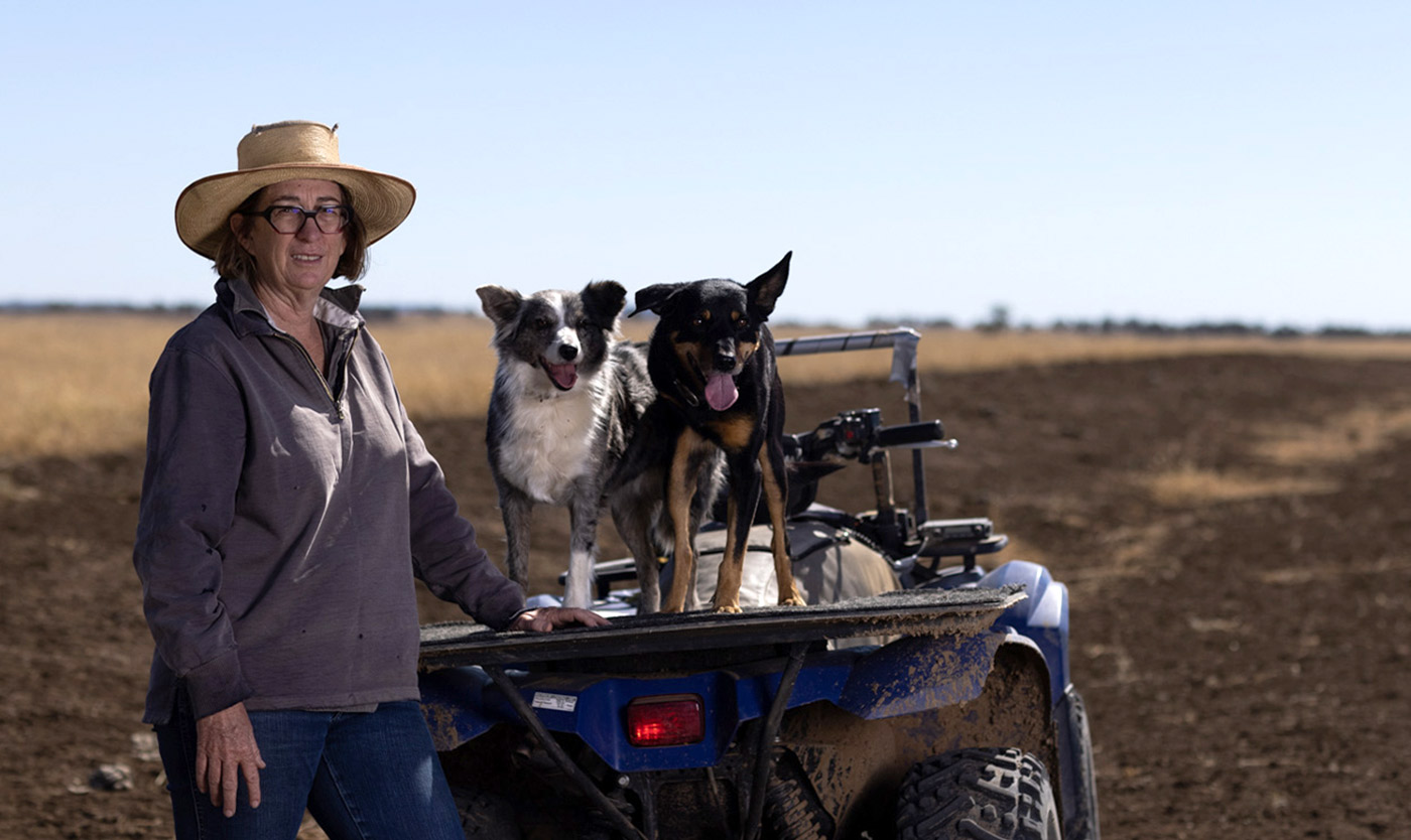
RAPAD is the regional development organisation representing seven local governments of Central West Queensland (CWQ). Since 1992, the RAPAD councils have come together to foster sustainable development of CWQ.
In recent years, the region’s population has been steadily declining, with residents relocating to cities and bigger regional hubs.
To fill essential worker vacancies and sustain the CWQ’s communities, RAPAD needed a way to encourage people to head outback to live, work, and invest.
Read more
Taking a different path
RAPAD’s original idea was to create three RAPAD-branded websites. Each site was to represent one of the three campaign pillars: live, work, invest.
However, after delving into the campaign objectives, we presented an alternative — we’d make a splash with a fresh new sub-brand; we’d build awareness with a digital campaign; and we’d drive traffic to a website that brought the three campaign pillars together in one place.
A bilateral view
To gain insights into our target audience, we conducted interviews with residents in metropolitan areas. The prevailing perception painted CWQ as a barren landscape, seemingly devoid of opportunities.
However, these city-dwellers also highly valued a balanced lifestyle. While financial and professional success mattered to them, so did spending quality time with friends, family, and on leisure activities.
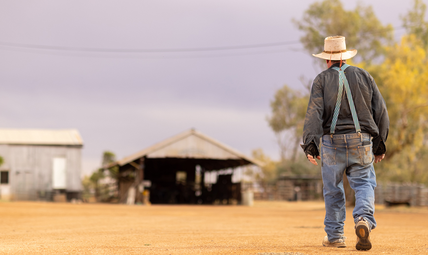
Upon venturing into the outback to delve into the life and culture of CWQ, we discovered the complex truth that challenged our earlier findings from the metro interviews.
Contrary to the metropolitan perception, CWQ was far from a barren wasteland; it was actually a fertile ground for untapped opportunities.
Importantly, the emphasis on work-life balance resonated strongly with the locals in CWQ. The distinction was, people in CWQ weren’t just talking about a balanced life; they were actually living it.
Insight
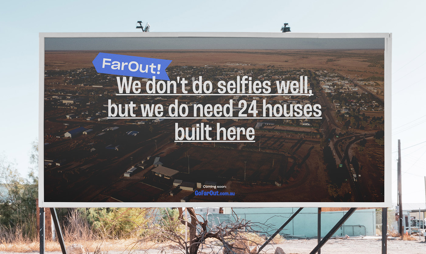
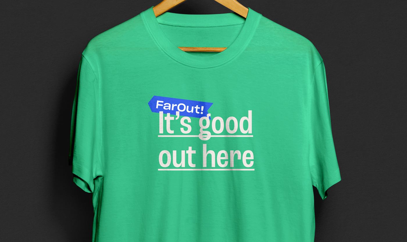
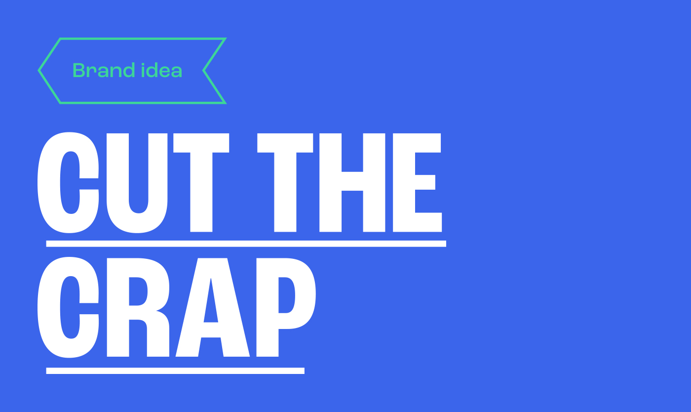
The Central West isn’t just the land of untapped opportunity, it’s an antidote to the restrains of modern life – and far out, it’s good out here!
Cut the crap
When you choose to live, work, and invest in CWQ, you’re choosing the path less travelled. But more than that – you’re cutting the crap from everyday life.
The ‘Cut the Crap’ brand idea is about skipping the plastic lifestyle and fast tracking your goals.
It’s honest and bold, just like the Central West.
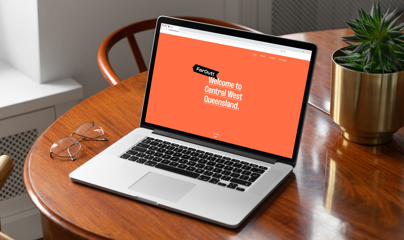
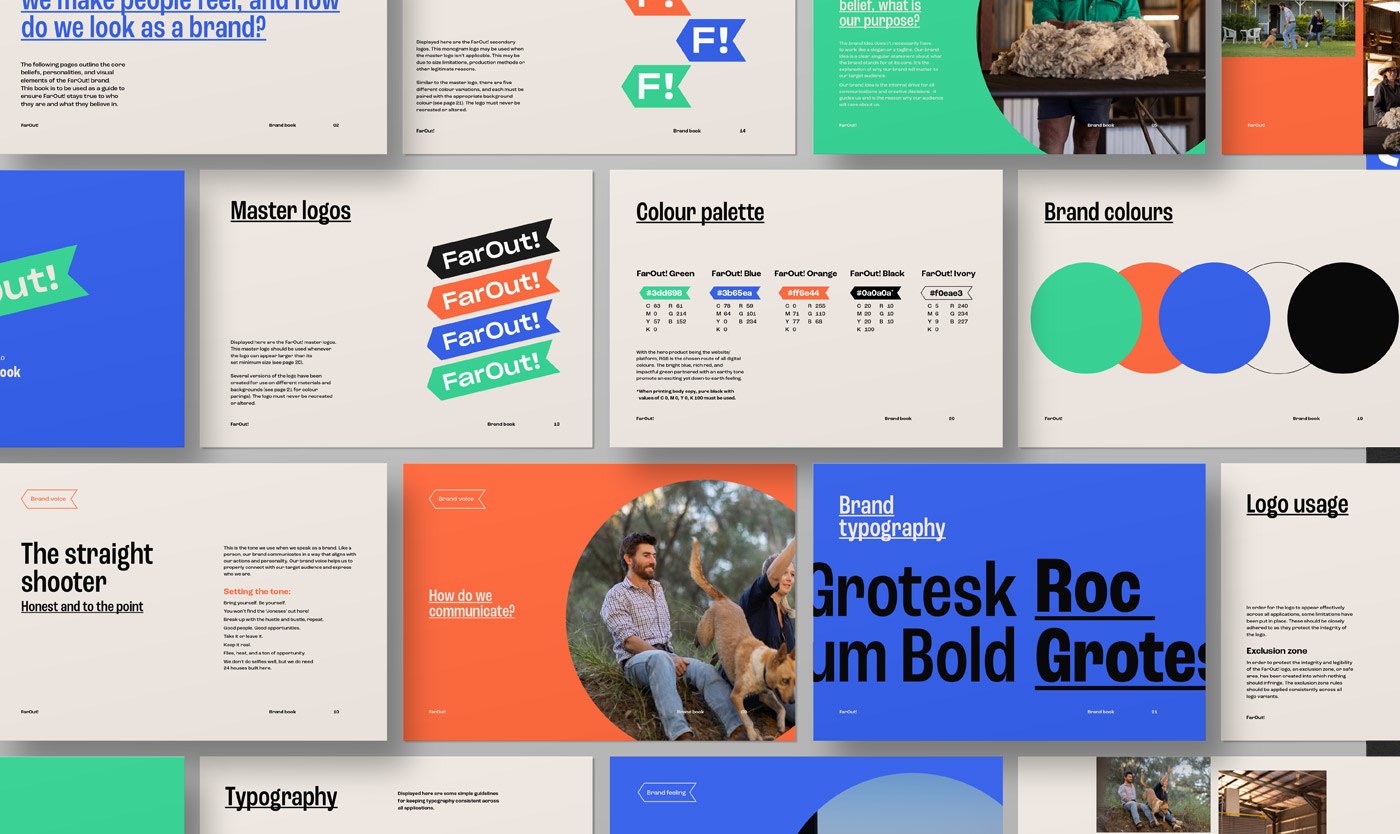
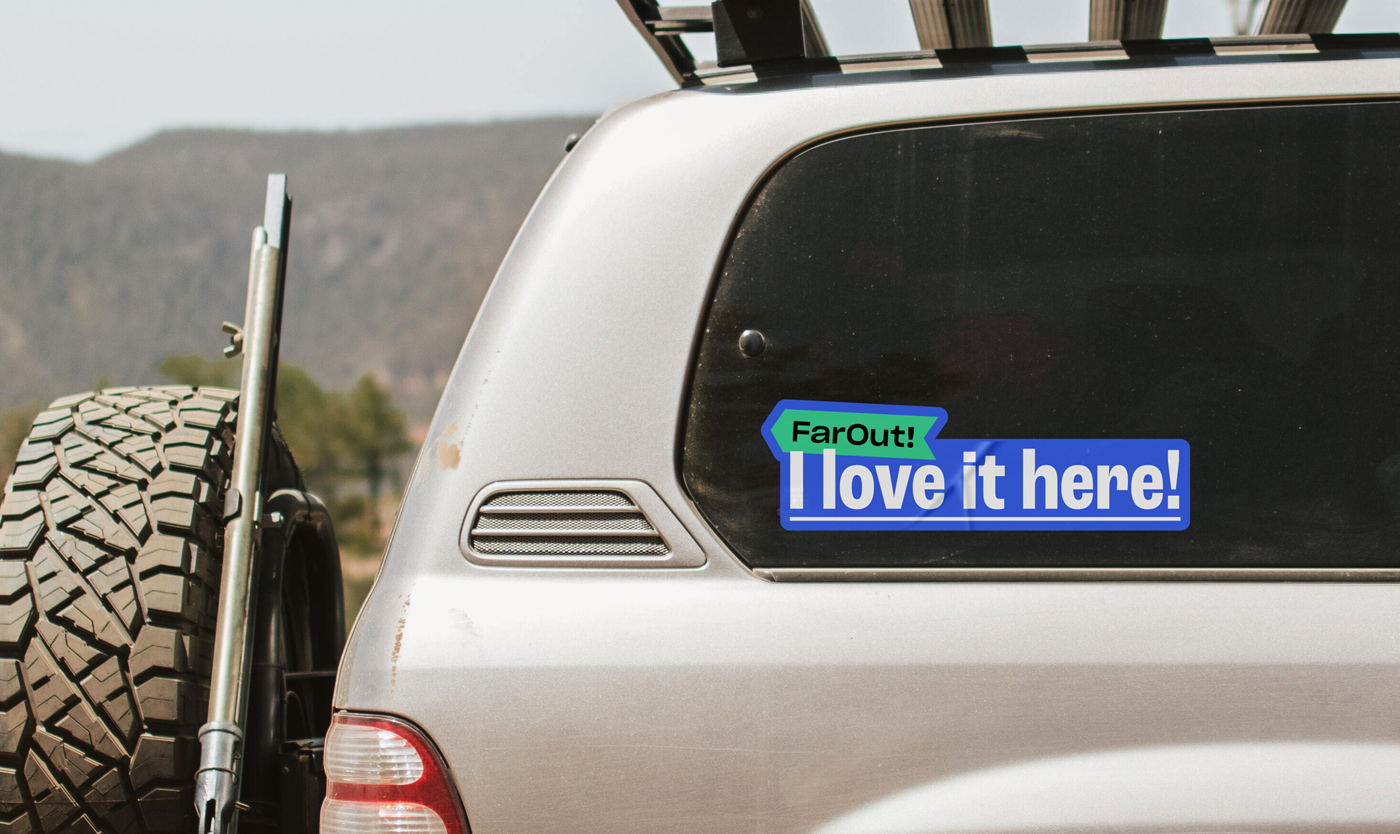
Introducing FarOut!
A name that goes beyond a label, FarOut! is a nod to CWQ’s geographical location, the unexpected opportunities of the region, and the brand’s straight-shooting essence.
Go west for more
Wanting to drive movement to Central West QLD, we drew inspiration from directional road signs. Pointing west, the logomark pays homage to the regional energy of CWQ and hints that there’s more to come — more excitement, more opportunities, more of the laidback lifestyle you’ve been dreaming of.
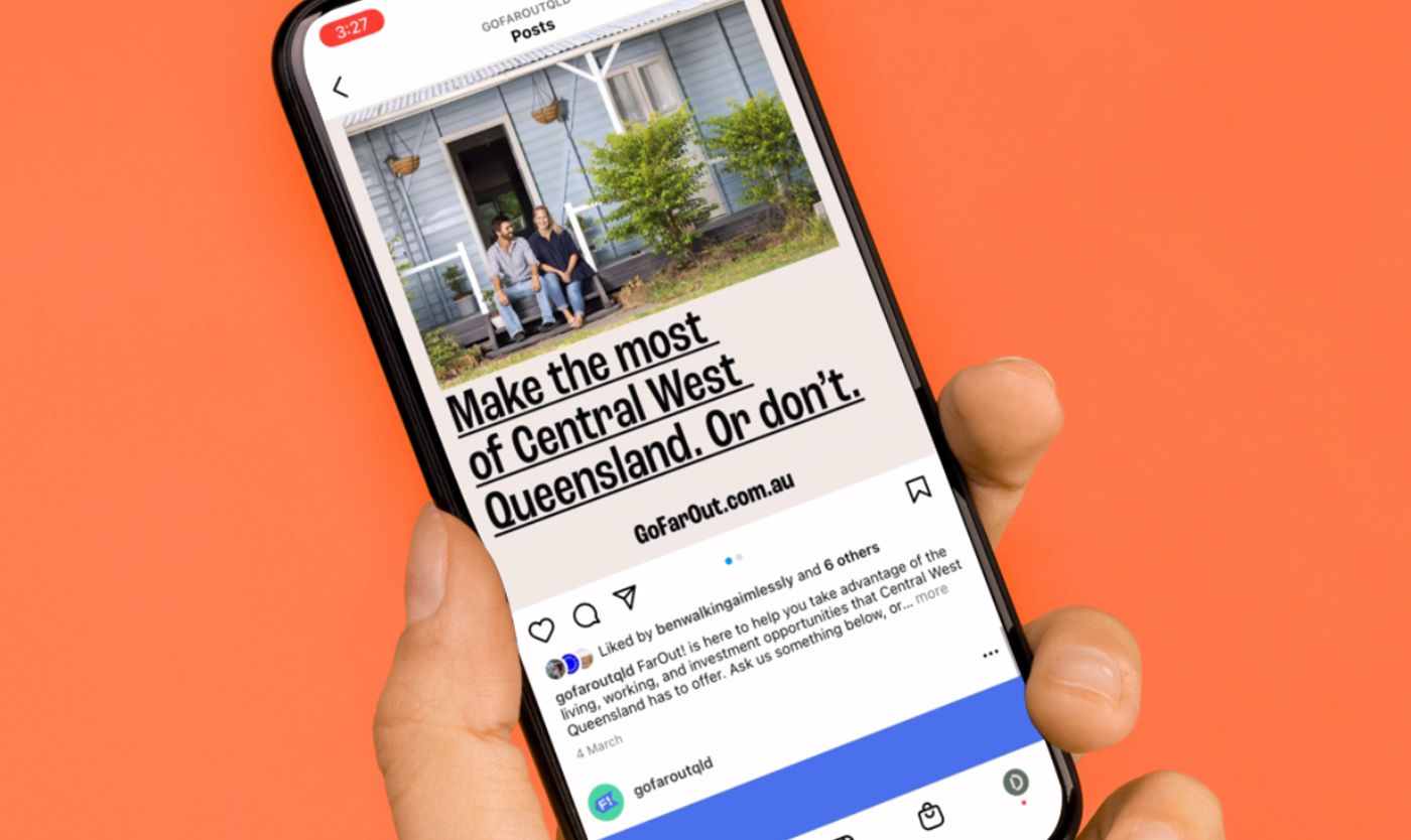
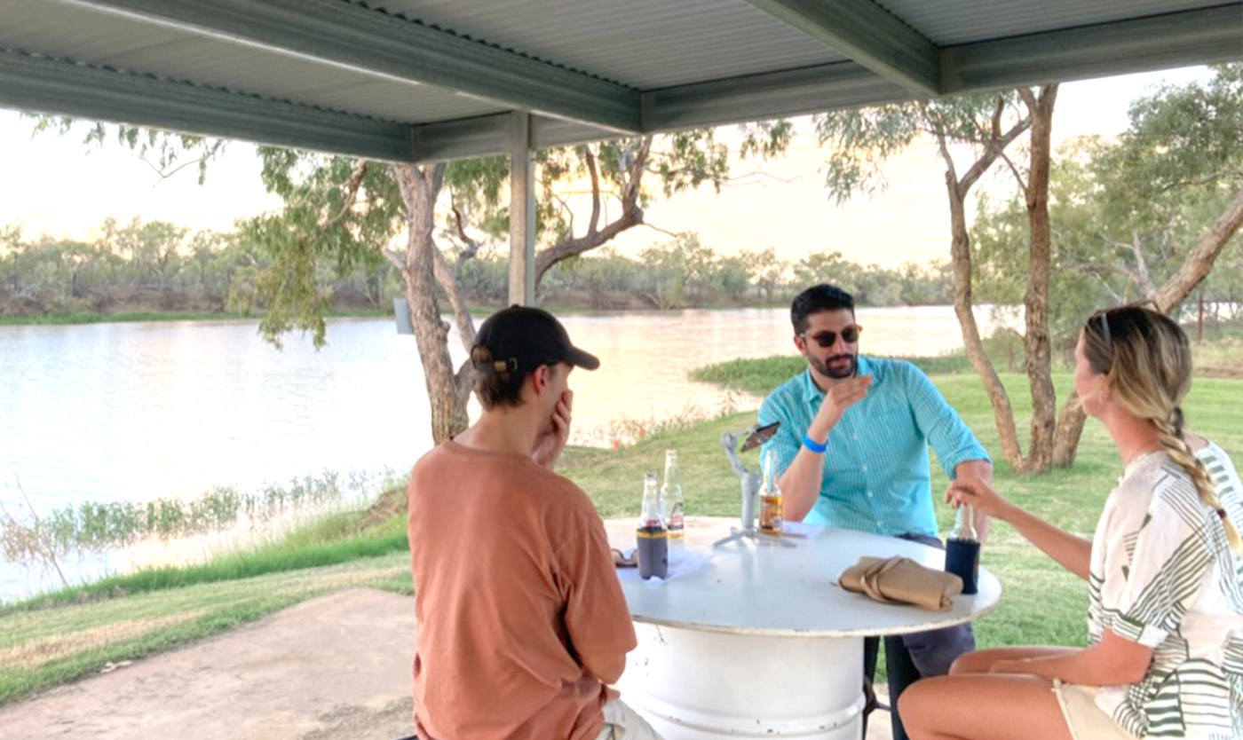
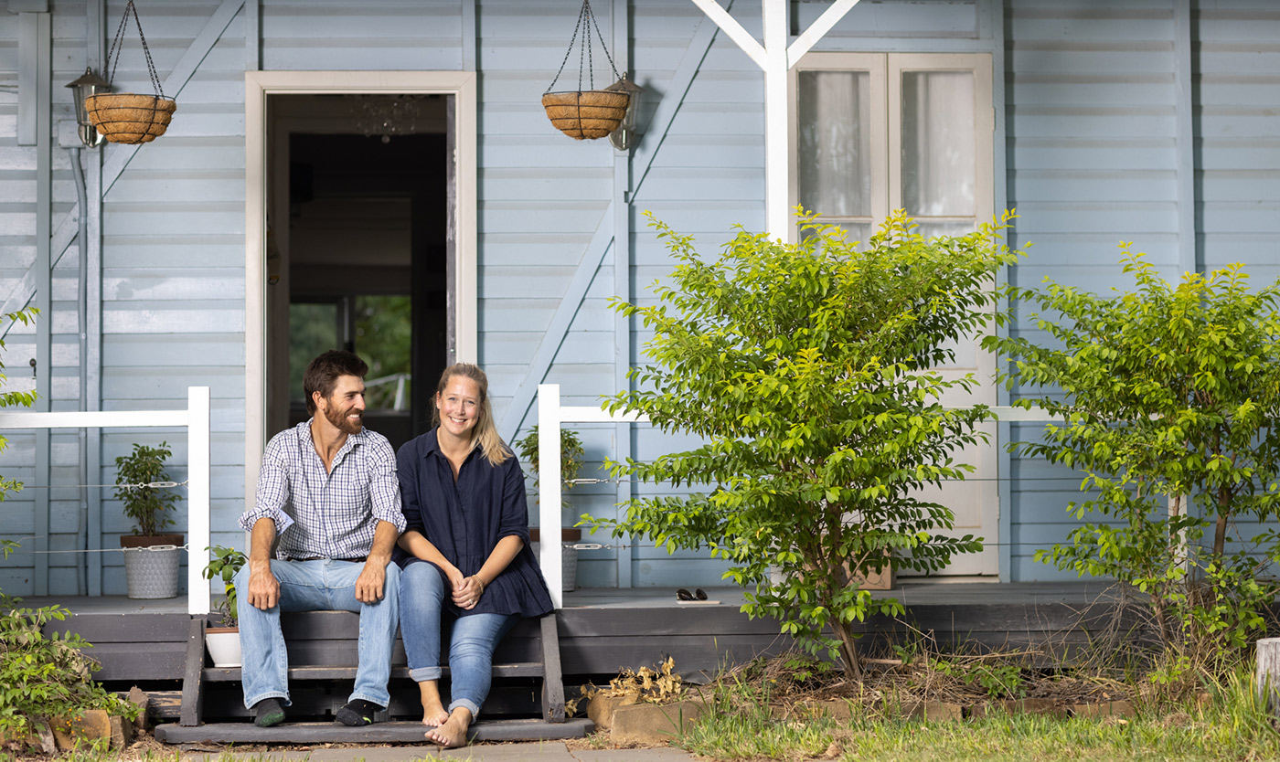
It’s the people that make the place
No one knows CWQ better than the people who call it home; and there’s nothing more powerful than a real story, told true. Through a series of interviews, we captured the real stories of people who’d made the move to the Central West.
These stories were textured, heartening, and most importantly, they were as real as it gets. These stories became a core component of the FarOut! brand and the digital launch campaign.
Space to grow
It was essential for the website to be modular enough to flex and grow with the brand. With our custom page builder, the RAPAD team can easily edit and add pages to support future campaigns.
Built on WordPress, the site leads by example and cuts the crap by embracing simple navigation. The straightforward banner menu means visitors get the information they need on living, working, and investing in CWQ, fast.
Getting the word out
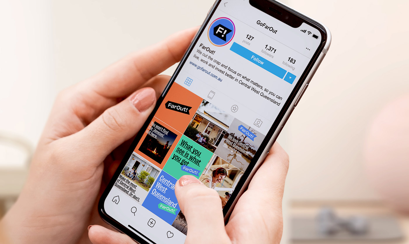
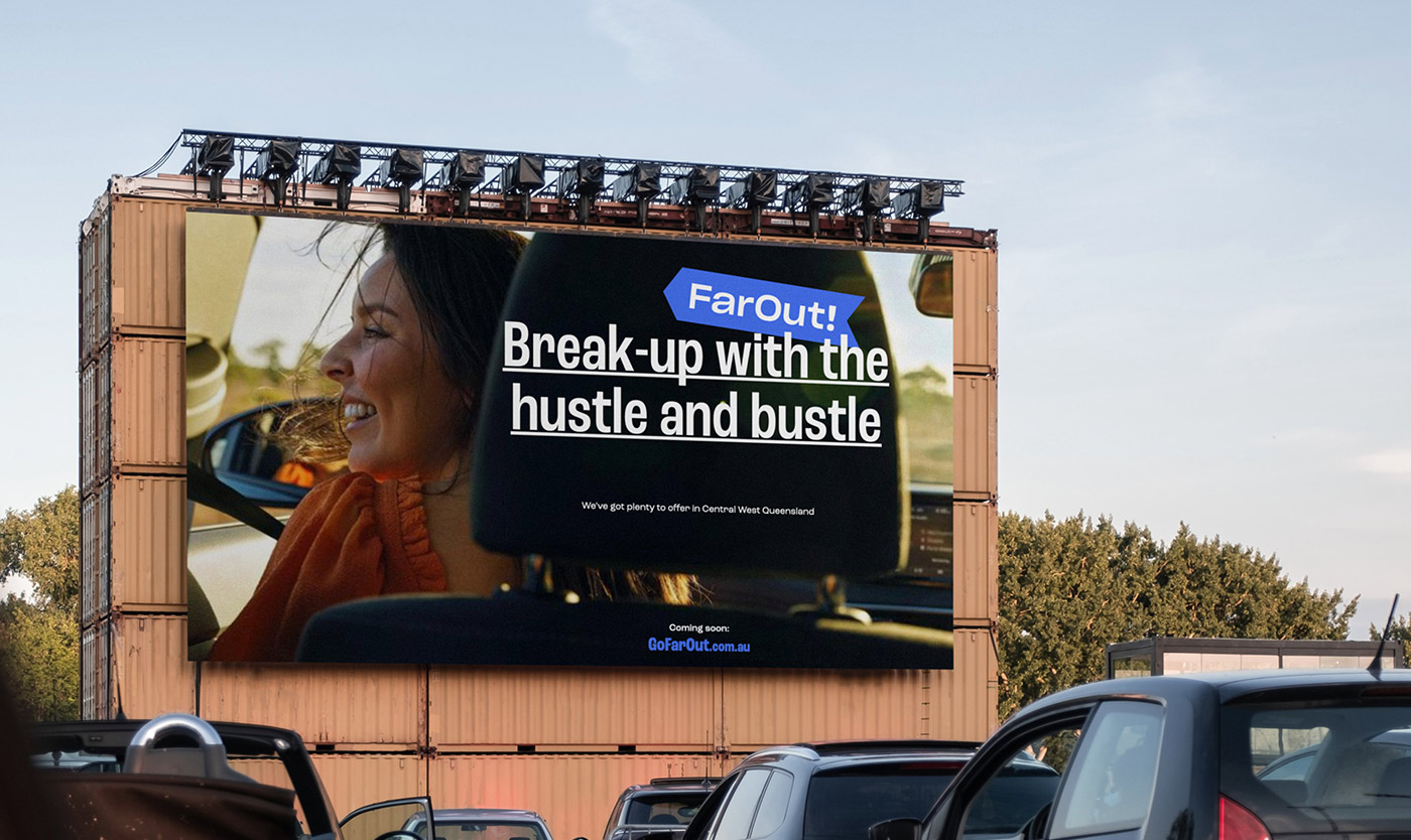
To build brand awareness, engage the local community, and get people talking about the prospect of a CWQ tree change, we kicked off the FarOut! launch with a digital campaign.
Using a mix of paid and organic media, we brought the campaign to life across Facebook, LinkedIn, and Instagram. The 4-month campaign period generated plenty of leads, with people reaching out to discuss job opportunities, housing options, and life in the CWQ.
This marked an exciting chapter for CWQ. Prior to the launch of the FarOut! brand and campaign, RAPAD had struggled to generate enquiries of this volume.
Driving forward, together
Since launching the FarOut! brand and campaign in 2021, we continue to work in close partnership with RAPAD.
We feel honoured to have been a part of this journey from the very beginning and to be trusted as RAPAD’s creative partner. This is just the beginning for FarOut!

- Client
Remote area planning & development board (RAPAD)
- Industry
Economic development
- Partners
Studio 18a
BFJ Digital - Recognition
Good Design Award Winner 2022
Bronze – Brand Identity BADC 2022
- Services
Brand strategy
Logo
Visual identity
Campaign development
Creative direction
Digital strategy
Naming
User interface (UI)
User experience (UX)
Website development
Digital marketing
Social media content
From the very beginning, the team at Driven felt like true partners. They didn’t just take the brief and start work. They took the time to understand our goals, respectfully challenge our initial ideas, and develop a creative alternative that made better sense for our objectives, budget, and timeline.
Right from the outset they got ‘it’, got us, and got what we were trying to achieve.
The FarOut! brand has enabled us to celebrate and promote Central West Queensland and capture the attention of our target audience. We couldn’t be prouder to partner with Driven for this project.
Morgan Gronold | Deputy CEO, RAPAD